Bell Curve in Excel is one of the advanced Excel charts. There is no built-in chart type in excel to make a bell curve but we can probably make it by using the Scatter Chart with Smooth Lines.
So let’s jump to work!
What is a Bell Curve?
Bell Curve is used to represent the normal distribution by using a graph. It is named so as it will always contain a symmetrical bell-shaped curve. The highest point of the curve is in its middle part which forms a peak.
The peak ( mean, median, or mode )in the middle of the curve will give us the range of values that is highly probable to occur out of a list of values. To the left and right of this peak, we have the least frequently occurring range of values.
How to Read a Bell Curve in Excel?
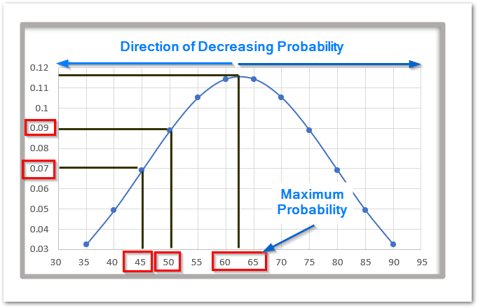
The above is a Bell Curve for the marks of students on a test out of a hundred. Using this bell curve, we found that a student has the maximum probability of scoring marks between 60 and 65.
The X-Axis is here representing the marks while the Y-axis represents the probability for that event.
The student has a 7% chance of scoring 45 marks while a 9 % chance of scoring 50 marks on the test.
Bell Curves are used in the field of science, business as well as in technology to analyze the probability distribution of the values.
Making a Bell Curve
Let us suppose we have the monthly sales of a company for a year as follows:-
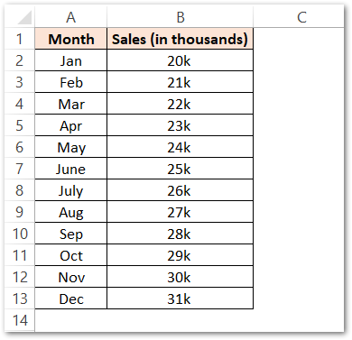
Now we need to get the value of Probability Density in order to get the points of the curve on the graph. We will use the NORM.DIST Function in Excel to get the values of Probability Density for each of the sales values.
Assign Column C to Probability Distribution (PD) and use the following formula in cell C2.
=NORM.DIST(B2,AVERAGE($B$2:$B$13),STDEV.P($B$2:$B$13),0)
We have used the Relative and Absolute Referencing in the above formula. Copy this formula down the range C2:C13 by simply selecting and then pressing the Ctrl D key.
Following are the results.
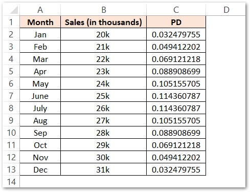
Now insert a Scatter Chart with Smooth lines and markers from the range B1:C13 where B2:B13 ( Sales ) will give the X values and C2:C13 will give the Y values.
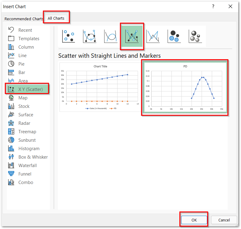
This inserts the chart as shown below:-
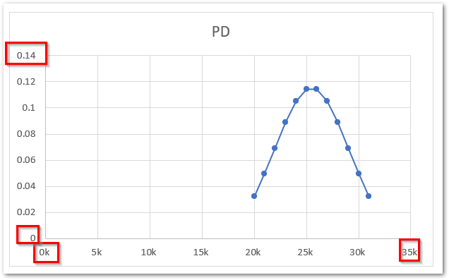
Here you can see that we have got the bell curve but we need to position it correctly on the chart. Consequently, we will change the minimum bounds, maximum bounds, and major unit of both the vertical and horizontal axis of the chart to:-
For Vertical Axis:-
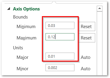
For Horizontal Axis:-
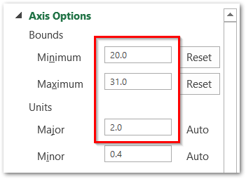
As a result, this is what our bell curve would look like.
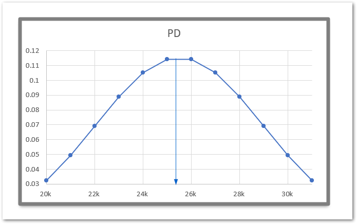
So you can infer that the probability of the sales is highest for the range 24k to 26k while the lowest for 20k and >30k.
This brings us to the end of the blog.
Thank you for reading.

