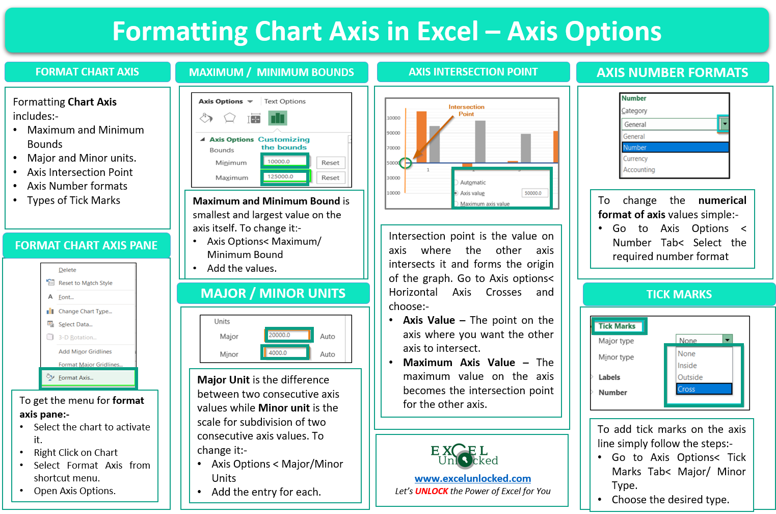
In this blog, we will learn to format the chart axis by using the Format Axis Pane in Excel: Axis Options. We will be taking an example of a column chart to learn the formatting of a chart axis. As we know, there is one primary and one secondary axis for each horizontal and vertical axis. In this example, we will consider only the primary axis for the graph.
Here we go 😎
What is Meant by Formatting Chart Axis in Excel
Formatting a Chart Axis in Excel includes many options like Maximum / Minimum Bounds, Major / Minor units, Display units, Tick Marks, Labels, Numerical Format of the axis values, Axis value/text direction, and more. However, there are a lot more formatting options for the chart axis, in this blog, we will be working with the axis options and Size, and properties.
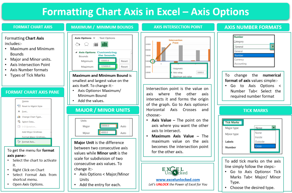
Moving Ahead in Steps
We will now continue in steps to get the formatting done.
Inserting a Column Chart in Excel
We need a chart to format its axis. Let us say there are the actual and target sales of a company in quarters for a year. Below is the data.
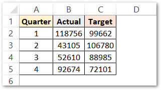
Now we can insert a column chart from this data.
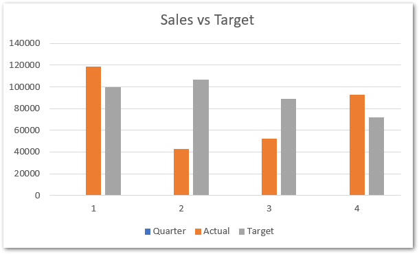
This will be the inserted chart. You can check the blog on how to insert a chart in excel.
Analyzing Format Axis Pane
Right-click on the Vertical Axis of this chart and select the “Format Axis” option from the shortcut menu.
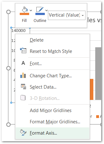
This will open up the format axis pane at the right of your excel interface.
Thereafter, Axis options and Text options are the two sub panes of the format axis pane.
Formatting Chart Axis in Excel – Axis Options : Sub Panes
There is some more sub-division of panes in the axis options named: Fill and Line, Effects, Size and properties, Axis Options. We have worked with the Fill and Line, Effects in our previous blog.
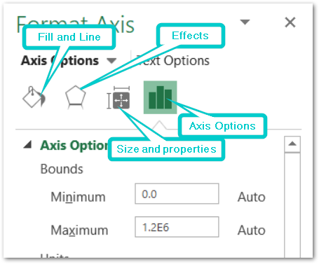
Format Chart Axis – Axis Options : Axis Options
The axis options have the following menu.
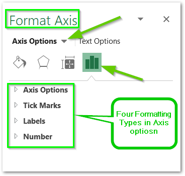
However, In this blog, we will be working with Axis options, Tick marks, Labels, Number > Axis options> Axis options> Format Axis Pane.
Axis Options: Axis Options
There are multiple options So we will perform one by one.
Changing Maximum and Minimum Bounds
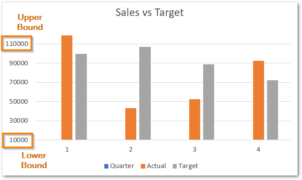
The first option is to adjust the maximum and minimum bounds for the axis. Minimum and maximum bounds are the smallest and largest axis values within which the entire range of data lies.
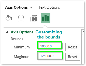
We are adjusting the minimum and maximum bound to 10000 and 125000 respectively.
Changing Scale/ Major or Minor Units of the Axis
In maths, we write the difference between two consecutive axis values as scale. These scales in excel are represented by Major / Minor units.
The major unit is the difference between two consecutive axis values while the minor unit is the difference between two consecutive further sub-divisions of two axes values.
You need to turn on gridlines to understand this.
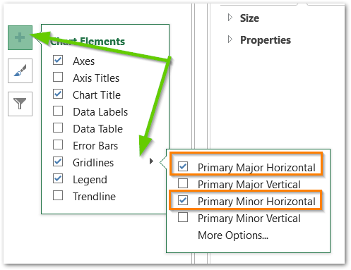
Check the two boxes and look at the chart now.
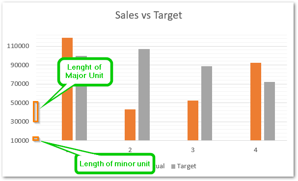
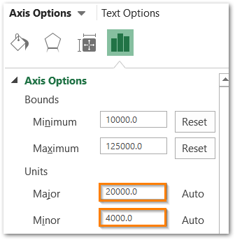
There is a visual representation of the minor and major units. We can change them from here.
Changing the Intersection Point
The intersection point is where the primary vertical axis and primary horizontal axis intersect i.e origin. We can change the intersection of one axis on another.
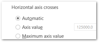
We have these three options. When we are in the format axis pane for the vertical axis, there will be the option to change the horizontal axis crossing point on the vertical axis.
We can adjust the intersection point by changing the value of the axis value as its value on the y-axis.
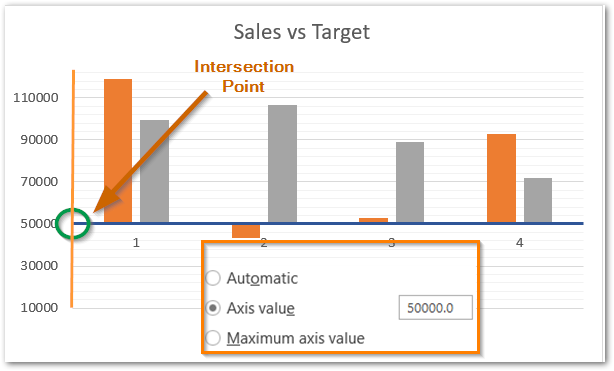
Here we have set the point to 50000 on the y-axis.
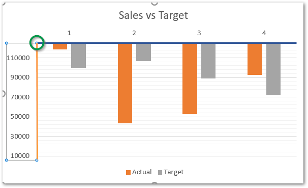
The third option will set the point to maximum value i.e 110000 or above.
Display Axis Units
Axis units convert the large axis values as a multiple of 10, 100, 1000 to millions and billions to shorten the length of axis values.
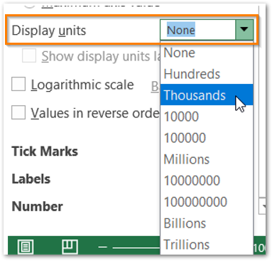
We are setting the display unit to thousands and this will change the axis values as:
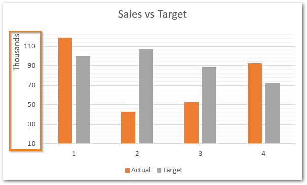
After that, there are three checkboxes and the function of each of them are:
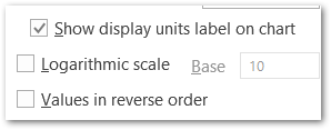
- Remove the unit of the label from the chart axis.
- The logarithm scale will convert the axis values as a function of the log.
- reverse the order of chart axis values/
Axis Options: Tick Marks and Labels
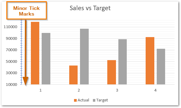
Tick marks are the small, marks on the axis for each of the axis values and the sub-divisions that make the chart easier to read.
Tick Marks can be of two types. For instance, we can say that the axis values have the corresponding major tick marks while the subdivisions in the axis values have minor tick marks.
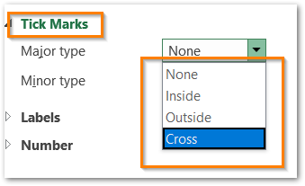
These tick marks have three formats in total for both major and minor type tick marks.
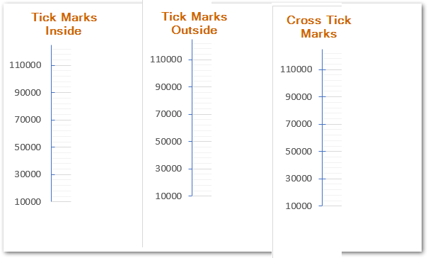
Similarly, we can add tick marks for the minor axis as well.
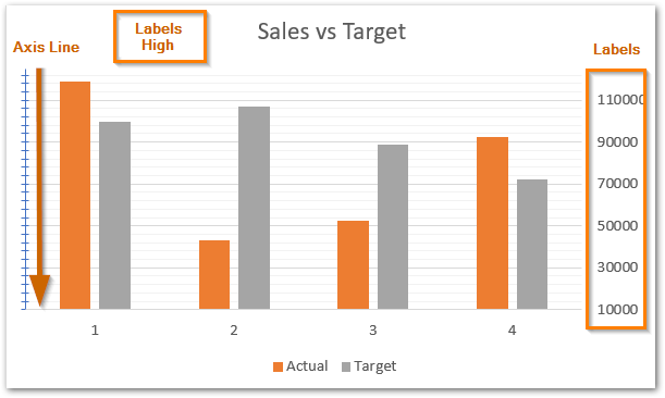
The Next option is to adjust the labels on the chart. Labels are nothing but the axis values. We can change the position of axis values relative to the position of the axis line.
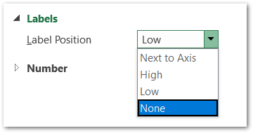
For now, we are setting the label’s position to high.
Axis Options : Number Format
We can change the format of axis values of the chart in excel in the same way we do for the cell entries. Below are the number formats available for chart values in excel. It is currently set to general number format. We would choose the currency from the list.
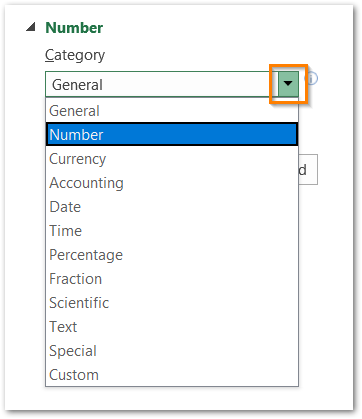
Hence, this will open up the formatting for the currency number format.
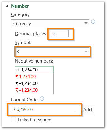
This would change the axis format to this.
Follow the link to know more about custom number formats.
With this, we have come to the end of this blog but you can learn more about Formatting Chart Axis from here.
Thank you for reading 😉
RELATED POSTS
- Format Chart Axis in Excel – Axis Options: Effects
- Line Chart in Excel – Inserting, Formatting, #REF! resolving
- Column Chart in Excel – Types, Insert, Format, Clickable Chart
- 3D Column Chart in Excel – Usage, Insertion, Format
- Make Your Own Chart Template in Excel
- Volume High Low Close Stock Chart in Excel – Insert, Format, Reading

