When it comes to analysis and decision-making from the data in any business or company, numerical data in any form would make it difficult. Excel solves this problem with the use of visual representation for the numerical values using Charts in Excel. Most people think that excel is all about crunching rows and columns in the form of data but No! There is so much more to do with the data when it comes to its visual representation.
What are Charts in Excel
A chart is a visual representation of data in the form of bars, lines, pies and so much more. Displaying the data in an organized way helps the team to come up with business decisions faster. Charts help us to summarize a relationship between the numerical values, business patterns, trends that might go unnoticed if there were just numerical values used to represent them.
- What are Charts in Excel
- Amazing Points About Charts in Excel
- Starting with Charts
- Yoast SEO Premium
- Google preview
- SEO analysisGoodCharts in Excel
- Add related keyphrase
- Cornerstone content
- Insights
- Blog2Social: Social Media Content Calendar
- Status & visibility
- Template
- Yoast SEO
- Permalink
- Categories
- Tags
- Featured image
- Excerpt
- Discussion
- Sections
- Webpushr Notification
- Blog2Social: Autoposter
- Append a Ninja Form
Amazing Points About Charts in Excel
One should know the following points in Excel to get a deeper knowledge about charts.
- Charts are dynamic in nature. They represent the data series of numbers in visual form. Any change in the data series will be reflected in the chart.
- When we create a chart, it can reside in the two locations in a workbook. It can either be an embedded chart or on a chart sheet.
- The embedded chart floats as a layer on the worksheet. It inserts near the data so you can see both data and chart at the same time.
- A chart sheet is a new sheet created only to represent the chart. It can be created by selecting the data and then pressing the F11 function key and getting the default chart type.
- A chart act as an object in Excel like other objects including shapes or text box. We can add a chart title, legends. gridlines to the chart.
- We can format a chart, resize it, add effects, customize it and do a lot more things to be done with a chart.
- When we click on a chart and select it, there are two more tabs on the ribbon. Design tab and Format Tab.
Starting with Charts
Let us start working with charts.
Components of Charts in Excel
A chart is so much more than a representation. We can do a lot of things with a chart but for that, we must understand its components first.
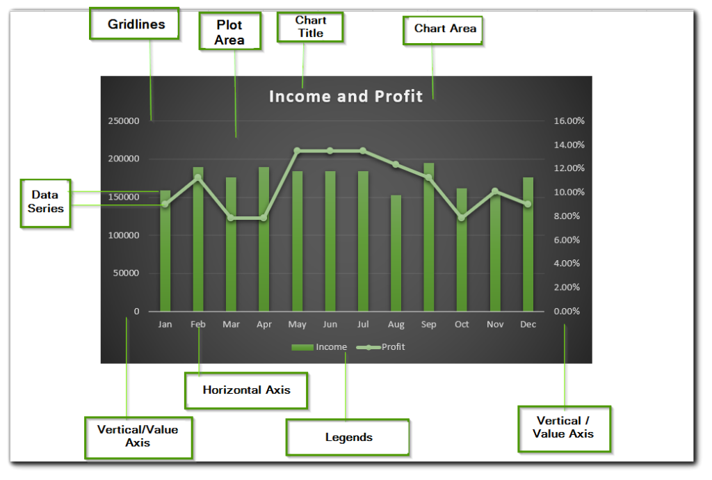
A chart has many useful elements yet they are not mandatory to be mentioned. We can make an empty chart that has no chart elements. Excel allows it but it has no use. Below are the points explaining chart elements.
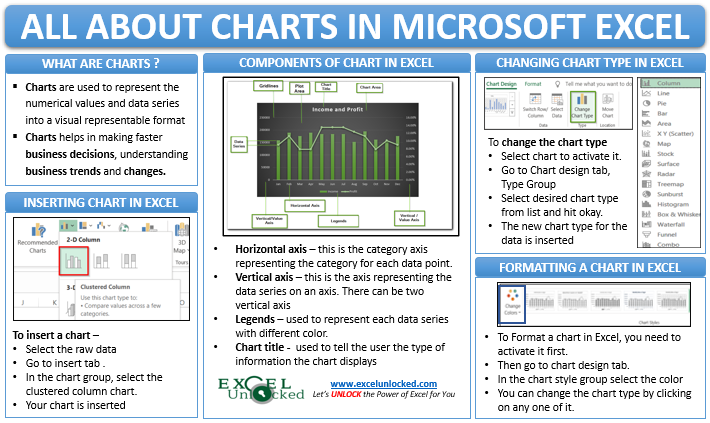
- Vertical/Value Axis – It has the data series representing values. There are two vertical axes in the above graph i.e. one for income and the other for profit percentage. This is so because if we tried plotting the profit and income on one axis, the profit line might not even be visible.
- Horizontal/Category Axis – This represents the category for each data entry. In above example, it is month.
- Legends – A chart with two data series ( profit % and income ) is appropriate but for that excel assigns a different color scheme to both of them that are called legends.
- Chart title – The name can be used to imply to the worker that what type of information the chart displays
Inserting a Chart in Excel
In this section of the blog, we will be knowing the steps to insert a chart in excel. Here we go
- Let us say we have a set of data representing the monthly website visits of a company.
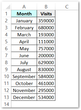
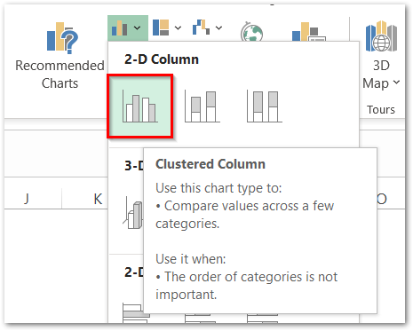
- Select this data and Go to Insert Tab. Go to Charts group and then select the Clustered Column Chart.
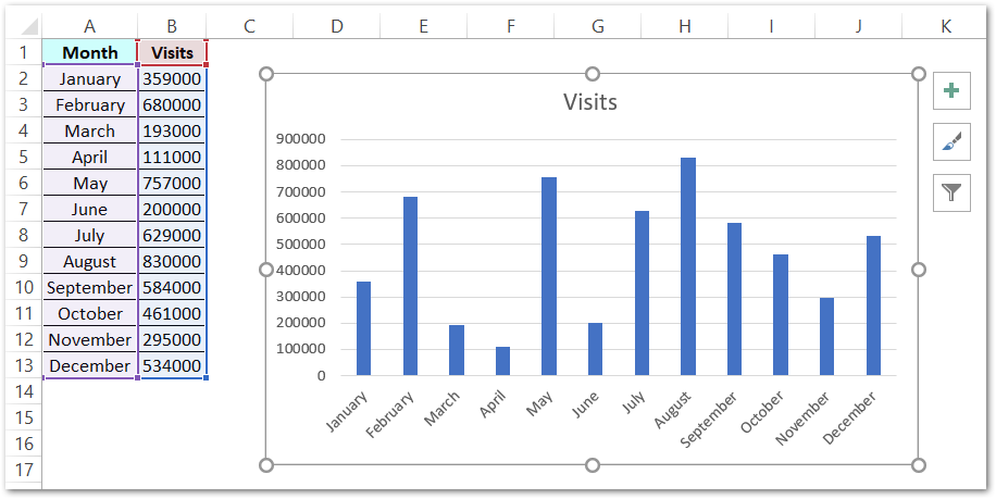
- As a result, Excel would now create a chart in the same worksheet representing the website visitors.
Changing Chart Type
As we have now created a clustered column chart for the website visits. We can now easily change the chart types. Although clustered column chart has perfectly represented the information nothing goes in checking some other chart types.
Select the chart and a new Chart Design tab will appear on the ribbon.
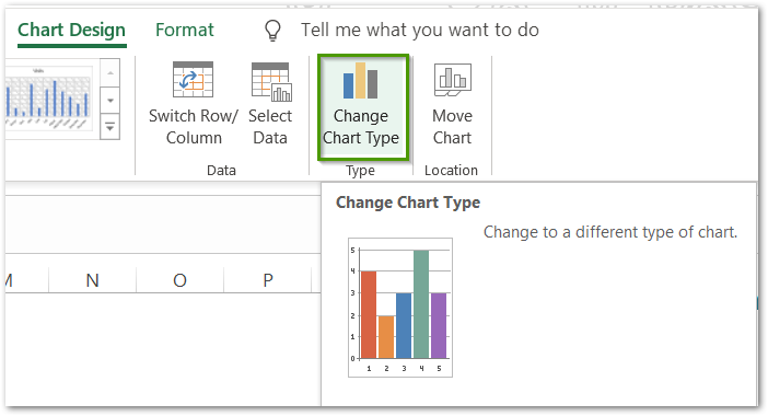
From there, go to Type group and click on the change chart type button.
The Change Chart Type dialog box appears.
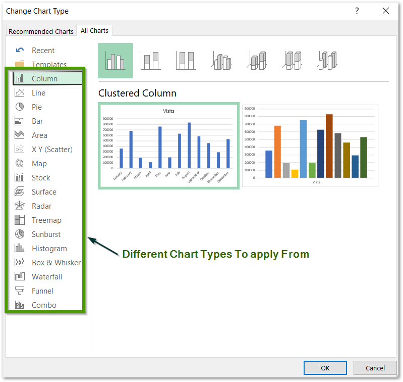
From here you can change the chart type in Excel. You can try on The Line Chart, Pie Chart, or any other of them.
Formatting Charts in Excel
Let us take a data source that has the actual sales and target sales for each month of a company. Below is the data.
Also Read: Make Your Own Chart Template in Excel
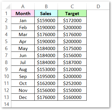
We will insert a combo chart this time. In a combo chart, we use different chart types for different data series. In the above data, there are two data series named sales and target. Steps to do this are
- Select the data. Go to insert tab > charts group > combo chart button. Refer to the image below.
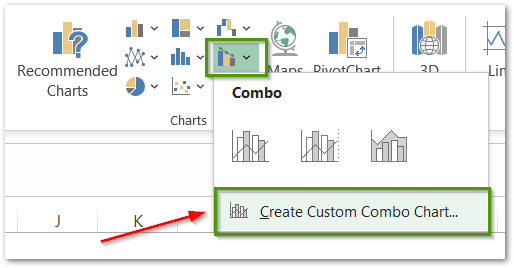
- Click on Create Custom Combo Chart Button to open the Insert Chart Dialog Box
- In the Insert Chart Dialog Box, Refer to the instructions in the below figure and click ok once you are done.
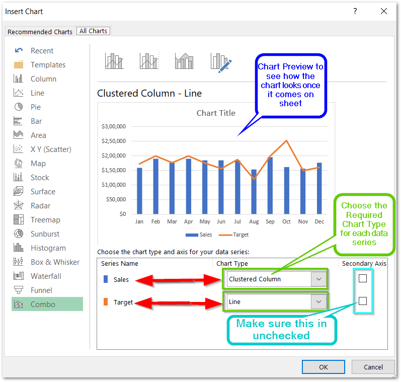
Once you click ok, the chart shown in preview inserts on the current worksheet. By default, excel inserts the chart title on the top of the chart. We can change it by double-clicking on it.
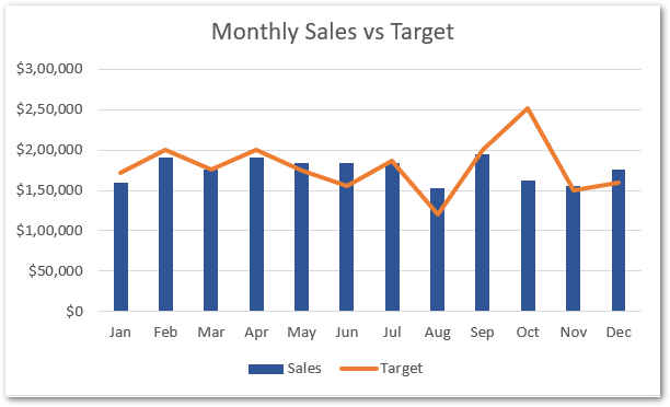
We can format our chart to make it look even better to match the theme of the project. Following are the steps:-
- Click on the chart to activate it.
- Two tabs named Chart Design and Format will pop up on the ribbon. Click on Chart Design Tab.
- In the chart styles group, click on the change colors button and choose the desired color for your chart.
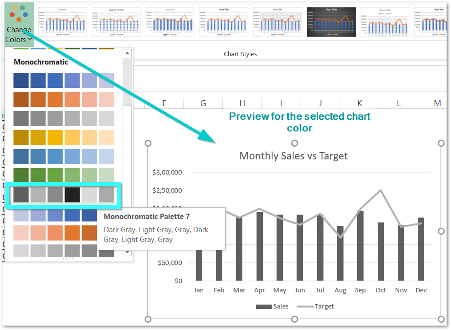
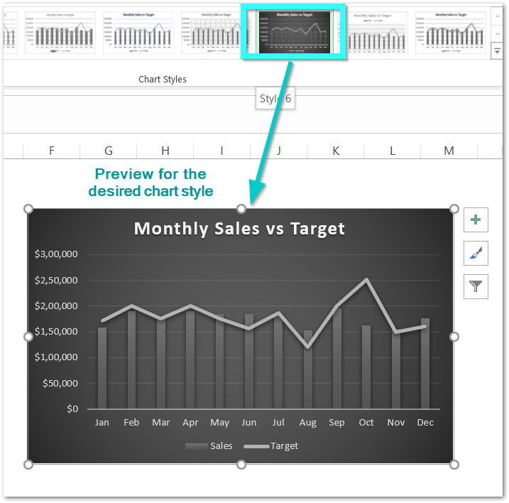
We can also change the chart style from the chart style group. There are many chart styles as you can see.
This brings us to the end of the blog. Thank you for reading 😉
Yoast SEO Premium
Toggle panel: Yoast SEO Premium
Focus keyphraseHelp on choosing the perfect focus keyphrase(Opens in a new browser tab)Get related keyphrases(Opens in a new browser window)
Google preview
Preview as:Mobile resultDesktop resultUrl preview:

Nov 8, 2021 - Charts in excel summarize a relationship between the numerical values, business patterns, trends that would go unnoticed with numerical valuesSEO titleInsert variableIntroduction to Charts – uses, Inserting, formatting, combo Page Separator Site title Site titleTitlePrimary categorySeparatorSlugMeta descriptionInsert variableCharts in excel summarize a relationship between the numerical values, business patterns, trends that would go unnoticed with numerical valuesSite titleTitlePrimary categorySeparator
SEO analysisGoodCharts in Excel
Add related keyphrase
Cornerstone content
Insights
Blog2Social: Social Media Content Calendar
Toggle panel: Blog2Social: Social Media Content Calendar
- Post
- Block
Status & visibility
VisibilityPublicPublishNovember 8, 2021 7:11 pmPost FormatAsideImageLinkQuoteStandardStatusVideoStick to the top of the blogAuthoradminAmitesh GuptaChetna DuaDhrunil BhattNitin BothraOffice BoradSanskar BaidEnable AMPMove to trash
Template
Yoast SEO
Readability analysis: Good SEO analysis: Good
22 Revisions
Permalink
URL Slug
The last part of the URL. Read about permalinks(opens in a new tab)
View Post
https://excelunlocked.com/introduction-to-charts-excel(opens in a new tab)
Categories
FunctionsTemplatesTips and TricksUncategorizedAdd New Category
Tags
Featured image
The featured image should have a size of at least 1200 by 675 pixels.about:blank
Excerpt
Discussion
Sections
Toggle panel: Sections Use Sections
Webpushr Notification
Toggle panel: Webpushr Notification Send Web Push Notification
Total Active Subscribers: 98+ Show additional settings
Blog2Social: Autoposter
Toggle panel: Blog2Social: Autoposter
Custom Sharing & Scheduling Info
Customize & Schedule Social Media Posts
The Autoposter is activated Info
Shared: 9 timesLast shared: 2021/11/09 5:30 pmAdvanced settings
Append a Ninja Form
Toggle panel: Append a Ninja Form — None Contact Me Feedback Open publish panel
- Document
NotificationsThe featured image should have a size of at least 1200 by 675 pixels.1✕Here are some notifications you missed:All About Chart Elements of a Chart in Microsoft ExcelJust nowSubscribe to receive push notifications on latest updates
SUBSCRIBE⚡ by WebpushrX
This brings us to the end of the blog. Thank you for reading 😉
RELATED POSTS
- All About Chart Elements of a Chart in Microsoft Excel
- Tutorial – Record and Run a Macro – Real Life Example
- Trendlines in Excel – Types and Usage
- Pie Chart in Excel – Inserting, Formatting, Filters, Data Labels
- Volume High Low Close Stock Chart in Excel – Insert, Format, Reading
- Stacked Column Chart in Excel – Usage, Examples, Format, Special Gridlines
