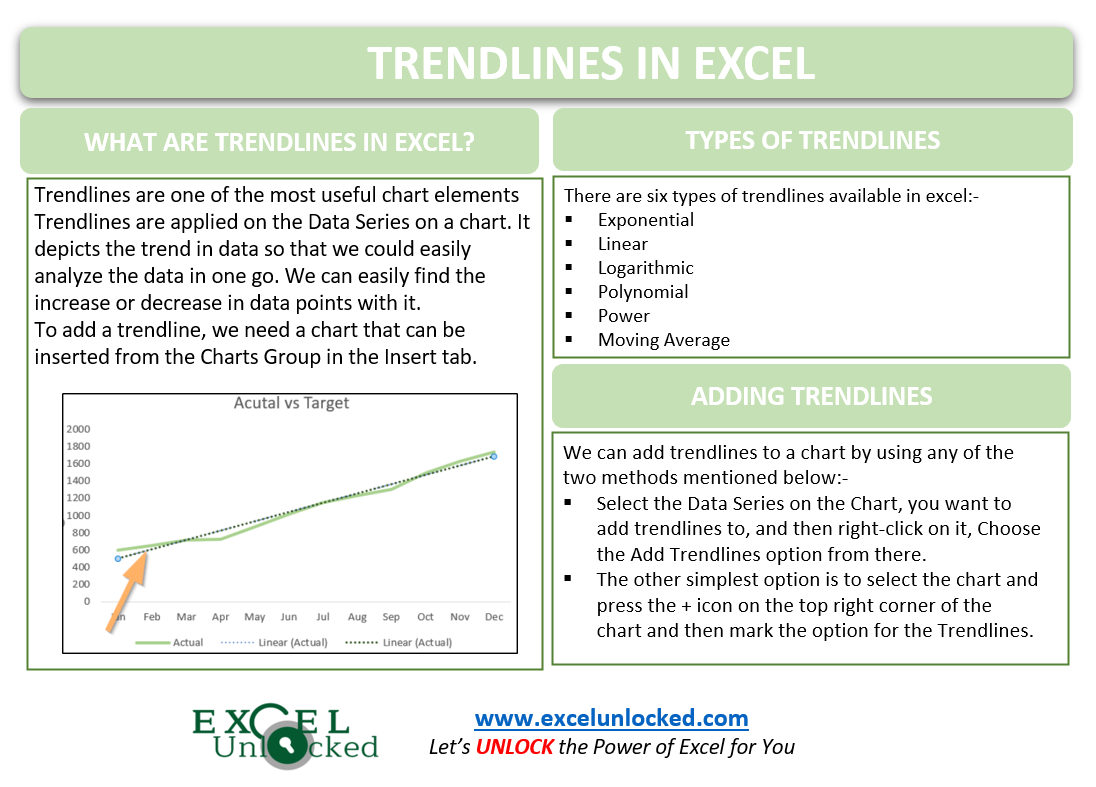
Trendlines are one of the most useful chart elements in excel. They form a major part of the most important components of excel charts and are the easiest to understand and create. Let us see how the Trendlines in Excel work.
What are Trendlines in Excel?
Trendlines are applied to the data series of charts in excel. Trendlines depicts the trend in data so that we could easily analyze the entire chart in just one go. We can easily find the increase or decrease in the data points.
To create trendlines, we first need to make a chart in our excel sheet from the Insert tab, under the Charts Group.

Accessing the Trendlines
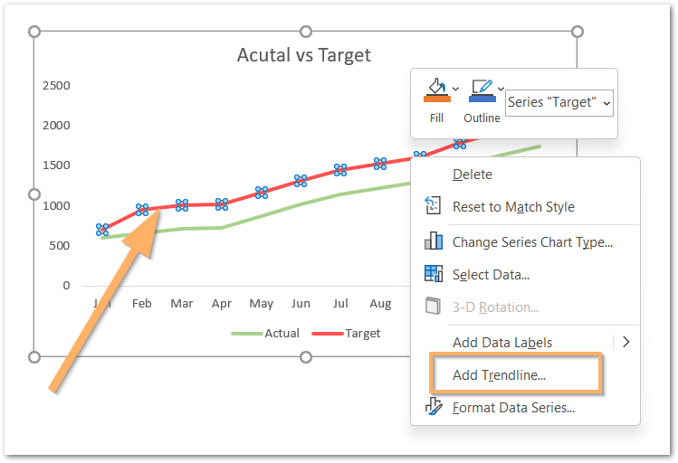
There are two ways to access the Trendlines and finally add them:-
- Select the Data Series on the Chart, you want to add trendlines to, and then right-click on it, Choose the Add Trendlines option from there.
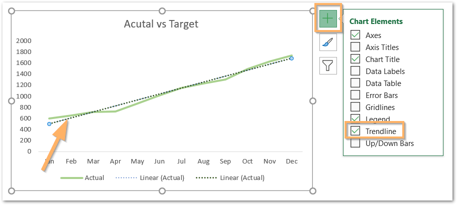
- The other simplest option is to select the chart and press the + icon on the top right corner of the chart and then mark the option for the Trendlines.
Adding Trendlines to Chart with Multiple Data Series
There are times when we have more than one data series in our chart. Let us suppose we have a bar chart containing two data series as follows:-
Also Read: Sparkline in Excel – Insert, Edit and Delete
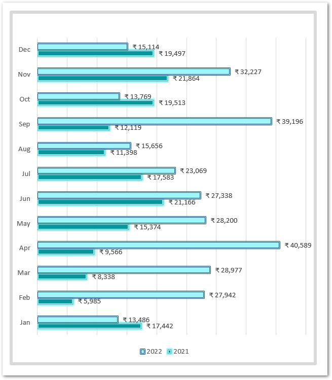
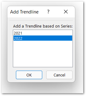
We can either add trendlines to both the data series representing sales of 2021 and 2022 or add trendlines to any one of the bar data series. To add data series to one series:-
- Click on the + icon on the top right corner of the chart and mark the options for trendlines.
- Now choose any one series you want to apply trendlines to and click Ok.
Different Types of Trendlines in Excel
There are a total of six different types of trendlines available in excel as follows:-
- Exponential Trendline – It is used where the data we represent accounts for the constant rises and falls. We avoid using this type of trendline when the data set has zeroes or negative values.
- Linear Trendline – This is a straight line trendline and uses a straight line to depict the increasing or decreasing values.
- Logarithmic Trendline – This is used when the rate of data change increases or decreases rapidly. It can represent both positive and negative values.
- Polynomial Trendline – It is used to study frequent fluctuations in data, for example, gains and losses in any business.
- Power – The Power trendline is similar to the exponential trendline, it is just a bit more symmetric.
- Moving Average – When the data has lots of ups and downs or fluctuations then the moving average trendline helps us analyze the trend more clearly.
Formatting the Trendlines
Let us say we have the following scatter plot in excel.
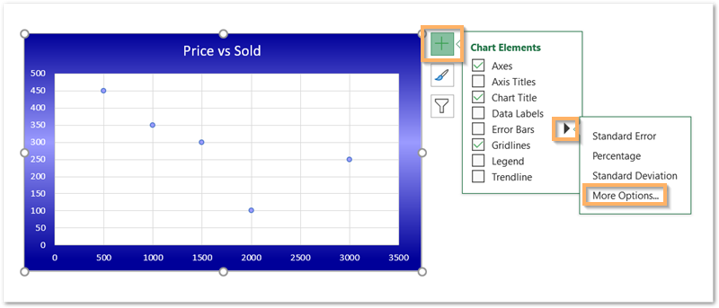
You can go for More Options and this will automatically add the trendline and open the Format Trendline pane.
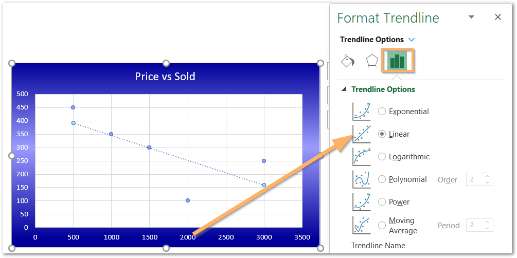
From there, you can change the type of trendline you have already added to the chart.
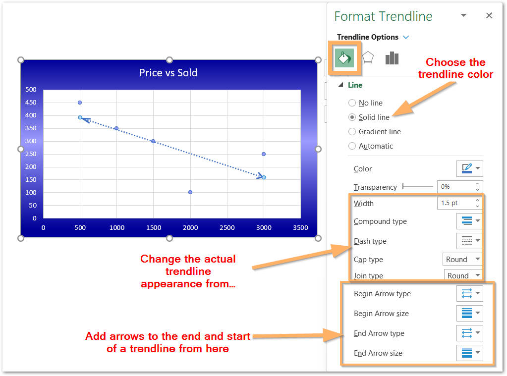
This brings us to the end of the blog.
Thank you for reading.
RELATED POSTS
- High Low Close – Stock Chart in Excel
- Column Chart in Excel – Types, Insert, Format, Clickable Chart
- Open High Low Close Stock Chart – Insert, Format, Up/Down bars
- Volume High Low Close Stock Chart in Excel – Insert, Format, Reading
- Scatter Charts in Excel – Straight and Smooth Lines with Markers
- Introduction to Charts in Microsoft Excel

