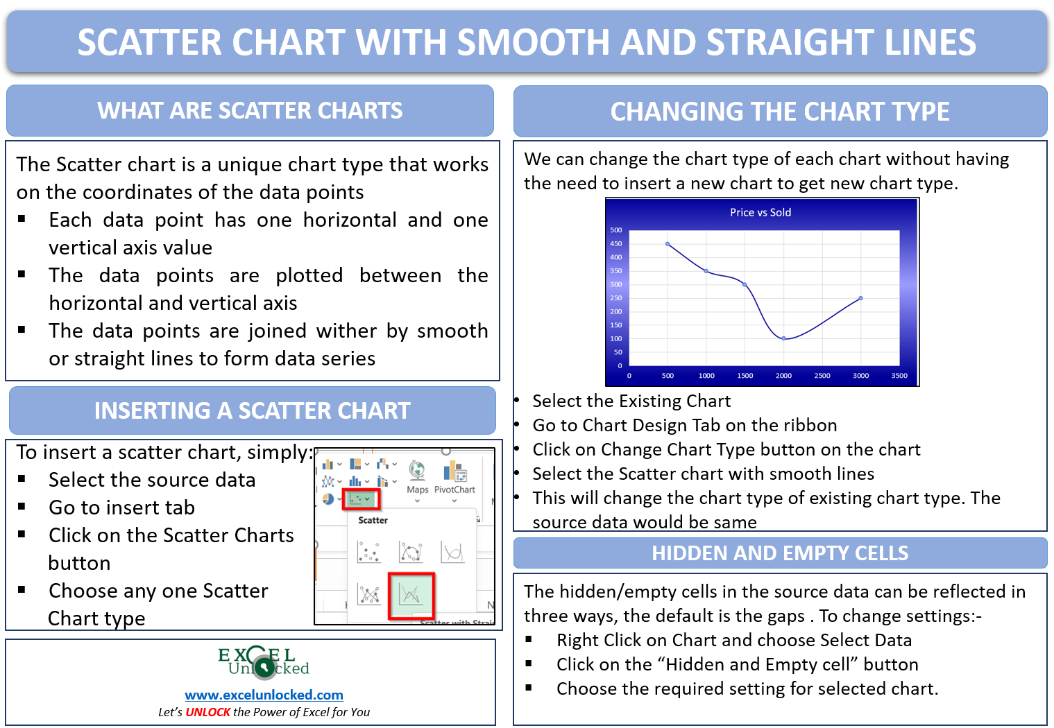
The earlier lesson taught us the usage of Scatter Charts in excel. Scatter charts help in plotting the coordinates on the chart between the axis. In this blog, we will learn the entire thing about Scatter charts with Smooth and Straight Lines in Excel.
Here we go 😎
What is a Scatter Chart with Lines
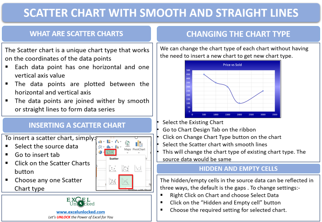
Scatter Charts in Excel is a unique chart type. The Horizontal and Vertical Axis represents the numerical values for the x and y coordinates of the data points. The data points are visually represented between the horizontal and vertical axis. Consecutive data points, when joined to either form straight lines or smooth lines.

Inserting a Scatter Chart with Straight Lines
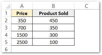
Let us say we the product details of a company. The details include the price and the number of products sold. The data is as follows:-
To insert a scatter chart with smooth lines, simply:-
- Select the data set A2:B5
- Go to the Insert tab on the ribbon
- In the Charts group, click on the Scatter Chart button.
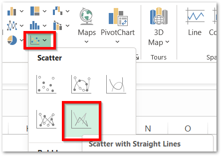
Consequently, this will insert the required chart type chart on the current worksheet.
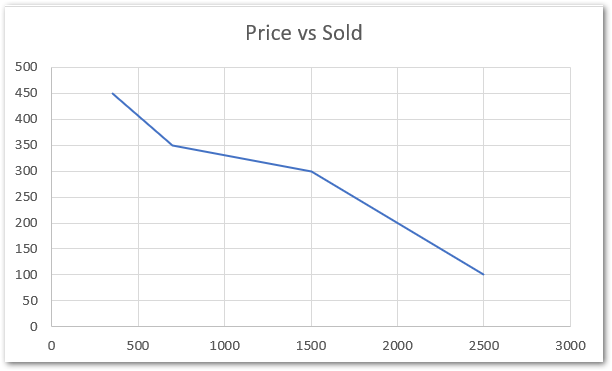
As a result, excel inserts default scatter charts with smooth lines.
Scatter Chart with Straight Lines and Markers
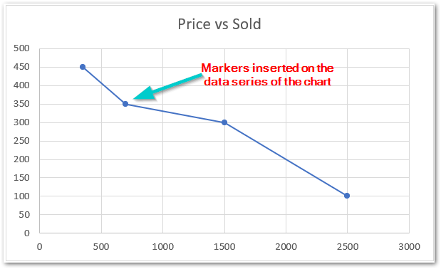
Markers are used to highlight the data points on the chart. They help in the accurate reading of the chart and can be inserted via a new chart type called Scatter chart with Straight Lines and Markers.
We can change the chart type of the above chart to add the markers. Follow the below-mentioned steps:-
- Select the chart
- Go to Chart Design Tab on the ribbon
- In the Type Group , click on the Change Chart Type button.
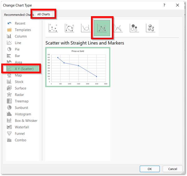
Consequently. this opens the Change Chart Type Dialog box. Go to the All Charts tab. Select the required chart type for conversion.
These are the results:-
You can switch the chart type of the above chart to Scatter Chart with Smooth Lines. As a result, the smooth lines will replace the straight lines in the above Chart.
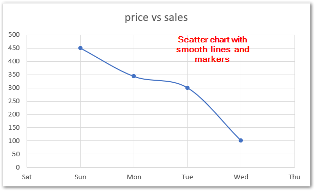
Following is a link to learn the Formatting of a chart in excel.
Dealing with Hidden/Empty Cells in Source Data
Let us say we have the empty cells in the source data. By default, the scatter chart would not contain any data point for the empty/hidden cell and the line joining the data points will become noncontiguous. For instance, look at the below chart:-
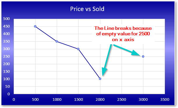
One entry in the above chart’s source data is kept empty which made the corresponding data point to be missing.
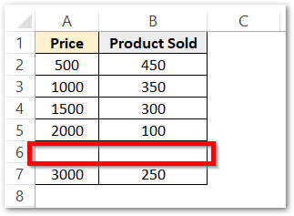
We can change the way, the empty cell plots on the chart. To do that:-
- Right Click on the Chart.
- The Shortcut menu opens, click on Select Data.
- This opens the Select Data Dialog box.
- Hit the button at the bottom left corner named Hidden and Empty cells.
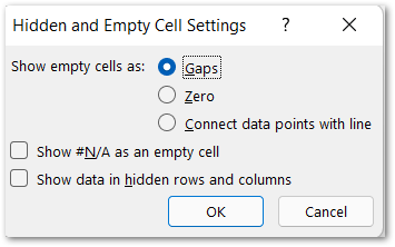
As a result, the settings for Hidden and Empty Cell open. There are three valid options from which leaving gaps is the default setting.
- zero – This will plot zero for each empty cell value in the source data.
Here are two missing values in the source data, for each of the x-axis and y-axis on the chart. (0,0) would be plotted on the chart instead.
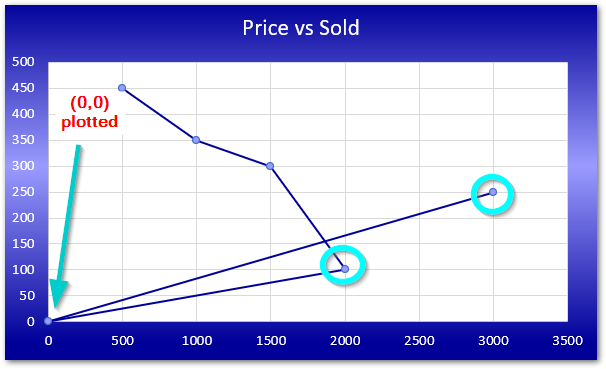
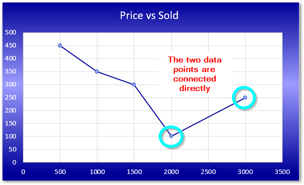
- Connect data Points with Line – This will directly connect the previous and next data point when there is a missing value in source data.
With this, we have come to the end of blog.
Thank you for reading.
RELATED POSTS
- Format Chart Axis in Excel Charts – Axis Options – Fill and Line
- Trendlines in Excel – Types and Usage
- Column Chart in Excel – Types, Insert, Format, Clickable Chart
- Bubble Chart in Excel – Insertion, Working, Bubble Format
- Sparklines in Excel – Types, Usage, Insertion
- All About Chart Elements of a Chart in Microsoft Excel

