In the earlier blog, we learned the usage of line charts in excel. Line charts were used to read the trends in data with time. In this blog, we will understand the usage of stacked line charts. Let us start 😎
What are Stacked Line Charts in Excel
Stacked Line charts are used to study trends in data when they are cumulative. In other words, a cumulative data series contains the previous data series in it as its sum. The lines in a stacked chart can never overlap because the line is formed by adding the data of the previous line data value with it. For instance, look at below given stacked line chart.
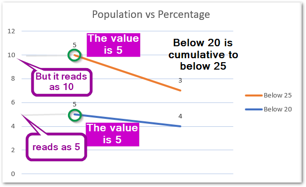
You would see that the Below 20 population is cumulative to below 25 population. Their values are 5 and 5 crores. However, you will note that on the graph, the value of Below 25 reads as 10 crores.
Stacked Line charts define the contribution of each data trend in the total data trend.
Inserting a Stacked Line Chart in Excel
For instance, let us say we have the monthly sales of a bakery. The bakery mainly has three items named cake, pastry, cold drink. Below are the sales for 6 months for each item.

To insert a stacked line chart:-
- Select the range (A1:G4)
- Go to insert tab
- In charts Group, click on line chart button.
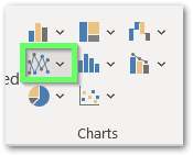
- Select the Stacked Line chart from the menu down there.
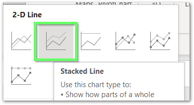
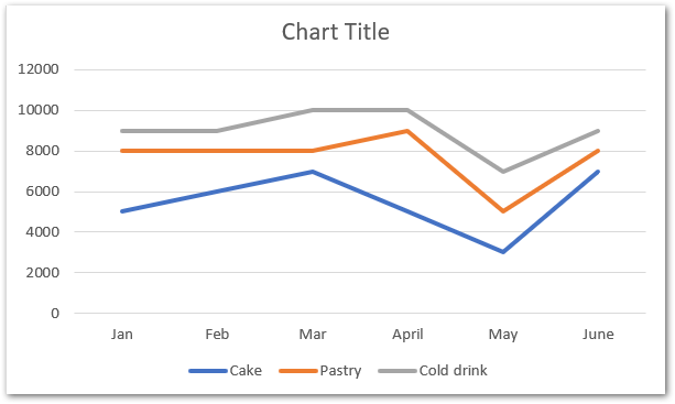
This will insert a stacked line chart in the current worksheet. However, the chart will look something like this:-
Efficient Reading of Stacked Line Chart in Excel
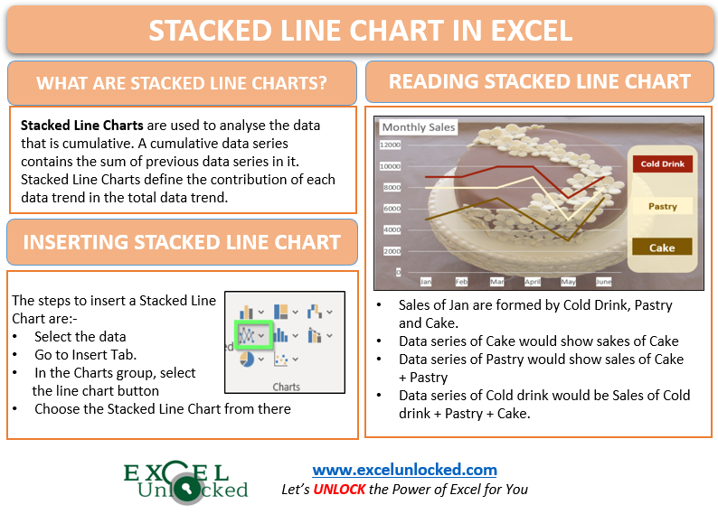
Charts are prepared in excel so that we could analyze them to come up to any conclusion. To analyze a chart, we must know how to read it properly. In the above chart, we inserted:-
- The Sales of Jan forms a group of data made up of three sales i.e Cake, Pastry and Cold Drink.
- Similarly, we have six groups of data made in total i.e Jan, Feb, Mar, April, May, June.
- The data series at upper level will contain the data of the series at lower level.
- Data series for pastry, will show the sales of Pastry + Cake. This is so because Cake Data Series is below Pastry Data Series.
- Similarly, Data Series for Cold Drink will show the sales of Cold Drink + Pastry + Cake. In other words, cold drink data series will contain the sales of both pastry and cake.
- The bottom data series i.e Cake is the simplest to read as there is no data series below it and it will represent the sales of cakes only.
In other words, we can say that the total sales ( Cold drink + Pastry + Cake ) for that month will be represented by the topmost data series i.e Cold Drink.
Formatting Stacked Line Chart in Excel
The default formatting of a stacked line chart inserted by excel is just a dough that needs to be baked! By baking, we mean formatting our chart:-
- Formatting the chart helps to match it with the brand theme and fonts.
- It hepls in better reading of the chart.
- To match the color scheme with the entire worksheet contents.
Altering Chart Elements
We would change the chart title to “Monthly Sales” by simply double-clicking on the Chart Title on the top of the chart and entering the new chart title.
Consequently, we will change the position of chart legends. Select the chart and go to the + button on the top right corner of the chart.
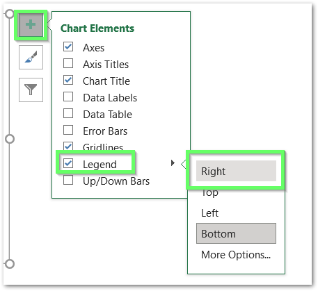
Alternatively, you can simply remove them by unchecking the checkbox as we will add legends manually thereafter.
To learn more about Chart Elements in Excel, click here.
Formatting Chart Area
The chart area is the chart background. We would change the chart fill. Follow the below steps:-
- Select the chart and go to Format Tab on the ribbon.
- Select Chart Area in the Current Selection Group.
- Click on Format Selection Button below the current selection button.
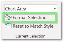
This will open the Format Chart Area Dialog box at the right of the excel workbook.
- Go to Fill and line tab.
- Choose Fill Option and select Picture or Texture Fill.
- Click on insert button and then select the image to be inserted in the chart background.
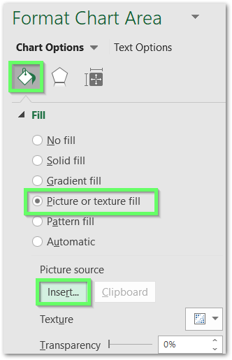
However, you can select the image both offline and online. Adjust the image transparency and This is the inserted image:-
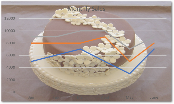
The chart remaining formatting now seems quite unrelatable. We will do some more formatting.
Formatting the Chart Axis
There are two chart axes in this chart i.e horizontal and vertical axis. Following are the steps to format each of them one by one:-
- Select the chart. Go to Format tab.
- Select “Vertical ( Value Axis ) in the current selection group. Click on Format Selection Button
- Consequently, this will open Format Axis Pane in the right of excel workbook.
- Go to Fill Option, Choose solid fill and select the desired fill color.
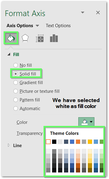
Repeat the above formatting by selecting the Horizontal ( Category ) Axis and Chart title one by one.
This is how the chart will look now.
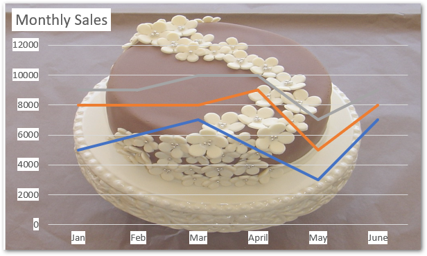
However, you can always learn more about formatting chart axis from here.
Formatting Data Series
We can change the color of the stacked lines on the chart to make them more visible on the selected chart background. Follow the below steps to do that:-
- Select the chart and go to Format tab.
- In the current selection group, select “Series Cake” and click on Format Selection Button
- This will open up Format Chart Axis Pane at the right of Excel window.
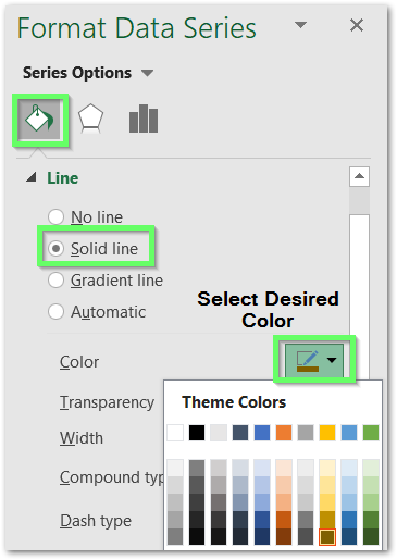
- In the Fill and Color Tab, Choose Solid Line and select the most relatable color for the data series.
Repeat the same procedure for the other two data series Pastry and Cold Drink by choosing them in the Current Selection one by one.
This is how the chart will look now.
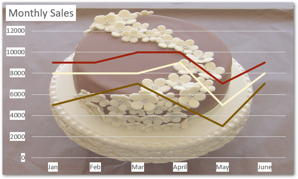
Adding Legends Manually
Adding Legends on your own makes them more visible. All we need to do is follow these steps:-
- Select the plot area of the chart, drag it from its right side to make space for legends.
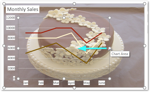
- Select the Chart, go to Insert tab.
- Choose a rectangle rounded corner shape from the shapes in Illustrations Group.
- Drag the cursor and insert the shape on the right of the chart.
- Select the shape, go to shape format tab and choose shape fill color that matched the chart theme. Increase the shape transparency to 20%
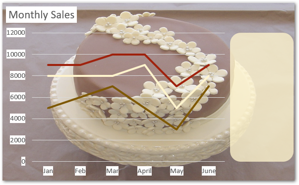
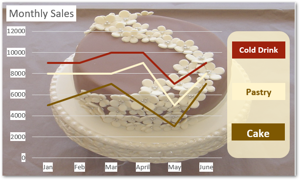
Add three more small rectangles above this shape. The rectangle must match the color of the data series to act as the legend. line this:-
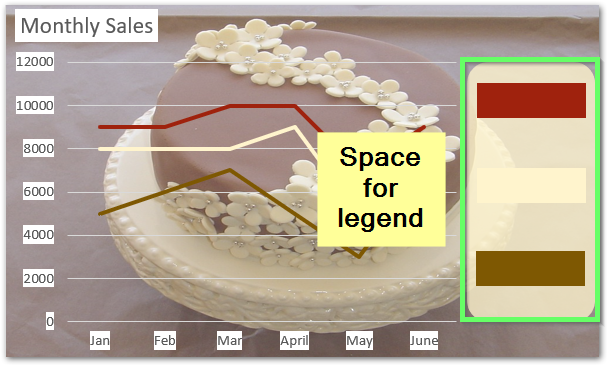
Type in the corresponding name for the data series in the small rectangular shapes ( legends ).
The final prepared chart is here.
This brings us to the end of the blog.
RELATED POSTS
- 100% Stacked Area Chart in Excel – Insertion, Reading, Formatting
- Column Chart in Excel – Types, Insert, Format, Clickable Chart
- Stacked Bar Chart in Excel – Usage, Insert, Format
- 100% Stacked Column Chart in Excel – Inserting, Usage, Reading
- Change the Order of Data Series – Stacked Line, Stacked Area, Column Chart
- Stacked Column Chart in Excel – Usage, Examples, Format, Special Gridlines

