In one of our earlier blogs, we learned the usage of Stacked Line Charts in Excel. 100% Stacked Line Chart in Excel is quite similar to it noting a few points of differences. Let us see how 😎
What Are 100% Stacked Line Charts
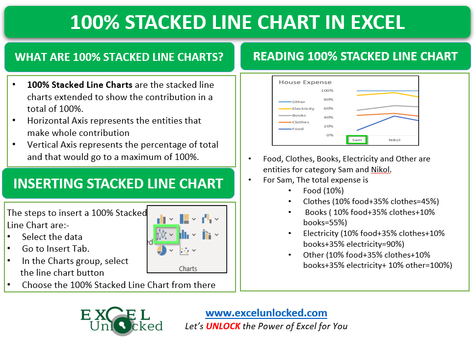
As the name suggests, 100% Stacked Line Chart in Excel is basically stacked line chart that is extended to show the contribution in a total of 100%. The Horizontal/ Category Axis would represent the entities that make a whole contribution. Consequently, the Vertical axis would represent the percentage of the total and that would go to a maximum of 100%. The lines/data series on the chart would be stacked and cumulative to each other.
The Data Points on the chart line would show the actual values and not the percentage contribution on the chart.
Points to Remember about 100% Stacked Line Charts
Before using this type of chart you must have complete information regarding it.
- 100% Stacked Line Chart in excel is used for cumulative data series. In other words, we can say that the consecutive data series would contain the data values of previous data series in it.
- These charts mainly represent the contribution of one entity in a group through percentages. Multiple entities would form a single category on the horizontal axis representing a total of 100%.
- The topmost line / data series would always be a straight line as it is a total of 100% ( its own data + data of all data series below it)
- The Data Legends are going to represent the actual values of data and not the percentage they contribute to the total.
- You can learn about formatting charts from here.
- You can add or delete chart elements with your desire.
Example of 100% Stacked Line Charts
In this section of the blog, we are going to make a 100% Stacked Line Chart. Let us suppose Mrs. Jennifer wants to analyze the monthly expense of her house and study the contribution of each house member to it. Below is the data.

Following are the steps to insert a 100% stacked line chart:-
- Select the range A1:E6.
- Go to Insert tab.
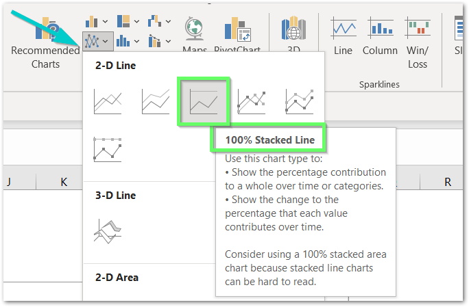
- In the Charts group, click on the below mentioned button:-

As a result, would insert the chart on the current worksheet containing raw data for the chart.

Reading 100% Stacked Line Chart
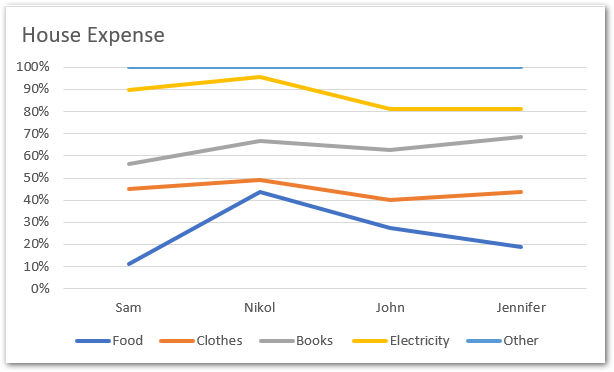
The chart inserted in the above section would be:-

Going through these points would let you read the above chart.
- Food, Clothes, Books, Electricity and other are the entities for the Category Sam, Nikol, John and Jennifer.
- The Horizontal/ Category Axis is representing Groups while Vertical/Value axis is representing percentages upto 100%.
- For Sam, The total expense is
- Food (10%)
- Clothes (10% food+35% clothes=45%)
- Books ( 10% food+35% clothes+10% books=55%)
- Electricity (10% food+35% clothes+10% books+35% electricity=90%)
- Other (10% food+35% clothes+10% books+35% electricity+ 10% other=100%)
Similarly, we can analyze the records of other house members.
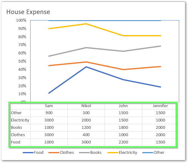
- However, we can add a data table to the chart to read the exact values:-
- Click on the chart
- Click on + button at top right corner of chart
- Select Data table

This brings us to the end of the blog.
Thank you for reading. 😉
RELATED POSTS
- Stacked Line Chart in Excel – Inserting, Reading, Formatting
- Stacked Area Chart Excel – Usage, Insertion, Area vs Line, Negative Values
- Stacked Bar Chart in Excel – Usage, Insert, Format
- Column Chart in Excel – Types, Insert, Format, Clickable Chart
- Bullet Chart in Excel – Usage, Making, Formatting
- Stacked Column Chart in Excel – Usage, Examples, Format, Special Gridlines

