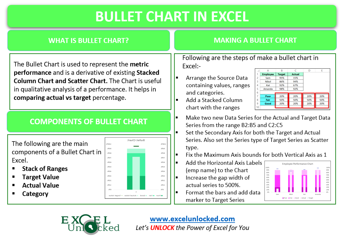
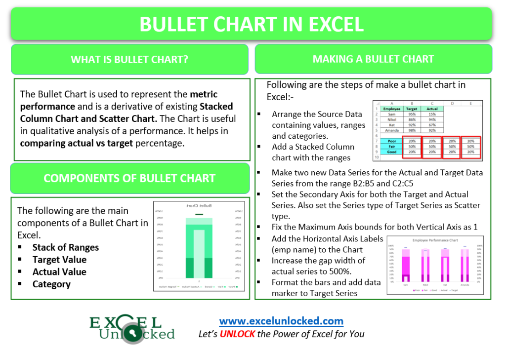
Bullet Chart in excel is a derivative of the existing Stacked Column Chart and XY Scatter Chart. Bullet Chart is used to compare the actual and target values for an entity or concept. Let us see how the Bullet Chart works!
What is a Bullet Chart in Excel?
Bullet Chart is used to represent the metric performance and it also helps in Qualitative analysis by putting the values into the range they lie. There can be the following example of ranges in which the metric measure may lie:-
| Range | Quality result |
| <30% | Poor |
| 30% – 70% | Good |
| <70% | Very Good |
Components of a Bullet Chart
Let us say we have the Actual and Target Sales percentage plotted via the Bullet Chart as follows:-
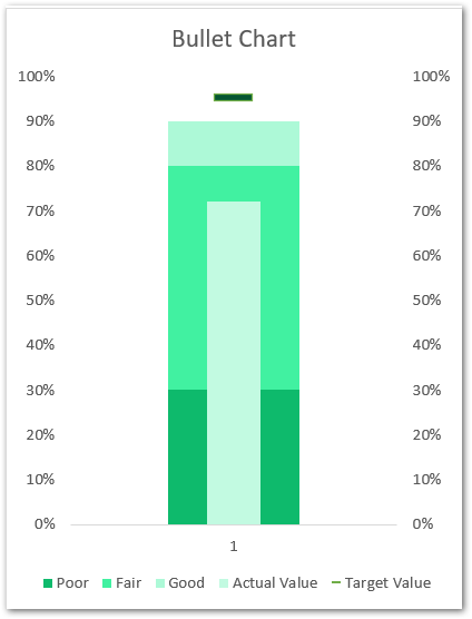
The following are the chart components in the above Bullet Chart:-
- Stack of Ranges – You can see that three vertical bars are starting from the darkest to the lightest color of green are stacked on one another. These are the ranges. You can read the scale for the range that the first range of Poor is from 0% to 30%. The second range for Fair is from 30 to 80% while the third range is for Good which lies in 80% to 905.
- Target Value – It is represented by the small Data Marker above the stack of bars. We can read the target value from there as 95%.
- Actual Value – The actual percentage of the target achieved is represented by the thin bar embedded in the stack of bars. It helps us know the actual percentage as 70%. So this actual percentage lies in the Fair Range.
- Category – In this chart, we only have one category of Target and Actual Percentage. We can even have multiple categories when we have the Target and Actual Percentages for different employees of the company
Making the Bullet Chart
Making a Buller Chart might seem intimidating for the first time, which is why we have divided the entire process into steps.
Arranging the Source Data
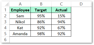
Let us suppose that we have the details of the percentage of the work done by each employee of the company along with the percentage of target each of them was assigned as follows:-
We also need to prepare the range of cells that define the bands or ranges in which the actual percentage lies as follows:-
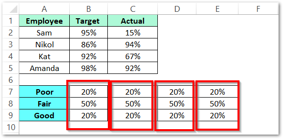
We have repeated the set of range values four times to get the set of ranges for each of the employees.
Creating the Stack of Ranges
We will start by making a range stack. Insert a Stacked Column Chart with the range A7:E9. To do so:-
- Select the range A7:E9 and go to the Insert tab on the ribbon.
- Click on the Recommended Charts button in the Charts group and add a Stacked Column Chart as follows:-
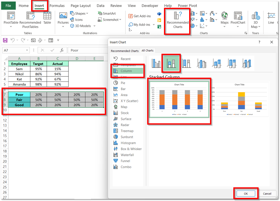
You can also see the preview of the chart in the Insert Chart Dialog box. Remove the Chart gridlines by simply selecting them and then pressing the delete key to get the result as follows:-
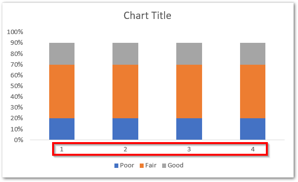
You can see that we have not added the employee names to the Horizontal Axis Labels.
Adding the Actual and Target Percentage to the Chart
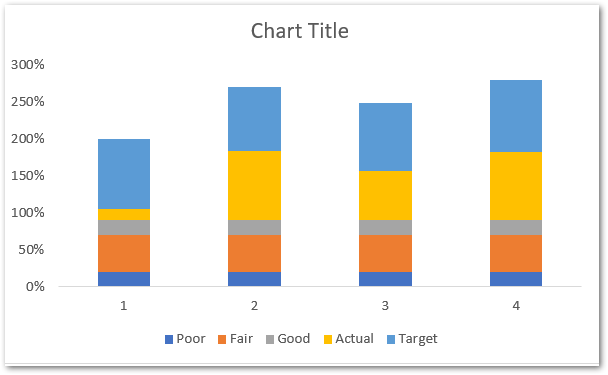
This is the time when we need to add the actual and sales percentage of all employees to the chart. This is done by adding a new data series for both of them. To do so:-
- Right Click on the chart and choose the option Select Data.
- Click on the Add button in the Legend Entries (Series) section.
- Select the cell C1 (Actual) as the series name and the range C2:C5 as the series values.
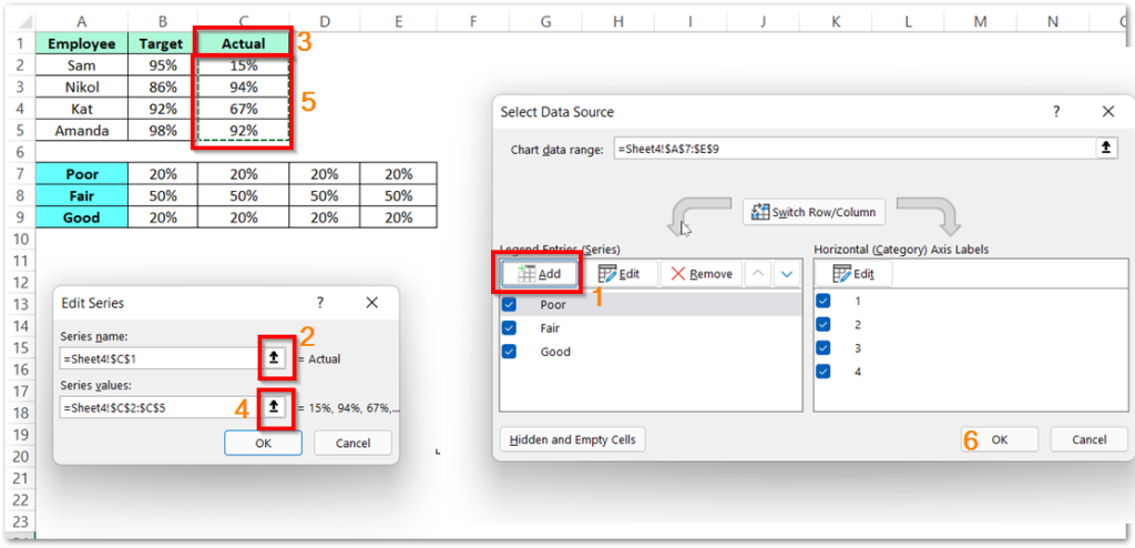
Similarly, you can add the series for Actual Percentage and get the chart.
Changing the Series Type
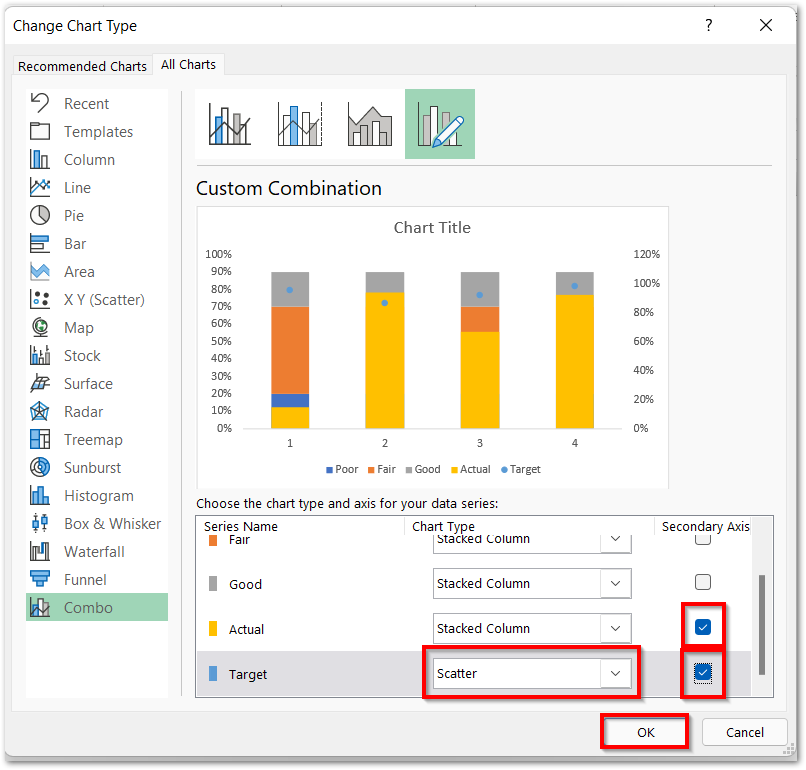
We need to change the Series Type of the Target Value to the Scatter type. Follow the below-mentioned steps to get the required results.
- Right Click on any one of the bars and choose the option Change Series Type. This will open the Change Chart Type dialog box.
- Mark the Secondary Axis for Actual Series and set the Series type for Target Series as Scatter. Mark Secondary Axis for Target as well.
Fixing the Axis Bounds
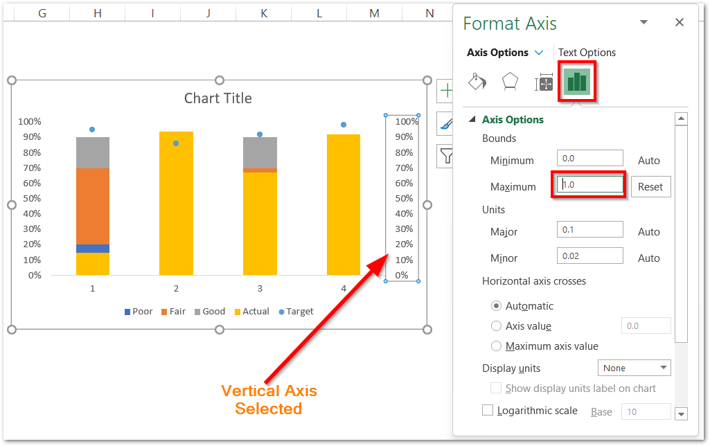
Axis bounds are the minimum and maximum values that an axis can represent on its scale. By default, this value is set and updated automatically as per the range of values. We need to fix the percentage scale to go up to 100% for both primary and secondary Vertical Axis. To do so:-
- Select the Secondary Vertical axis on the chart and press the ctrl 1 key.
- Navigate to the Axis Options tab in the Format Axis pane.
- Write the maximum axis value as 1 and hit the enter key.
- Similarly, repeat the procedure for Primary Vertical Axis also.
Consequently, this is our chart now:-
Adding the Horizontal Axis Category Labels
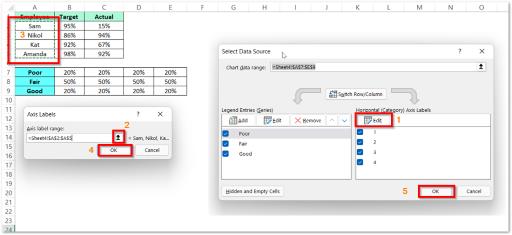
To add employee names to the horizontal axis, follow the given steps:-
- Right Click on the chart and choose the option Select Data.
- The Select Data Source Dialog box will open.
- Click on the Edit button under the Horizontal Axis Category.
- Select the range of cells A2:A5 containing the name of employees.
Formatting the Bars of the Chart
We will start by reducing the width of the Actual Percentage bar. To do so:-
- Select the Yello Bars on the Chart and press the ctrl 1 key.
- Increase the Gap width to 500% as shown below.
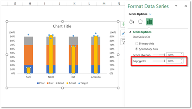
Now navigate to the Fill Color tab of the Format Data Series pane and change the solid fill color for the yellow bars to a shade of pink.
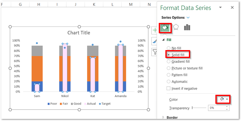
Similarly, you can change the solid fill color for the rest of the bars for the ranges. Add the Data Markers to the Target Sales and set the marker type as a hyphen-shaped icon to get the following chart.
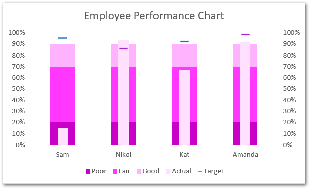
Congratulations! Our chart is ready to rock.
This brings us to the end of the blog.
Thank you for reading.
RELATED POSTS
- Column Chart in Excel – Types, Insert, Format, Clickable Chart
- 100% Stacked Area Chart in Excel – Insertion, Reading, Formatting
- Stacked Column Chart in Excel – Usage, Examples, Format, Special Gridlines
- Pie of Pie Chart in Excel – Inserting, Customizing, Formatting
- Waterfall Chart in Excel – Usage, Making, Formatting
- Tornado Chart in Excel – Usage, Making, Formatting

