A Tornado Chart in Excel is a derivative of the existing Stacked Bar Chart. Tornado Chart is very useful when we want to compare two variables. The chart is also used in sensitivity analysis when we want to compare the outputs with the inputs.
What is Tornado Chart in Excel?
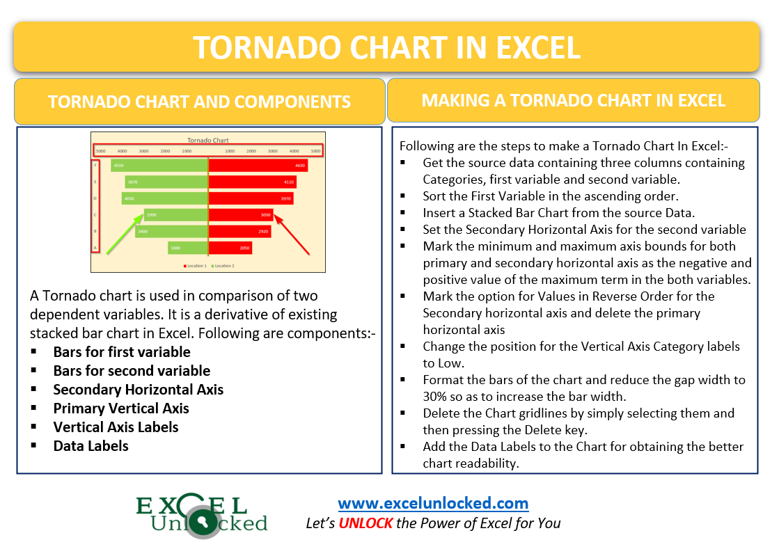
As the name suggests, a tornado chart has its bars aligned to form a tornado shape because the values in the source data are sorted. We can use the tornado chart to compare two different series of bars.
It’s completely up to us that, what horizontal axis ( primary or secondary ) will be representing the scale for comparing the values of bars. We can even remove the horizontal axis as the data labels make the chart much easier to read.
Components of a Tornado Chart in Excel
Here we are considering a Tornado Chart built for comparing the sales of different products in two locations as follows:-
Also Read: Tornado Chart using Conditional Formatting

In this Tornado Chart, you will find the following chart components:-
- Red Bars – These bars are representing different product sales in location1. So this is a data series for representing our first variable.
- Green Bars – The bars opposite the Red bars are representing different product sales in location2. Green bars are the data series representing our second variable.
- Secondary Horizontal Axis – The Axis at the top of the chart containing the scale of values up to 5000 on both sides is the Secondary Horizontal Axis.
- Primary Vertical Axis – The brown-colored line that acts as a separator for both the red and green bars is the Primary Vertical Axis.
- Vertical Axis Labels – The labels A, B, C, D, E, and F are the Primary Vertical Axis Labels. They are placed away from the axis for a better chart layout.
- Data Labels – Although we have the scale for reading the value of the bar from the Secondary Horizontal Axis, we can only get the estimation of values. Data Labels on the bars represent the actual value that a bar depicts.
Making a Tornado Chart in Excel
Let us suppose we have the actual sales vs target sales of a company for different years as follows:-

Since excel does not have a pre-built Tornado Chart in it, we can make one using the Stacked Bar Chart in Excel. We are dividing the process of making a Tornado Chart into steps so that you could understand it better.
Sorting the Data to get Tornado Shape in Future
Our Source data has three columns. Column A has the years which are our categories. Column B and Column C are the two variables that we want to compare.
We need to sort the first variable (column B). Perform the following steps.
- Set the active cell as any one of the cells from the range B2:B6. In other words, we can say that we need to select any one cell from the range B2:B6.
- Go to the Data tab on the ribbon.
- Go to the Sort and Filter Group.
- Click on the button to sort the items from smallest to largest.

This is our source data:-

Inserting the Stacked Bar Chart
Now we will start making the actual chart by inserting the Stacked Bar Chart from the above source data:-
- Select the range of cells A1:C6.
- Go to the Insert tab on the ribbon and click on Recommended Charts button.
- Navigate to the All Charts tab and select the bar chart from the list.
- Set the bar chart type to Stacked Bar Chart.

- Click Ok after choosing the chart. This inserts a Stacked Bar Chart assigned default formats as follows:-

Setting the Second Variable Bars to Secondary Axis
Here our second variable is Target Sales which are represented by orange bars on the chart. Select the orange bars on the chart and press the Ctrl 1 key to open the Format Data Series pane for orange bars.
- Navigate to Series Options
- Mark Secondary Axis for this Data Series

This adds a Secondary Vertical Axis right below the chart title and has the scale for reading the Target Sales.
Adjusting the Secondary and Primary Horizontal Axis
We have now got two horizontal chart axis:-

The upper one is the secondary axis that has a scale for Target Sales and the lower one is the Primary Axis to read the value of Actual Sales.
We will format them one by one in the following way:-
- Select the Secondary Horizontal Axis on the chart ( we are assuming that the Format Data Series pane is opened as in the previous part we set the data series to the secondary axis)
- This will make the Format Data Series pane convert to the Format Axis pane.
- In our source data, the maximum value of target sales is 39,290. We will set the Minimum and Maximum Axis Bounds as -40000 and 40000 respectively.
- Mark the Check box for Values in Reverse Order.

Repeat the same procedure for Primary Horizontal Axis. Do not mark Value In Reverse Order in this case.
This is how our tornado gets in shape by now:-

Set the Number Format of Secondary Axis Labels as #;# and then delete the gridlines and primary horizontal axis by selecting and pressing the delete key.
Format the Bars on the chart and add Data Labels. Set the position of labels at the inside end to get this:-

Changing the Position of Category Labels
We have got our categories as 2016, 2017, 2018, 2019, and 2020. Right now, the position of the category labels is clashing with Data Labels on the chart.
We can change the position of the Vertical Axis labels, just perform the following steps:-
- Select the Vertical Axis on the Chart.
- Press the ctrl+1 key.
- Set the Labels position to Low

Changing the Gap Width
We can change the width of each bar by reducing the gap between the bars. Since there are two kinds of bars, we need to repeat the procedure for both the blue and green bars. To change the gap widht of the bars in the chart, simply:-
- Select the green-colored bars on the chart and press the ctrl+1 key if the format pane was not pre-opened.
- Navigate to the Series Options tab in the Format Series pane and reduce the gap width to 30%. Repeat this for blue bars.
Consequently, this is our resultant Tornado Chart in Excel:-

This brings us to the end of the blog. You can learn to make the Tornado Chart by using Conditional Formatting directly in the Worksheet.
Thank you for reading.
RELATED POSTS
- Waterfall Chart in Excel – Usage, Making, Formatting
- Bullet Chart in Excel – Usage, Making, Formatting
- Stream Chart in Excel – Making, Usage, Formatting
- Stacked Bar Chart in Excel – Usage, Insert, Format
- Bar Chart in Excel – Types, Insertion, Formatting
- Column Chart in Excel – Types, Insert, Format, Clickable Chart