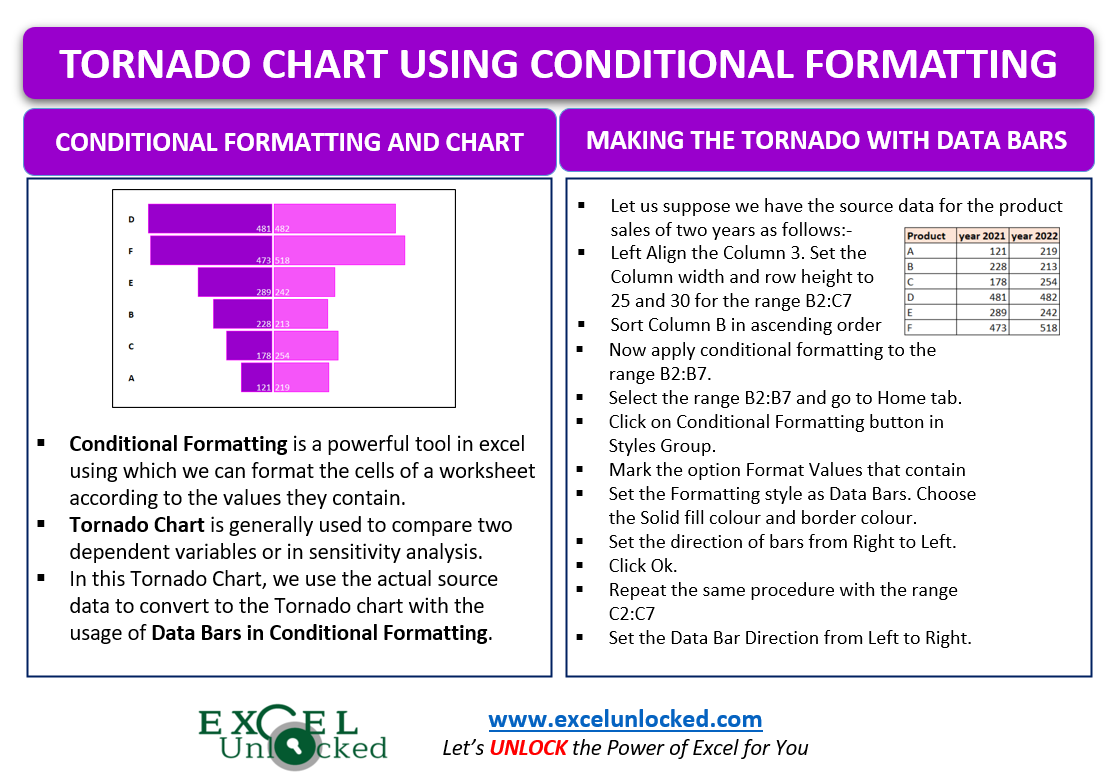
In the earlier blog, we did the usage and making of a Tornado Chart by using the Stacked Bar Chart in Excel. In this blog, we will make the Tornado Chart by using Conditional Formatting in Excel.
Conditional Formatting is a powerful tool in excel using which we can format the cells of a worksheet according to the values they contain. For example, if I have student marks. then by using Conditional Formatting, I can highlight those cells which have marks less than 30 to know which students did not clear the exam.

Making the Tornado Chart by using Conditional Formatting
In this chart, we will use the actual source data to convert into a chart by inserting the Conditionally Formatted Data Bars. For instance, let us say we have the prices of different products for two years as follows:-
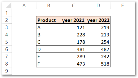
We will make the tornado chart with this data by doing the following steps:-
Preparing the Source Data
We have got three columns in our source data, the first column has product names, the second column has sales for 2021, and the third column has sales for 2022.
However, we will align the third column to left. To do so:-
- Select the range of cells D3:D8 and press the alt H A L key one by one.
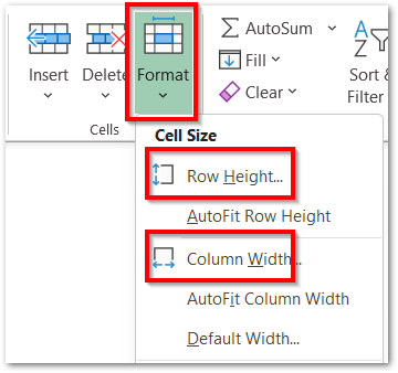
Also, increase the column width and row height of the range C3:D9 so that the chart could be presentable when ready. In order to change the row height and column width:-
- Select the range of cells D3:D8.
- Go to the Home tab on the ribbon.
- Hit the Format button in the Cells group.
- You can set the row height to 25 and column width to 30 respectively.
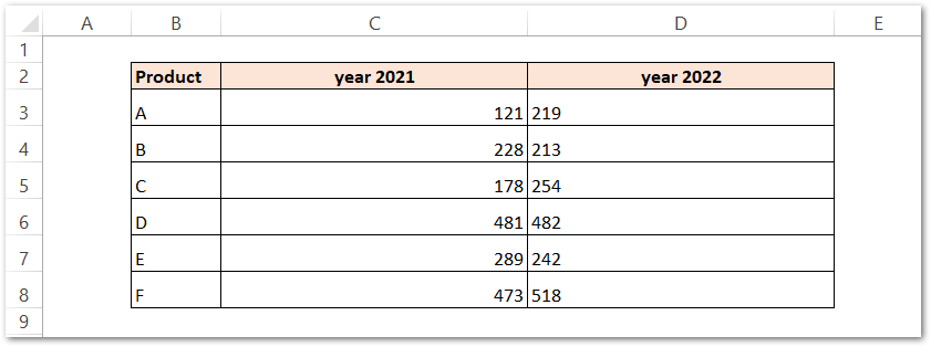
This is how the data looks:-
Sorting the Data
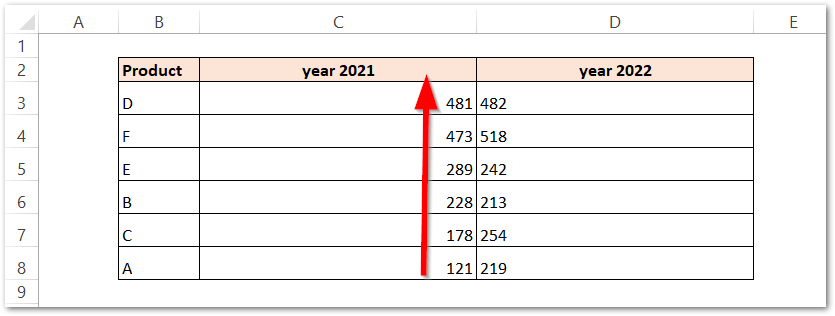
We need to sort column C in descending order to get the tornado shape of the bars. To sort the data:-
- Select any one cell from the range C3:C8
- Click on the Data tab on the ribbon.
- In the Sort and Filter group, click on descending sort order button.
Adding Data Bars by applying Conditional Formatting
In this step, we will apply Conditional Formatting to get the Data Bars. To apply the Conditional Formatting on the range, perform the following steps:-
- Select the range of cells C3:C8.
- Go to the Home tab.
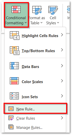
- In the Styles group, click on Conditional Formatting button.
- Choose the New Rule option.
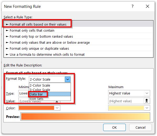
- Consequently, the New Formatting Rule dialog box opens. Choose the first option Format All Cells Based on Cell Value.
- Set the Format Style as Data Bar.
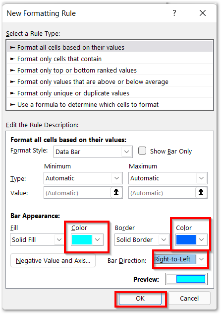
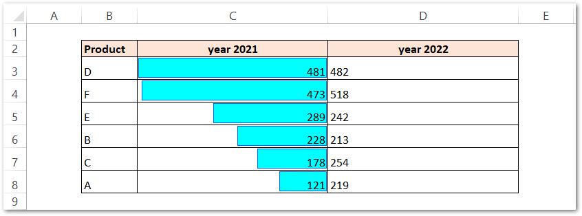
- Set the Color of the Bars as per your choice and the color of the border. Mark the Direction of bars from Right to Left.
This adds our data bars in the range C3:C8 as follows:-
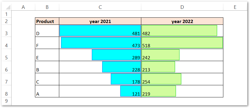
Repeat the same procedure of adding Data Bars in the range D3:D8. Apply a different fill color and border and set the direction of bars from Left to Right. Consequently, this gives us the following chart:-
This brings us to the end of the blog.
Thank you for reading.
RELATED POSTS
- Population Pyramid in Excel – Usage, Making, Formatting
- Column Chart in Excel – Types, Insert, Format, Clickable Chart
- Radar Chart in Excel – Components, Insertion, Formatting
- Bar Chart in Excel – Types, Insertion, Formatting
- Stacked Bar Chart in Excel – Usage, Insert, Format
- Data Bars Excel – Min Max Value, Formula Based Bars

