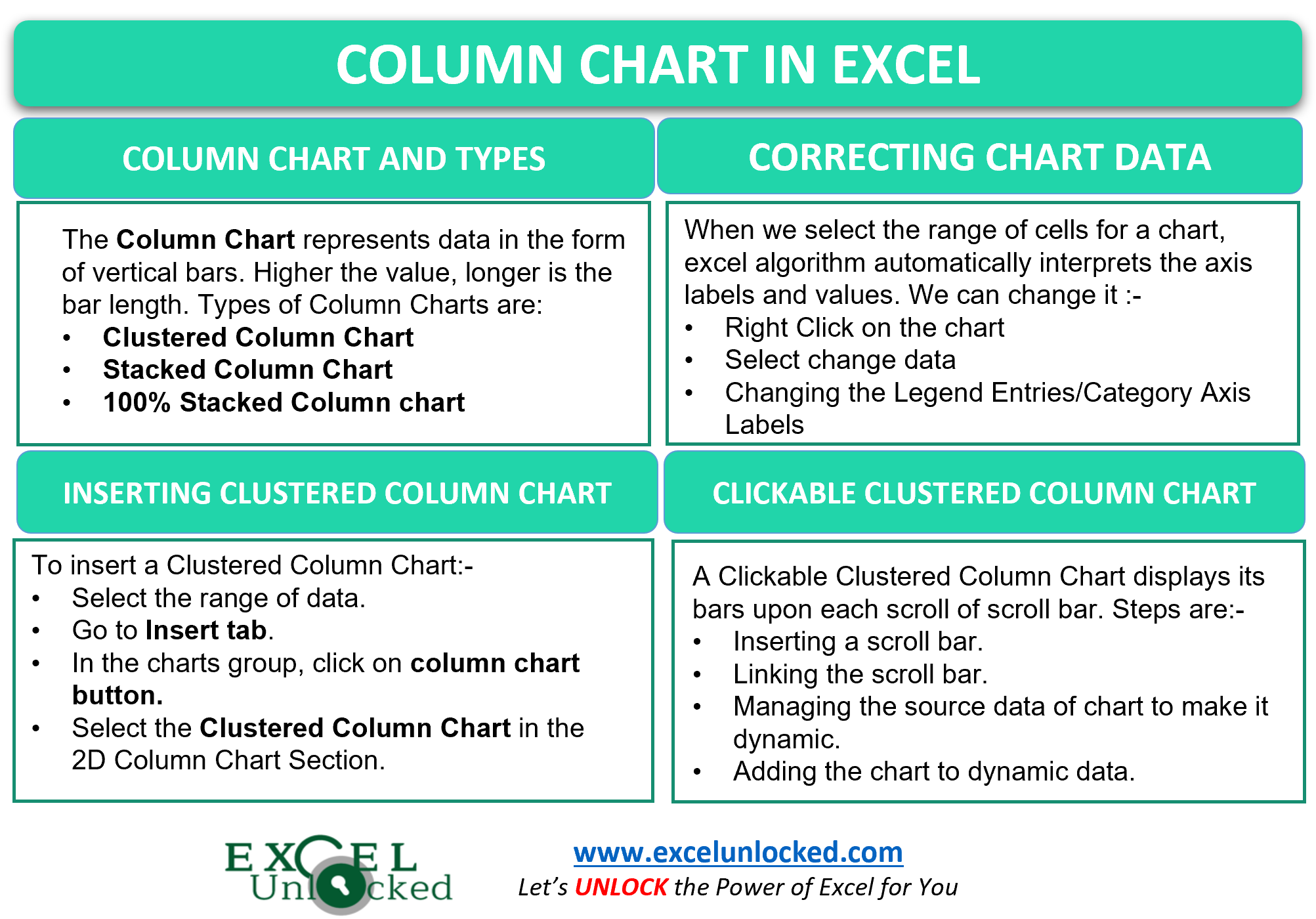
Charts in Microsoft Excel are used to visually represent the data. Column Charts are the most common and widely used charts, not only in Excel but from school years to any business. newspapers and magazines. So most of us are familiar with it.
What are Column Charts in Excel
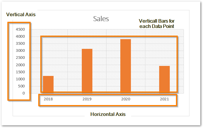
Column word represents “Vertical Bars”. The most column chart in excel would consist of a vertical axis, horizontal axis, and vertical bars to represent each category value. The higher the value, the longer will be the vertical bar for that particular data point. The following are the main chart components.
Types of Column Chart in Excel
In Excel, there are so many types for a column chart in excel. You can check them, the steps are as follows:-
- Select the data for your chart.
- Go to Insert tab.
- Move your cursor to chart group.
- You’ll find the button to insert a column chart there.
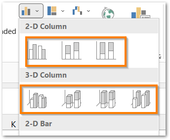
As a result, you will find that there are mainly three types of Column Charts:-
- Clustered Column Chart – The word Cluster says it all. The chart represents the data in the form of vertical clustered bars. This type of chart helps us to directly compare different data series and their trend with the increasing time. Too many data series for the sames axis labels make the chart comples and unreadable. Consequently, the chart is suitable to be used with few data series.
- Stacked Column Chart – Stack could be of books, bangles, dishes. The same applies for vertical bars. When the data series of each of axis label ( x axis ) are stacked on the top of each other then it forms a stacked column chart.
- 100% Stacked Column Chart – This type of stacked chart takes into account the percentage of stack that a particular data series occupies for that axis label. There will always be a total of 100% for each vertical bar.
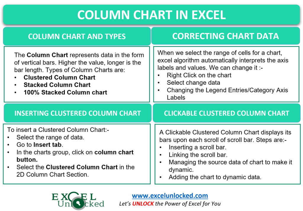
Inserting a Clustered Column Chart in Excel
Let us say that we want to visually represent the sales of a company for four consecutive years by using excel. Below is the data.
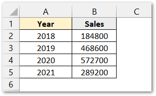
To insert the chart:-
- Select the data.
- Press alt + F1 to get the default chart type ot F11 to get chart on seperate sheet or follow the long method.
- Go to insert tab< Charts group< Column chart button< Clustered Column Chart.
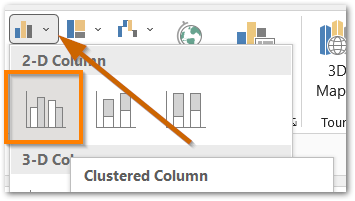
The clustered column chart will be inserted.
Changing Axis Labels of a Chart in Excel
There is the Excel algorithm that decides which column from the chart will be the data points ( values) and what would be the horizontal and vertical axis labels.
In the above-clustered column chart, there might be the possibility that we need to change the axis labels if they happen to be like this.
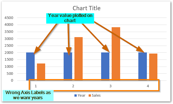
There are two faults in the chart inserted by excel as follows:-
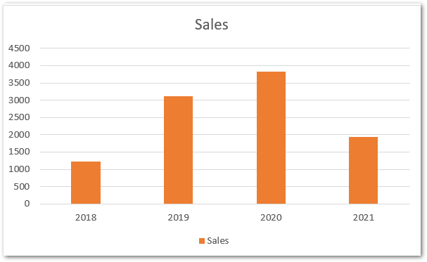
- We wanted the horiontal axis to have years as axis labels i,e 2019, 2020, 2021
- The years are plotted on the graph in blue bars that are not needed.
To correct both of the faults in a few clicks:-
- Right click on the chart and select change data.
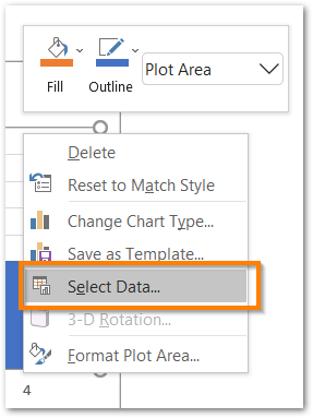
- In the Select Data dialog box,, choose Edit in the Horizontal Axis Labels.
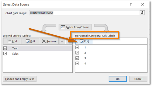
- Click on the arrow button and select the range that contains years i.e A2:A5
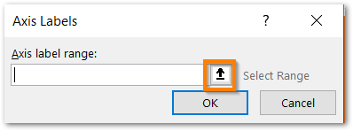
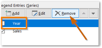
- Now again click on the arrow button to get back to the Select Data Dialog Box. Select the Year from Legend Entries and click on remove button. This will remove the years that are plotted along with sales.
This is how we can correct the column chart of Excel.
Creating a Clickable Column Chart
A clickable column chart is something that displays the data with each clicks. However, There is no direct option to do that in Excel. But yes! there is the indirect way.
Let us say there are the number of flags of each color manufactured in a factory. Below is the manufacturing for a month.
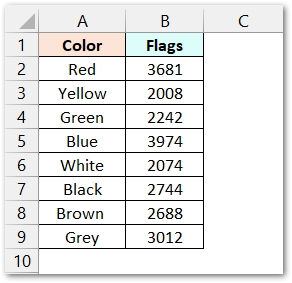
This is not going to be the source data for our clickable column chart.
Step 1 – Inserting a Scroll Bar
To insert a Scroll Bar, Go to developer tab < Controls Group < Insert Button< Scroll Bar Button.
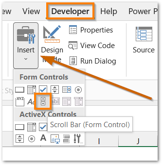
If You do not find the Developer Tab on your ribbon then Click on File, Go to Options, Select Customize Ribbon, and add the Developer Tab on the Ribbon From there.
The cursor will change to +. Drag it to make a scroll bar on the screen like this.

Step 2 – Linking the Scroll Bar to a Cell C2
Right Click on the Scroll Bar and click on Format Contorl Option from the shortcut menu. Set the following values in each entry in the control tab of format control dialog box.
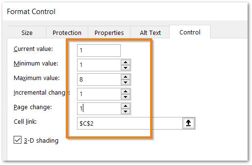
The following values are explained in the scroll bar article.
Click on Ok and now if you scroll the scroll bar, the value in cell C2 will lie in between 1 to 8 incremented or decremented by 1 each time you scroll.
Step 3 – Managing the Source Data
We are not going to use the source data directly into the chart. For instance, follow the sub steps to get a clickable source data that changes on each click.
- Select the range A1:B9, and press ctrl + c and paste it at cell N1.
- Enter a counting from 1 to 8 in the range P2:P9..
- Now clear the entries from the range N2:O9 and enter the following formulas in cell N2 and O2
=IF($C$2>=P2,A2,"")
=IF($C$2>=P2,B2,"")
Copy these formulas down the range N3:N9 and O3:O9 using excel fill handle tool.
- Hide the Column P that has counting and now scroll the scroll bar.
Each time you will scroll, the value of cell C2 will update and thus the formulas we used will make the source data as dynamic that would led to the linking of source data (N2:O9) with the scroll bar.
Step 4 – Inserting the Column Chart
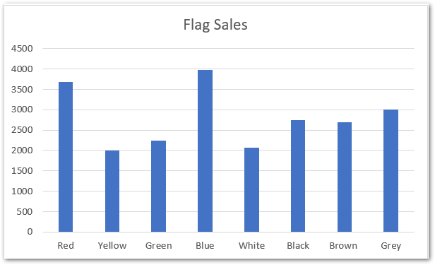
Now select the data in the range N1:O9 and go to insert tab< charts group< column charts< clustered column chart.
Step – 5 Formatting the Chart
Right click on the bars and select Format data series from the shortcut menu.
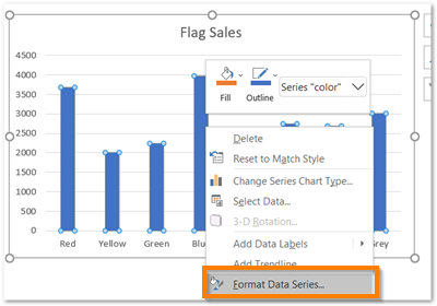
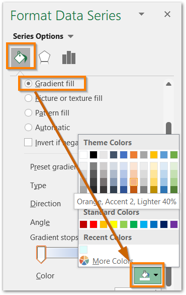
Now in the Format Data series dialog box, go to Fill tab and select gradient fill and choose color.
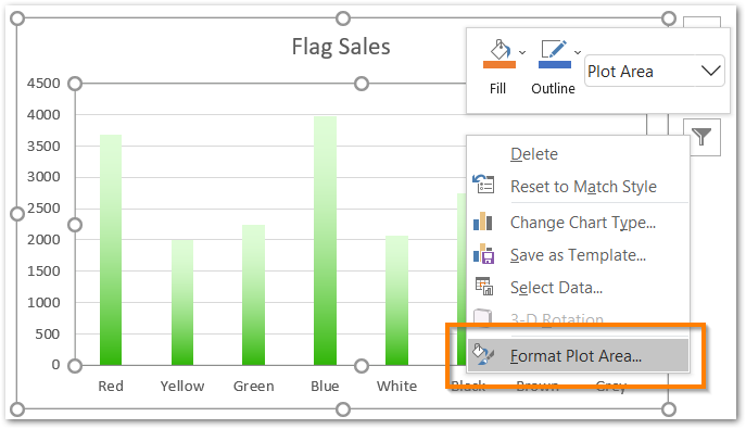
Select the plot area of chart and click on Format plot area.
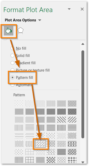
Similarly, choose pattern fill and select the desired pattern, foreground color and background color.
Now the chart will work dynamically upon each scroll both forward and backward.
However, We can move the scroll bar below the chart by simple dragging it. This would be the required out put upon scrolling.
As a result, you can use this chart during a presentation to display the information one by one.
Amazing Points About Column Chart in Excel
The following points about clustered column chart are must to know.
- There can be primary as well as secondary chart axis.
- We can change the chart source data by right clicking on the chart.
- We can format the chart axin every possible way. Read our the article for that.
- Chart elements can be very easily added and removed. Refer to this.
This brings us to the end of function blog. Thank you for reading 😉
RELATED POSTS
- Stacked Bar Chart in Excel – Usage, Insert, Format
- Introduction to Charts in Microsoft Excel
- 100% Stacked Column Chart in Excel – Inserting, Usage, Reading
- Stacked Column Chart in Excel – Usage, Examples, Format, Special Gridlines
- Make Your Own Chart Template in Excel
- Stacked Line Chart in Excel – Inserting, Reading, Formatting

