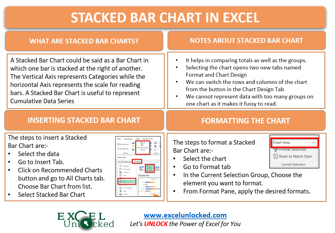
In the earlier blog, we did the usage of a Clustered Bar Chart. A stacked Bar chart is a horizontal version of the Stacked Column Chart. A stacked Bar chart in Excel is quite useful when we have multiple inputs for the same category of data. Using a Normal Bar Chart makes the chart fussy to read and we are unable to compare the contribution of each input in the whole Category.
What is a Stacked Bar Chart?
A Stacked Bar Chart in Excel could be said as a Bar chart in which one bar is stacked at the right of another. Stacked Bars could be explained as if it would be a stack of plates or boxes. The Vertical Axis represents the Categories while the Horizontal Axis represents the scale of values.
A Stacked Bar Chart is useful to represent cumulative data series. For example, let us suppose we have the sales of 2018 and 2019 for a company. When sales of 2018 are cumulative to 2019, we can get the combined sales up to 2019 as the cumulative sum from a Stacked Bar Chart.
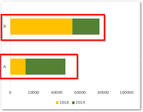
Here, in the above chart, you will see that there are two categories of data A and B. Each Category is having two horizontal bars, one to the left of another. There are two data series here, 2018 and 2019 represented by the bars.
From this chart, if you try reading the value of sales for 2019 only, then it is not possible from the horizontal scale of values. The bar for sale of 2019 is stacked at the left of 2018, so it will contain the sales of 2018 ( to its right ) within it.

Comparison between Presentation of Clustered Bar Chart and Stacked Bar Chart
Let us see an example for both of the charts made using the same source data of sales of fruits for different years.
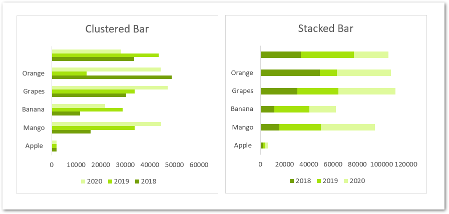
Common things in both of these charts are:-
- The Fruits have five Categories as Apple, Mango, Banana, Grapes and Orange.
- These five categories are represented by the Vertical Axis.
- We have the sales of 2018,2019 and 2020 for all the fruit categories. These three are the Data Series.
Difference between Bar Chart and Stacked Bar Chart
- In the Bar Chart, the bar for one year is below the other for a category.
- In Stacked Bar Chart, the bar for one year is at right of the other year for that fruit category.
- We can read the individual value of annual sales for any fruit in a Bar Chart.
- The Sales are cumulative, the last bar ( for 2020 ) at the right of any category would represent the total of all sales (2018+2019+2020).
Inserting a Stacked Bar Chart
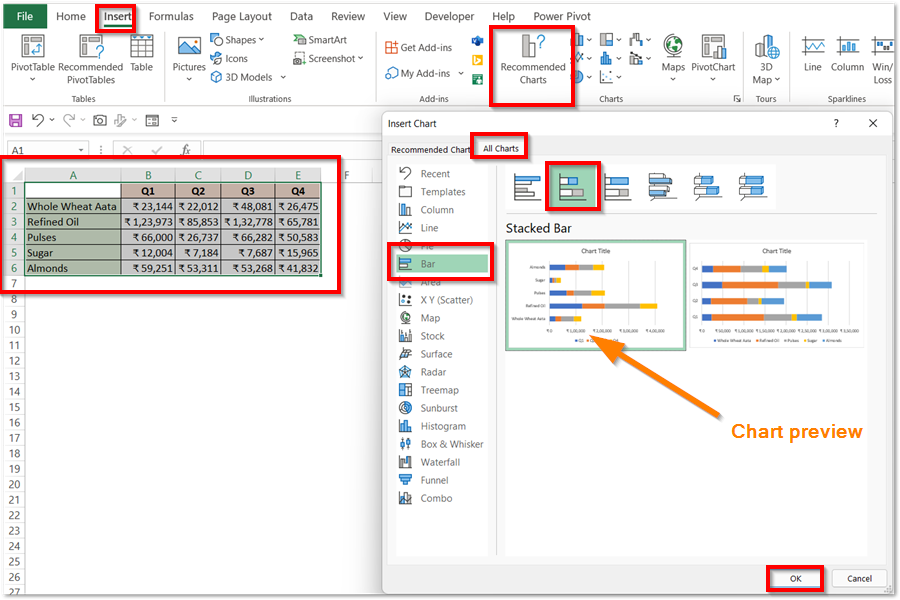
Let us suppose that we have the Quarterly Sales of the different Grocery Products of an Online Grocery Store as follows:-
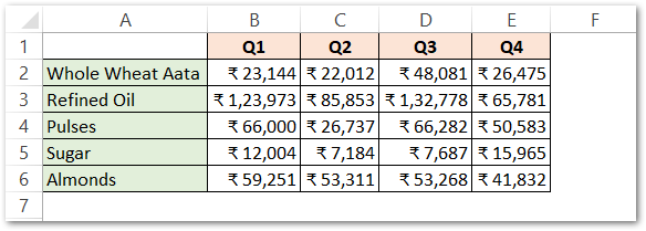
To insert a Stacked Bar Chart from this data simply:-
- Select the range of cells A1:E6
- Go to the Insert tab on the ribbon and click on Recommended Charts button under the Charts group.
- This opens the Insert Chart dialog box. Go to the All Charts tab.
- Click on Bar Chart from the list and choose the type of Bar chart as Stacked Bar chart.
This inserts the required Stacked Bar Chart as follows:-
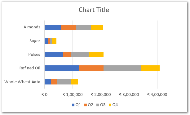
You can learn the formatting of a Stacked Bar from the formatting of Stacked Column Chart as both of the Charts have same structure.
This brings us to the end of blog.
Thank you for reading 8D
RELATED POSTS
- Stacked Column Chart in Excel – Usage, Examples, Format, Special Gridlines
- Stacked Area Chart Excel – Usage, Insertion, Area vs Line, Negative Values
- 100% Stacked Column Chart in Excel – Inserting, Usage, Reading
- Stacked Line Chart in Excel – Inserting, Reading, Formatting
- 100% Stacked Line Chart in Excel – Inserting, Analyzing
- Change the Order of Data Series – Stacked Line, Stacked Area, Column Chart

