In one of our earlier blogs, we learned the usage of Area Charts in Excel. Stacked Area Chart in Excel covers one limitation of Area Charts.
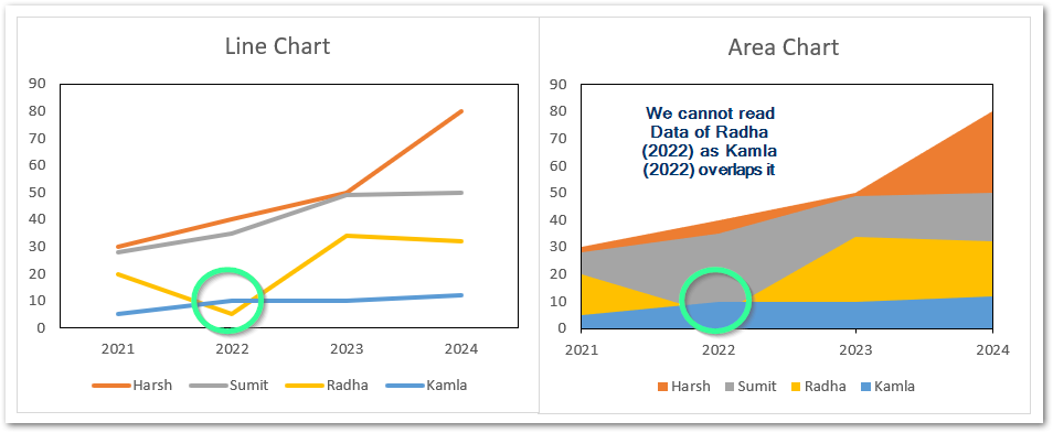
On comparing, we see that when the overlapping data series has a greater value of data than the series it overlaps, the data value becomes unreadable. This is the limitation of the Area chart.
What are Stacked Area Charts
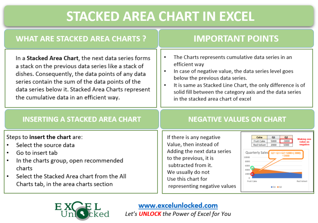
In a Stacked Area Chart, the next data series forms a stack on the previous data series like a stack of dishes. Consequently, the data points of any data series contain the sum of the data points of the data series below it. Stacked Area Charts represent the cumulative data in an efficient way.
You can change the order of data series in a Stacked Area Chart. To know how to change the order, check here.
Inserting a Stacked Area Chart
The working of Stacked Area Charts is very similar to the Stacked Line Charts of Excel. The only difference is that in Stacked Area Charts, the area below the data series fills with legend key color.
Let us say I have the quarterly sales of a bakery for its different variety of cakes as follows.

To insert a Stacked Area Chart:-
- Select the range A1:E8.
- Go to Insert Tab
- In the Charts Group, click on recommended charts
- In the Insert Chart dialog box, go to All Charts tab.
- From there, first choose the Stacked Area chart from the Area Charts in the menu
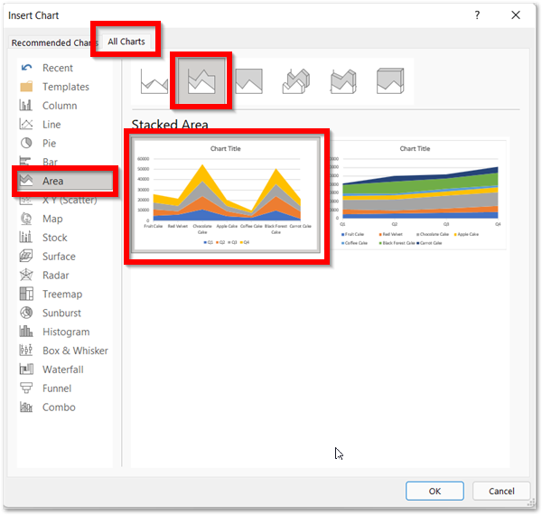
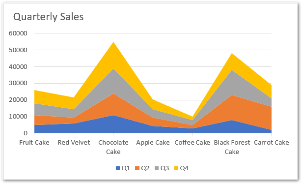
This would insert a Stacked Area chart.
Efficient Reading of Stacked Area Chart in Excel
In the above chart:-
- The four columns in the source data has become the four data series in the chart as Q1, Q2, Q3, and Q4
- The seven rows containing the name of cakes took the place of category axis labels on the area chart
- The four data series named Q1, Q2, Q3 and Q4 are stacked on the top of each other.
- The data series names Q4 contains the sum of the sales of data series below it i.e sales of Q4= Sales of (Q4+Q3+Q2+Q1). In other words, we can say that the topmost data series represent the total of all data series.
- Similarly, data series Q3 represents total of sales by the end of Quarter 3 (Q3+Q2+Q1). Consequently, data series Q2 has the sales of Q2+Q1.
- As there is no data series below Q1, which means that Q1 only has the sales of Q1 itself.
- The total sales of any category obtain by the total sale at the end of Q4. For example, Q4 gives the total sales of fruit cake for the entire year (Q1, Q2 and Q3 are cumulative to it).
In case you want to know the sales of Quarter 3 (only) for Chocolate Cake, then subtract the value of data series of Q2 ($24000) (Q1+Q2) (Sales by end of Quater 2) from Q3 ($39000) (Q1+Q2+Q3) (Sales by end of Quarter 3) Consequently, this would return the sales of quarter 3 (39000-24000=$15000) for Chocolate Cake. Alternatively, you can add data labels to see the Quarterly sales i.e check here
Comparing with Stacked Line Charts
If we had inserted a Stacked Line Chart instead of a Stacked Area chart, this is how it would look:-
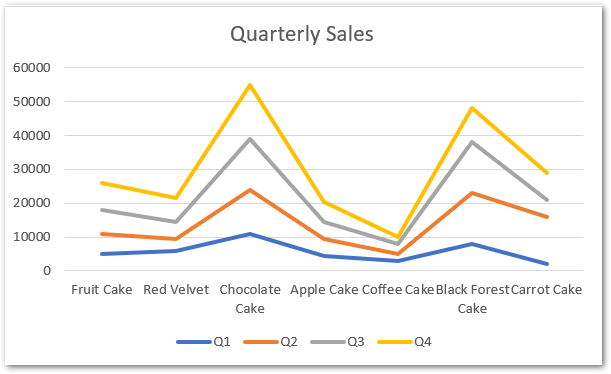
This is the same as the stacked area chart. The only difference is there is no area filled for the data series.
What if Source Data has Negative Values?
There can be a case when the source data we considered for making the chart has the negative values to be plotted on the chart.
To understand this we must know this:-
- The data series at lower level are all cumulative to the data series at relatively topmost position.
- First of all, the chart plots lower data series which is exactly same as the values from source data as there is no data series below it.
- The data points of second data series add to the data points of first data series, so as to make its stack.
- If there is a negative value it would be subtracted from previous one. For an example, consider this:-
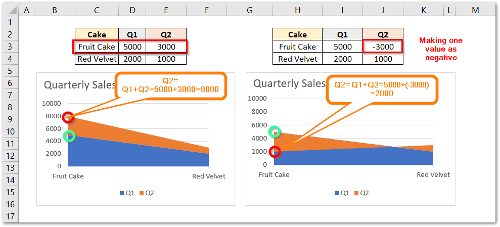
As the figure explains, the red circle represents Quarter 2 data while the green circle represents Quarter 1 data. We have changed the value of fruit cake sales for Quarter 2 from +3000 to -3000. The green circle remains at 5000 in both charts as Quarter 1 sales are same for fruit cakes in both charts. But also, the red circle (5000+3000) is above green as Quarter 2 sale is positive for fruit cake. In second chart, red circle shifts below green as the sale is negative and now the red circle represents 2000 (5000-3000).
This brings us to the end of the blog.
Thank you for reading 😎
RELATED POSTS
- Area Chart in Excel – Types, Inserting, Line vs Area, Correcting Chart
- Stacked Bar Chart in Excel – Usage, Insert, Format
- Stacked Line Chart in Excel – Inserting, Reading, Formatting
- 100% Stacked Line Chart in Excel – Inserting, Analyzing
- Change the Order of Data Series – Stacked Line, Stacked Area, Column Chart
- Stacked Column Chart in Excel – Usage, Examples, Format, Special Gridlines

