While working with charts in Microsoft Excel, there are many chart components that are not mandatory to mention but are quite useful. In this blog, we are going to learn everything about the chart elements in Excel.
Here we go 😎
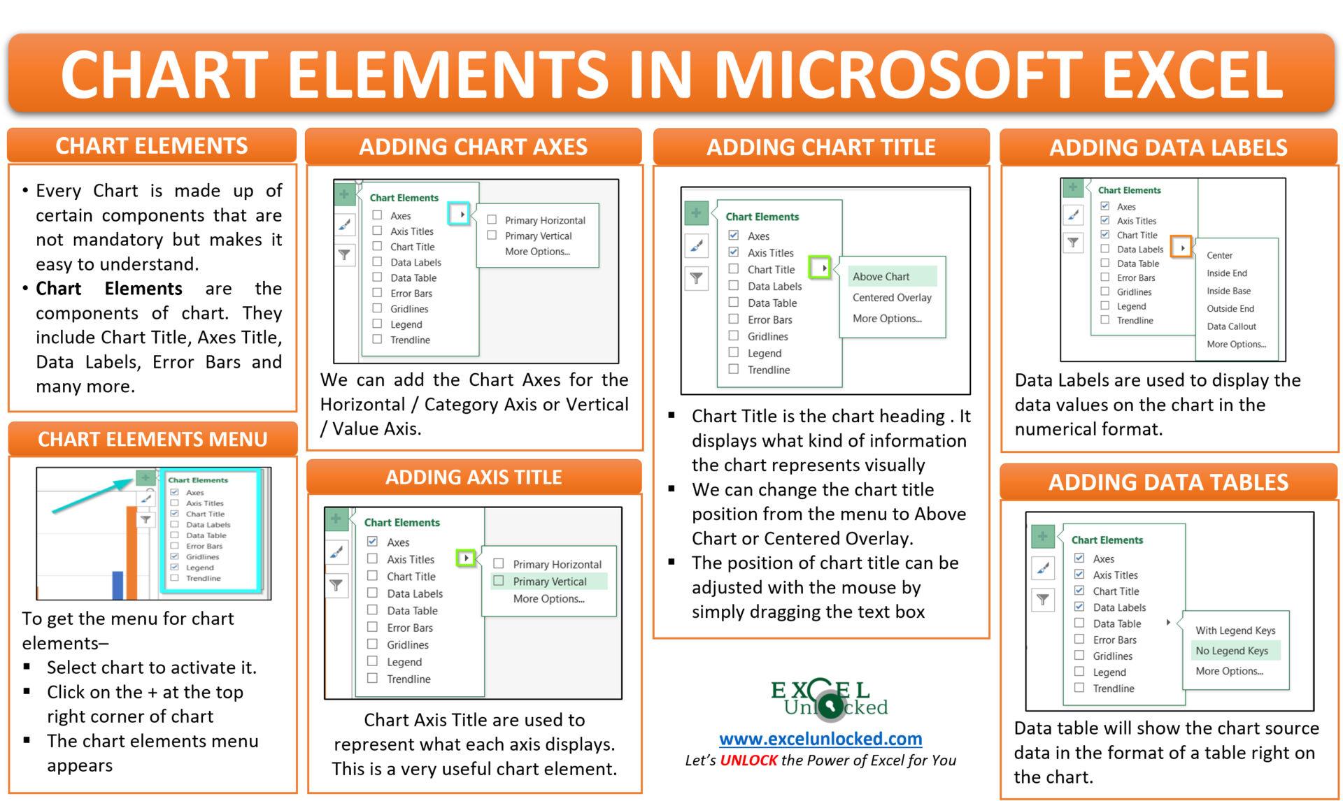
What Are Chart Elements in Excel
There are several components that make a complete chart in excel. These include Chart titles, Legends, Gridlines, Axes, Axis titles, Data Labels, Data tables, Error bars, and Trendline. These elements making the chart are called chart elements and Yes! It is possible to make a chart without taking even one of these into the chart. This type of chart is an empty chart and is completely useless but excel allows us to make this type of chart.
Making a Chart in Excel
We need to first insert a chart to get the chart elements into use. Let us say we have the sales of bolts and nuts from January to October of a company.

To insert a chart, select this data and press the F11 function key ( for chart sheet ) or go to Clustered Column Chart > Charts Group > Insert Tab ( for embedded chart ).
The following chart inserts. Click on the chart to activate it.

On clicking the + icon you will see the entire list of chart elements with the checkboxes.
Adding and Deleting Chart Elements in Excel
We will start by modifying each chart element one by one for the above chart. I have unchecked all of the above checkboxes to remove them from the chart.
Chart Axes
A chart has two Axes named Horizontal/Category Axis and Vertical/Value Axis. With the use of the chart element menu, we can either keep or delete both axis or keep one of them.

Clicking on the right pointed arrow, a sub-menu for keeping or deleting primary horizontal/ vertical appears. We can check or uncheck the check box to see different results.

For now, we are keeping both the Horizontal and vertical axis.
Chart Axis Title
The Vertical and Horizontal axis in the chart has a title for what they contain, We can find the option to add or delete the Axis title from the chart element menu.

We can add the axis title for both the horizontal and vertical axis, either of them or none of them using the checkboxes.

By default, Excel uses the text string “Axis Title” at the place of the actual title. We can change it by double-clicking on it and entering the desired axis title. i.e Sales ( vertical axis ) and month ( horizontal axis ).
Chart Title
Chart title is the chart heading containing the name for that chart. The chart title should have a clear indication of what it displays. The fourth option from the chart element item is for the chart title.

On clicking the right arrow, we will find there are three options to change the position of the chart to keep it either above the chart or to overlap it on the chart. More options open the format chart title pane on the left.

By default, Excel writes the text string “Chart Title” at the place of the chart title. We can rename the chart title by double-clicking on it. i.e “Monthly Sales”
We can also change the position of the chart title by simply dragging it using the cursor.

Chart Data Labels
Data labels are the values that represent the information on the chart and make the chart easier to read. We can also change the position of the data labels with respect to the data series in the chart.

There can be four positions for the data labels in this column chart: Center, Inside End, Inside Base, Outside End. The fifth option for Data Callout puts the data labels into shapes.

We can choose the desired position for data labels that are easier to read. We can adjust the position of each data label by simply selecting it and then dragging it with the mouse.
Data Table in a Chart
Data Table is the table that excel generates from the source data of the chart. It is also a chart element and is inserted on the chart.

We can select the data table to either contain the legend keys or not, You can see the preview.

In a similar way, we can add error bars, Legends, Gridlines as well as Trendlines.
This brings us to the end of the blog. Thank you for reading 😉
RELATED POSTS
- Format Chart Axis in Excel – Axis Options
- Make Your Own Chart Template in Excel
- Line Chart in Excel – Inserting, Formatting, #REF! resolving
- Introduction to Charts in Microsoft Excel
- Volume High Low Close Stock Chart in Excel – Insert, Format, Reading
- 3D Column Chart in Excel – Usage, Insertion, Format