The line chart is a very powerful and commonly used excel chart tool used to represent the data in visual form. In this blog, we will be covering the entire functionality of the line chart. This chart adds more readability to a dashboard.
What is Line Chart In Excel
A line chart is nothing but the representation of data series in the form of a line on a chart. The data values are first plotted on the graph and a line joining the consecutive points (x,y) forms the graph. The line needs not to be contiguous for a data series. Consequently, it can break in between.
Creating a Line Chart in Excel
Markers are nothing but the highlighted data points on the line of the line chart. Let us say we have the monthly sales of a company for 2020. Below is the data.
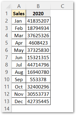
Thereafter, we have the steps to create a line chart with this data:
- Select the data.
- Go to insert tab.
- In the charts group, click on this button to insert the line chart.

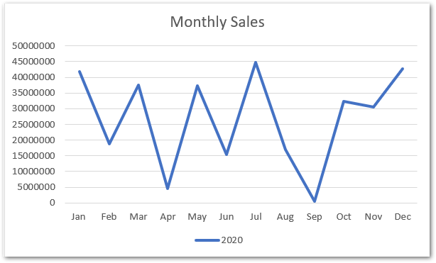
A chart will be inserted on the current sheet.
Changing Axis Number Format and Chart Formatting
As we can see that the axis values are a bit lengthy and unformatted. Select the chart axis and right-click on it. Choose Format Axis Option from the shortcut menu. This will open the format axis pane on the left of the Excel interface.
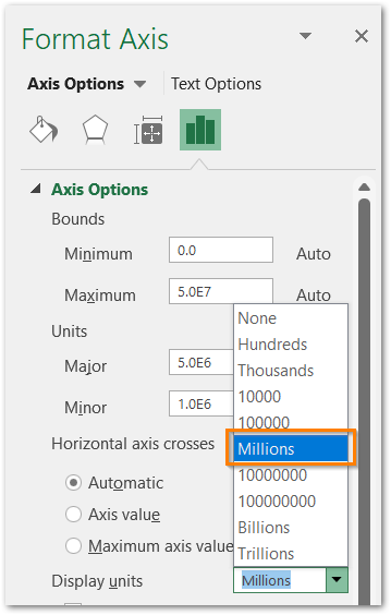
Set the display units to Millions and notice the change.
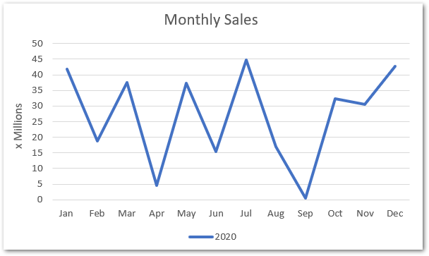
The axis values have changed as a multiple of Millions.
This graph legend seems useless because there is only one data series on the chart. Select the chart and click on the + button.
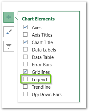
Uncheck this legend box from this menu and we got the legend removed!
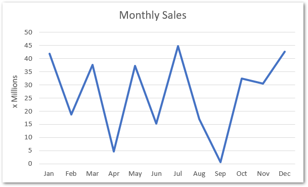
You can learn more about adding or removing other chart elements for this line chart from here
Changing Chart Type to Line Chart with Markers
We can change this chart into a line chart with markers. Follow this procedure.
- Right Click on the chart.
- Select change chart type from the shortcut menu.
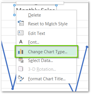
- The Change Chart Type dialog box appears, Select the line chart with markers from there.
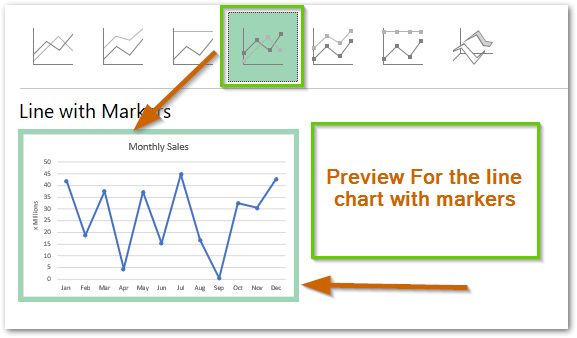
Click on OK. This is the required chart.
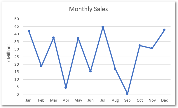
Resolving the #REF! Error
Many times, when we select the data to make its chart, the excel algorithm, picks up some entries that we do not want to present on our chart. For an example, have a look at the below chart.
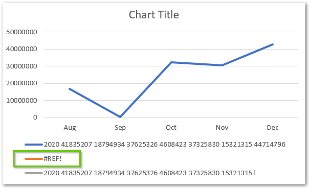
This #REF! error on excel chart occurs when:-
- Excel was unable to detect the source data properly.
- Source data was moved to another worksheet or workbook.
This error can be resolved by selecting the source data for this chart. The steps are:-
- Right Click on the chart and select Change Data option from the shortcut menu.
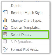
- Click on the data source button from the Select Data Source dialog box.
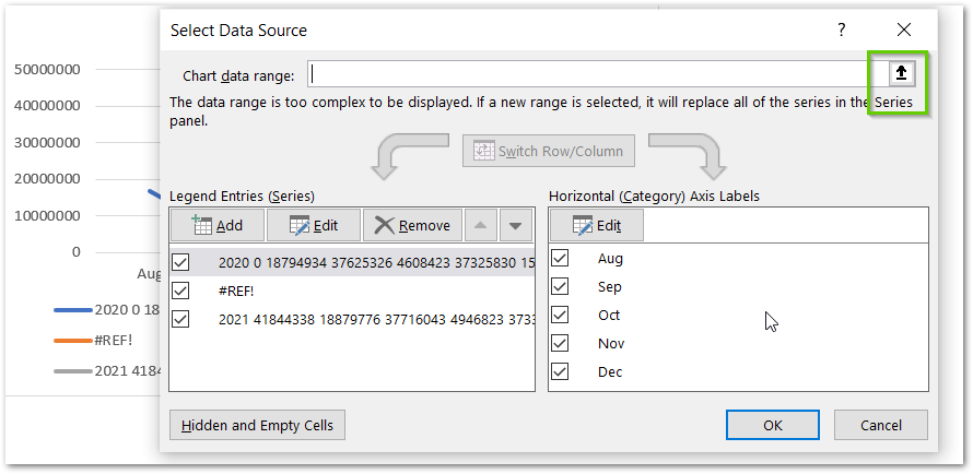
- Reselect the data source from the excel sheet and click ok.
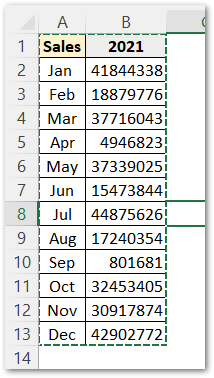
This will correct the chart and remove the #REF! error from legend.
Amazing Points About Line Chart in Excel
The following points are good to know about the line chart in excel:-
- There can be two horizontal or vertical axis on the chart.
- As soon as you change any entry in the source data, it gets reflected in chart without refreshing it.
- Line charts can pick up source data from multiple ranges in different worksheets of the same workbook.
- It is not mandatory for a line chart to have one line data series on it. We can create a line chart with multiple lines in the same way we did for single line chart by selecting the source data for multiple data series. However, too many lines on the same chart make it messy an unreadable like this:-
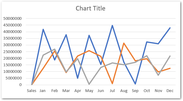
Thank you for reading 😉
RELATED POSTS
- All About Chart Elements of a Chart in Microsoft Excel
- Column Chart in Excel – Types, Insert, Format, Clickable Chart
- Format Chart Axis in Excel – Axis Options
- Stacked Line Chart in Excel – Inserting, Reading, Formatting
- Sparklines in Excel – Types, Usage, Insertion
- Area Chart in Excel – Types, Inserting, Line vs Area, Correcting Chart
