In one of our earlier blogs, we understood the usage of line charts in excel. In the line charts, the consecutive data points join to form a line. The functionality of the Area chart in excel is quite similar to it. Let us see how. 😎
Area chart and its Types
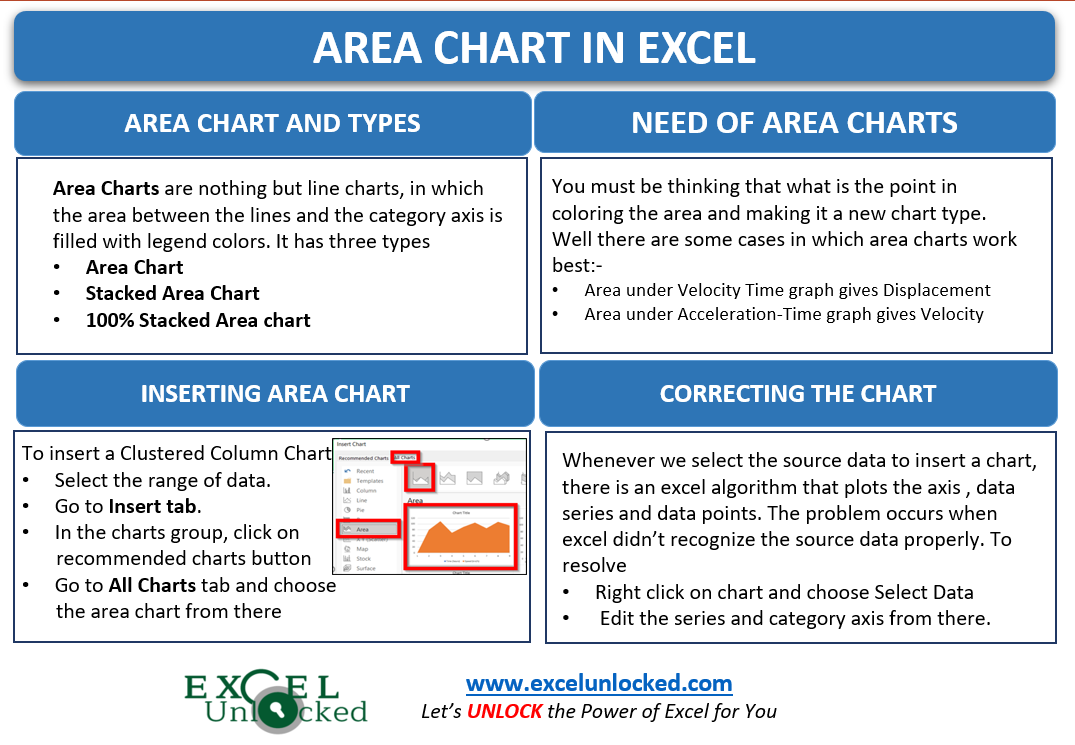
Area charts are nothing but line charts, in which the area between the lines (data series) and the category axis (horizontal axis) is filled with legend color.
There are three types of area charts. (just like the line chart)
- Area chart. (2D as well as 3D)
- Stacked Area chart (2D as well as 3D)
- 100 % Stacked Area chart (2D as well as 3D)
The three chart types have their 3D versions also, but they work the same as the 2D charts.
Why do we need Area Charts
The question that arises is, what is the point in filling the area between the data series (lines) and bottom axis? Well, there are some cases in which the analysis of the entity happens on the basis of the area it covers in the chart.
- The area under Velocity-Time graph gives displacement. This is so because displacement = velocity*time
- Area under the Acceleration-Time graph gives velocity.
In both of the examples, we would study the change of velocity or acceleration with increasing time. We can also use the area charts to form a special type of gridlines to make a combo chart.
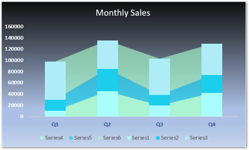
This is a very cool formatting feature and you must check it out!
Inserting Area Chart in Excel
Let us say we went on a trip. The journey to reach the destination was of 8 hours. We have the data of the speed of the car after certain hours.
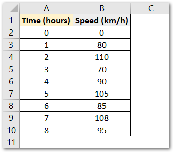
As you can see, initially both time and speed are zero as the journey has not started when time is zero and the car is at rest. Then there are the average speeds after 1 hour, after 2 hours, and so on.
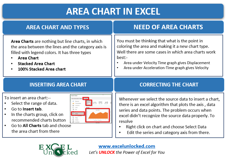
To insert an area chart in excel:-
- Select the data range A1:B10
- Go to insert tab
- In the charts group, click on recommended charts button
- Move to all charts tab
- Choose the area chart from the menu there.
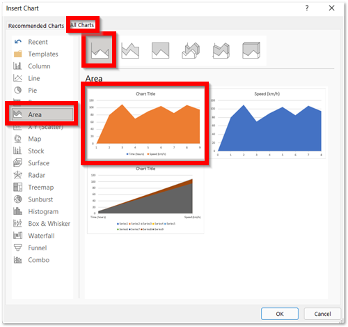
This is going to insert a default area chart in excel. We made some changes as follows.
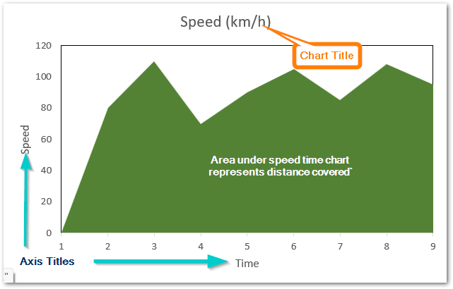
- We have formatted the data series. You can learn it from here.
- We have added Chart title, axis title and removed gridlines. This is known as adding/deleting chart elements in excel.
- However, You can learn about formatting the chart axis.
This is how the chart looks now.
Comparing Line Chart and Area Chart (Multiple Data Series)
Let us say I have the report of the targetted number of projects for different employees as follows.
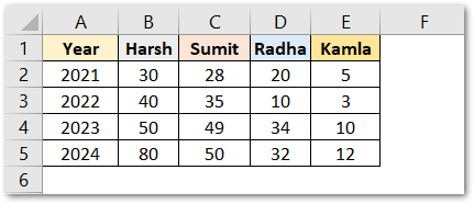
We can insert both the line chart and the area chart for this type of data as explained before.
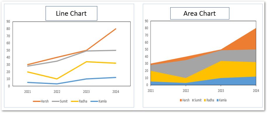
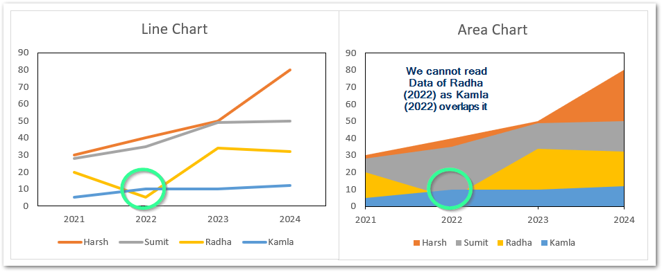
In a line chart, the data points are plotted on the chart and consecutive points of a series are joined to form a line. In an area chart, the area between these lines and the bottom axis is filled. These areas overlap if there is more than one data series as in this case i.e Harsh, Sumit, Radha, Kamla
The consecutive data series can be seen overlapping as:
- The data series for Harsh can be seen on the top in orange color.
- “Sumit” overlaps “Harsh” as grey covers a part of orange.
- “Radha” overlaps both “Sumit” and “Harsh”.
- “Kamla” is in front so it overlaps all three series. We can see the complete area occupied by “Kamla” because it is on the front and no data series overlaps it.
Now there is one disadvantage of this overlapping as the next data series covers the previous data series to some extent. Now, look at this variation where we changed the data of Radha and Kamla for 2022.
However, this is a case when we have multiple data series in the chart.
In this case, usage of Stacked Area Charts becomes efficient.
Correcting an Area Chart in Excel
We are assuming that you know the basic terminology of a chart in excel, and if you don’t then please read the fundamentals of charts in Microsoft excel.
As we know when we select the data, excel inserts a selected chart type with some default settings including:-
- Data Series on the chart to be plotted.
- What would horizontal and vertical axis represent.
- Axis labels on the axis of chart.
There might happen a case when excel doesn’t recognize the data you provide to it. and the chart becomes inefficient to read. For instance, look at this area chart.
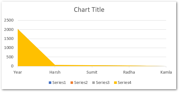
Here you can see that there is a problem with this chart. It is completely different from the chart we inserted earlier. To correct it:-
- Right click on the chart
- Click on Select Data option from the shortcut menu
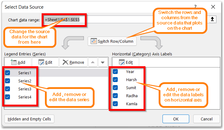
Consequently, using the above controls you can alter the default setup of any chart in Microsoft excel.
Thank you for reading. 😉
RELATED POSTS
- Format Chart Axis in Excel Charts – Axis Options – Fill and Line
- Stacked Line Chart in Excel – Inserting, Reading, Formatting
- Line Chart in Excel – Inserting, Formatting, #REF! resolving
- Column Chart in Excel – Types, Insert, Format, Clickable Chart
- Change the Order of Data Series – Stacked Line, Stacked Area, Column Chart
- XY Scatter Chart in Excel – Usage, Types, Inserting Scatter Chart

