We are going to format our chart axis by taking an example of a simple column chart in excel. Chart Axis contains the values for any particular horizontal/category axis or vertical / value axis. There can be a secondary axis too ( 2nd vertical axis or horizontal axis ) but the method to change its formatting remains the same. Let us start now. Here we go 😎
What Is Meant by Formatting Chart Axis in Excel
In earlier cases, most of the time we have performed formatting in excel cells or ranges by changing the font color, fill colors or the number format, and many other formatting things. Formatting a chart axis includes some common functions highlighting the chart axis values, changing the width of the axis line, adding the ending or beginning arrows, and much more. Let us learn from scratch. Here we go 😎
Getting Started Step Wise
We have made steps you need to follow for each formatting option for the chart axis.
Inserting a Column Chart in Excel
We obviously need a chart first in order to change its formatting in excel. Let us say we have the actual sales and target sales for each month in a year of a company. Below is the data.

We have inserted a column chart for the above data. Follow this link to know how to insert a chart.
Also Read: Format Chart Axis in Excel – Axis Options

We have changed the default chart title name to Sales vs Target.
In order to open the format axis pane for the vertical axis containing sales amount. Right-click on the axis and select the Format Axis option.

Once you click on this button, a new format axis pane will open up at the right side of the excel window like this.

Analyzing Format Axis Pane
Let us see the parts in which functionality of the Format Axis pane has been divided,
There are two broad sub panes named Axis options and Text options. In this blog, we will study the Axis options. Axis options have four sub panes as follows:

Axis Options Sub Panes
The four sub panes will format the vertical axis as we have opened the format axis pane by selecting the primary value / vertical axis. However, in this blog, we are going to work with Fill and Line.
Axis Options : Fill and Line
In the Fill and Line sub pane, we can format the fill color for the axis values and the axis line on the graph.

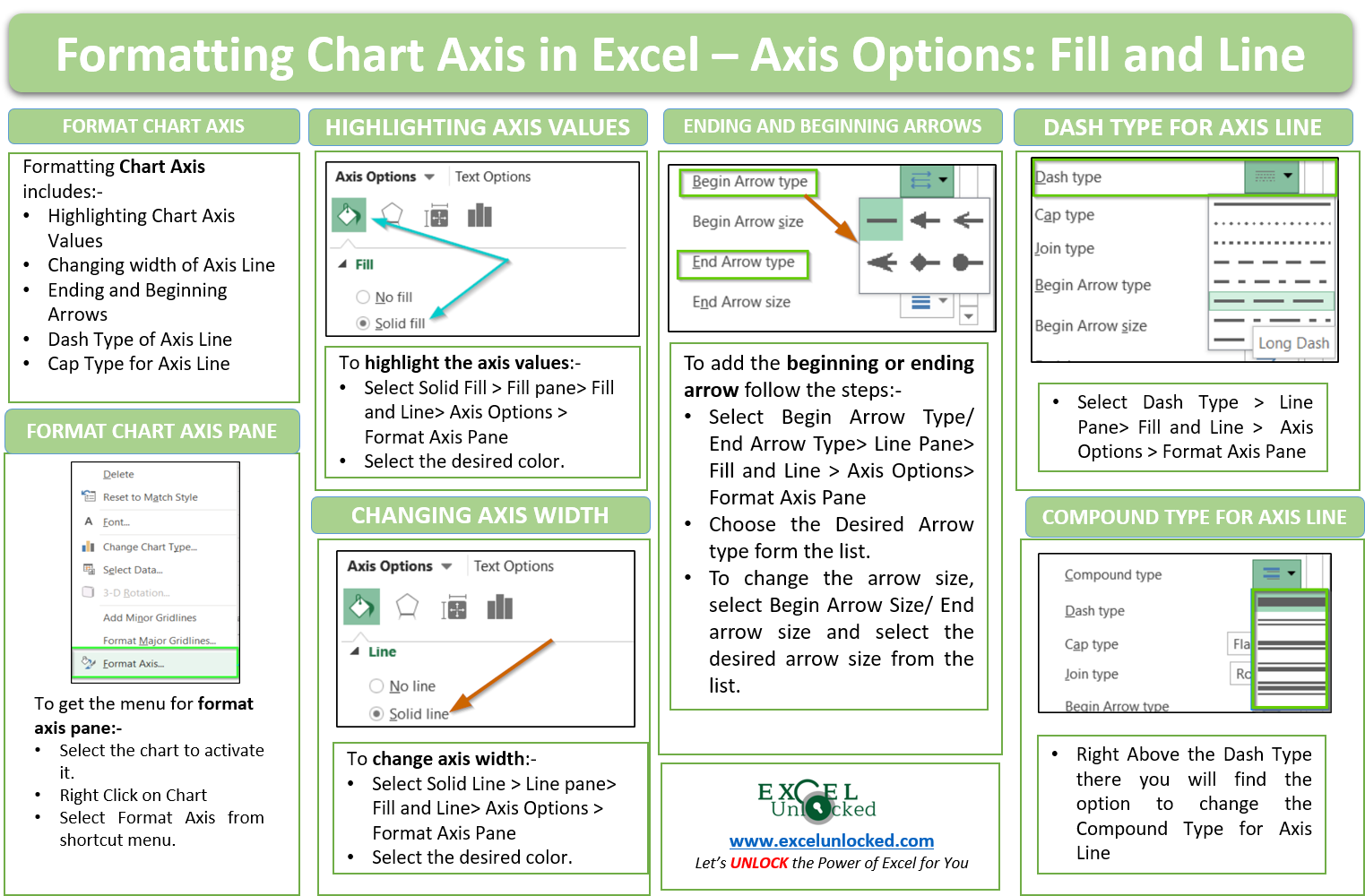
Filling The Chart Axis Values with Color
We can change the fill color by going to the Fill option in the pane and selecting the desired background fill for the axis value. In our example, we are highlighting the axis values using the light orange solid fill. You can experiment with any of the fill types including pattern fill, gradient fill, or add a picture as a background fill of the axis values.
This is how the chart will look.

In the same way, we can highlight the axis value for the category / horizontal axis by right-clicking on the axis and the choosing format axis option from the shortcut menu.
Formatting the Axis line of a Chart in Excel
We will now format the y-axis or the vertical axis line of the graph.

We have opened the line menu. From here we can change the color of the axis line ( in this example – orange ), its transparency by sliding it between 0% to 100% ( not visible ) transparency. We are increasing the width of the axis line to 2pt.

In a similar way, we can change the axis line color and width for the vertical axis also.
The next option is for compound type. We have the following compound types for the axis line.

After this, we have an option to adjust the dash type. We use a dashed line when we do not want the axis line to be contiguous.
We are taking long dashes for this axis from here.

Cap type changes the shape of the axis line edge. For instance, we are increasing the width of the line to 3.5 pt to notice the change in cap type.

After that, there are options to design the edges arrow, their shape, and size for both ending and beginning arrows.
We are keeping the beginning arrow type as we want, With the option Begin arrow size we can check for the sizes available for the arrow. Below is the menu.
This is how our chart looks after changing the arrow type and size.
However, You can learn more about adding effects to Chart Axis.
This brings us to the end of the chart axis: fill and line blog.
Thank you for reading 😉
RELATED POSTS
- All About Chart Elements of a Chart in Microsoft Excel
- Column Chart in Excel – Types, Insert, Format, Clickable Chart
- Line Chart in Excel – Inserting, Formatting, #REF! resolving
- Make Your Own Chart Template in Excel
- Scatter Charts in Excel – Straight and Smooth Lines with Markers
- 3D Column Chart in Excel – Usage, Insertion, Format