In the earlier blogs, we learned the usage of Column Chart in Excel. The Column Chart is a 2D chart having only two dimensions or we can say axes while 3D Column Chart is spread across three dimensions. Let us see how this chart type works. 8D
What is a 3D Column Chart in Excel?
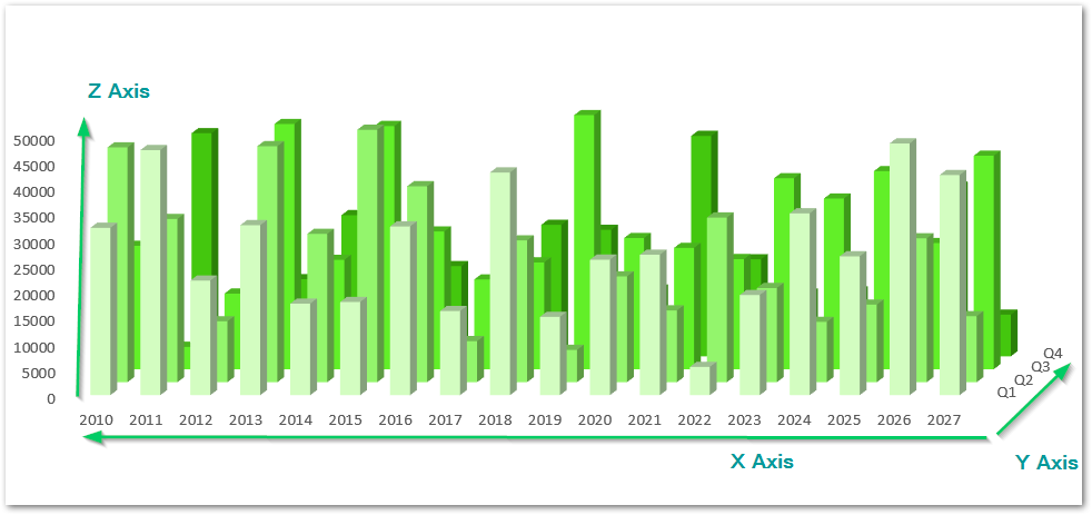
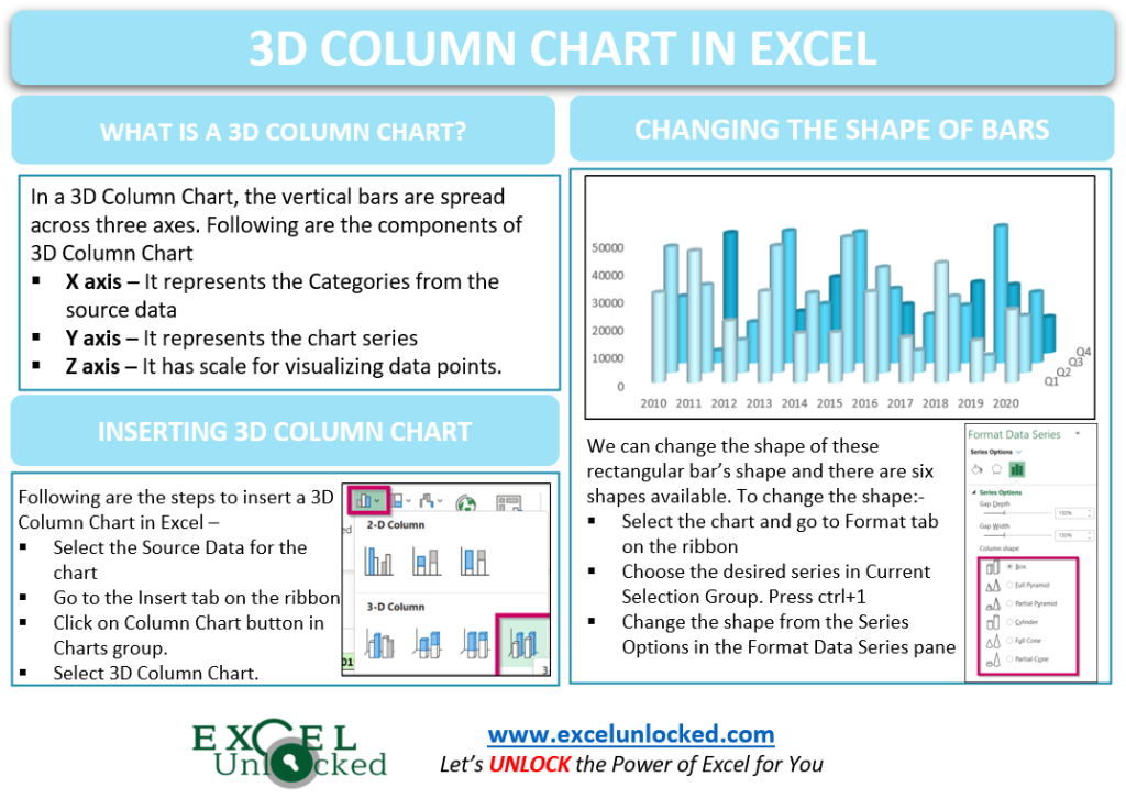
In a 3D Column Chart, the vertical bars are spread across the three axes i.e. X-axis, Y-axis, Z-axis. The following are the chart components of a 3D Column Chart in Excel.
- X axis – It represents the Categories from the source data of the Chart.
- Y axis – It represents the Series on the Chart.
- Vertical Bars – The actual data series is in the form of vertical bars or Columns.
- Z axis – It has the scale for visualizing the data points of the Vertical Columns.
Inserting a 3D Column Chart in Excel
We can plot a 3D Column Chart when there is data that has both Categories and Series to be plotted on the Chart. For Example, let us say we have the sales of a company for its four quarters of ten years. Below is the data for the same.

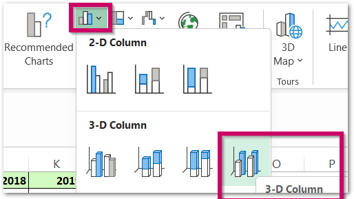
To add a 3D Column Chart in Excel, follow the steps mentioned:-
- Select the range of cells A1:L5
- Go to the Insert tab on the ribbon.
- Click on the Column Chart button in the Charts Group.
- Select the 3D Column Chart from there.
This inserts a 3D Column Chart in the current worksheet with default formatting.
Formatting a 3D Column Chart
We can format our chart in a number of ways as presented below.
Unhiding the Hidden Axis Labels on the Chart
The chart inserted in the above section is:-
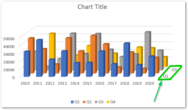
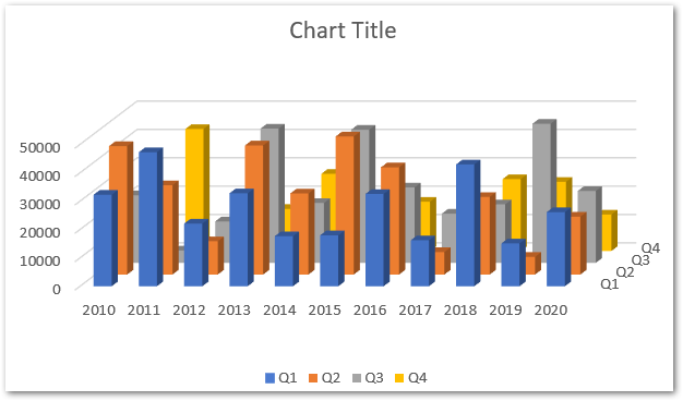
As you can see that the axis labels for Quarter 2 and Quarter 4 have been hidden by Excel due to the compact space available. But we can undo that by using the following steps.
- Select the chart and go to the format tab on the ribbon.
- Choose Depth (Series) Axis.
- Click on the Format Selection Button
Consequently, this opens the Format Axis Pane for the Y-axis of the chart. Navigate to the Labels Menu and specify the interval between the labels as 1.
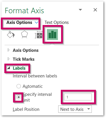
Consequently, all the labels on the axis will be unhidden. If the labels seem to overlap, simply drag the corners of the chart to adjust/increase the chart widht and height. This is how the chart labels look once done.
Changing the Shape of Vertical Bars in a 3D Column Chart
There are a variety of shapes to format your chart into.
- Box ( current )
- Full Pyramid
- Partial Pyramid
- Cylinder
- Full Cone
- Partial Cone
To change the shape of 3D Columns simply:-
- Select the Chart and go to the format tab on the ribbon.
- Choose any one of the Series in the Current Selection Group and hit Format Selection button.
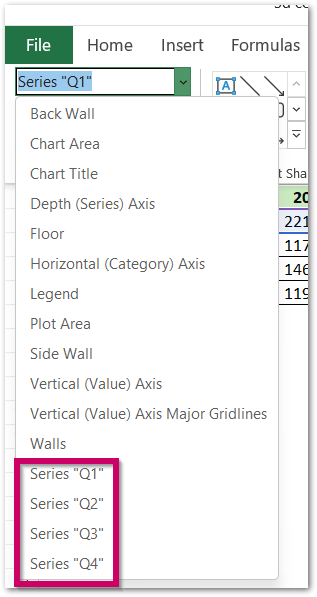
Navigate to the Series Option and set the shape of the data series.
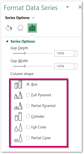
For now, we are choosing this shape as Cylinder. Repeat the same procedure for the rest of the Data Series.
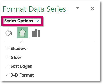
Click on this Series Option and then again choose the Series to change its shape.
Changing the Solid Fill Color for the Data Series
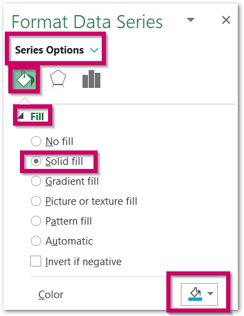
We can change the solid fill color for the cylindrical columns. All you need to do is:-
- Open the Format Data Series pane as explained in the previous section.
- Navigate to Fill and Line Options in the Format Data Series pane.
- Set the Solid Fill color and repeat the procedure for the rest of the Data Series
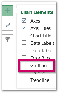
We have removed the chart Gridlines from the + button appearing at the top right corner of the chart when we select it.
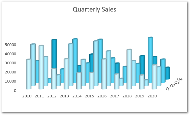
Below are the satisfying results for our 3D Column Chart in Excel.
This brought us to the end of the blog. Thank you for reading.
RELATED POSTS
- Wireframe 3D Surface Chart in Excel – Insert, Working, Format
- All About Chart Elements of a Chart in Microsoft Excel
- Format Chart Axis in Excel Charts – Axis Options – Fill and Line
- Bar Chart in Excel – Types, Insertion, Formatting
- Format Chart Axis in Excel – Axis Options
- Contour Chart in Excel – Inserting, Usage, Format

