In the earlier blogs, we learned the usage of 3D Surface Charts and Wireframe 3D Surface Charts. Contour Chart in Excel is a specific 2D version for the same chart types. Let us see how they work.
What is Contour Surface Chart?
The 3D Surface Chart was made using 3 axes while this chart type is made using only 2 axes namely X and Y-axis. A Contour chart is basically similar to the 3D Surface Chart viewed from the top. The axis representing the scale of values i.e Z axis would not be present in a Contour Chart. The X-axis will represent categories whereas the Y-axis represents series.
This chart is mainly used in specific fields like geocoding of regions, Astrology, Meteorology. This chart type is even used in statistics to check the relationship among two predictors and one response.
Inserting a 2D Contour Surface Chart
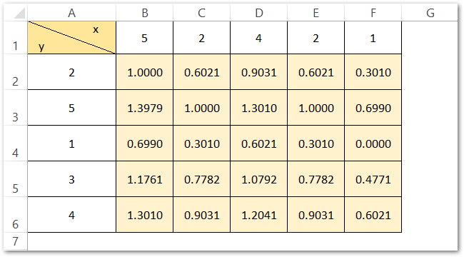
In this example, we are considering the sum of log base 10 for different values of X and Y as mentioned in the table below.
To insert a Contour Surface Chart in Excel follow these steps:-
- Select the range of cells B2:F6 ( do not select the column and row headers).
- Go to the insert tab on the ribbon.
- Click on the Recommended Charts Button.
- Move to the All Charts tab and select Surface Charts from the list.
- Select the Contour Surface Chart from the Surface Chart types.
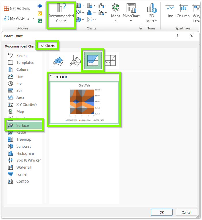
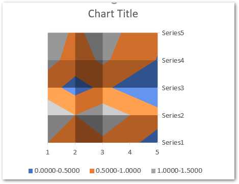
Click Ok and this will insert the Contour Charr with default formatting as shown below.
We can format this chart so as to make it look much better.
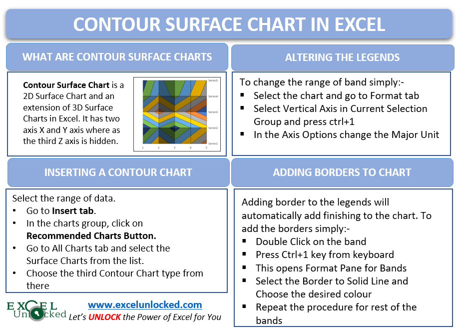
Altering the Range and Color of Legends in a Contour Chart in Excel
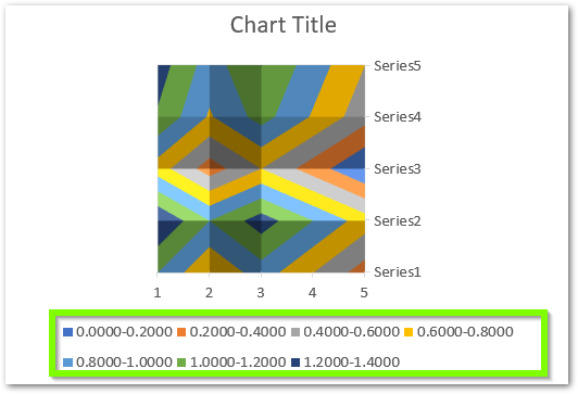
As you can see in the above chart, colors have been assigned to specific ranges and there are three such ranges in total. These ranges are actually lying on the third Z-axis which is not visible as the contour chart enables you to see the 3D Surface Chart from the top. The only way to change these legends’ range is to change the Z-axis Major Units. To do so:-
- Select the Chart and go to the Format tab on the Ribbon.
- Select Vertical ( Value ) axis in the Current Selection Group. This axis is the Z axis.
- Click on Format Selection Button which is below it.
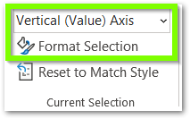
This opens the Format Axis Pane for the third hidden axis for this 2D Contour Chart, From the Axis Options change the Major Unit and set it to 0.2
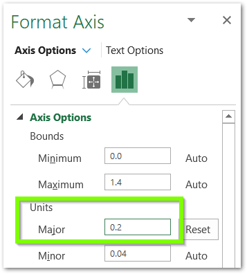
This will update the hidden axis as well as the legends as follows:-
Adding Border to the Contour Chart Data Series
We can add a border to the interpolating lines of the x and y-axis to make it more clear and easier to understand. To do so, double click on any one legend so as to select that band as shown below.

Press ctrl+1 to open the band options and add a border from there as a solid line set to black color.
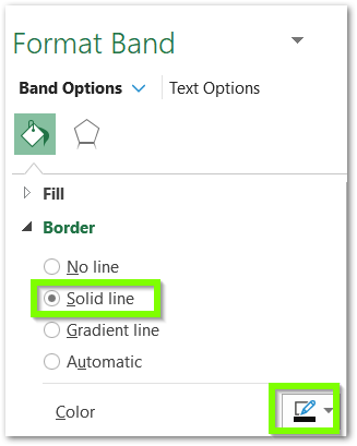
Repeat the same procedure for the rest of the bands. After adding the Borders, this is how the chart looks now.
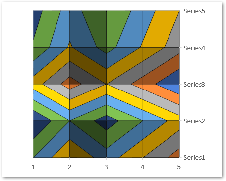
For instance, we have removed the Chart Title and Legend Keys from the chart. You can learn more about adding or deleting Chart Elements from here.
This brings us to the end of the blog. Thank you for reading 8D
RELATED POSTS
- 3D Column Chart in Excel – Usage, Insertion, Format
- Scatter Charts in Excel – Straight and Smooth Lines with Markers
- Format Chart Axis in Excel Charts – Axis Options – Fill and Line
- XY Scatter Chart in Excel – Usage, Types, Inserting Scatter Chart
- Radar Chart in Excel – Components, Insertion, Formatting
- Column Chart in Excel – Types, Insert, Format, Clickable Chart
