3D Surface Chart is one of the different and complex charts of excel. In this blog, we will be covering all of its axes, functionality, formatting, and a lot more. So let us just move ahead 😀
What is 3D Surface Chart in Excel
As the name has suggested to you, it is a 3D chart type and has three axes. The chart works like a 3D column chart on the vertical bars of which a sheet is wrapped.
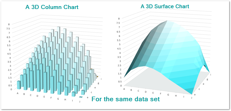
There are no bars in a surface chart and just a sheet spread across three dimensions. The Data Points join to form this sheet.
Axes in a 3D Surface Chart
There is a total of 3 axes on the chart.
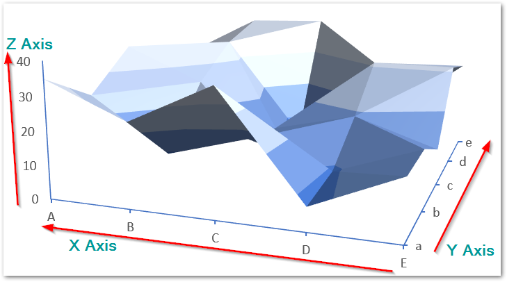
- X axis – It represents the category labels on the chart.
- Y axis – It represents the sub categories on the chart.
- Z axis – It represents the scale of each data series on the chart.
The Surface chart has an exception over other chart types of excel. We cannot format the chart on the basis of data series. Instead, the chart formats on the basis of data series value on Z Axis. The legends of this chart will have a starting and end value on Z axis that we can format in certain color.
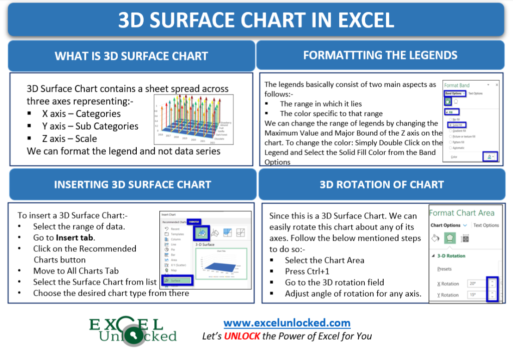
Understanding the Chart working by Inserting Blank Chart
Let us start by considering the sales of a bakery for different years. We are assuming the sales in the source data to be zero at first so as to understand how excel plots the data points in this chart type.

As you can see that the sales of each cake for every year are zero. We can insert the chart for this data. Follow the below-mentioned steps:-
- Select the range of cells A1:F7.
- Go to the Insert tab on the ribbon and Click on Recommended Charts button.
- Navigate to All Charts tab and select the Surface Chart from the list down there.
- Choose the 3D Surface Chart from the Surface Chart types
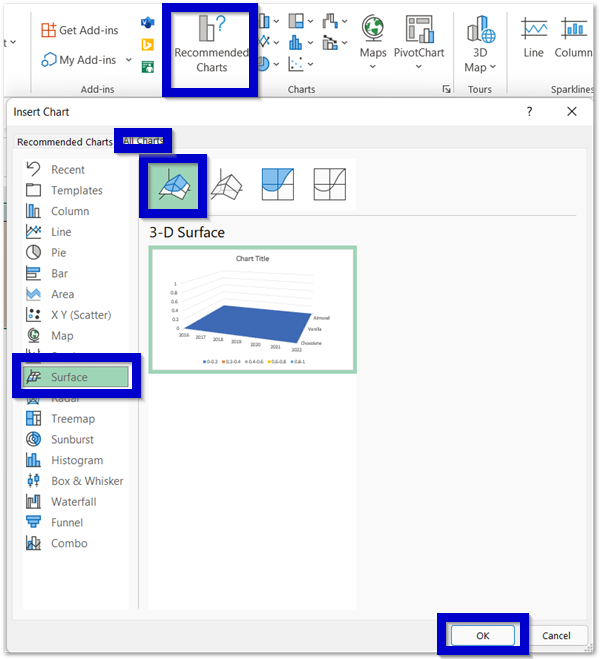
As a result, this will insert the 3D stock chart which appears like a 2D chart because of the zero sales we took in our source data of the chart.
Legends in a 3D Stock Chart of Excel
Legends are basically the fixed color assigned to different data series of a chart. The legends have an exception in the 3D Surface chart. The color keys are assigned to the range in between the Data Points lie and not the Data Series. For an example;-
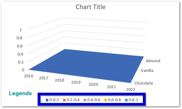
Here you can see that any value on the chart lying in between 0-0.2 would be assigned with the blue color. This is why the chart appears to be blue as we took all the sales as zero. The range in the legend is made by using the major gaps in the Z-axis i.e 0-0.2, 0.2-0.4, 0.4-0.6, 0.6-0.8, 0.8-1
Once we add any larger value in the sales, these legends will update themselves automatically as per the Z-axis Major units.
Adjusting the Hidden Chart Axis Labels
As you can see in our source data, we have six types of cakes. The Y Axis of the chart displays only three cakes while the rest of the three cake labels are hidden. They are still there on the chart but have been hidden to save some space in the chart. We can change this. To do so:-
- Select the chart and go to the Format tab on the ribbon.
- In the Current Selection Group, select the Depth Axis (Y Axis).
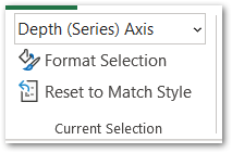
- Click on the Format Selection button or press ctrl+1. This opens the Format Axis Pane on the right of Excel sheet.
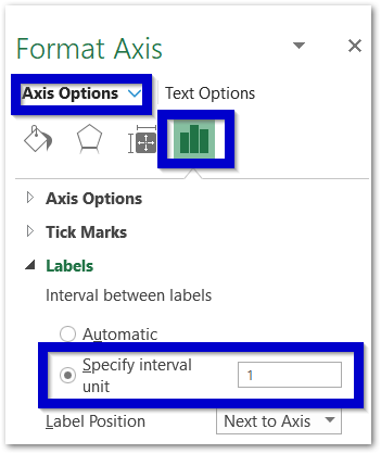
- Set the interval unit to 1 and you will see that the axis now represents all the cake types on it.
What makes the Surface Chart 3D?
Once we have some value of sales other than zero, these data points will rise upward ( in the direction of the Z-axis) and the plane blue sheet will spread in three dimensions:
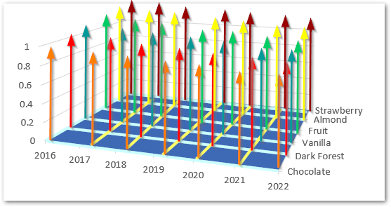
On the base of this blue sheet, you will see the intersection of blue and yellow-colored lines. These points are currently representing zeroes. If you change the source data then these points will rise from zero in the direction of the vertical arrows.
Let us update the source data for this chart to:-

The chart will automatically detect the changes and update itself.
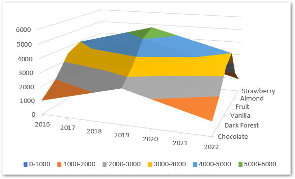
Changing and Formatting the Legends
The legends have been assigned a specific color and a range of values to which that color would be assigned. So there are basically two aspects in a legend that we can alter:-
- Range of Legends
- Color of Legends
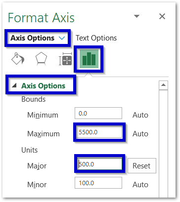
The legends get their range ( starting and end value) from the Z-axis intervals. Formatting the major units of the Z-axis will update the legends. To do so:-
- Double click on the Z-axis on the chart to select it.
- This opens the Format Axis Pane for Z-axis. Open the Axis Options
- The maximum bound is the maximum value on the scale of Z axis. Set it to 5500
- The Major unit is the gap between two consecutive axis labels on the Z axis. Set it to 500.
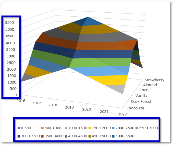
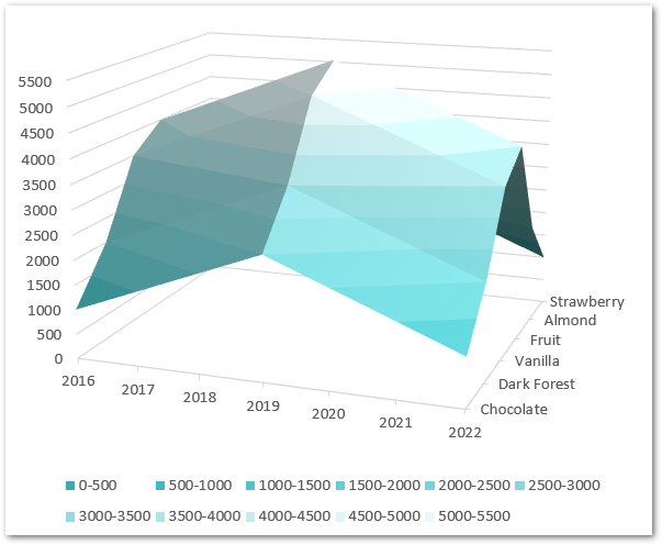
Consequently, this will update the legends range to 0-500, 500-1000, 1000-1500, 1500-2000…………5000-5500 as follows:-
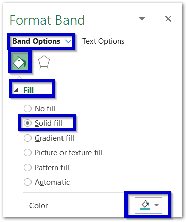
We can change the color of each legend from a darker shade of any color to going every time one shade lighter. To change the color of the band:-
- Double Click on the first legend 0-500.

- Press ctrl+1
- Select the solid fill color for this band as follows
Similarly, change the color of all legends to one shade lighter of the same color you have selected in the First Legend Entry. This is how the chart will look once done.
3D Rotation of 3D Surface Chart
Since this is a 3D chart, we can rotate it about any of its axes to see it from any angle. To rotate this chart simply select the Chart and press ctrl+1.
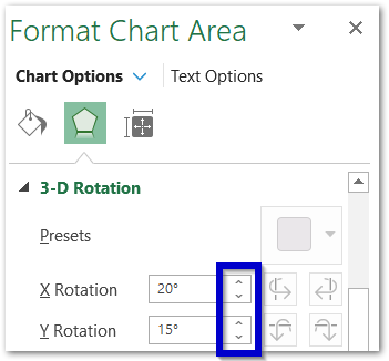
For instance, these buttons will let you rotate the chart about the X and Y-axis.
This brings us to the end of the blog.
Thank you for reading 😀
RELATED POSTS
- Column Chart in Excel – Types, Insert, Format, Clickable Chart
- Contour Chart in Excel – Inserting, Usage, Format
- Bar Chart in Excel – Types, Insertion, Formatting
- Stacked Column Chart in Excel – Usage, Examples, Format, Special Gridlines
- Format Chart Axis in Excel Charts – Axis Options – Fill and Line
- Make Your Own Chart Template in Excel

