In the previous blog, we learned the usage of Open High Low Close Chart in Excel. This is the next stock chart type and is quite easy to understand via this blog. Let us move ahead 😎
What is Volume High Low Close Stock Chart
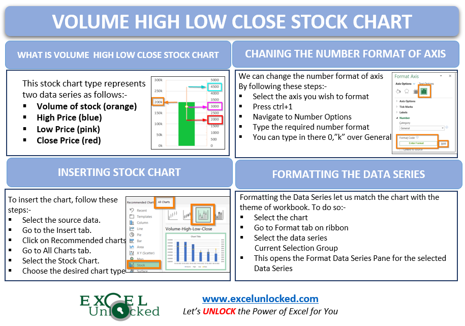
Stock Charts are basically used to show the stock trends in prices or the number of shares. One such important chart type is Volume High Low Close Stock Chart of Excel visualizing four data series as follows:-
- Volume :- It is the total number of shares traded in between that period.
- High Price – It is the maximum price of a stock for a period.
- Low Price – It is the minimum price that goes for stock in that period.
- Closing Price – This is the price of last trade for that period.
It is a kind of bar chart with additional functionality.
What do Axes Represent ?
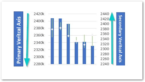
In this stock chart type, we would have one horizontal axis and two vertical axes. In earlier stock chart types we had one vertical axis to represent the data series with different kinds of stock prices. The vertical axis represents:-
- Primary Vertical – This is the axis at the left of chart and represents the scale for Volume of stock
- Secondary Vertical – This is the axis at the right of excel chart and represents the prices for stock (high,low,close)
- Primary Horizontal Axis –The labels represent an increasing time period. It could be seconds, minutes,hours, days, months or years.
Reading a Volume High Low Close Chart in Excel
We need to read the Volume of Stock traded from the Primary Vertical axis while any kind of price is to be read from the Secondary Vertical axis.
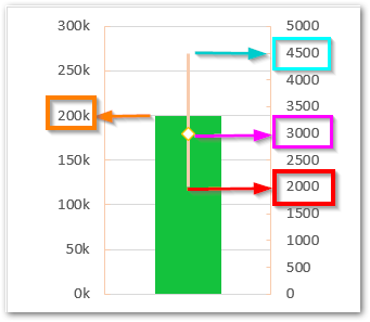
The arrows in the above figure indicate the axis for reading each data series.
- Volume – The Arrow in orange reads the volume
- High Price – The arrow in blue reads High Price
- Close Price – The arrow in pink reads Close Price
- Low Price – The arrow in red reads Low Price
Inserting a Volume High Low Close Chart in Excel
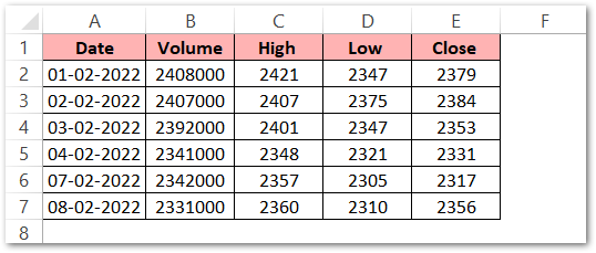
Let us say we have the stock data for a company as follows:-
To insert a stock chart simply:-
- Select the range of cells A1:E7
- Click on Recommended Charts button on the Insert Tab
- Move to the All Charts tab in the Insert Chart Dialog Box
- Choose the Stock Charts from the list
- Select the third chart type fromt there named as Volume High Low Close Chart
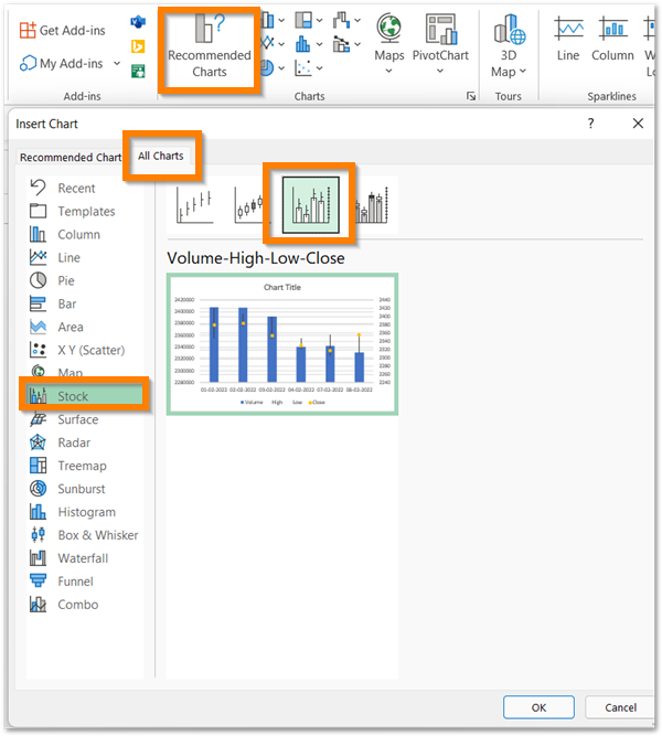
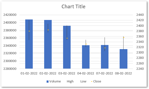
As a result, this will insert the selected stock chart type with default formatting.
Formatting the Stock Chart
The chart inserted by excel is raw and it needs to be formatted to make it more readable as well as to match it with the theme of your workbook (if any)
Changing the Number Format of Primary Vertical Axis
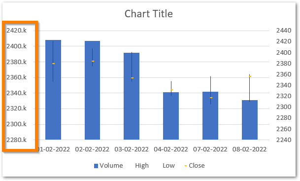
We can change the Number Format of the axis labels of the Vertical Axis so as to make it short and take up less space on the chart. As you can see that the Primary Vertical Axis Labels have three zeroes at the end of each label we can replace them with a “k” (thousand). To do so:-
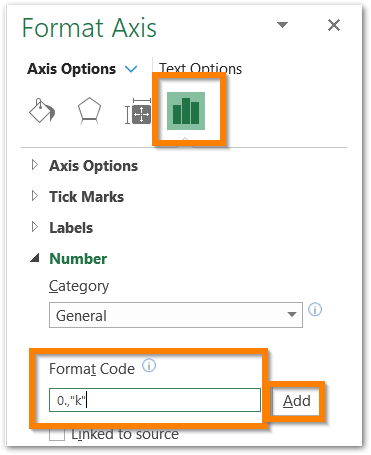
- Click on the Primary Vertical Axis of the chart to select it and then press ctrl + 1
- This opens the Format Axis Pane for the Primary Vertical Axis
- Go to the Number Options.
- Type 0,”k” over “General” and click on Add button
This will format the vertical axis as follows:-
Formatting Data Series on the Chart
We can format the data series on the chart so as to match it with any existing color scheme. In data series, we can either format the bars (volume) or the vertical line associated with it (prices). To do so:-
- Select the chart and go to Format tab on the ribbon
- Go to the Current Selection group and choose “Series Volume”.
- Click on Format Selection button in the Current Selection Group or press ctrl+1
The Format Data Series Pane must have opened.
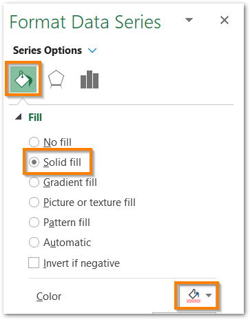
Choose the solid fill color for the Vertical Bars.
Now Select High – Low Line Options in the Format Pane to format it.
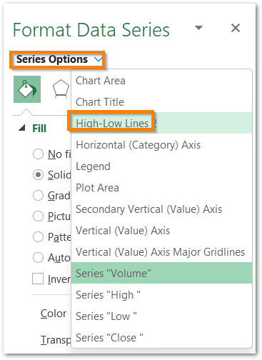
Consequently, you can now change the line color by using the Solid line.
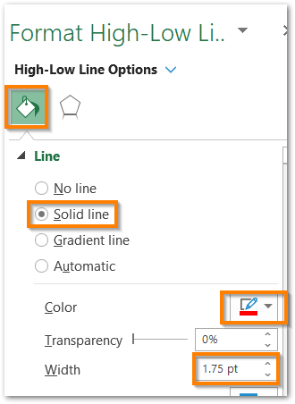
Choose the color of line to some dark color as we have selected the bar’s color as baby pink. Change the width of these lines to 1.75 pt to make them clearly visible.
The next thing is to add appropriate markers for the Closing Price. All you need to do is select “Series Close” from the Format Pane and then choose the markers type, size, and color.
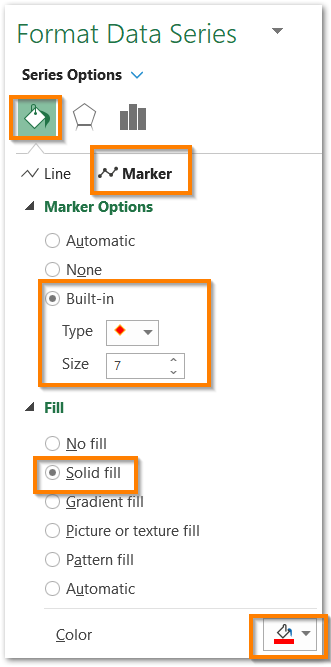
As a result, we have now beautifully formatted our chart’s data series in a shade of red.
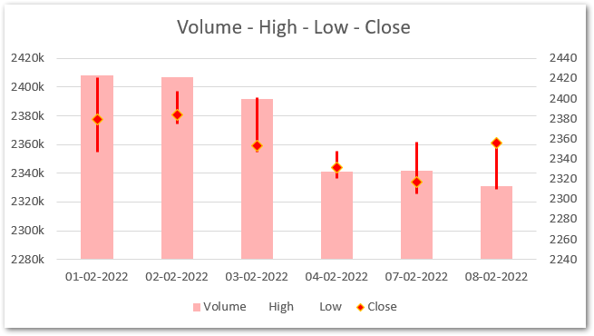
And this brings us to the end of the article.
RELATED POSTS
- Column Chart in Excel – Types, Insert, Format, Clickable Chart
- Trendlines in Excel – Types and Usage
- All About Chart Elements of a Chart in Microsoft Excel
- Introduction to Charts in Microsoft Excel
- Format Chart Axis in Excel Charts – Axis Options – Fill and Line
- Format Chart Axis in Excel – Axis Options
