In the earlier blog, we learned the usage of the High Low Close Stock Chart in it. We can display one additional piece of information using the Open High Low Close Stock Chart. Let us see how.
Here we go 😎
What is Open High Low Close Stock Chart
The Stock Prices can be represented by using the stock charts of excel. This stock chart type represents four data series though a single chart that is:-
- Open Price – The opening price at which an exchange opens for the day.
- High Price – This is the maximum value of price for the stock in that period.
- Low Price – This is the minimum price value of stock exchange.
- Close Price – This is the closing price of the last exchange for that period.
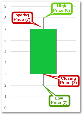
In a stock chart, we have the time on the horizontal axis while stock prices are on the vertical axis.
Up/Down Bars
The stock chart can have two types of bars as follows:-
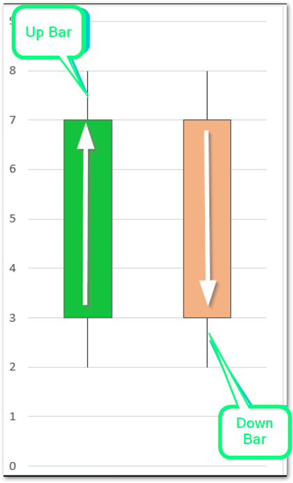
The different stock bars indicate a trend in price depicted as follows:-
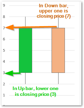
- Up bars – When the opening price is greater than the closing price then it forms an up bar.
- Down bars – When the closing price is greater than the opening price then it forms a down bar.
Inserting Open High Low Close Stock Chart in Excel
Let us say we have the Stock Price details of Reliance for a couple of days as follows:-

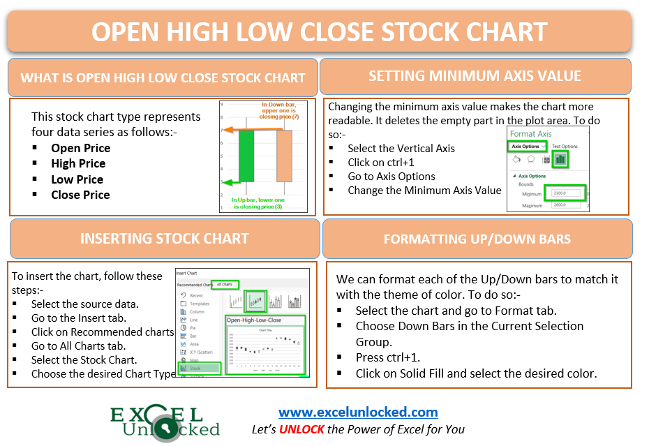
To insert the Open High Low Close chart, follow the below-mentioned steps:-
- Select the range of cells B2:E16 ( do not select the dates )
- Click on the Recommended Charts button in the Insert tab.
- Go to All Charts tab and choose Stock Chart from the list
- Select the second chart type from there.

Click ok. As a result, the stock chart with default formatting would be inserted in the current worksheet.
Adding Dates to Horizontal Axis
We cannot directly import the dates in the stock chart by selecting as source data of chart. Righ now we have 1,2,3,4,5…. up to 15. We need to replace this counting with the corresponding stock dates we had in our data. To change the horizontal axis labels:-
Also Read: High Low Close – Stock Chart in Excel
- Right Click on the chart and click on Select Data option from the shortcut menu.
- This opens the Select Data Source dialog box. Click on the edit button in the Horizontal Axis Labels section
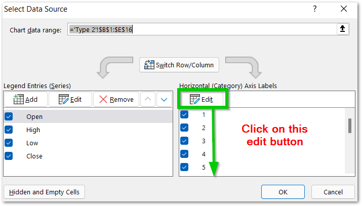
Select the range of cells A2:A16 and click ok. This will update the horizontal axis in the chart.
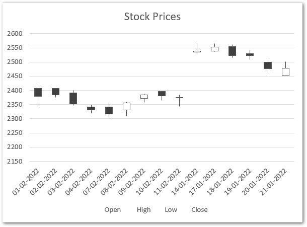
The black colored are Down bars while the white solid filled are Up bars.
Setting the Minimum Vertical Axis Value
We can change the minimum axis value for the vertical axis to reduce the empty space in the plot area to make the chart more readable. To change the minimum axis value of the vertical axis simply click on the vertical axis and press the ctrl+1 key together. This will open the format axis pane for the vertical axis of the chart.
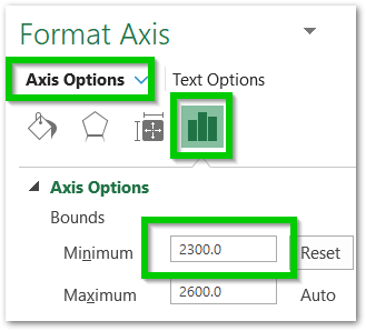
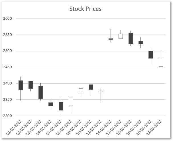
Enter the minimum axis value as 2300. As a result, the scale of the vertical axis will start from 2300 instead of 2150. This will remove the unnecessary empty space from the bottom part of the plot area on the chart.
Formatting the Up/Down Bars in Stock Chart
We can format each of the up/down bars and this will give a good presentation to the chart. To do so simply:-
- Select the chart and click on Format tab on the ribbon
- Choose “Down Bars – 1” in the Current Selection Group
- Click on the Format Selection button right below to it.
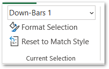
Consequently, this will open the Format Down Bars Pane at the right of the Excel window.
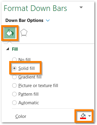
Click on the Solid fill and select the fill color for the down bars as red. Similarly, you can set the fill color of Up bars as green by selecting “Up Bars” in the current selection group.
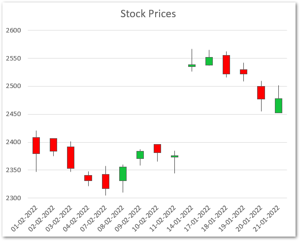
This brought us to the end of the blog.
Thank you for reading 😎
RELATED POSTS
- Column Chart in Excel – Types, Insert, Format, Clickable Chart
- Trendlines in Excel – Types and Usage
- Bar Chart in Excel – Types, Insertion, Formatting
- All About Chart Elements of a Chart in Microsoft Excel
- Format Chart Axis in Excel Charts – Axis Options – Fill and Line
- Line Chart in Excel – Inserting, Formatting, #REF! resolving
