Holding a cup of coffee in the morning while reading the stock prices from the newspaper, we all see that there is not just one kind of price mentioned in the paper. Stock Prices can be represented by using the stock chart and help us analyze the price trend properly. Excel has built-in charts for representing the stock prices.
Stock Charts and its Types
Stock charts are made especially for representing the data related to stock. Excel has four types of stock charts available as follows:-
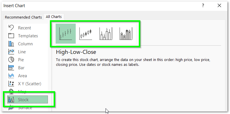
- High – Low – Close
- Open- High – Low – Close
- Volume – High – Low – Close
- Volume – Open – High – Low – Close
What is High – Low – Close Stock Chart
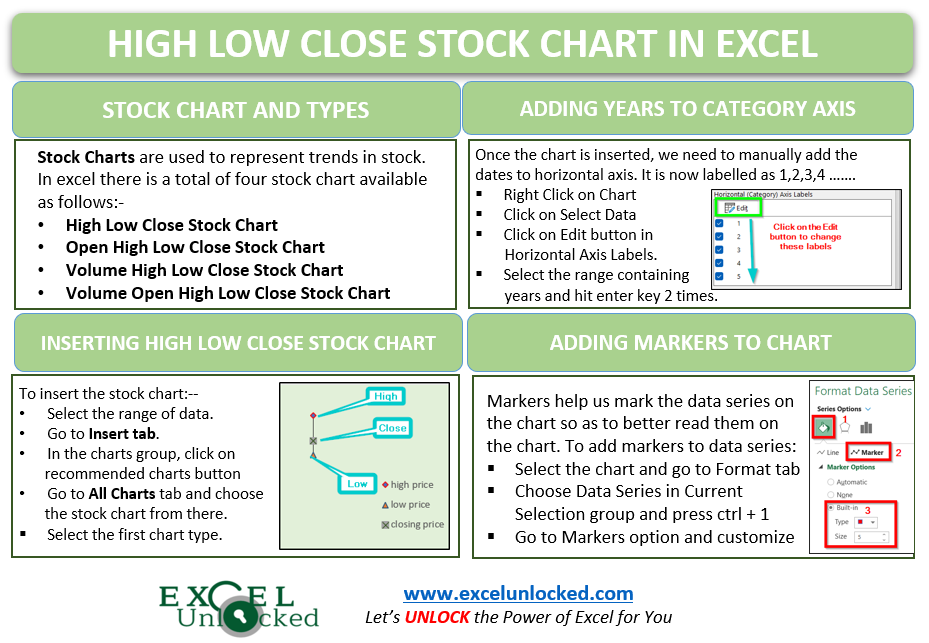
As the name suggests to you, the High – Low – Close Stock Chart represents the three data series named high price, low price, and closing price of a stock during a period.
- High price – It is the highest value of the stock price of a period.
- Low Price – It is the lowest value of stock price for a certain period.
- Closing Price – Closing price is the price of a stock when the stock exchange closed the shop.

Inserting High-Low-Close Stock Chart
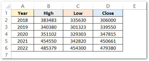
Let us say we have the Berkshire Hathaway – five-year stock price history as follows:-
Following are the steps to insert a stock chart:-
- Select the range of cells B2:D6 (do not select the year column).
- Go to Insert tab.
- In the Charts Group, hit the Recommended Charts Button.
- Go to All Charts tab in the Insert Chart Dialog Box.
- Click on Stock Charts from the list
- Select the First Stock Chart Type.

As a result, this will insert a default chart in the current worksheet as follows:-

This chart is hard to read as is just a dough that is yet to be baked to get it into shape. So let us start formatting it to get the required results.
Adding Years to Horizontal Axis Labels
We need to replace the 1,2,3,4 and 5 on the horizontal axis with years from our source data. To do so:-
- Right Click on the Chart.
- From the shortcut menu, click on Select Data option.
- Hit the Edit button in the Horizontal Axis Labels button.
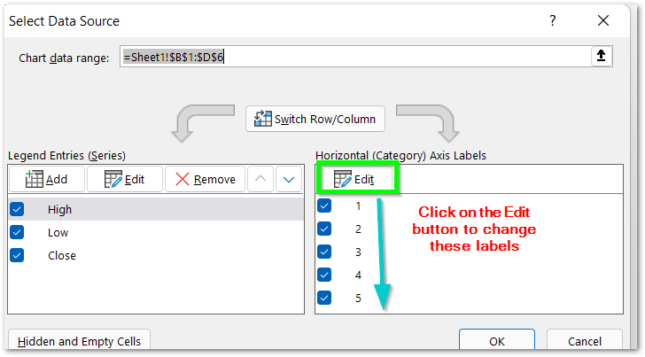
- Hit the Arrow button and select the range A2:A6
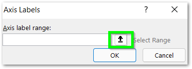
- Click OK. Consequently, it will update the Horizontal Axis Labels.
Double Click on the chart title and type “Berkshire Hathaway – five-year stock price” as the new chart title. You can delete the Gridlines in the chart:-
- Select the Chart
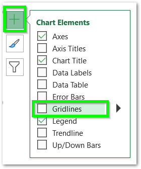
- Click on the + button on the top right corner of the chart
- Unmark the checkbox for the gridlines
As a result, these are the changes in the chart:-
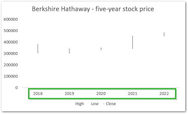
You can learn more about adding/deleting chart elements.
Changing the Minimum Axis Value
The chart is not readable by now as the scale of the vertical axis is not correct.
- Select the Chart
- Go to Format Tab on the ribbon
- Choose Horizontal Axis in the Current Selection Group
- Click on Format Selection Button

This will open the Format Axis Pane for Horizontal Axis.
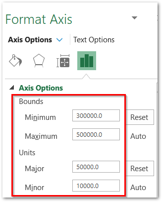
- Click on the Axis Options.
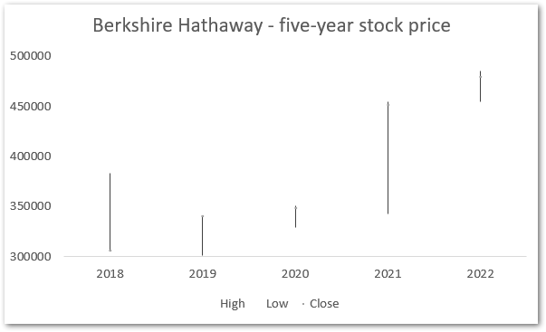
- Set the value of Minimum Bound as 300000.
- In the unit section, mark the Major value as 50000.
Adding Markers to the Stock Chart
There is a total of three data series in this one chart. We can add markers for each of them so that we can read them properly. We can add markers to each of the data series one by one.
- Click on the Chart
- Go to Format tab on the ribbon
- Select the “Series High” in the Current Selection group. (step 3)
- Click on the Format Selection button
- This opens the Format pane for the High Price data series
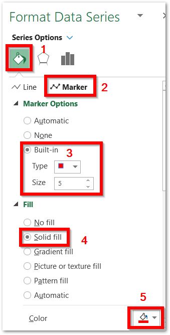
- Click on the Marker Options and Click on Built-in Marker. Choose the marker type and set the size to 5.
- You can also change the Fill Color of the Marker using Solid Fill.
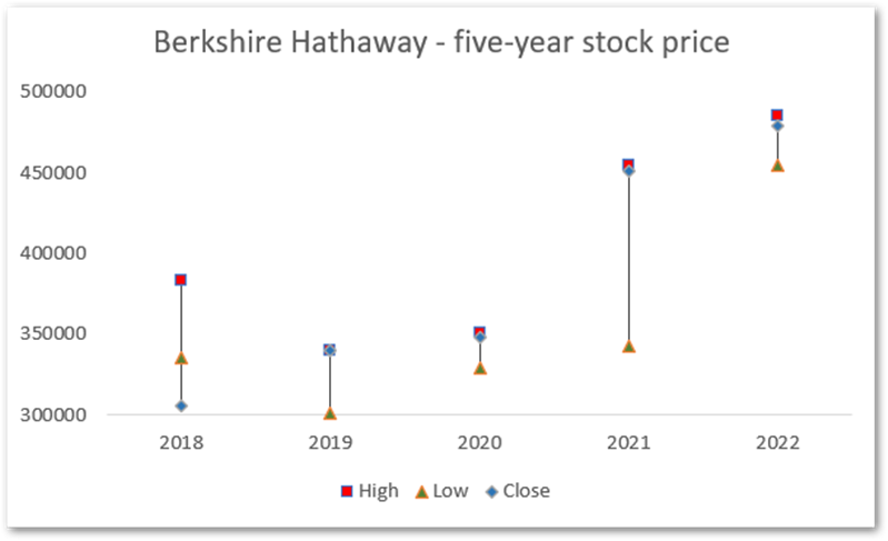
Similarly, we can change the color of markers for the rest of the two data series. All you need to do is Select “Series Low” and “Series Close” simultaneously. As a result, this is how the chart looks now:-
We have reached the end of the blog.
