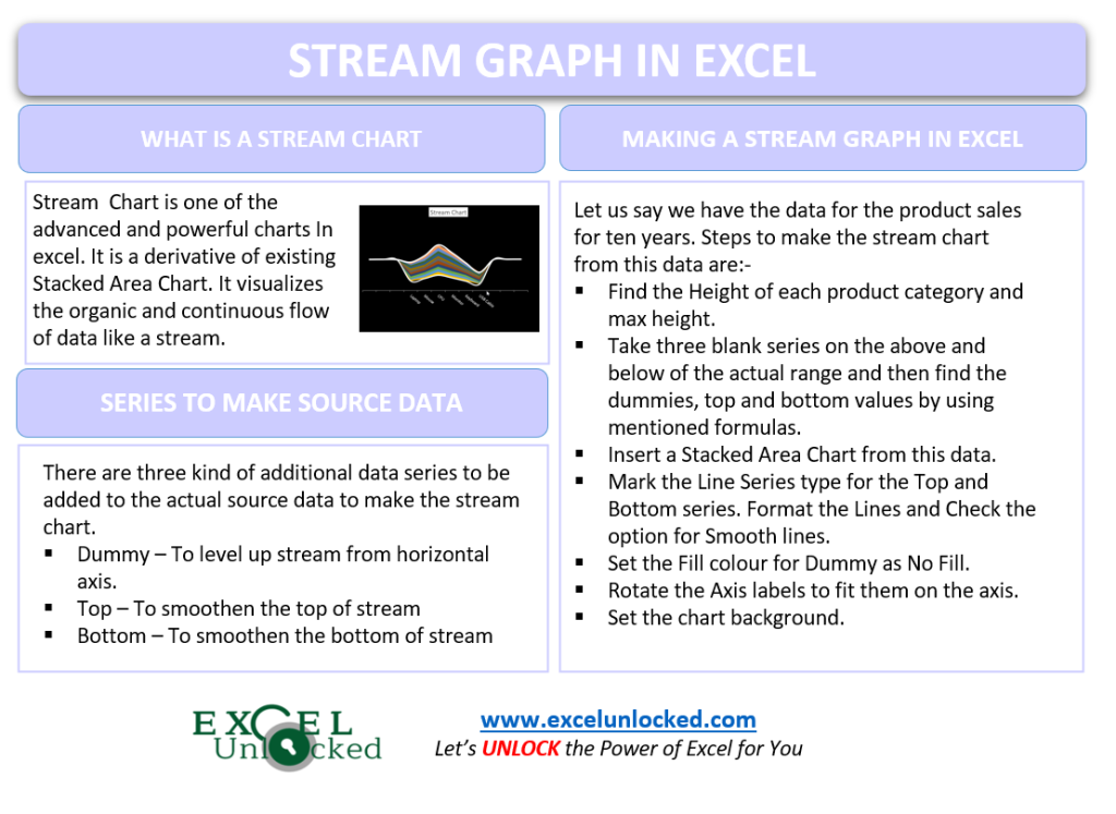
Stream Chart is one of the advanced and powerful charts in Excel. It is a derivative of the existing Stacked Area Chart. The chart is useful to study the trends in data with respect to time. Let us see how the chart works.
What is a Stream Graph in Excel?
Stream Graph visualizes the organic and continuous data flow in a smoothened way. It can represent both positive and negative values. The simplest Stream Graph would look something like this:-
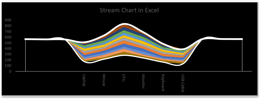
So in this chart, you can see that the data is continuous and is flowing in the shape of a stream which is why the chart is named a stream chart.
Making a Stream Graph in Excel!
Making a Stream chart is not intimidating at all if we divide the process into steps. Let us suppose we have the sales of different company products for ten years as follows:-

Arranging to get the required Source Data
We need to set the above data set into a required form so as to get the Stream Chart. Add three Columns at the Right of Column A and three rows below the Row 1as follows:-

Red arrows and Orange arrows indicate the freshly added columns and rows respectively.
Now the next step is to find the Maximum Height. Height is the total sale for each product. Use the SUM function for that. Apply the formula in cell Q5 and copy it down up to Q10.
=SUM(E5:)5)

We have found the Maximum value of height as 551 by using the MAX Function.
Now name Columns B C and D as Dummy, Top, and Bottom respectively. Dummy is the value that will make the stream rise at a level from the Horizontal Axis. The top and Bottom are will form smooth lies at the top and bottom of the stream to curvify it. Use the following formula in ranges B2:B4 and B11:B13.
=$Q$11+RANDBETWEEN(10,20)
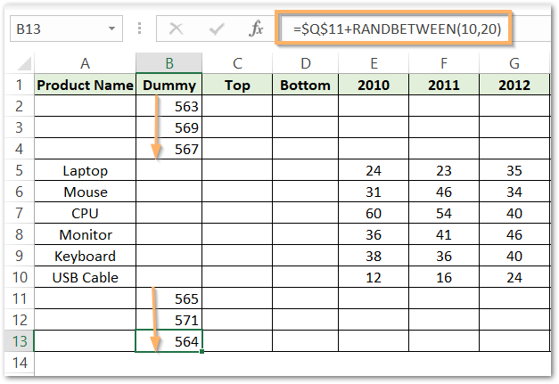
Now copy these values in the adjacent Top and Bottom values.
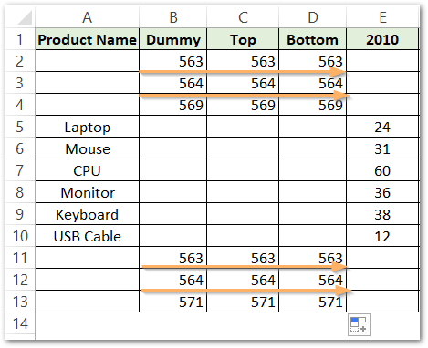
After this, we will get the dummy, top, and bottom values for the actual products. Use the following formula in cell B5 and copy it down up to cell B10.
Also Read: Sparkline in Excel – Insert, Edit and Delete
=Q5/2+RANDBETWEEN(1,10)
For the Top, enter the formula in cell C5 and copy it down up to cell C10.
=Q5+B5
The final one is Bottom. The Bottom of the stream would be the same as the Dummy since the Bottom of the Stream starts from the level which is stacked right on the Dummy. Therefore, use this formula in cell D5 and copy it down up to the D10 cell.
=B5
These are our resultant values.

Making the Stream Chart
This data has six Products as Categories to be plotted on Horizontal Axis (A5:A10) while 13 Data Series ( Top, Bottom, Dummy, and ten years sales ). We need to use a Combo Chart, where each series can have a different type. We are going to use Line Data Series for Top and Bottom while Stacked Area Chart for Dummy and ten yearly sales. To do so:-
- Select the range of cells A1:O13
- Go to the Insert tab on the ribbon and click on Recommended Charts button under the charts group.
- Navigate to the All Charts tab and Choose the Stacked Area Chart. This will make all data series to be of stacked area types.
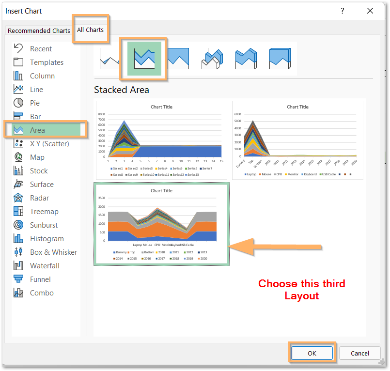
- Click Ok and this inserts the Stacked Area Chart on the Current worksheet. Right Click on any one Data Series on the Chart and then choose the option for Change Series Type.
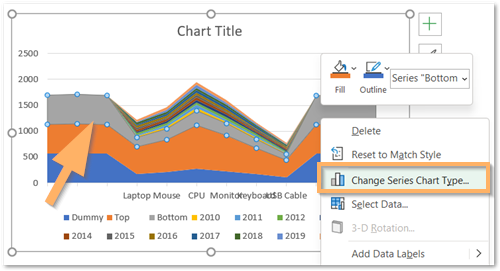
From there, set the series type for Top and Bottom as Line.
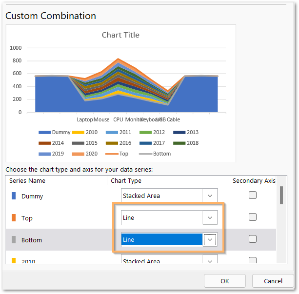
Click Ok and the chart will look just like shown in the preview above.
Formatting the Stream Chart
We will now give proper look at our chart as we are now almost done.
Hiding the Dummy
A dummy at the bottom of the stream stack was required only to level up the stream. In order to hide it, select the series for Dummy on the chart and press the ctrl 1 key. Mark the Fill as no fill.
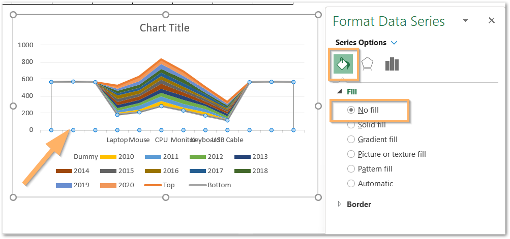
Delete the Gridlines, Vertical Axis, and Legends by simply selecting and pressing the Delete key.
Making the Smooth Stream
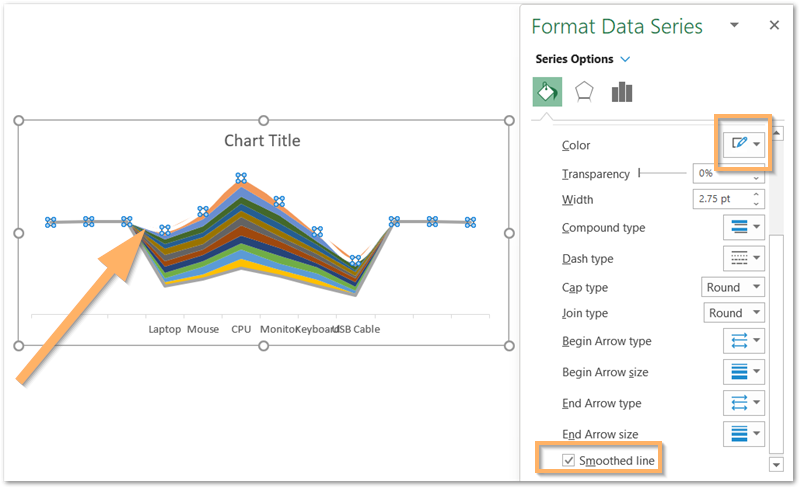
With the Format Data Series pane opened, select the Top Series on the Chart. Set the Solid Line-color as white and mark the option for a Smooth line. Repeat the Procedure for Bottom Line as well.
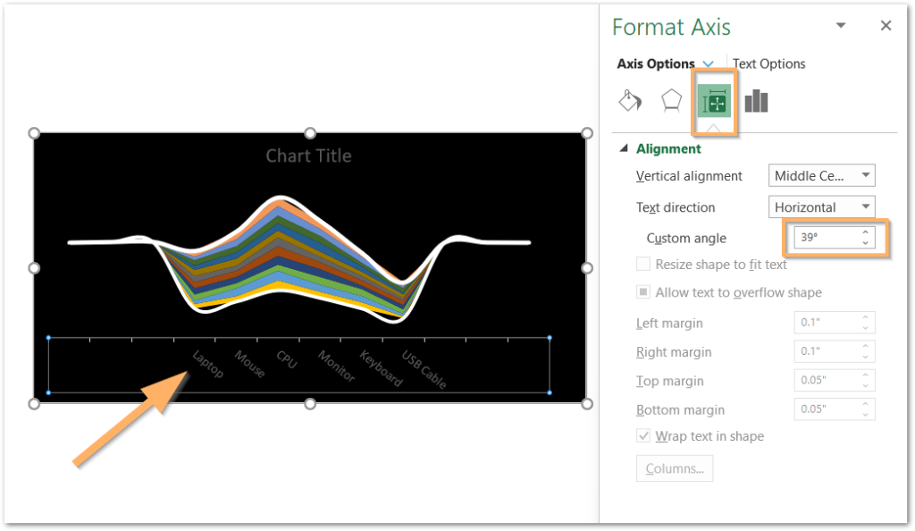
Set the Chart background to Black. Select the Horizontal Axis on the chart and set the custom angle got the Axis Labels as 39 degrees. This will make them not overlap.
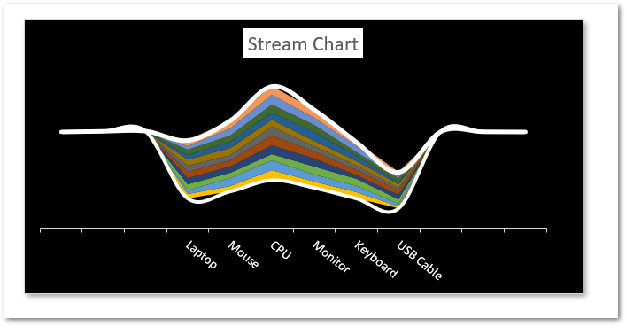
Change the Fill color and Font Color for the Chart Title and Axis Labels to white. Our Stream Graph in Excel is finally completed.
Consequently, this brings us to the end of the blog.
Thank you for reading.
RELATED POSTS
- Stacked Column Chart in Excel – Usage, Examples, Format, Special Gridlines
- Trendlines in Excel – Types and Usage
- High Low Close – Stock Chart in Excel
- Column Chart in Excel – Types, Insert, Format, Clickable Chart
- Step Chart in Excel – Step vs Line, Insert, Working
- Tornado Chart in Excel – Usage, Making, Formatting

