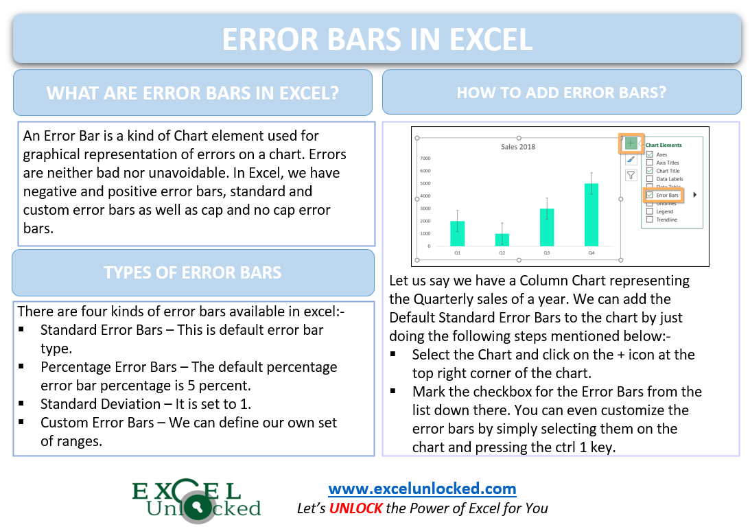
Error bars are one of the important Chart Elements in Excel. They are used in many kinds of charts in Excel including Column charts, Bar charts, Line Charts, and Area Charts. We can add both the horizontal as well as the Vertical Error Bars in the XY Scatter Plot and Bubble Chart. Let us see how they work.
What are Error Bars in Excel?
An Error Bar is a kind of Chart element used for the graphical representation of the errors on a chart. Errors are neither bad nor unavoidable. Rather, errors in any result become the base for further research and investigation while the errors in business analysis prevent us from any future damage.
In Excel, we have positive and negative error bars, Standard and Custom Error Bars as well as Cap and no Cap error bars. We can even format them as per the theme of the chart and the worksheet.
Types of Error Bars
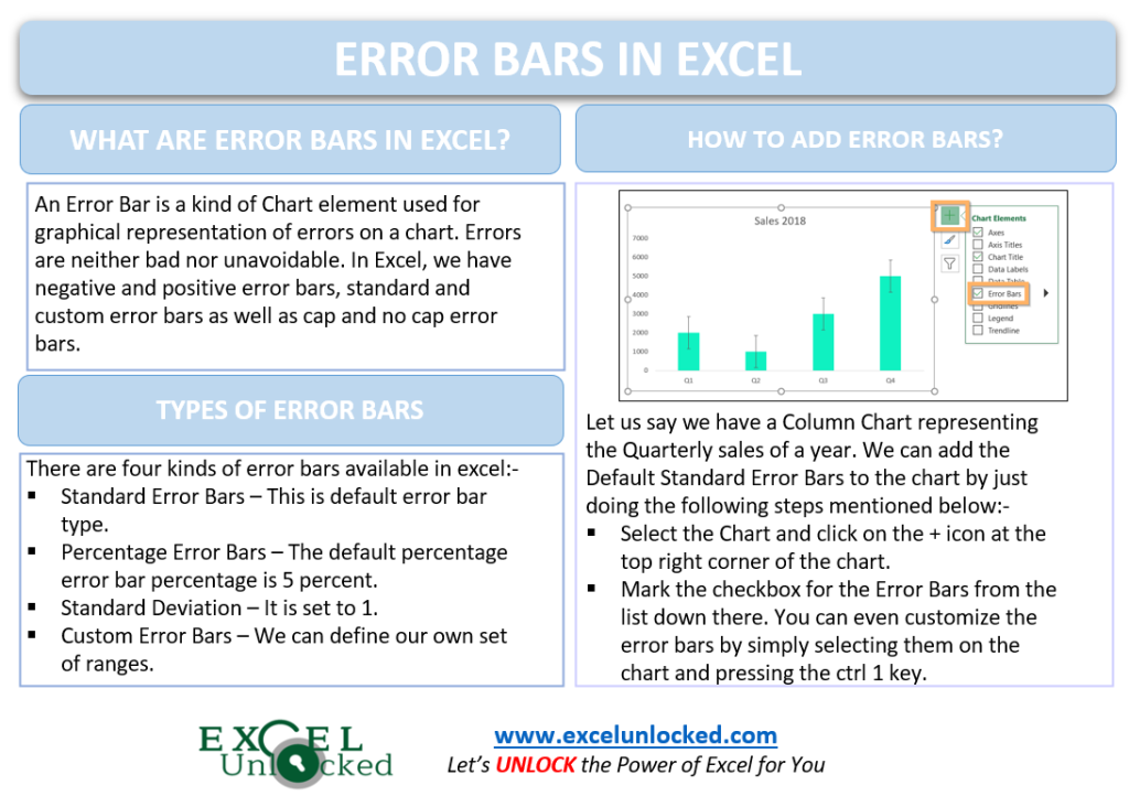
There are mainly four different types of Error Bars available to add to our charts as follows:-
- Standard Error Bars – This is the default error bars type. It helps in depicting the error in the mean for all values.
- Percentage Error Bars – By default, the value of percentage error is 5% of the total value the data point represents. We can change the value of the percentage error that we want on our chart.
- Standard Deviation – By default, the charts are plotted with error bars having a standard deviation set to 1. It shows how close is the data to the mean value.
- Custom Error Bars – We can define the ranges of cells for both the positive and negative error values. Those ranges can contain any formula like mean or standard deviation. You can learn about Custom Error Bars from here.
Example 1 – Adding Standard Error Bars to Column Chart in Excel
Here we have inserted a Column chart representing the Quarterly sales of a year. We will start by adding the Standard Error Bars ( default type ). To do so:-
- Click on the Chart and hit on the + button on the top right corner of the chart.
- Mark the option for Error Bars from the list.
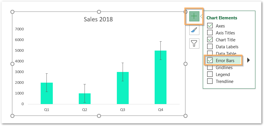
As a result, this inserts the standard error bars on the chart.
Similarly, we can add Error Bars to the Bar Chart as well. The error bars for a bar chart will be horizontal.

Example 2 – Adding Percentage Error Bars to the Line Chart in Excel
In this example, we have taken the Line Chart representing the Actual vs Target Sales for a year. Add the Error Bars to the Chart and then go to the More Options button.
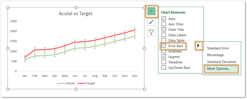
Once you click on More Options, choose any one data series since we can’t alter the data bars for both lines at the same time.
By now, we have added the Standard error bars and we will now change the type from the Format Error Bars pane.
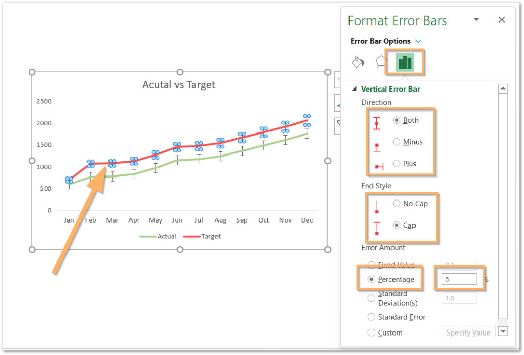
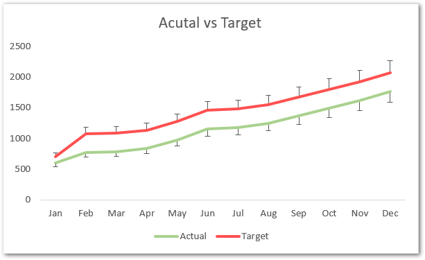
From here, you can set the error amount to a percentage ( You can also try the Standard Deviation Error Bars from here) and even change the percentage value. We can even change the bar direction. We are taking Plus bars for Target and Minus Bars for Actual Series with error bars of 10 percent.
Example 3 – Adding Error Bars to XY Scatter Chart
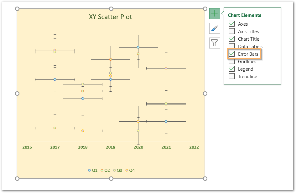
Here when we add error bars to XY Scatter Chart, both the Horizontal and Vertical Error Bars are added automatically.
This brings us to the end of the blog.
Thank you for reading.

