In the earlier blog, we did the usage of a static Pictograph Chart which is nothing but a bar chart with icons used to represent the magnitude of each category in the series. The limitation of a normal Pictograph chart is that we can only represent one kind of data series with it. With the use of an Interactive Pictograph Chart in Excel, we can represent multiple data series. by adding buttons to represent each data series at a time. You must learn to make a normal Pictograph before moving on to the Interactive one!
Usage of an Interactive Pictograph Chart in Excel
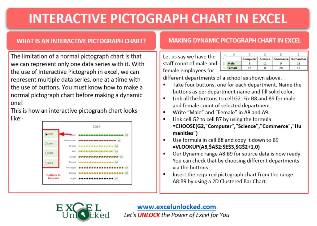
We can represent multiple kinds of data series by using an Interactive Pictograph Chart. We can add buttons to show one data series at a time on the chart.

You can see above that we have represented the sales for four years by using only one chart. We have made buttons to represent the sales of fruits for different years.
The number of buttons we used, would always equate to the number of Data Series we want to represent.
Making of an Interactive Pictograph Chart
Let us say we have the men and women staff count of different departments of a college as follows:-

We will now make the Interactive Pictograph in steps.
Inserting the Buttons
We need to take four buttons since there are four departments. To add a button, all you need to do is:-
- Go to the Developer Tab on the ribbon ( If you do not have the developer tab on the ribbon, go to Excel Options. Find the Option for Customize ribbon and mark the checkbox for Developer Tab in the main tabs.
- In the Controls group, click on the Insert button. Select the round button from the Form Controls
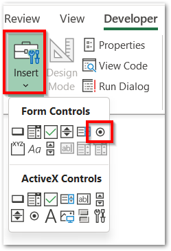
- Drag the + cursor on the screen to get the button. Right-click on the button to change its default name to Computer as the department name. Once you type the name, press the escape key to come out of the button name edit mode.

- Similarly, take three more buttons for the other three departments and place them in the current order.
- Select all four buttons ( Select one button and press Ctrl-a ), go to the Shape Format tab on the ribbon, and set the Fill color for the buttons.
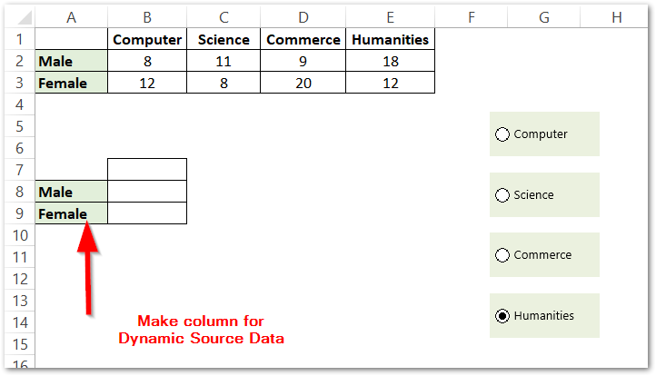
We will now link these buttons with cell G2. Right Click on the button for Computer and click on the Format Control option. Set the cell link to G2.

Doing this will assign that cell with the button index that has been marked out of four. G2 will contain 1 when Computer is selected, 2 when Science, 3 when Commerce, and 4 when Humanities button is marked. G2 acts as the driver cell.
Linking Driver Cell (G2) to Actual Data Series
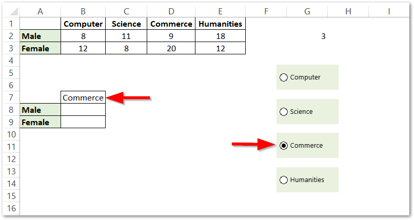
We need to use this formula in cell B7.
=CHOOSE(G2,"Computer","Science","Commerce","Humanities")
We have used the Choose Function here. AS a result, whatever Department we choose on the button, will appear in cell B7.
Preparing the Dynamic Source Data
Now the final step is to get the source data updated according to whatever department the cell B7 contains. Use the following formula in cell B8.
=VLOOKUP(A8,$A$2:$E$3,$G$2+1,0)
Copy this formula down to cell B9 to get the Female Count.
We have used the VLOOKUP Function of Excel to get the values corresponding to the department contained in cell B7.
As a result, this creates our dynamic Source Data A8:B9. Now make a Pictograph with this range as follows:-
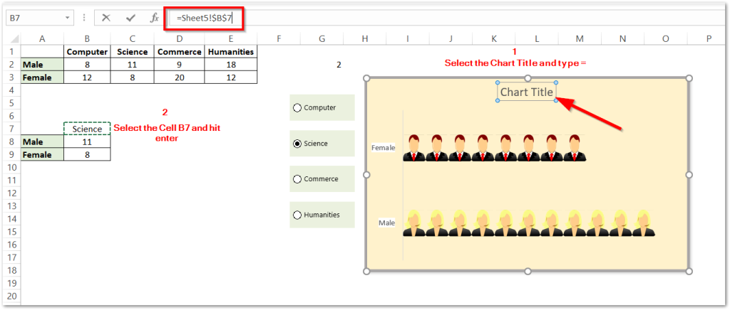
We are using the Formula for making the Dynamic Chart Title. Just Select the Chart Title and press =. Select Cell B7 and hit enter.
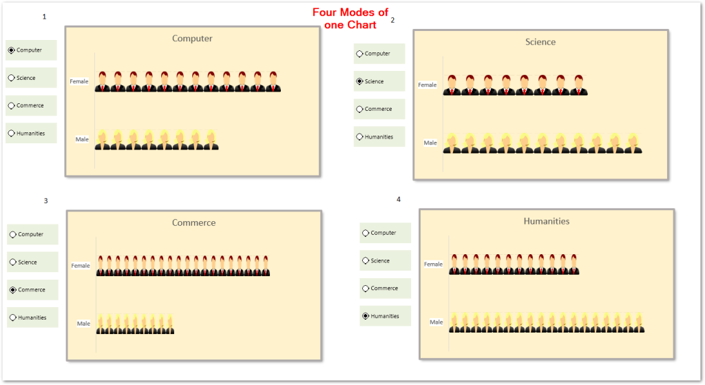
Consequently. this brings us to the end of the blog.
Thank you for reading.
RELATED POSTS
- Tutorial – Record and Run a Macro – Real Life Example
- All About Chart Elements of a Chart in Microsoft Excel
- Stacked Column Chart in Excel – Usage, Examples, Format, Special Gridlines
- Introduction to Charts in Microsoft Excel
- Bar Chart in Excel – Types, Insertion, Formatting
- Gantt Chart in Excel – Usage, Insertion, Formatting

