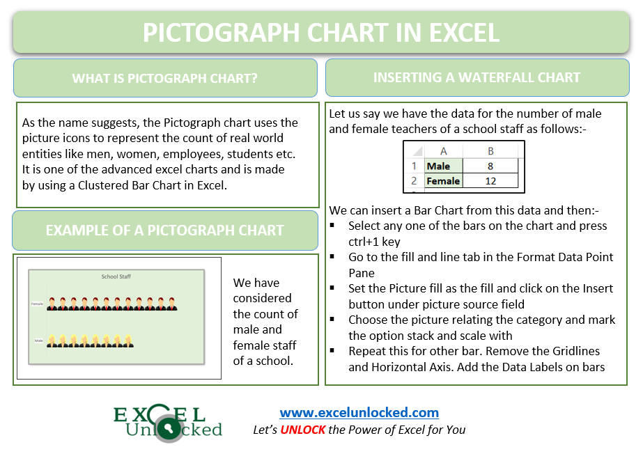
Pictograph Chart in Excel is a useful chart for visually representing the real-world object count. There is no pre-existing chart type for the Pictograph chart. Since this is one of the advanced excel charts, we can make it by using the Bar Chart in Excel. Let us see how the chart works.
What is a Pictograph Chart in Excel?
A Pictograph chart uses small icons to define the magnitude of values of real-world entities like males, females, employees, students, etc. Those icons are chosen on the basis of the category they represent. For instance, look at the following pictograph chart for the employees of a company belonging to different age group categories.
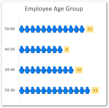
So you can see here that each person icon is representing one person. Therefore there are twelve icons in the first topmost bar since there are twelve employees in the age group of 50-60.
This is how we read a Pictograph chart. Now let us start making one!
Making a Pictograph Chart in Excel
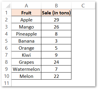
Let us suppose we have the sales of different fruits of a City Mall as follows:-
Inserting the Bar Chart
We will start making the pictograph chart by first inserting a Bar Chart from the above range of cells A1:B10
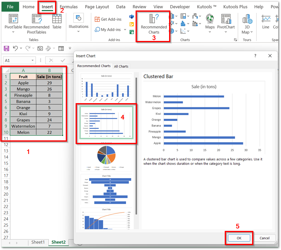
This will insert the bar chart as shown in the Preview.
Adding icons to the Bar Chart
Adding icons to the inserted bar chart will make it convert into a Pictograph Chart. All you need to do is:-
- Select the Bar for Melons on the chart and press the ctrl 1 key. Make sure that not all bars are selected.
- From the Format Data Point pane, set the Bar Fill to Picture or texture fill. Click on the Insert button below the Picture Source field. You can add the picture and there are four options for it.
- We are inserting an icon for melons in the Online Picture utility.
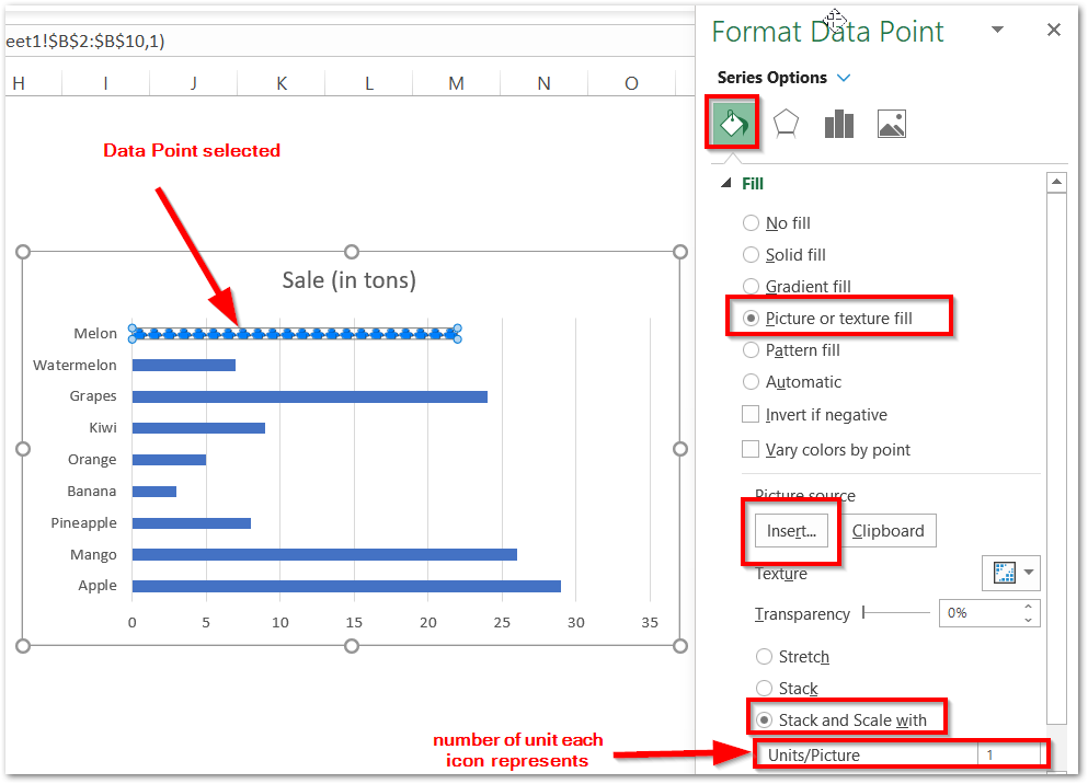
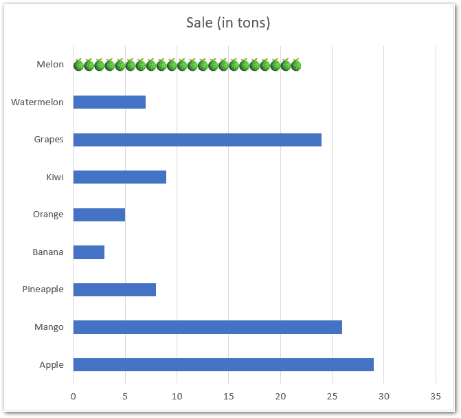
- Mark the option for Stack and Scale with. You can also change the value of units one icon represents from the Units/Picture option if required. This is how our chart looks after inserting the melons:-
Similarly, we can add icons for other fruit categories to get the chart.
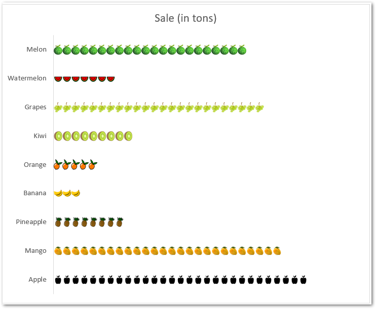
We have deleted the Gridlines and Horizontal Axis by simply selecting and pressing the delete key.
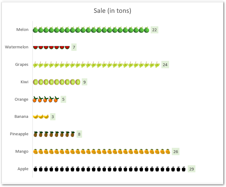
We can even add data labels to make the chart more readable as follows:-
Example 2 – Pictograph Chart in Excel
Let us say we have the number of Male and Female Staff in a School as follows:-
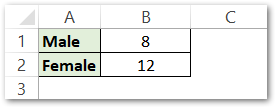
We will insert the Bar chart from this data and then add the desired icon for males and females to get the resultant chart:-
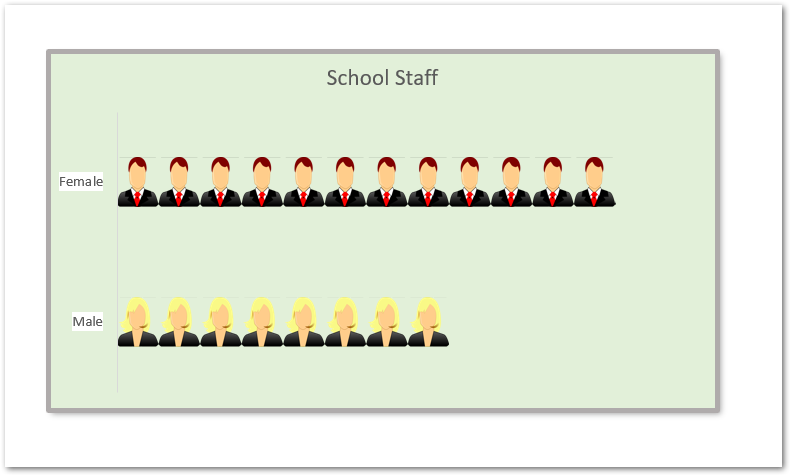
In the above chart, we have changed the chart background color to light green. To change the chart background:-
- Select the entire chart and go to the Format tab on the ribbon.
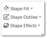
- Go to the Shape Styles Group and set the Shape Fill and Border color. Add the desired shadow effect also.
Consequently, this brings us to the end of the blog.
Thank you for reading.
RELATED POSTS
- Population Pyramid in Excel – Usage, Making, Formatting
- Pie Chart in Excel – Inserting, Formatting, Filters, Data Labels
- Pie of Pie Chart in Excel – Inserting, Customizing, Formatting
- Stacked Column Chart in Excel – Usage, Examples, Format, Special Gridlines
- Stacked Bar Chart in Excel – Usage, Insert, Format
- Introduction to Charts in Microsoft Excel
