Waterfall Chart in Excel is a pre-existing chart also known as Bridge Chart, Flying Bricks Chart, or Mario Chart. This chart is used in many industries for Quantitative Analysis. Let us see how the chart works.
What is a Waterfall Chart?
As the name suggests, the Waterfall chart has a similar look to that of an actual Waterfall, but the data keeps flowing instead of water. In a Waterfall chart, we have the bars representing the cumulative relationship with the previous bar. The value represented by the previous bar acts as the base value for the next bar ( from where it arises ).
We can only represent the Cumulative kind of data with the help of this chart.
For example, let us say we have the sales of 2018 and 2019 as 1 Million and 1.5 Million. The first bar for 2018 will start from zero and its height will go up to 1 Million on the Vertical Axid scale, while the second bar for 2019 will start from 1 Million (The value of the first bar becomes the base for the next bar ) and the height of bar would be 1.5 Milion. The bar would be 2.5 Million away from the Horizontal Axis.
Connection Lines will join the end of the bar and the base of the consecutive bar.

Components of a Waterfall Chart
Let us say we have the sales of a company and we have prepared a Waterfall Chart with sales value for the years 2018, 2019, and total sales before 2018 as follows:-
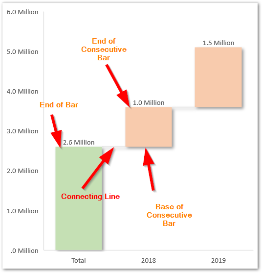
Here the magnitude of the Total is 2.6 Million which is the base value for the next 2018 sales. The 2018 sales are 1 Million but the actual value of sales by 2018 is 1+2.6=3.6 Million.
In the above Waterfall, you will notice the following chart components:-
- Total – Total acts as the base value from where the deviation starts with increasing time.
- Positive Bars – These are used to represent the positive change in the previous bar value. In other words, we can say that the value has increased with time.
- Negative Bars – They represent the decrease in the Total Value.
- Horizontal Axis – has the categories for Total and increasing time.
- Vertical Axis – has the scale for reading the bar magnitude.
Making a Waterfall Chart in Excel
Let us say we have the transaction details of a bank account as follows:-
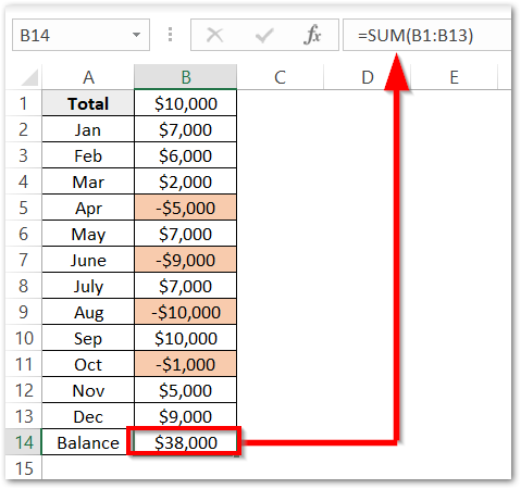
In this data, the Total is the total money in the account before January. Column B has the list of Transactions. Negative Transactions are highlighted for money withdrawal.
We have used the SUM Function to get the closing account balance of all the positive and negative transactions at the end of the year.
To insert a Waterfall Chart from the above data:-
- Select the range of cells A1:B14.
- Go to the Insert tab on the ribbon.
- Click on the Insert Chart button in the Charts Group and select the Waterfall Chart from there.

This inserts the Waterfall Chart with the default formatting as follows:-
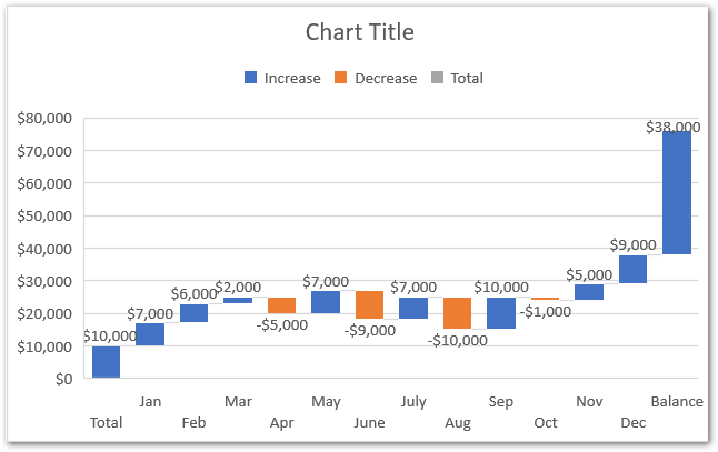
Here you can see in the legend key that there are three kinds of bars each of them representing Total, Increase and Decrease.
Formatting the Waterfall Chart in Excel
We can format the chart to get the desired color scheme. We can do this in a number of steps.
Marking the Balance as a “Total” Bar kind
Total in the Chart is the Bar whose base starts from zero ( right from the horizontal Axis ). There is the first Category named Total which starts from zero and the last category named Balance which is the closing balance.
We need to assign both the Total (opening balance) and Balance (Closing Balance) to Total Bars. Select the bar for Balance and Right Click. Click on the option Set as Total.
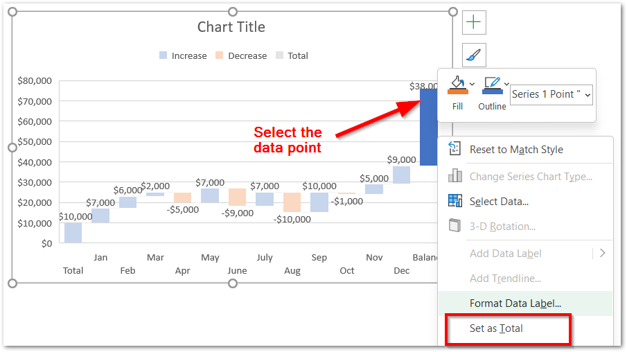
Repeat the same procedure for the Total Data Point to get the chart as follows:-
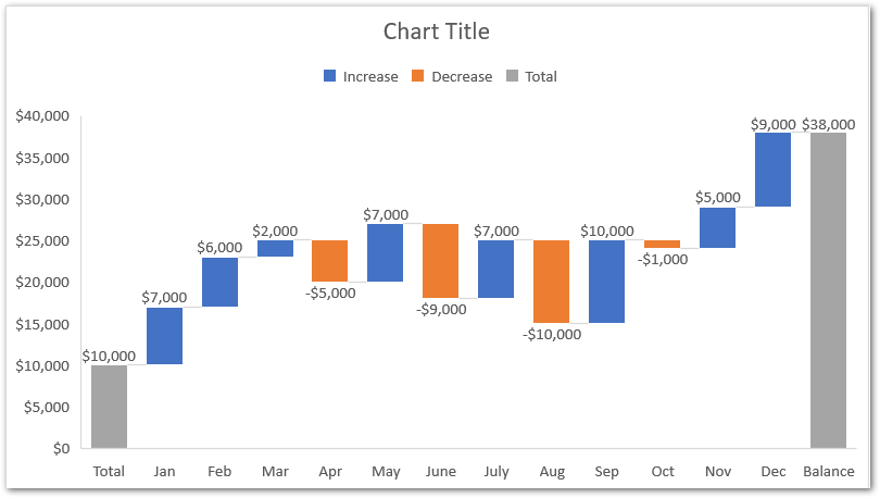
Now both the Total and Balance start from the Horizontal Axis.
You can Delete the Gridlines by just selecting them and then pressing the Delete key on your keyboard.
Formatting the Bars
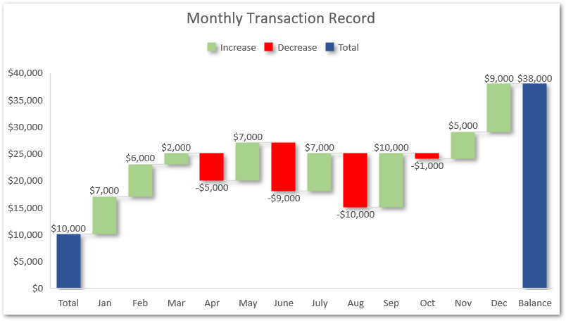
We can change the fill color for all three kinds of bars and even add effects to each of them. All you need to do is:-
- Double Click on the legend key for Increase on the Chart. Make sure that all the legends are not selected and then press the ctrl 1 key.
- Choose the Fill color and effect from the Format Legend Entry Pane.
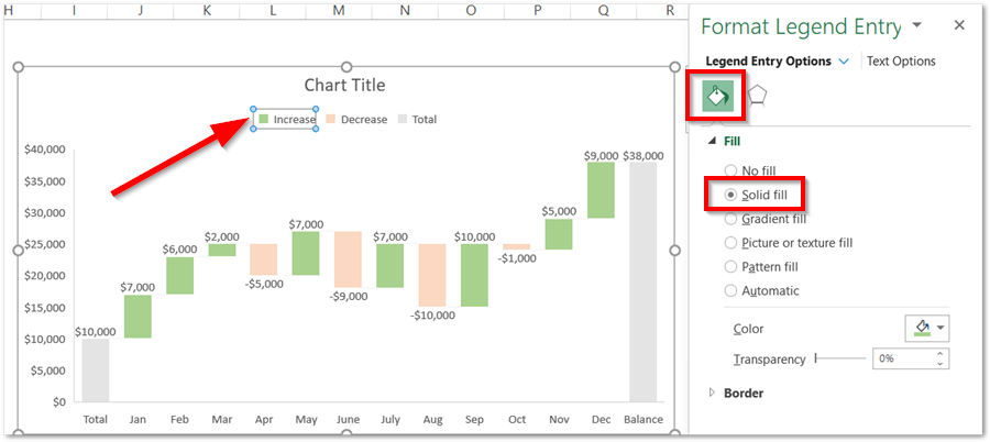
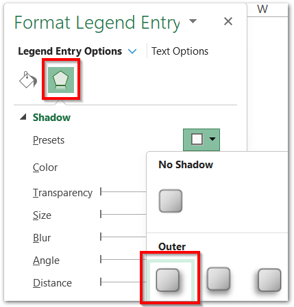
- Add Shadow Effect to the Bars.
Similarly, we can format the bars as follows:-
This brings us to the end of the blog.
Thank you for reading.
RELATED POSTS
- Bar Chart in Excel – Types, Insertion, Formatting
- Column Chart in Excel – Types, Insert, Format, Clickable Chart
- Radar Chart in Excel – Components, Insertion, Formatting
- Sparkline in Excel – Insert, Edit and Delete
- Stacked Bar Chart in Excel – Usage, Insert, Format
- Tornado Chart in Excel – Usage, Making, Formatting

