The Population Pyramid is one of the advanced excel charts. It is made up of the pre-existing Bar Chart in Excel. Let us see how the chart works.
What is a Population Pyramid in Excel?
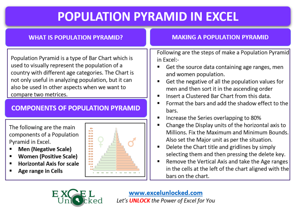
The Population Pyramid is nothing but a bar chart representing the population of a country in different categories of gender and age. The chart is not only useful to study the population, but we can make this chart for some other kinds of data also. The structure is closely similar to a Tornado Chart.
Components of a Population Pyramid Chart
Let us suppose that we have the population pyramid made up of a country’s population as follows:-
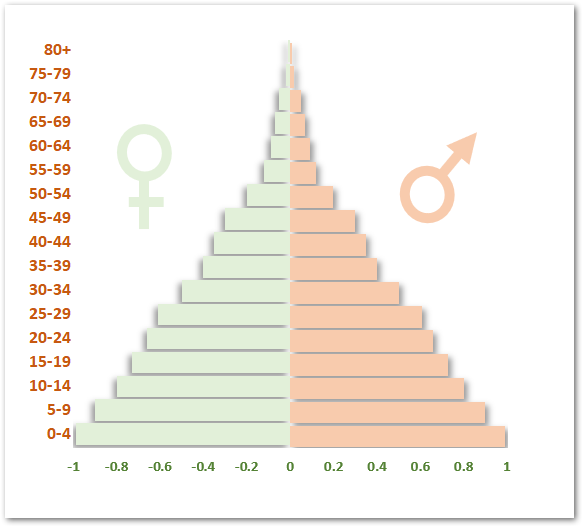
In the above chart you can see that:-
- The Chart does not have a Vertical Axis. The place of Axis labels has been taken by the cells in excel containing the population ranges.
- From the Horizontal Axis, we can read the values that each Population bar represents.
- One Data Series is represented on the Negative Scale of the Horizontal Axis while the other is on the Positive Scale. For example, the number of men and women in the population\
This chart is called the population pyramid since the data is sorted from largest to smallest values so that the bars form a peak at the top of the chart.
Making a Population Pyramid in Excel
Let us say we have the population of India divided into different age groups as per the census 2020 as follows:-
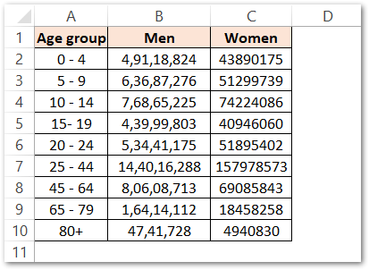
To make the Population Pyramid from the above data, follow the steps mentioned below:-
Arranging the Source Data
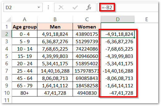
Since we have two columns in total for men and women each, we need to assign each of them to negative values so that one of them could be on the left side of the chart.
Use the below-mentioned formula in cell D2 and copy it down using the excel fill handle tool.
=-B2
This will give the negative values for the population of men as follows:-
Now use the paste special feature to paste values (ctrl alt v) for the range D2:D10 into the range B2:B10. Delete the contents of range D2:D10 once copied and pasted as values.
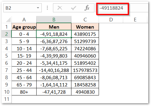
Now we need to sort the data. Select any one of the cells in the range B2:B10 and click on the Sort button in the Data tab on the ribbon.

Inserting the Bar Chart
Since we have sorted our data set, we can finally insert the Clustered Bar Chart with the data:-
- Select the Range B2:C10 and insert a Clustered Bar Chart from the data.
- Select any one kind of bar i.e for men and press the Ctrl 1 key.
- Set the Series Overlap to 80%. Repeat the same procedure for the Women’s Data Series
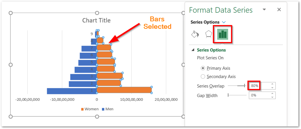
Select the Gridlines on the Chart and press the delete key to make the chart easier to understand.
Formatting the Bars on the Chart
Since, we have the Format Data Series pane opened in the above section of this blog, navigate to the Fill and Line tab and choose the Fill color for the bars.
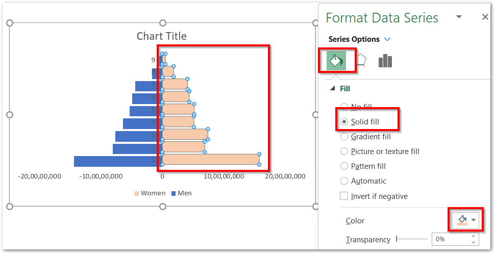
You can also navigate to the Effect tab to add some effects to the bars.
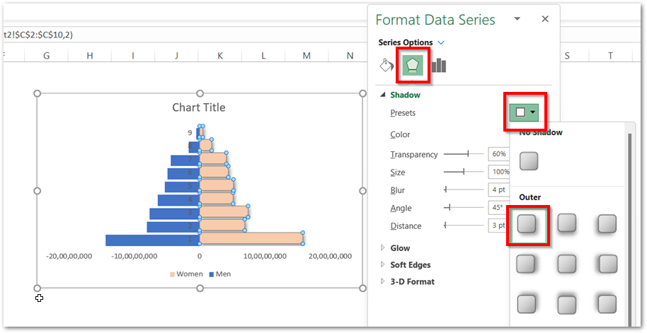
We will delete the Vertical Axis by simply selecting it and pressing the delete key.
Similarly, we can format the other data series of bars to get the chart as follows:-
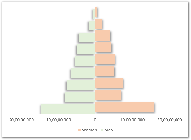
Formatting the Chart Axis
We must reduce the Display unit of the Horizontal axis representing the population scale to Millions. This will make the axis labels take up less space on the chart. To change the display units of the axis labels of a chart in excel:-
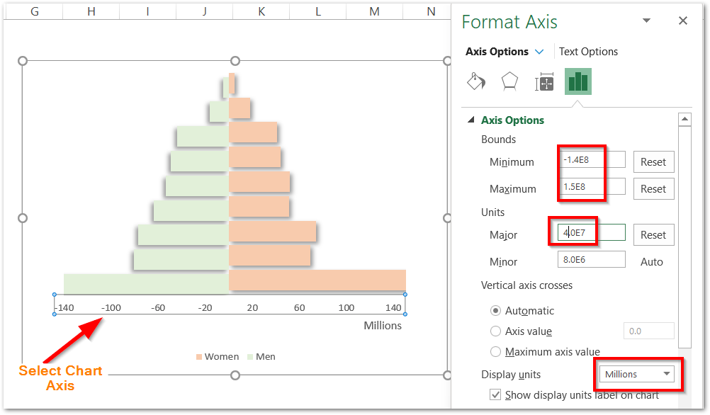
- Select the Horizontal Axis and press Ctrl 1 key. Navigate to the Axis options tab.
- Set the Minimum and Maximum Axis bounds to the values shown in the above figure.
- Set the Major unit to 4.0E7
- Choose the Display units as Millions.
This makes our chart much simpler to read. You can also see that the display unit “Millions” has been automatically mentioned right below the horizontal axis.
Type the Age ranges in the adjacent cells to the left of the chart to get the final results as follows:-

This brings us to the end of the blog. Thank you for reading.
RELATED POSTS
- Radar Chart in Excel – Components, Insertion, Formatting
- Stacked Bar Chart in Excel – Usage, Insert, Format
- Bar Chart in Excel – Types, Insertion, Formatting
- Data Bars Excel – Min Max Value, Formula Based Bars
- Tornado Chart using Conditional Formatting
- 100% Stacked Column Chart in Excel – Inserting, Usage, Reading

