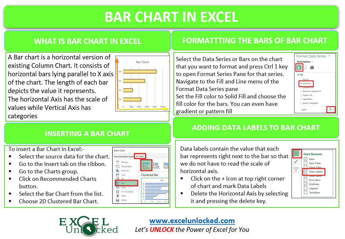
A Bar chart in Excel is a horizontal version of the existing Column Chart. The Bar chart is frequently used when we have categories that are quite long and cannot be fitted properly in a Column chart. Let us start working.
What is a Bar Chart in Excel?
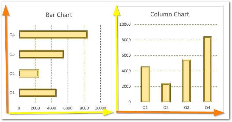
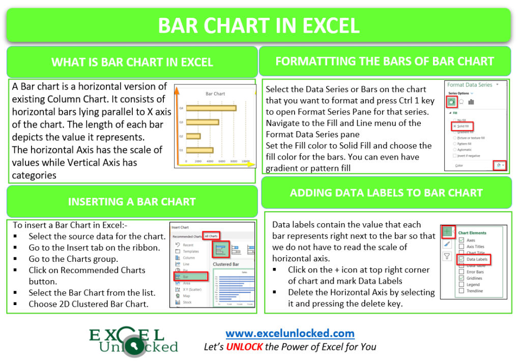
A Bar chart in excel consists of horizontal bars lying parallel to the horizontal axis. The length of each bar depicts the value it represents. The Horizontal Axis has a scale for estimating the value each bar represents while the Vertical Axis shows the categories to which the bar belongs. It is just a version of the Column Chart whose horizontal and vertical axis have been switched.
Here is an example of a Column Chart and a Bar Chart inserted using the same source data of Quarterly sales of a year.
Example 1 – Inserting a Bar Chart with one Data Series
A Data Series is a combination of bars that represent a particular group of values for example sales, heights, and weights. In this example, we will learn to make a Bar chart with a single data series.
Let us suppose we have the monthly sales of a region as follows:-
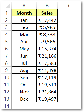
To insert a bar chart from this data:-
- Select the source data A1:B13
- Go to the Insert tab on the ribbon.
- Click on the Recommended Charts button, this opens the Insert Chart dialog box.
- Navigate to the All Charts tab and choose the Clustered Bar Chart. Click Ok.
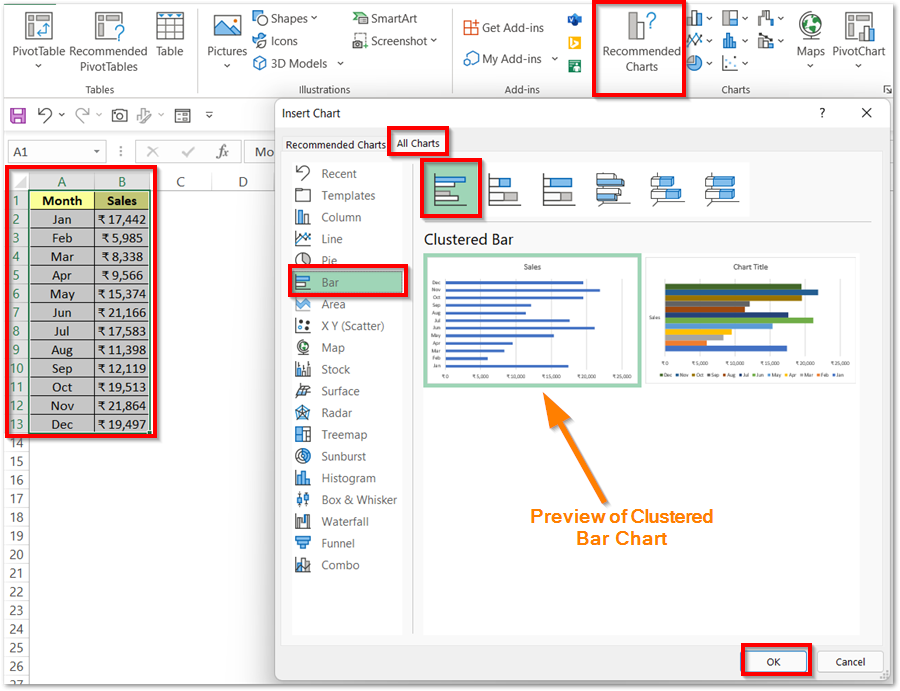
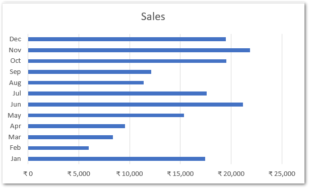
This inserts the bar chart as shown in the preview. This chart will consist of only one data series plotted from the sales range (B1:B13). Excel inserts the chart with default formatting as follows:-
We would learn to format this chart in the last section of this blog.
Inserting a Bar Chart with Multiple Data Series
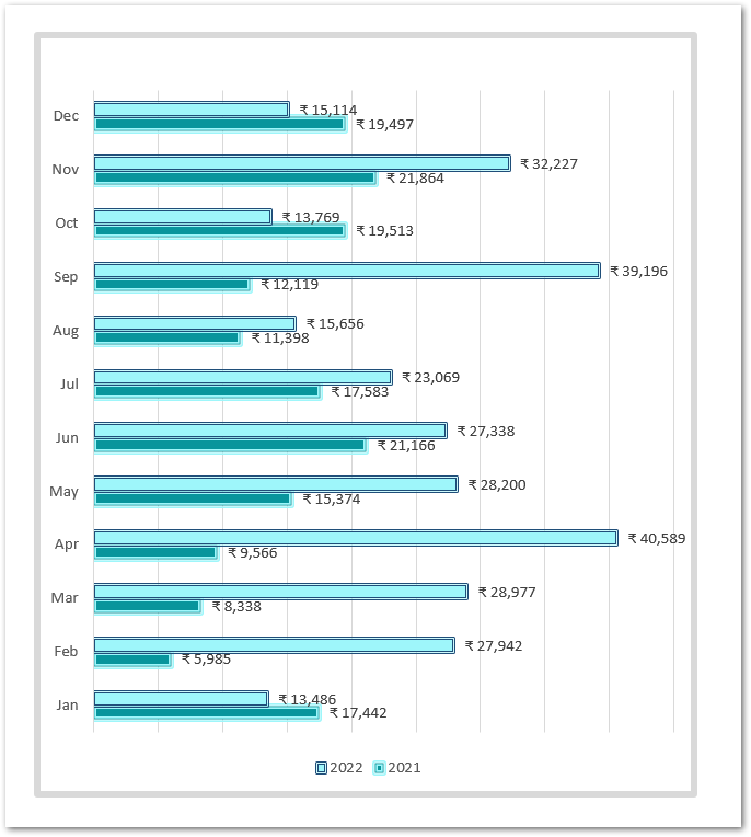
Let us suppose that we want to represent the monthly sales for two years i.e 2021 and 2022. We will have two data series in this chart. However, each data series will represent one year.
Here is the source data for our new chart with multiple data series:-
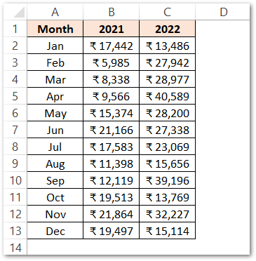
Insert a bar chart with this data A2:C13 ( not A1:C13) to get the default formatted chart as shown below.
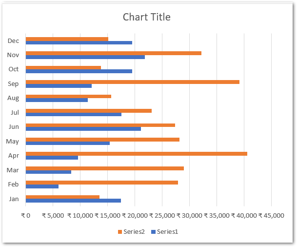
In this chart, you can see that each category on the Y-axis is having two bars. The two years are named Series1 and Series2 represented by blue and orange bars.
We need to change the name of these series and add the years instead of the default names. To do so:-
- Right-click on the chart and choose the option Select Data
- This opens the Select Data Source Dialog box.
- Select Series1 and click on the edit button. As a result, this opens the Edit Series Dialog box.
- Select cell B1 as the series name.
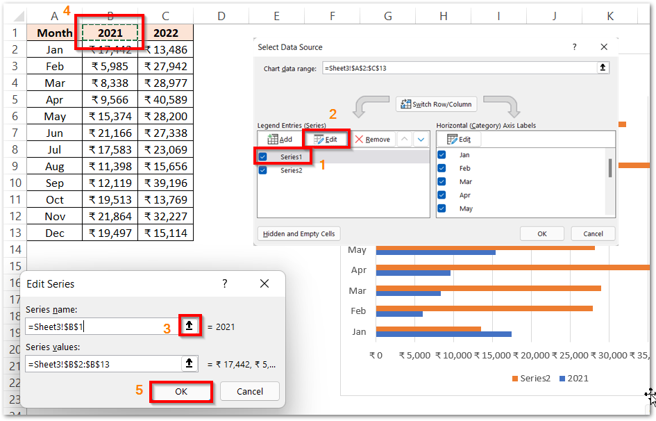
Repeat the procedure with Series2 and set its name as cell C1.
Formatting the Data Series (Horizontal Bars)
There are two data series, and we need to perform formatting on them one by one. So to format a data series in excel:-
- Select the Data Series (orange bars) on the chart. The small light blue circles at the four corners of each bar indicate that the series of bars is selected.
- Press the ctrl 1 key to open the Format Data Series pane for that series.
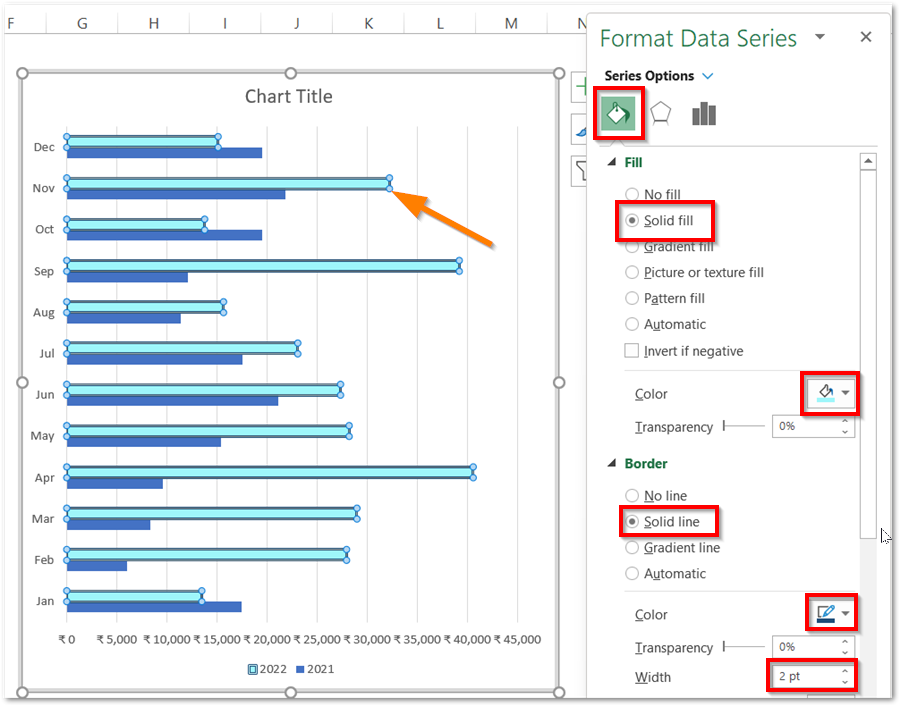
- Select the Solid Fill color and the Border Color and width for the data series.
- Click on the second data series with the Formatting pane opened. Similarly, format the other data series. As a result, we get our chart’s bars formatted as follows:-
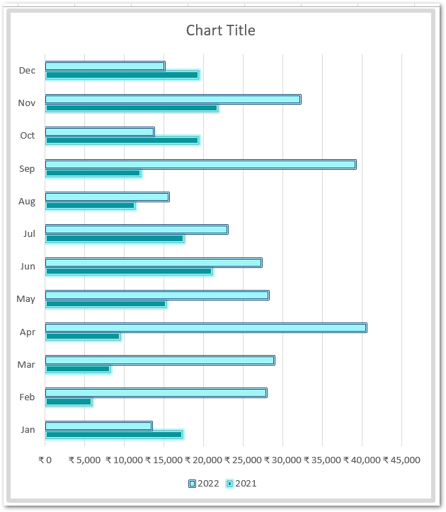
Adding Data Labels to the Chart
Data Labels show the value that each bar represents right at the end of each bar. They make the chart even easier to read since we do not have to move our eyes to the horizontal axis scale to get the estimated values.
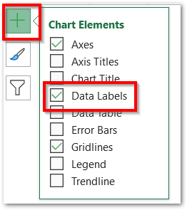
To add Data Labels to the chart, perform the following steps:-
- Click on the Chart and go to the + icon at the top right corner of the chart.
- Mark the Data Labels from there
After that, select the Horizontal Axis and press the delete key to delete the horizontal axis scale. This is how the chart looks once finished.
You can even learn about the Stacked Bar Chart in Excel.
This brings us to the end of blog. Thank you for reading. 8D
RELATED POSTS
- Change the Order of Data Series – Stacked Line, Stacked Area, Column Chart
- Stacked Column Chart in Excel – Usage, Examples, Format, Special Gridlines
- Make Your Own Chart Template in Excel
- 100% Stacked Column Chart in Excel – Inserting, Usage, Reading
- 3D Surface Chart in Excel – Insert, Working, Formatting Legends
- Open High Low Close Stock Chart – Insert, Format, Up/Down bars

