In our earlier blogs, we learned the usage of Stacked Column Charts. 100% Stacked Column Chart in Excel is its subset. The chart is useful in showing the percentage contribution within the whole. Let us begin 😎
What is 100% Stacked Column Chart
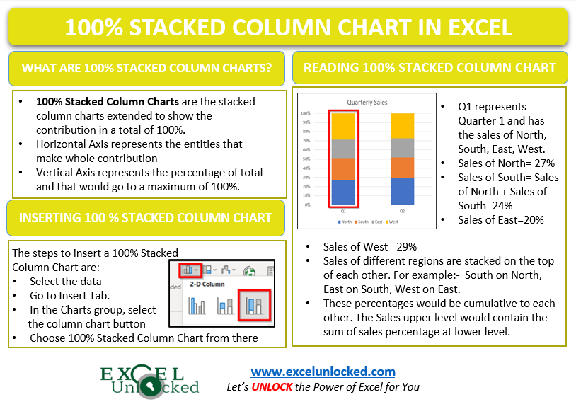
100% Stacked Column Charts in Excel contain the multiple data series grouped together to show their percentage contribution in the whole. We can also use this chart to represent cumulative data series.
The Horizontal axis would represent the groups/categories that make the whole while the Vertical axis represents the percentage scale up to 100%.
Points to Remember About 100% Stacked Column Charts
The following are must-know points before using the 100% Stacked Column Chart in Excel:-
- In 100% Stacked Column Chart, the height of each column would be constant as all the columns are representing a total of 100%.
- Each Column is made up of a group of entities/values that sum up to form 100%.
- We can add data labels on the chart to see the actual data values along with the percentages.
- 100% Stacked Column Chart becomes complex as we add more data series to the chart.
- We cannot use this chart to compare the values of two data series of different columns as the height of all the columns would go to a constant of 100%.
- You can learn about Formatting the chart and Chart Elements.
- You can save your chart formatting using Chart Templates of Excel.

Inserting 100% Stacked Column Chart
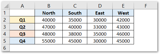
Let us assume that we have the quarterly sales of a bakery in the different regions of the country. Below is its data:-

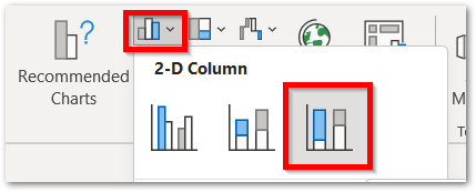
To insert a 100% Stacked Column Chart in Excel, follow the below-mentioned steps:-
- Select the range of data A1:E5.
- Go to Insert Tab.
- In the Charts group, click on column chart button.

- Select the 100% Stacked Column Chart from the 2-D Column Chart Section.
Reading 100% Stacked Column Chart
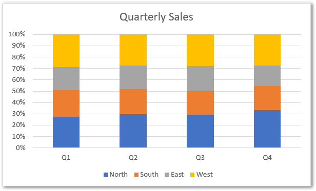
The chart inserted in the above section would be:-

Excel has an inbuilt algorithm that decides the orientation of rows and columns in the chart. You can always switch rows and columns i.e Quarters and Regions by the button Switch Rows/Columns in the Chart Format Tab on the ribbon
Read the following points to understand the chart structure:-
- Q1 represents quarter 1 and comprises the sales of four regions i.e North, South, East and West.
- There is a total of four Quarters each containing percenatage sum of regional sales.
- Consequently, the total sales of Q1 would be sales of (40000+35000+30000+42000) North+South+East+West= 147000. This is 100% of the total sales pf Quarter 1.
- Similarly, the total sales of Q2, Q3 and Q4 are 158000, 164000, 165000. These sales are different but the total is always represented by 100% for each quarter.
- For instance, in Q1 we have:-
- North Sales as 40000. Percentage contribution = 40000/147000*100= 27.21%
- South Sales as 35000. Percentage contribution = 35000/147000*100= 23.81%
- East Sales as 30000. Percentage contribution = 30000/147000*100=20.41%
- West Sales as 42000. Percentage contribution = 42000/147000*100= 28.57%
- We never need to calculate these percentages. However, they are implicitly calculated and represented on the chart. Since the chart is a stacked chart, the values are stacked on top of each other. The upper region would contain the sum of the percentage contribution of the regions lower to it.
This brings us to the end of the blog.
Thank you for reading. 😎
RELATED POSTS
- Stacked Area Chart Excel – Usage, Insertion, Area vs Line, Negative Values
- Stacked Bar Chart in Excel – Usage, Insert, Format
- Column Chart in Excel – Types, Insert, Format, Clickable Chart
- Stacked Column Chart in Excel – Usage, Examples, Format, Special Gridlines
- Stacked Line Chart in Excel – Inserting, Reading, Formatting
- Pie Chart in Excel – Inserting, Formatting, Filters, Data Labels
