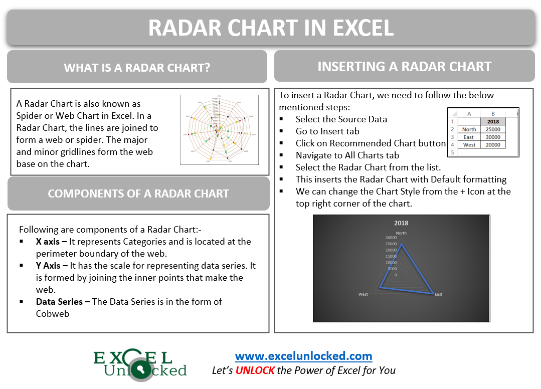
A radar chart in Excel is also known by the name of Spider Chart or a Web Chart. This chart is quite useful in representing a two-dimensional form of data. Let us see how it works.
What is a Radar Chart in Excel?
A Radar Chart in Excel contains lines that are joined to form a web of a spider. The following are the components of a Radar Chart.
- X Axis – It represents the Categories. The axis is at the perimeter boundary of the web.
- Y Axis – It is the scale for representing the data series. It is formed by joining the inner points that form the web.
- Data Series – The Data Series is in the form of Cobweb.

The highlighted lines in Blue color at the outer side of the web are the Category Axis and the Purple Boxes containing years are the Category Axis Labels.
The Orange arrow from the center of the web to its outline is the Y-Axis and the Numerical Values on it are the Vertical Axis Labels.
From the above chart, we can infer that sales of 2022 are the highest since the data point is closest to the border of the web. The sales are minimum for 2023 since the data point is closest to the center of the web.
The lines forming this web are the gridlines. So in case, if we remove the Gridlines, the chart looks like:-

Example 1 – Inserting a Radar Chart with One Data Series
We will start learning the usage of this chart by plotting only one data series. Let us say here we have the sales data of three regions of the country as follows:-
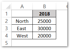
To insert the Radar Chart from this Data:-
- Select the range of cells A1:B4.
- Click on Recommended Charts button in the Charts Group of Insert tab on ribbon.
- Select the Radar Chart from the list and choose the first radar chart type.
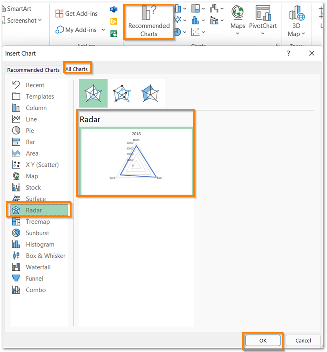
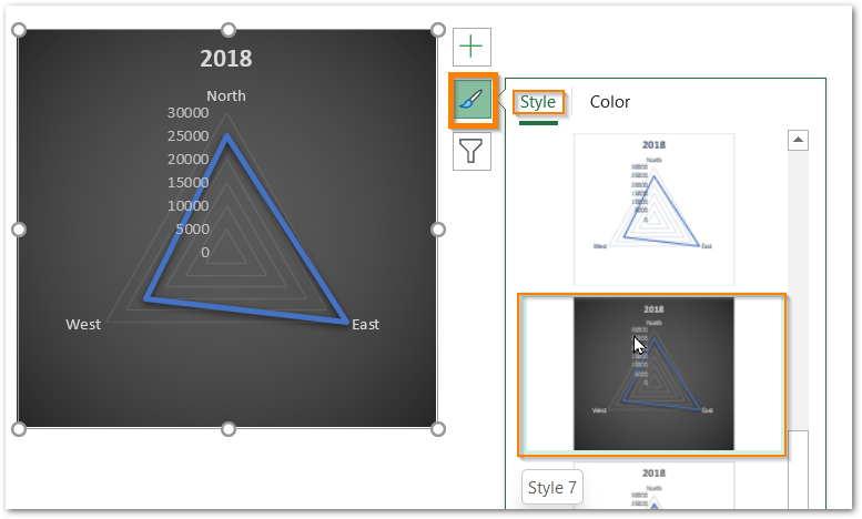
Consequently, this will insert the chart as shown in the preview of the Insert Chart dialog box. We can change the chart style from the chart options at the top right corner of the chart.

Example 2 – Radar Chart in Excel with 2D Data
By two-dimensional data, we mean that there are multiple Data Series as well as Data Categories. Let us consider we have the Quarterly Sales of a company for ten years.
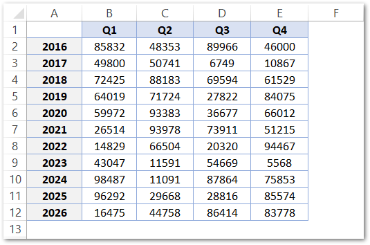
We can insert the chart from this range A1:E12 by using the steps mentioned in Example 1 as follows:-

Cleaning the Radar Chart
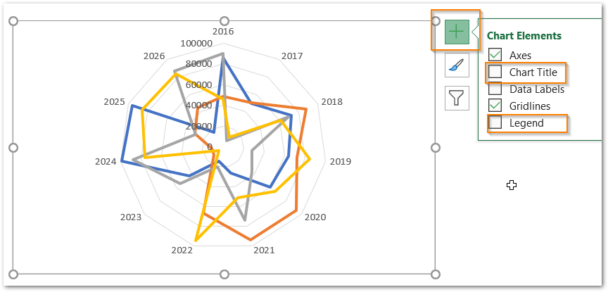
We can remove some of the chart elements so that this web could expand itself in the same area. To do so, select the chart and from the + icon at the top right corner of the chart, unmark the Chart Title and Legends for now.
Changing the Scale of Vertical Axis
As you can see that the Vertical Axis now starts from zero and the maximum value it can represent is 100000 which is automatic. The length of each interval is 20000. Increasing the Length of each interval will let us visualize the chart perfectly.
To do so:-
- Double Click on the Vertical Axis Labels.
- This opens the Format Axis Pane for the Vertical Axis.
- From the Axis Options, set the Major unit to 10000.
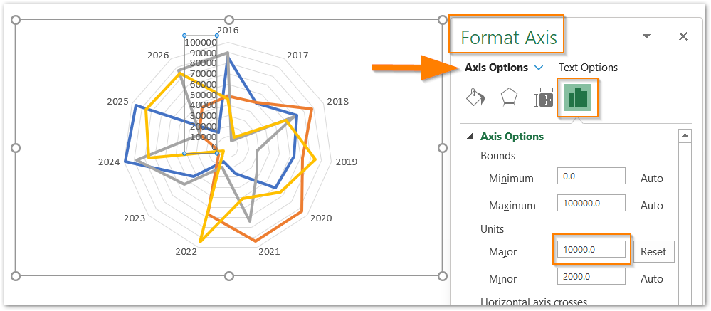
These major units will change the Vertical Axis Labels intervals. Now Drag the Chart corners to expand it so that the added intervals could be visible like this:-

Formatting and Adding Markers to the Data Series
There are four data series for each of the Four Quarters of the year. To format the data series, double click on any one data series on the chart. ( The first click will select the data series and the second click will open the Format Data Series pane. )
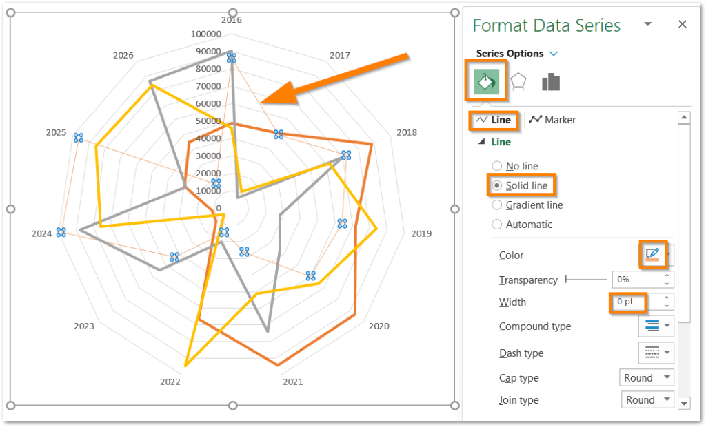
From the Fill and Line tab, set the Line as Solid. Select the color of the line and you can reduce the width of the line from there. After this, navigate to the Marker tab next to the Line tab.
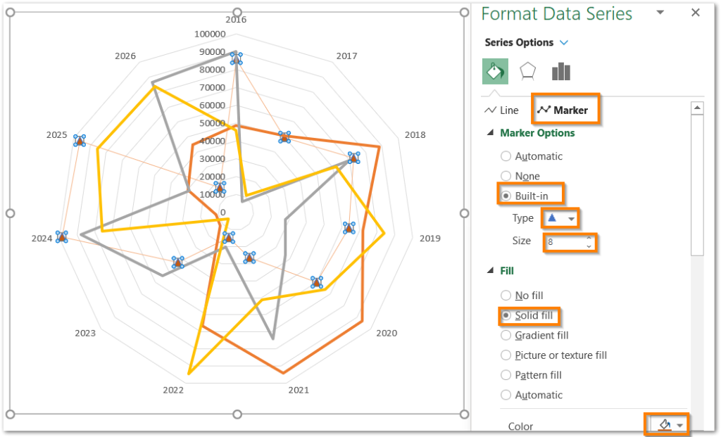
Select the Marker Type and Size. Set the Marker Fill to a shade darker than that of the solid line for this data series.
Repeat the same steps for the rest of the three data series. The resultant chart is as follows.
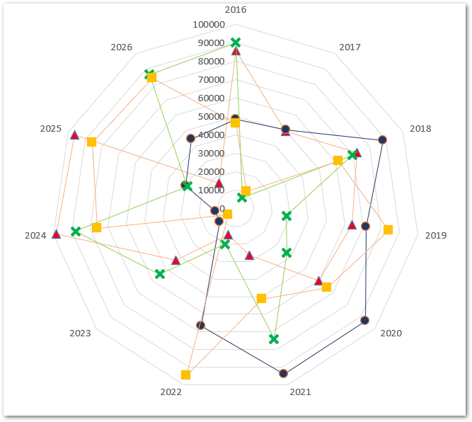
Formatting the Web
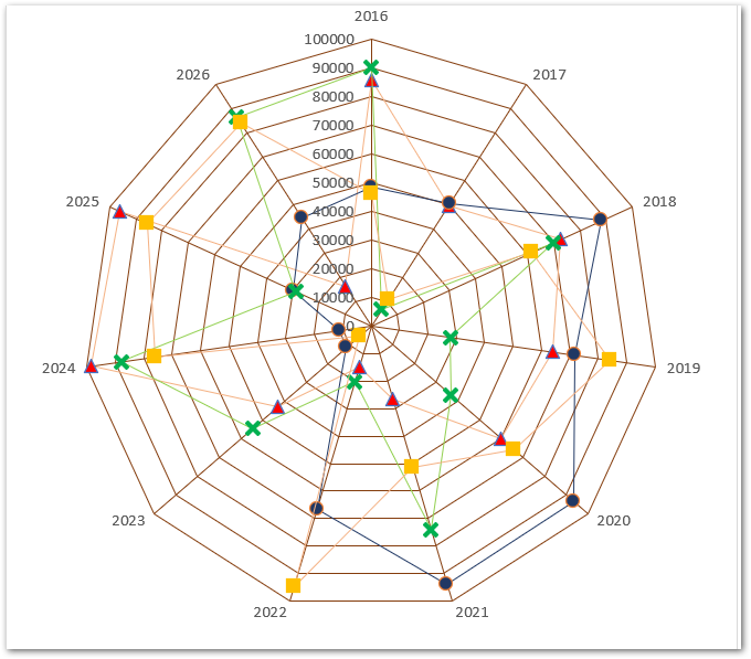
The web of the chart is made up of vertical axis and gridlines.
We need to add the Solid Line corresponding to the Vertical Axis and this will complete the web. To do so, double click on the axis representing the scale for years and then mark a solid line from the Fill and Line tab. Set the color.
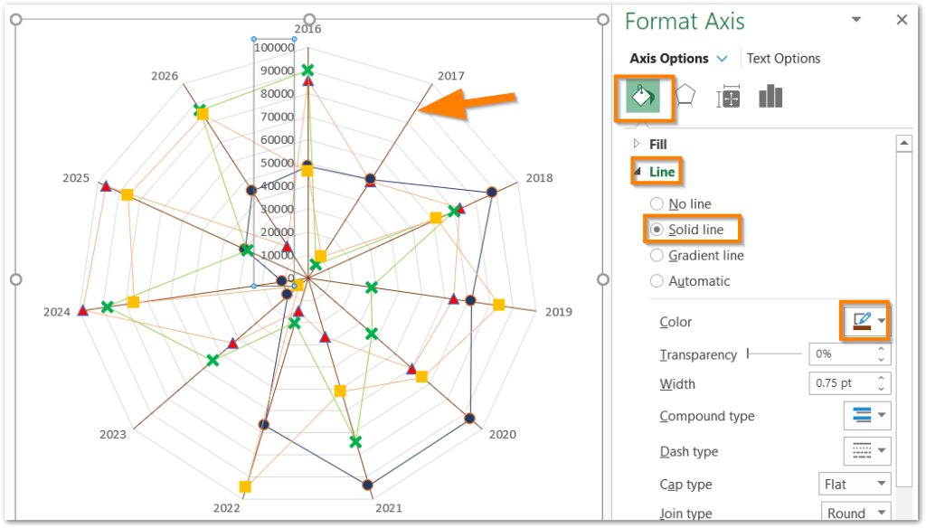
Similarly, we can click on the Gridlines and match them with the color of the Vertical Axis. This formats the entire chart web as follows:-
Changing the Chart Background
The Background of the Chart must be of a Soft Color as that increases the readability. To do so, double click on the chart and:-
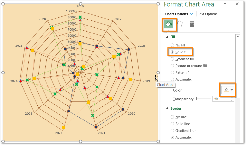
Set the Solid Fill color from the Fill and Line tab. Add the legends from chart options and below are the final results.
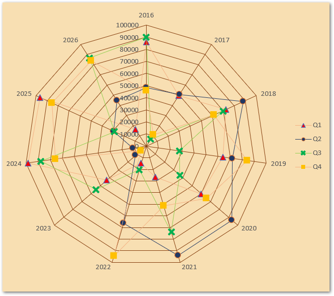
From the chart, we can compare the sales of different quarters for each year. For example, in 2021, Sales of Q2 are maximum. The Sales of 2024 Q1 are highest since it is closest to the border of the web while the sales of Q3 for 2017 are the minimum sales.
This brings us to the end of the blog. Thank you for reading 8D
RELATED POSTS
- Population Pyramid in Excel – Usage, Making, Formatting
- Waterfall Chart in Excel – Usage, Making, Formatting
- High Low Close – Stock Chart in Excel
- Bar Chart in Excel – Types, Insertion, Formatting
- Sunburst Chart in Excel – Usage, Insertion, Formatting
- Stacked Bar Chart in Excel – Usage, Insert, Format

