In one of the recent blogs, we learned how a Clustered Column Chart works. A Histogram Chart in Excel is similar to read as a Column Chart but the usage and working of both charts are different. Let us see how.
What is a Histogram Chart in Excel?
A Histogram Chart in Excel represents the frequency distribution of data in intervals. It will let us know how many entities are there lying in each interval or bin. The intervals are contiguous and each interval has its upper and lower value in which the frequency lies. For instance, we have plotted a Histogram for the height of students in a class as shown below:-
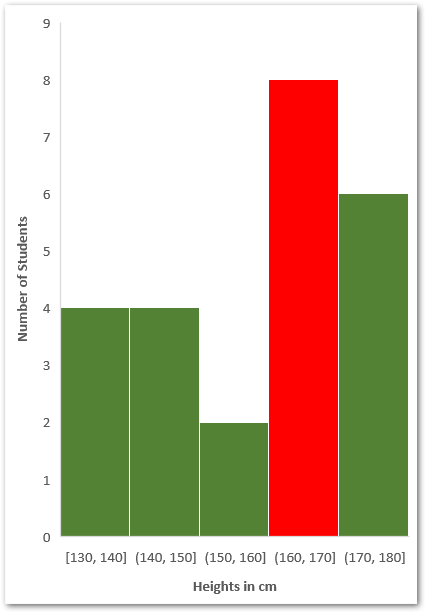
Here the interval column with maximum bar is filled with red as the majority of students have their heights lying in between 160-170 cm which is 8 students.
Understanding the Intervals
The intervals have a lower value and an upper value. When an interval (other than the first) is plotted on the chart, it is shown on a horizontal axis like this:-
(140,150]
The first bracket ( is an open bracket which means that the lower value does not lie in that interval. So in the above example, a student with a height of 140 cm does not count in the interval (140,150]. It will fall under (130,140]
This is so because there is a ] close bracket for upper value and the upper value of an interval is included in it.
The First interval has both square brackets [130,140], so both the lower and upper values are included in it.

Inserting a Histogram Chart in Excel
Let us say we have the salaries of different employees of a company as follows:-
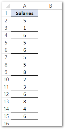
The salary is in LPA ( Lakhs per Annum ). For inserting a Histogram Chart, run the following steps:-
- Select the range of cells A1:A15
- Click on the Insert tab on the Excel Ribbon.
- From the Charts group, hit on Recommended Charts button.
- In the All Charts tab, select the Histogram Chart from the list an the first chart type.
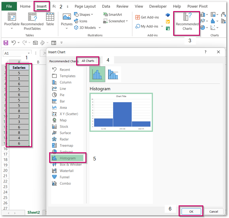
Consequently, this inserts a Histogram Chart with formatting as defaults. We need to format the chart to make it exactly like what we want it to be.
Adding Intervals to the Histogram Chart
The chart inserted in the above section has default formatting as follow:-
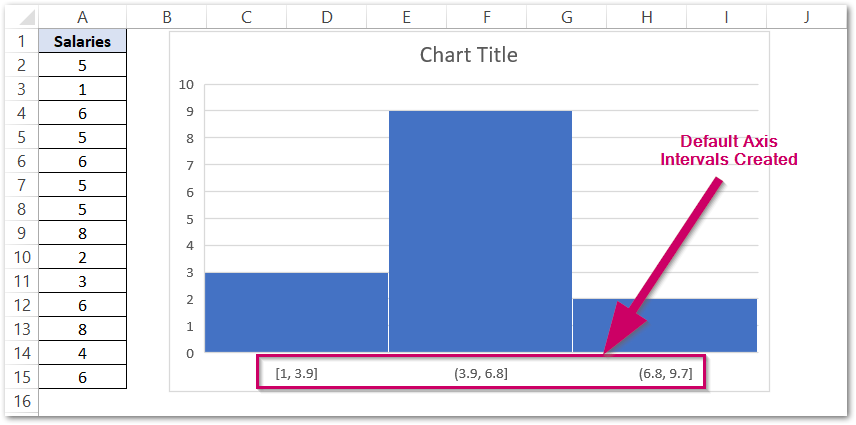
For changing these bins simply:-
- Click on the chart and on the ribbon, find the Format tab.
- In the Current Selection group, mark the Horizontal Axis.
- Press ctrl+1.
This opens the Format Axis pane for the Horizontal Axis.
- Navigate to the Axis Options tab.
- Mark the Bin Width as 3.
- Set the Overflow Bin as 10 ( It is the Upper Value of the Last Interval )
- Set the Underflow Bin as 1 ( It is the Lower Value of the First Interval )
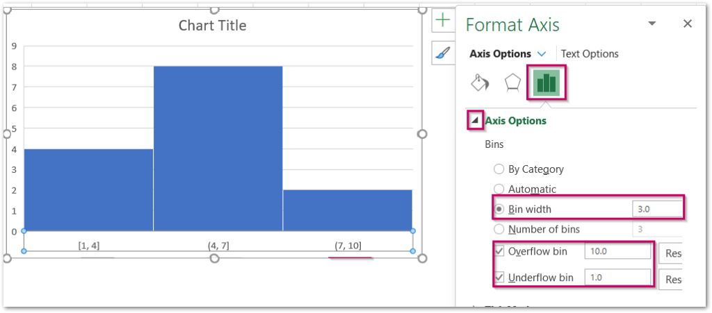
You can see that the labels have updated themselves.
Formatting the Data Series of the Chart
We can change the Solid Fill color of these contiguous Vertical Bars. To do so:-
- Double Click on the Blue Bars.
- Navigate to Fill and Line tab in the Format Data Series pane.
- Choose the Solid Fill color and the Border as Solid Line.
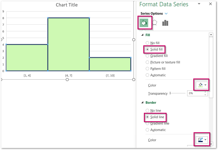
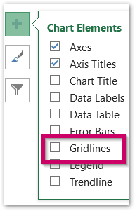
We can remove the Chart Gridlines, making the chart easier to read. To remove the Gridlines, click on the + button at the top right corner of the chart and unmark the checkbox for Gridlines.
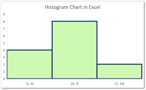
Consequently, we have got the resultant chart.
Changing the Number Format of Axis Labels
Since the salary is in LPA, we can add this unit in the Horizontal Axis Category Labels. Double Click on the Horizontal Axis.
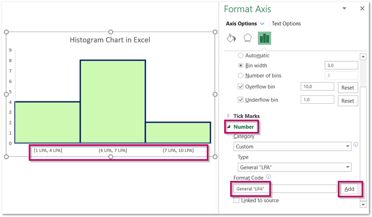
Move to the Number Field in the Format Axis pane. Add the Format Code as General “LPA” and hit on the Add button. This formats the axis labels.
And here we have come to the end of the blog.
RELATED POSTS
- Format Chart Axis in Excel – Axis Options
- Format Chart Axis in Excel Charts – Axis Options – Fill and Line
- Pictograph Chart in Excel – Usage, Making, Formatting
- Stacked Bar Chart in Excel – Usage, Insert, Format
- Sunburst Chart in Excel – Usage, Insertion, Formatting
- Population Pyramid in Excel – Usage, Making, Formatting

