A Gauge Chart is also known as a Speedometer Chart in Excel. It is made using a Pie chart and Doughnut Chart in Excel. So let’s start making one!
What is a Gauge Chart in Excel?
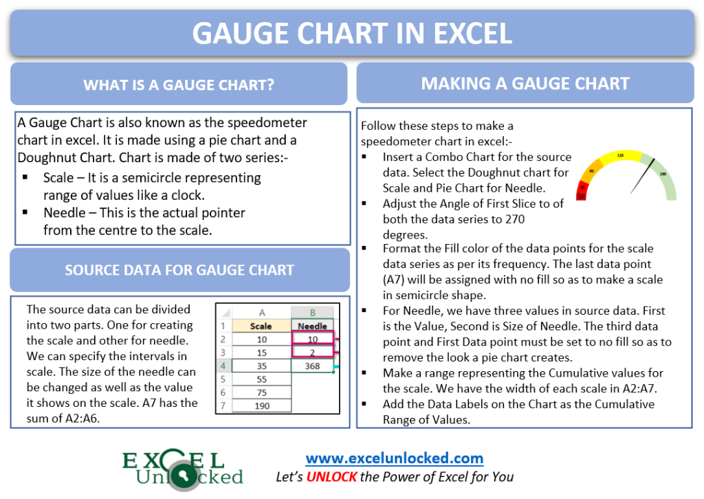
A Gauge Chart in Excel is very similar to a speedometer of vehicles. The chart is made using two data series as follows:-
- Scale – The Scale is a semicircle having the range of values like a clock. We will use Doughnut Chart for it.
- Needle – This is the actual pointer from the center to the scale. It is made up of Pie Chart.
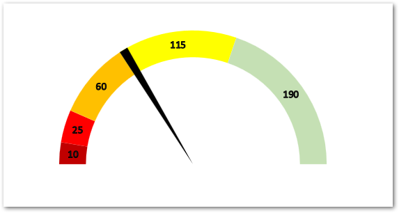
Example – Creating a Gauge Chart in Excel
Microsoft Excel does not have an inbuilt Gauge Chart type. It is time-consuming but at the same time, easiest to create. So let us get started.
Getting the Source Data
The Source Data will contain two ranges. The first is the scale containing the length of each range on the scale while the second range is the needle information as follows:-
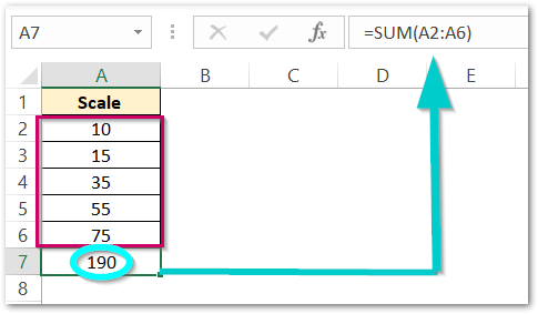
The range A2:A6 has a length of six ranges in which our scale for the speedometer chart lies. Cell A7 has the sum of all ranges at the end.
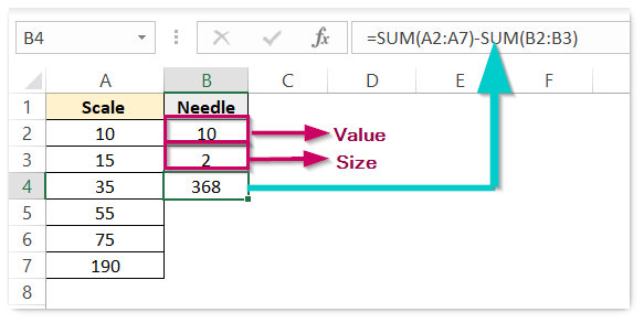
Column B has information for the needle. B2 has the Value that the needle shows on the chart and it can be changed. B3 has the width of the Needle. Cell B4 has a formula used in it as follows:-
=SUM(A2:A7)-SUM(B2:B3)
Inserting the Combo Chart (Pie+Doughnut)
The next step is to get a Combo Chart. Select the range of cells A1:B7. From the Insert Tab, click on the Recommended Charts button. Navigate to the All Charts tab and Choose the Combo Chart from the list down there.
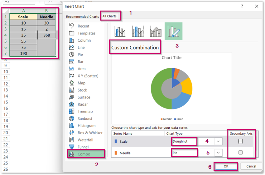
Select Doughnut Chart for Scale and Pie Chart for Needle. You can see the option for Secondary Axis for each of the Data Series. Although both Chart types do not include the use of axis, still the marking of the secondary axis will overlap that series over the other on the top. We will use this feature later.
Adjusting the Angles
By default, the angle of the first slice for both Doughnut and Pie Chart is zero degrees as follows:-
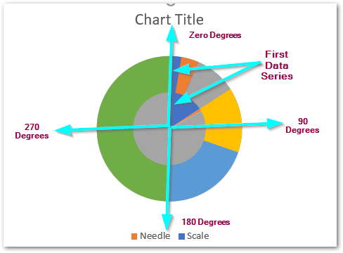
We need to set this angle as 270 degrees for both our data series. To do that,
- Select the Chart and go to Format tab on the ribbon.
- Choose the “Scale” Series in the Current Selection Group.
- Click on Format Selection button to open the Format Axis Pane.
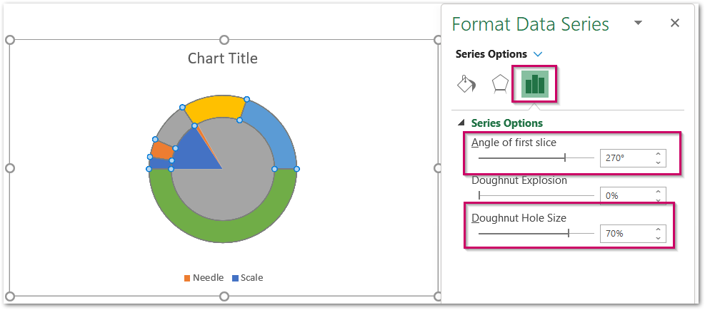
Set the angle of the First Slice as 270 and also increase the hole size to 70% (only for Doughnut Chart). Set the angle to 270 degrees for Pie Chart by selecting Needle Series in the Current Selection Group.
Formatting the Data Points
The union of Data Points forms the Data Series. We cannot select the Data Point from the Current Selection Group. The Data Point can be selected by directly clicking on it on the chart. However, the condition is that the data series belonging to that Data Point must be on the Secondary Axis. We will start by formatting the Data Points of Doughnut (Scale Series). Set it to Secondary Axis ( Mark the Checkbox as told in Inserting Combo Chart Section above ).
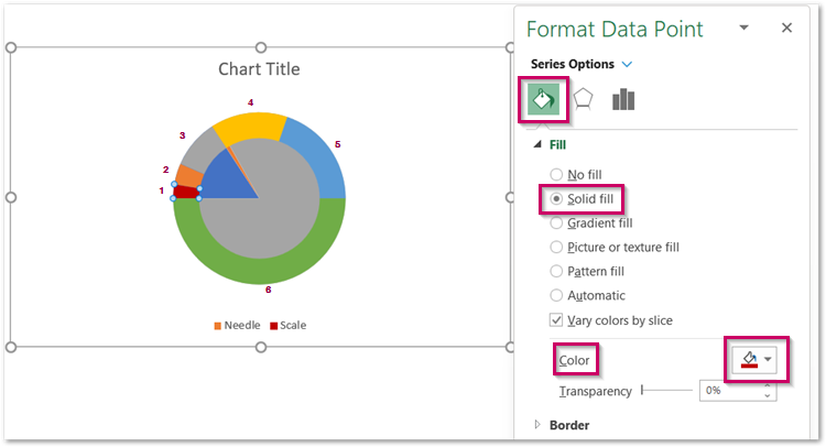
For instance, we have marked the data points for the scale for now. You need to set the fill color of each Data Point as follows:-
- 1 – Brown
- 2 – Red
- 3 – Orange
- 4 – Yellow
- 5 – Green
- 6 – No Fill
This is how the Chart looks once the scale is ready.
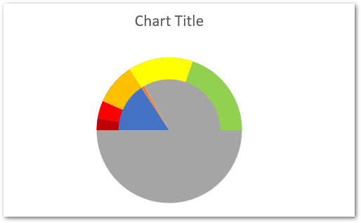
Now set the Secondary Axis to Needle Series. Double Click on its Data Point one by one and set the Fill as follows:-
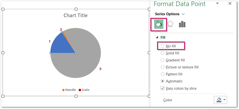
For the Needle, use the following colors:-
- 1 – No Fill
- 2 – Black Solid Fill Color
- 3 – No Fill
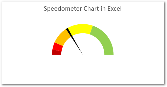
Adding the Data Labels
We need to add the Cumulative Sum of range Length to the Data Labels. To do so, make a column named CR (Cumulative Range). Use this formula:-
=SUM($A$2:A2)
Copy this formula down (C6) to get the following results:-
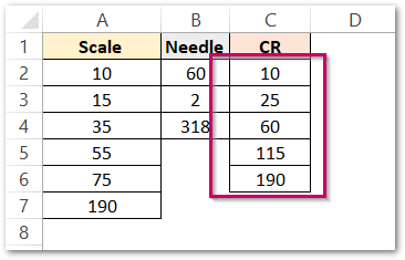
Select the Chart and press the + button. Mark the Data Labels and go to More Options. Click on Value from cells and Select the range C2:C6. However, you should unmark the Value from Label Options.
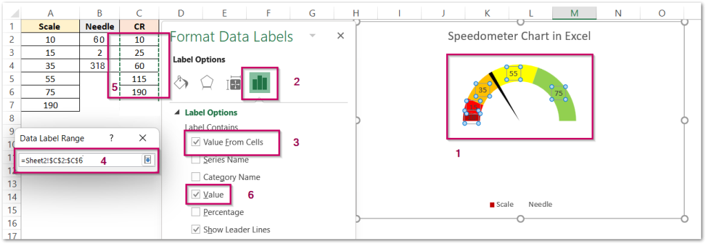
We have removed the unnecessary data labels by selecting and pressing the delete key.
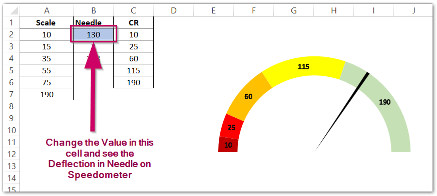
Consequently, the results are satisfying as per the work.
RELATED POSTS
- Waffle Chart in Excel – Making, Usage, Formatting
- Pictograph Chart in Excel – Usage, Making, Formatting
- Thermometer Chart in Excel – Making, Usage, Formatting
- Pie Chart in Excel – Inserting, Formatting, Filters, Data Labels
- Radar Chart in Excel – Components, Insertion, Formatting
- Column Chart in Excel – Types, Insert, Format, Clickable Chart

