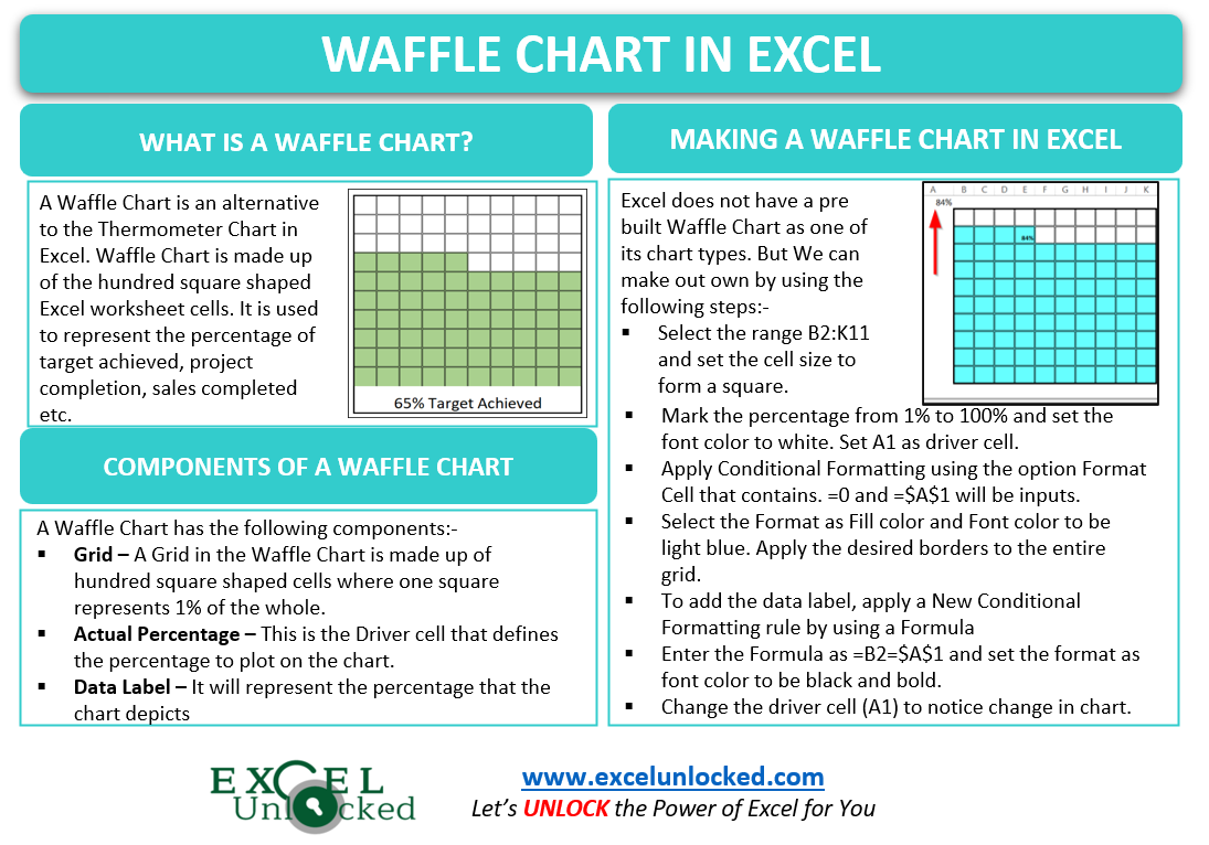
A Waffle Chart in Excel is just an alternative to the Thermometer Chart. The Chart is one of the advanced excel charts and is not a pre-built chart type. So let’s start working.
What is a Waffle Chart?
A Waffle Chart is a chart in Square Shape and consists of grids dividing the chart into cells. Surprisingly, this chart is made on a range of hundred cells in the shape of squares. The chart is filled on the basis of percentage out of 100%.
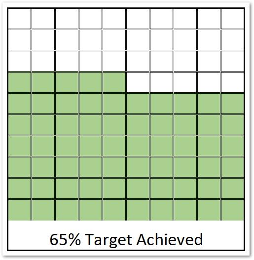
It is used to represent the target percentage, project completion percentage, sales percentage for one entity. Remember that this chart has the ability to represent only one data point which is the actual percentage out of a hundred.
Components of a Waffle Chart
There are the following components of a Waffle Chart in Excel:-
- Grid – The Grid in the Waffle Chart is made up of hundred square cells where each cell represents 1 % of the whole (100%).
- Actual Percentage – This is the cell that contains the percentage value to represent on the chart.
- Data Label – The Data Label on the chart will contain the percentage value that the chart represents.

Making a Waffle Chart in Excel
Making a Waffle Chart is a way too easy task. We will work in steps to get a simpler understanding of the topic.
Preparing a Grid of Waffle
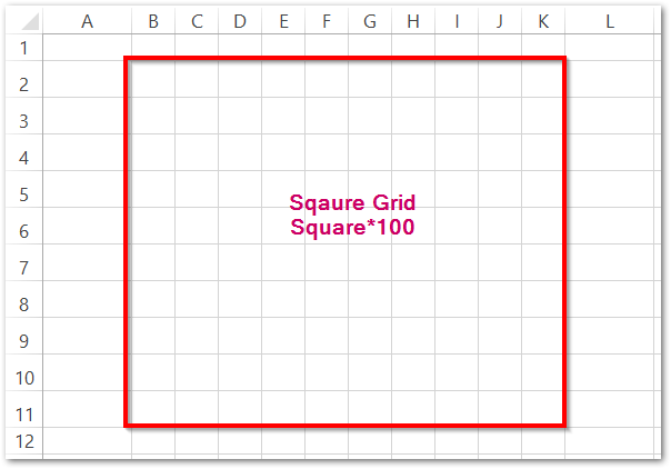
The Chart is made up of hundred cells. Each cell must be in a square shape so that the whole of 100 squares makes a perfect waffle chart. To change the size of the range of hundred cells:-
- Select the range of cells B2:K11. (We leave the first row and column of the sheet empty to get a better chart alignment on the screen)
- Go to the Home tab on the ribbon.
- In the Cells group, Click on the Format Button.
- In the Cell Size field, there are two options for Row Height and Column Width.
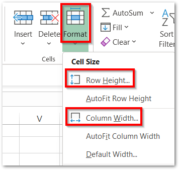
- Set the Row Height as 20 and Column Width as 3,56. As a result, the selected range of cells will turn into square shaped gridlines.
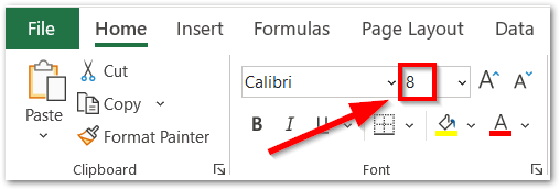
Now we need to reduce the Font Size of these cells to 8. Select the range B2:K11 and from the Home tab, In the Font Group, Set the size from 11 to 8.
Filling the Gridlines with Percentages
We need to assign these square boxes as a consecutive series of percentages from 1% to 100%. We cannot directly enter the percentages by using the % symbol into the cells but we will use the number formatting. Enter the values from 0.01, 0.02, 0.03 …………… 0.98, 0.99, 1 in the range B2:K11.
Or you can use this procedure:-
- Enter 0.91 in B2.
- Type =B2-0.1 in cell B3 and copy the formula down (B3:B11) using Excel Fill Handle tool .
- Type =B2+0.01 in cell C2 and copy this formula to the left (C2:K2) and then to down (C2:K11)
Once you have got the values in the cells, select the entire grid and press ctrl+1. In the Format Cells Dialog box, navigate to the Number tab and select the Percentage Format from the list. Set the digits after decimal to zero.
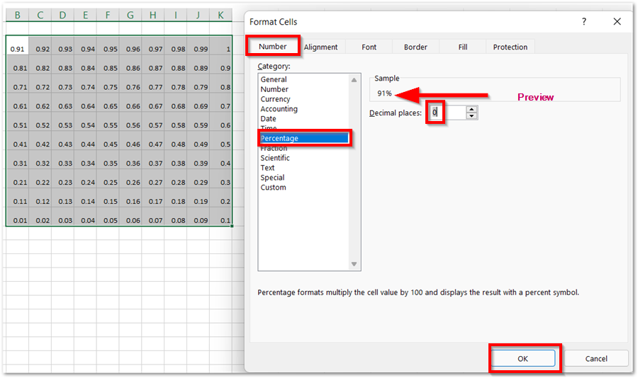
Consequently, we will get the percentages in the square grid of cells as shown in the preview of Number Format.
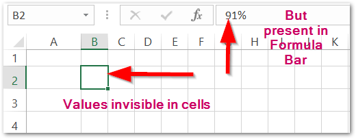
With these cells selected, set the Font Color to white, so that these percentages become invisible. You can do that from the Font Group of the Home tab.
Applying Conditional Formatting to make the Waffle Work
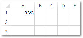
Now we need to choose a cell that will contain the percentage we want to represent via this Waffle Chart. Let us say the Data Point is cell A1. Add any percentage using the Number Formatting lying between 1% to 100& like this:-
After this, we will apply Conditional Formatting on the Grid.
- Select the range B2:K11
- Go to the Home tab on the ribbon.
- Click on Conditional Formatting Button in the Styles Group.
- Select the option New Rule from there.
Conditional Formatting is used to apply a certain formatting to the cells only when the condition becomes TRUE.
- This opens the New Formatting Rule dialog box. Choose the option Format Cells that contain
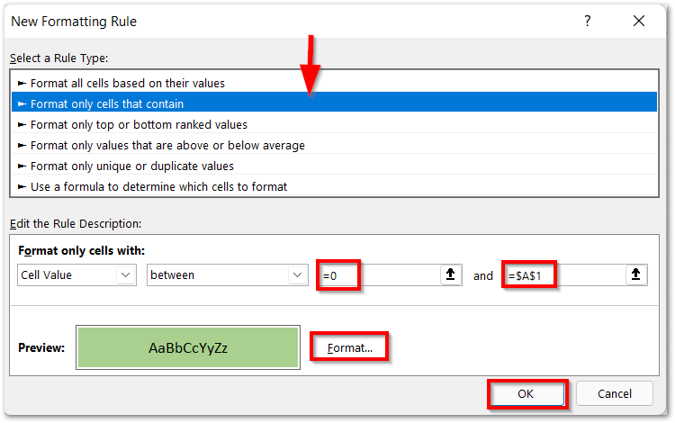
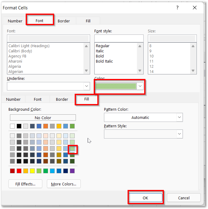
Enter the Starting and Ending Values as zero and the Data Point (=$A$1). Click on the Format button and from there, set the Fill Color and Font Color of the Cell to the same shade of Green.
Now The Waffle Chart is in working.
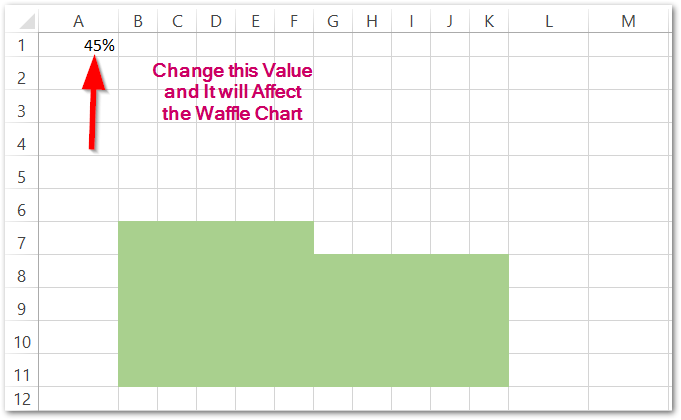
Each Square box represents 1% so 45% will be represented by filling 45 square boxes in green color.
Adding Data Label to the Chart
We can add the Data Label representing the percentage at the last filled square box by using Conditional Formatting.
- Select the Range B2:K11 and click on Conditional Formatting button.
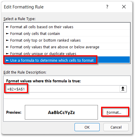
- Choose the Option Use a Formula to determine which cells to format
- Enyer =B2=$A$1 under the formula.
- Click on the Format button and set the format as Font Color to be black and bold.
We can even add borders to our Waffle Chart and make it look even more attractive like this:-
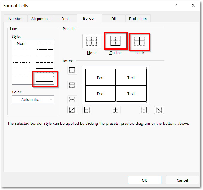
As a result, our Final Chart is now ready!
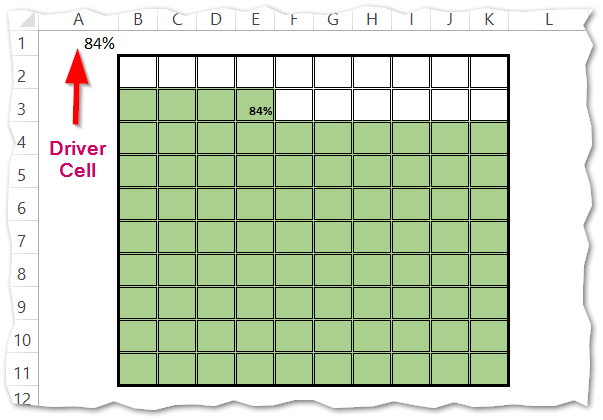
This brings us to the end of the blog. You can also learn to make an Interactive Waffle Chart from here.
Thank you for reading.
RELATED POSTS
- 100% Stacked Column Chart in Excel – Inserting, Usage, Reading
- Pie Chart in Excel – Inserting, Formatting, Filters, Data Labels
- Pie of Pie Chart in Excel – Inserting, Customizing, Formatting
- Bullet Chart in Excel – Usage, Making, Formatting
- Doughnut Chart in Excel – Single, Double, Format
- Column Chart in Excel – Types, Insert, Format, Clickable Chart

