A milestone chart in Excel is also known by the name of Timeline Chart. A Milestone Chart is very helpful in representing the project schedule in an efficient manner. Excel does not have a built-in Timeline Chart but we can make one by using 2D Clustered Chart.
So let’s move ahead 8D
What is a Milestone Chart
A Milestone Chart is a kind of timeline chart that represents the different phases of project development graphically. The chart helps us to keep a track of the progress of the existing project. It is used to schedule the various activities associated with an event across time.
Reading a Milestone Chart in Excel
The Chart is easiest to read. Have a look at the chart below.
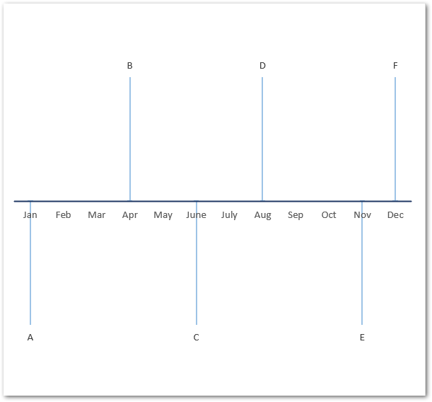
In the above chart, you can see that A, B, C, D, E, and F could be the different stages of a project development life cycle. There is no Vertical Axis in this Chart while the Horizontal Axis is representing the project schedule with increasing time.
The Data Series does not represent any magnitude or value. There are consecutive lines perpendicular to the horizontal axis right above and below it.
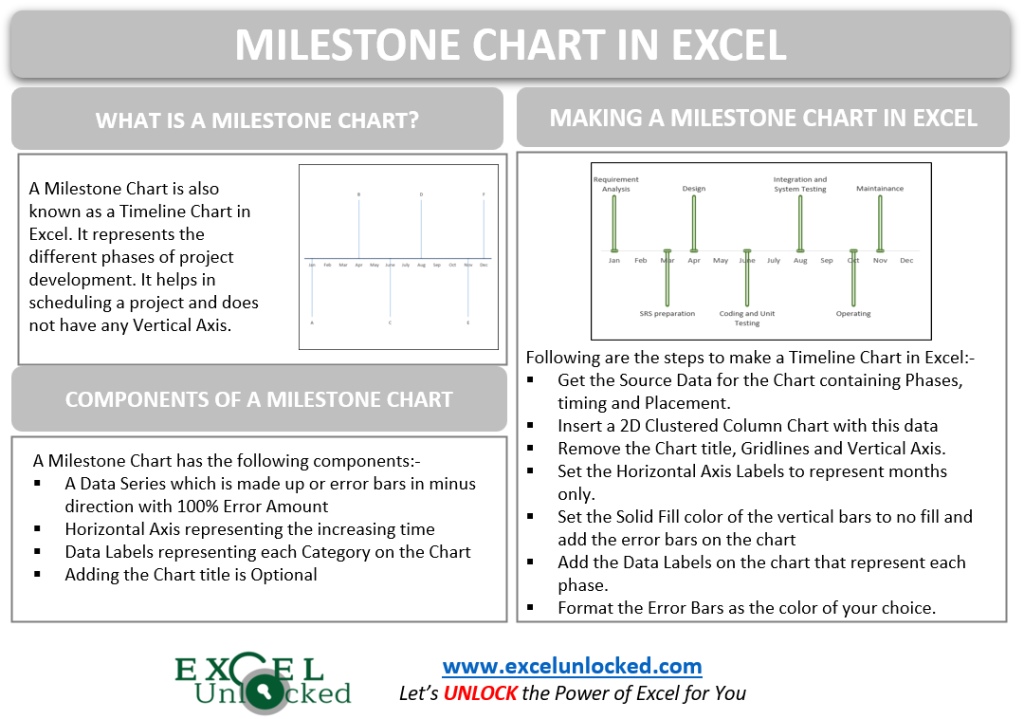
Creating a Milestone Chart
Excel does not have a built-in Milestone Chart, but we can create one by using the existing Column Chart. To Create a Milestone Chart, we will require the source data first.
Understanding the Source Data
Let us say we have the different phases of a software development life cycle of a project as follows:-
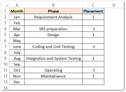
The First Column is representing the months while the second column represents the phases in which the entire process of software development is divided. The third column is for Placement. Placement is nothing but an alternative set of positive and negative of any number ( 1 in this example ) which could be used to generate the vertical lines as data series.
The blanks next to any Phase in the second column indicate that the process continues in those months also.
Inserting a Milestone Chart
To make a Milestone Chart in Excel, simply:-
- Select the Source Data A1:C12 ( in this example)
- Insert a 2D Clustered Column Chart from this data.
The Default Formatted Clustered Column Chart would be inserted as follows:-
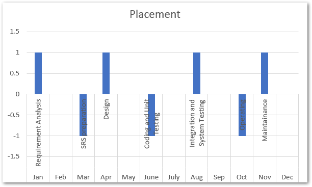
Since this chart is not exactly what we need, we will format this chart in different steps.
Removing the Chart Elements
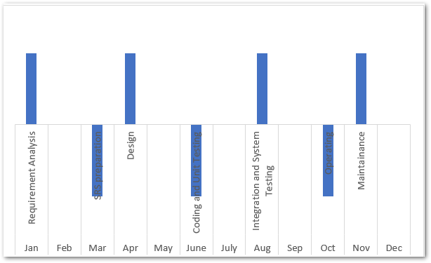
Remove the Chart title, Vertical Axis, and Gridlines by selecting them one by one and then pressing the delete key. This will make the Chart much clean as follows.
Correcting the Horizontal Axis Category Labels
The Horizontal Axis Labels are representing the Phases as well as the months which is creating a mess on the chart. We need the horizontal axis to represent months only. To change the Axis Labels simply:-
- Right Click on the Chart and choose the Select Data Option from the shortcut menu that appears.
- This opens the Select Data Source Dialog box.
- Click on the Edit button under the Horizontal Axis Labels section.
- Select the range A2:A13 and click OK
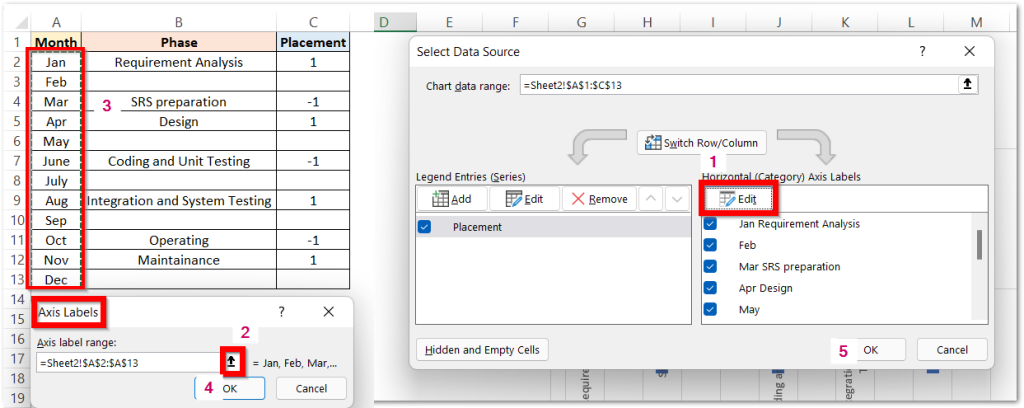
This will update the Axis labels for months.
Hiding Data Series and Adding Error Bars
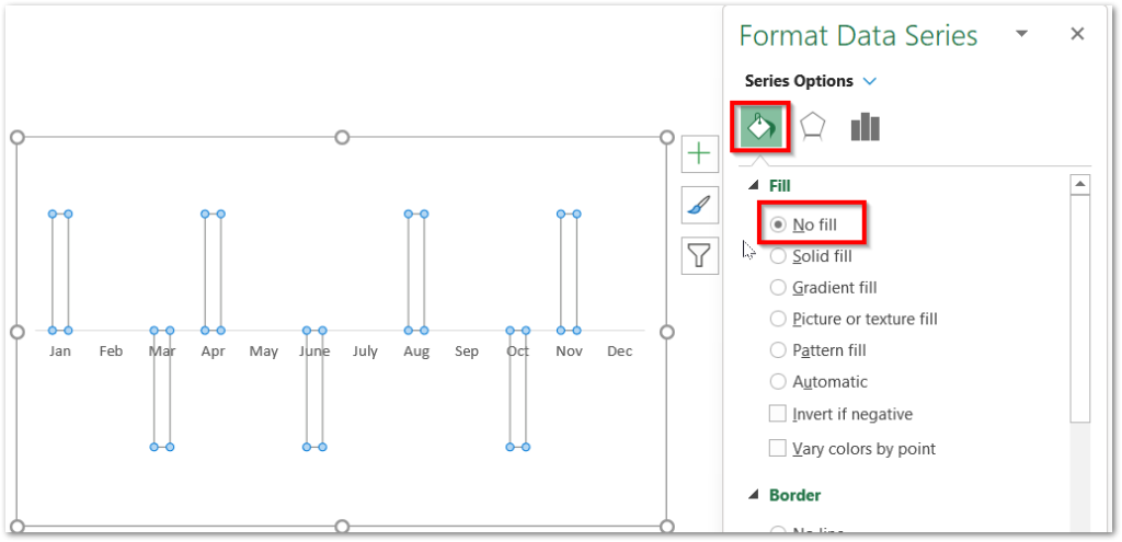
Until now, the chart is containing Vertical Bars as its data series. We need to set the fill color of these bars as no fill to make them invisible. To do so:-
- Select the Vertical Bars on the chart and press ctrl 1 key.
- This opens the Format Data Series pane.
- Set the Solid Fill Color of the Bars to No Fill.
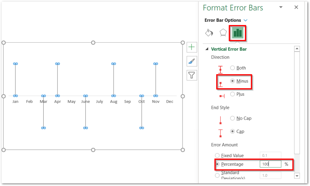
Now Click on the + Icon at the top right corner of the chart and mark the check box for Error Bars and then go to More Options.
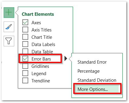
This opens the Format Error Bars pane. From there, set the error bars Direction to Minus ( towards the Horizontal Axis) and the Error Amount as 100 %.
Formatting the Error Bars
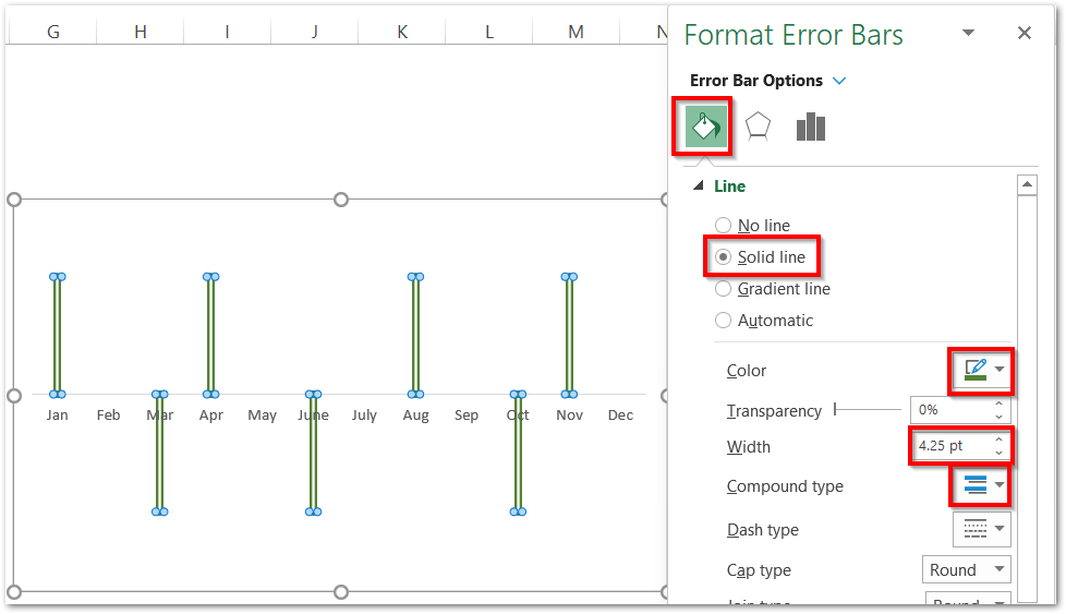
As we have the Format Error Bars pane opened in the previous section, we can change their color, compound type, and width as follows.
Adding the Data Labels on the Chart
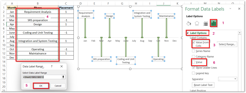
We need to add the phases of Project Scheduling via the Data Labels. To add the Data Labels, mark the checkbox for Data Labels from the + icon of the chart and go to More Options.
This will open the Format Data Labels pane. Go to the Label Options and Choose Value from Cells. Select the range B2:B13 and hit Ok. Unmark the Value from the Label Options field.
Here comes the end of the blog.
Thank you for reading.
RELATED POSTS
- All About Chart Elements of a Chart in Microsoft Excel
- Introduction to Charts in Microsoft Excel
- Radar Chart in Excel – Components, Insertion, Formatting
- Step Chart in Excel – Step vs Line, Insert, Working
- Waterfall Chart in Excel – Usage, Making, Formatting
- Tutorial – Record and Run a Macro – Real Life Example

