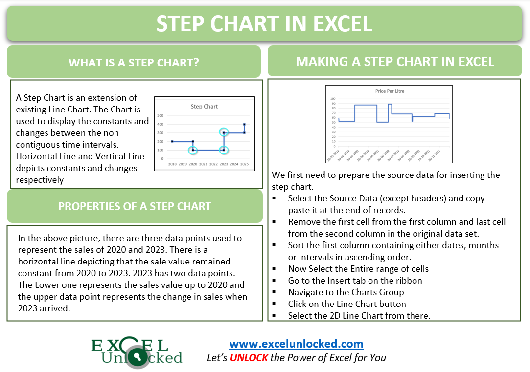
The Step Chart in Excel is an extension of the existing Line Chart. The Chart provides an additional advantage over the Line Chart. Let us see what is the difference between the two.
Difference Between a Step Chart and Line Chart
Let us suppose that we have the sales data of a company for its nonconsecutive years as follows:-
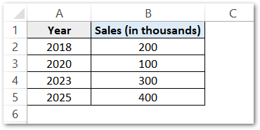
Since you can see that the years are not continuous. The Line Chart and Step Chart inserted for this data will be as follows.
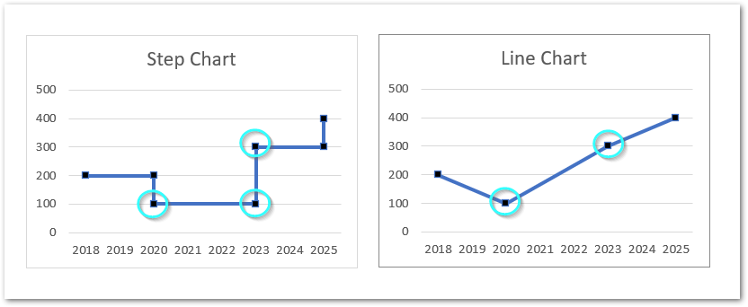
Consider the Sales of 2020 and 2023 in both charts. You will notice the following differences of representation in the line chart and the step chart.
- In a Line Chart, The two data points for 2020 and 2023 are joined using the shortest path between them. The angle of the line does not matter.
- In a Step Chart, there are three data points used to represent 2020 and 2023 sales. There is one horizontal line at zero degrees which shows that the sales between the two years remained constant until 2023. 2023 has two data points. The lower one represents the sales until now while the upper data point represents new value of sales. There is a vertical Line joining the two data points for 2023 that depicts the change.
When to Use a Step Chart?
The Chart in the above example is:-
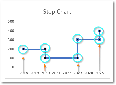
Here you can see that:-
- There is one data point corresponding to first category i.e 2018 that represents 200
- There are exactly two data points corresponding to second category i.e 2020. The Upper Data Point is representing 200 while the Lower Data Point represents 100.
- The Horizontal Line between the two Data Categories (2018 and 2020) depicts that there was a constant value of sales as 200 for year 2019 also until 2020 approached.
- The Change is always depicted by a Vertical Line.
So you will notice that, whenever we want to represent the constants and changes in between irregular intervals of time, then we will use a Step Chart in Excel.

Creating a Step Chart in Excel
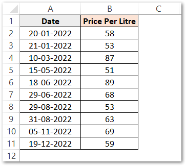
Let us say we have the history of the change in petrol price pet liter as follows:-
Preparing the Source Data
The First Step is to Arrange the Source Data. Copy and Paste the range A2:B11 right below this source data to get this.
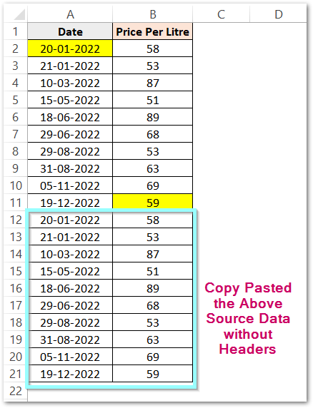
Here you can see that we have highlighted the first cell of the first column and the last cell of the last column in the original data set. These cells (A2 and B11) will be deleted from this range. To delete a cell:-
- Go to the cell A2 and press ctrl – (minus)
- Choose the option, shift cells up and click ok.
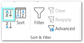
Repeat this procedure with cell B11. Now select any cell from the range A2:A21 and go to the Data tab on the Ribbon. Click on the Sort button in the Sort and Filter Group.
This will sort our data and bring the rows containing the same dates at one level to pair them.
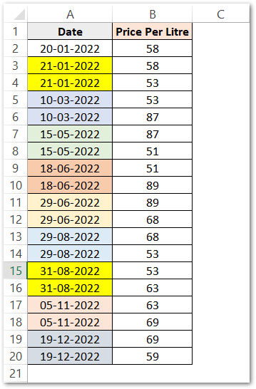
This will further become the base for two data points corresponding to each Category except the first Category (20-1-2022) in the Step Chart.
Also Read: Sparkline in Excel – Insert, Edit and Delete
Inserting the Step Chart in Excel
Now to insert the chart simply:-
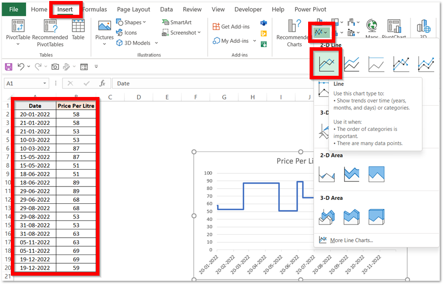
- Select the Source Data A1:B20
- In the Insert Tab on the ribbon, move to the Charts Group.
- Click on the Line Charts button and select the 2D Line Chart from there
This inserts the line chart as follows:-
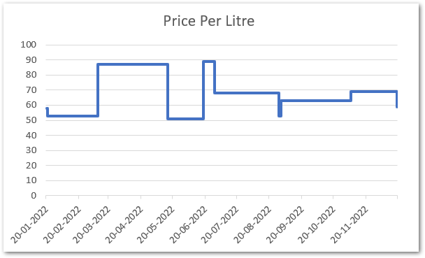
In Case, if your Category Axis does appear like this:-
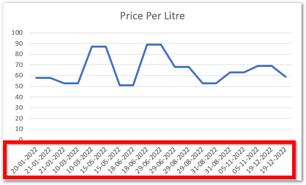
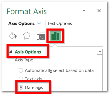
Then select the Category Axis, and press ctrl 1. Mart the Date Axis from the Format Axis pane and you will get your results.
With this, we have come to the end of the blog. Thank you for reading 😎
RELATED POSTS
- Line Chart in Excel – Inserting, Formatting, #REF! resolving
- Sparklines in Excel – Types, Usage, Insertion
- Change the Order of Data Series – Stacked Line, Stacked Area, Column Chart
- Stream Chart in Excel – Making, Usage, Formatting
- Trendlines in Excel – Types and Usage
- High Low Close – Stock Chart in Excel

