In the earlier blogs, we learned the usage of the Sunburst Chart. Just like the Sunburst Chart, Treemap Chart is also used in defining Hierarchical Relationships and Contributions. Let us see how this chart works!
What is Treeemap Chart in Excel?
Treemap Chart in Excel contains a bunch of rectangles whose color defines the category in which it lies and size tells its percentage contribution. The chart helps in defining hierarchical relationships and there are categories and subcategories that make the origin of this chart. We can use this chart to show the regional sales, Category wise Product Sales, Population, etc.
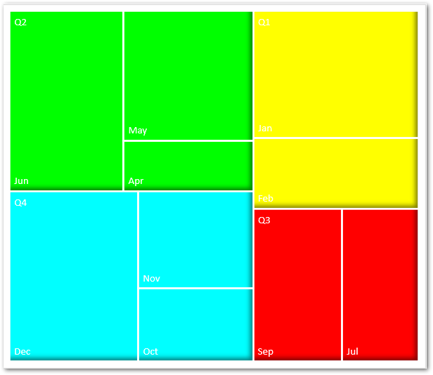
The chart does not have any axes. The Category Labels are overlapping on the Data Series (rectangles) itself. For example, in the above chart, the Quarters Q1, Q2, Q3, and Q4 have each color assigned to their subcategories which are months, and the Quarters are written on the rectangles. Here the Quarters are categories and Months are subcategories.
Example 1 – Inserting a Treemap Chart with one Subcategory each
Instead of directly jumping onto a complex Treemap, we will first understand the base of this chart by taking only one subcategory in each of the categories, The source data is as follows.
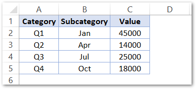
The Data Set has three columns for Quarters, Subcategories and Sales Values
To insert a Treemap Chart in Excel, follow the simple steps:-
- Select the range of cells A1:C5
- Go to the Charts group in the Insert tab on the ribbon.
- Select the Treemap Chart from the list in All Charts tab.
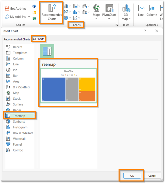
This inserts the Treemap chart with some default formatting.
How to Conclude Results from a Treemap?
The chart inserted in the above section is as follows:-
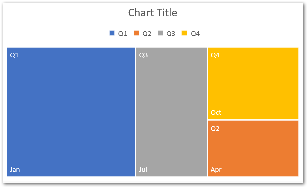
The chart has one Data Series for Sales. There are four Data Points in the series as Q1, Q2, Q3, and Q4. Excel has assigned these four Categories with specific colors and category labels are overlapping on the Data Points themselves. There is one subcategory in each Quarter. The Subcategories plot on the chart via rectangles and the color will tell which category they belong to. The size of the rectangle tells its contribution to the entire sales.
Conclusion – Here the sales of Jan in Q1 are maximum since the blue rectangle covers the largest area in the chart and the sales of Apr in Q2 are minima covering a small area on the chart.
Example 2 – Inserting a Complex Treemap Chart in Excel
Let us suppose we have the Quantity of the different products sold belonging to different categories of a Showroom as follows:-
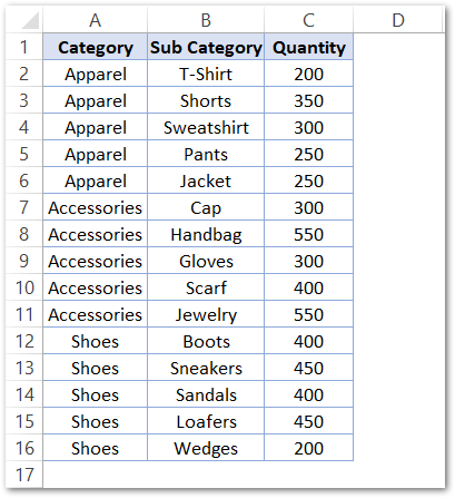
The shop owner wants a Visual Representation for this data such that he could easily compare the sales of different items as well as check the category to which the item belongs. We all know that the chart that best suits his needs is a Treemap Chart, We can insert the Treemap chart by using the steps mentioned in Example 1. The default Treemap chart we get is as follows-
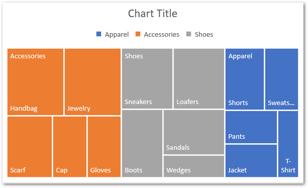
We can format the above chart in the following ways.
Formatting the Data Series
The Data series in the above chart is the Number of Products. Here the legends have been assigned default colors like Orange, Grey, and Blue. Double Click on any one Data Point on the Chart and this opens the Format Data Point pane. Make sure that it highlights upon double-clicking.

Set the Solid Fill Color and the Solid Line as the border of the Data Point. Repeat the steps for the rest of the two data points Shoes and Apparel.
As a result, we will get the formatted chart as follows.
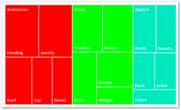
We have removed the Chart Title and Legend Key by simply selecting them and pressing the delete key.
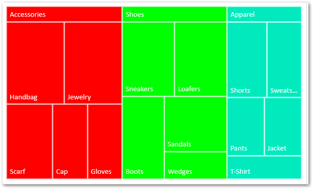
Formatting the Category Labels
The Categories are labeled on the top of Each Data Point. We can format it from the Format Data Point pane as follows:-
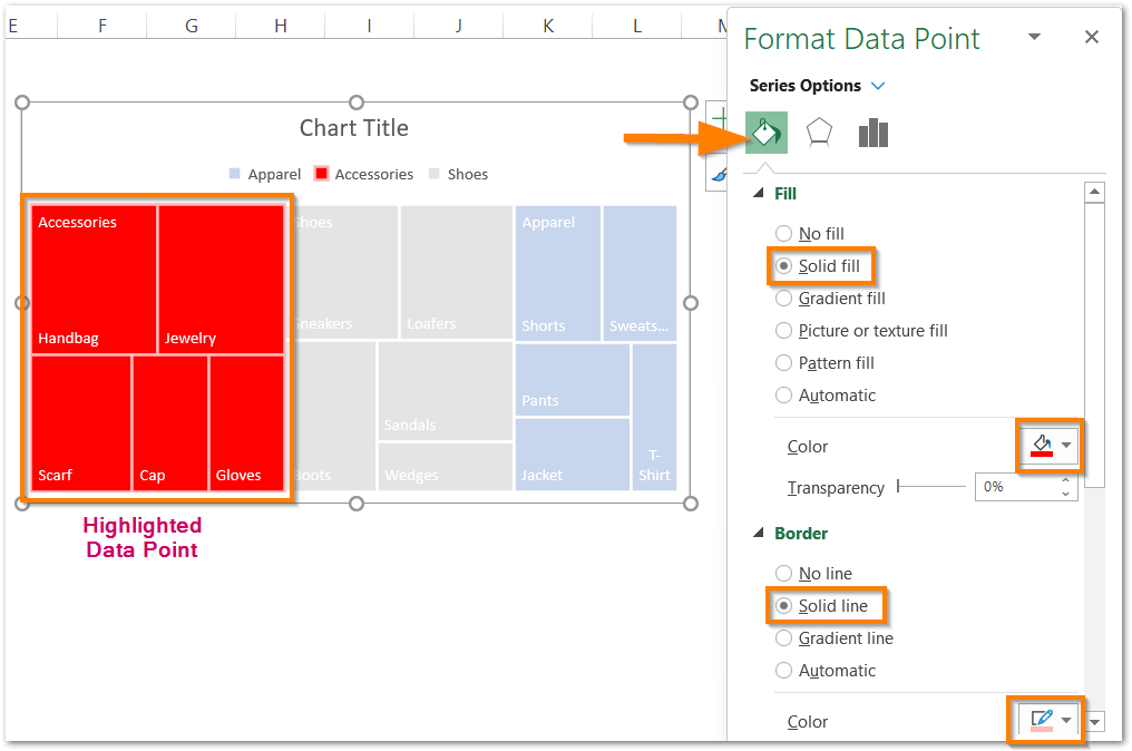
Consequently, we have got the resultant chart as follows.
This brings us to the end of the blog. Thank you for coming.
RELATED POSTS
- Stacked Bar Chart in Excel – Usage, Insert, Format
- Stacked Column Chart in Excel – Usage, Examples, Format, Special Gridlines
- Column Chart in Excel – Types, Insert, Format, Clickable Chart
- Waterfall Chart in Excel – Usage, Making, Formatting
- Stacked Area Chart Excel – Usage, Insertion, Area vs Line, Negative Values
- Radar Chart in Excel – Components, Insertion, Formatting
