In earlier blogs, we did the usage of the Doughnut Chart. Sunburst Chart in Excel looks similar to it but has completely different usage. Let us see how and where the chart type is used.
What is a Sunburst Chart in Excel?
As the name of the chart suggests, the data series of the chart is in the shape of the sun. The chart is also known as Stacked Pie Chart, Radial Treemap, or a Ring Chart. The chart is used in representing the hierarchal relationships among the data sets. The Hierarchy starts from the inner ring and the outer rings contain subcategories.
Reading a Sunburst Chart in Excel
We have the sales sunburst chart as follows.
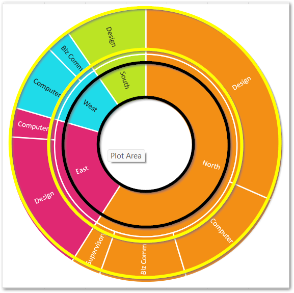
The chart has two rings from which the inner ring in black represents the categories. There are four categories in the above Sunburst chart as North, South, East, West from which the sales of North are maximum while the sales of South are minimum. So along with hierarchy, the chart is also representing the percentage contribution of each category in the whole.
The outer ring contains the subcategories and there are three subcategories for North, two for East, two for West, and one for South. You can also see that for the North region, the Sales of Design subcategory is maximum while sales of the Supervision subcategory are minimum. The chart also depicts that out of all subcategories, sales of Biz Comm in West are the lowest.
Inserting a Sunburst Chart in Excel
Let us say we have the Quarterly Sales of a company as follows:-
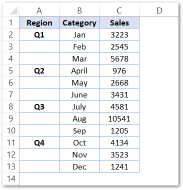
To insert a Sunburst chart simply:-
- Select the range of cells A1:C13
- Go to the Insert tab and click on Recommended Charts button.
- Select the Sunburst Chart from the All Charts tab in the Insert Chart dialog box.
This inserts a Sunburst Chart in Excel’s current worksheet with default formats.
Formatting the Data Series
The Chart inserted in the above section is as follows:-
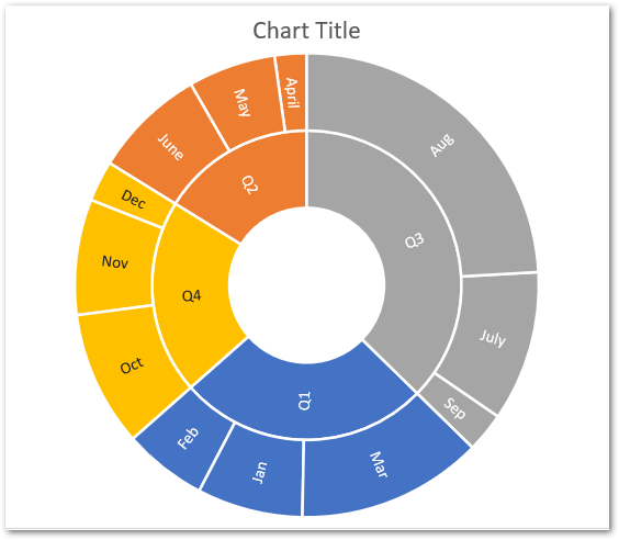
Since you can see that the automatic colors to these data points have been assigned. So in order to change the color, double click on any one of the Data Points on the chart and make sure it highlights after that.
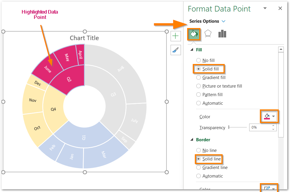
Set the solid fill color and the border color for the Data Point from the Format Data Point dialog box. Similarly, you could format the entire Data Series to get the following resultant chart.
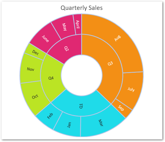
And here we have reached the end of the blog. Thank you for reading 8D
RELATED POSTS
- Column Chart in Excel – Types, Insert, Format, Clickable Chart
- 100% Stacked Column Chart in Excel – Inserting, Usage, Reading
- Stacked Column Chart in Excel – Usage, Examples, Format, Special Gridlines
- Pie of Pie Chart in Excel – Inserting, Customizing, Formatting
- All About Chart Elements of a Chart in Microsoft Excel
- Stacked Area Chart Excel – Usage, Insertion, Area vs Line, Negative Values
