In the earlier blog, we learned the usage of a simple Pie chart in Excel. Pie of Pie Chart in Excel is a special case. Let us see how 😎
What is Pie of Pie Charts in Excel
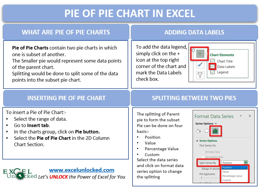
As the name says, the Pie of Pie chart contains two pie charts in which one pie chart is a subset of another pie chart. The smaller pie would represent some data points of the Parent pie chart. Consequently, splitting would be done to split some of the data points into the subset pie chart.

In the above example, there were a total of 6 data points. The Parent Pie chart represents three of them i.e Facebook, Youtube, and Instagram while the fourth data point named “Other” splits into a subset Pie chart that represents the rest of the three data points i.e Zee, Linkedin, and Hotstar.
Important Points to Mark
The following points about Pie of Pie charts must be kept in mind before using them.
- Pie of Pie chart is a type extension of simple Pie charts in Excel.
- It contains two pie charts, in which one is a subset of another.
- For instance, all the data points would be represented within these two pies i.e Parent Pie and Subset Pie
- The Parent pie would always contain one category that splits to form Subset Pie. That category is named “Other”.
- It;s completly up to us, that what type of splitting we want in our Parent Pie. Splitting occurs on four bases.
- Position
- Value
- Percentage value
- Custom (selecting Pie for each data point)
- Similarly, we can change the size of Parent and Subset Pie chart and adjust the distance between them on the chart.
Inserting a Pie of Pie Chart
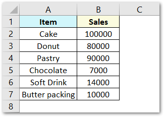
Let us say we have the sales of different items of a bakery. Below is the data:-
To insert a Pie of Pie chart:-
- Select the data range A1:B7.
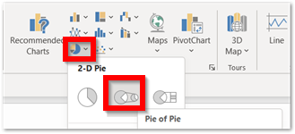
- Enter in the Insert Tab.
- Select the Pie button, in the charts group.
- Select Pie of Pie chart in the 2D chart section.
Adding Data Labels to Pie of Pie Chart
The chart inserted in the above section is:-
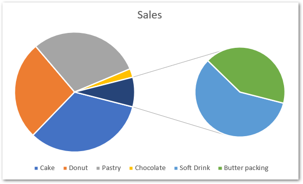
As we can see, the chart is slightly hard to read as there are no values or percentage ratios on the chart. To add the data labels:-
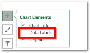
- Select the chart and click on + icon at the top right corner of chart.
- Mark the check box containing data labels.
Formatting Data Labels
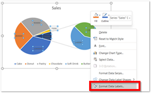
Consequently, this is going to insert default data labels on the chart. To order to format the data labels, right-click on any one of them and select format data labels from the shortcut menu.
This is going to open a Format Data Labels pane at the right of excel.
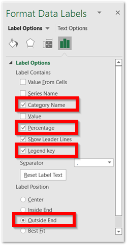
Mark the percentage, category name, and legend key. Select the position of data labels at Outside End. Select the fill color for data labels as white as we will change the chart background in the coming section. You can do it from the fill tab of the opened pane.
You can unmark the legends from the + icon as we have added the legend keys in the data labels.
Formatting Chart Slices, Background and applying Chart Styles
We can format the color of each slice by simply selecting it, and choosing the format data series option from the shortcut menu.
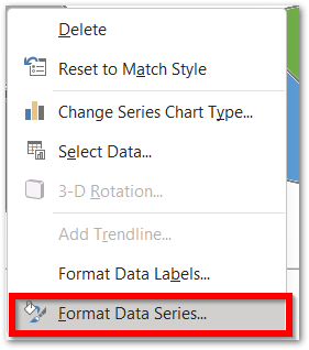
This opens the Format Data Series pane at the right of excel. Choose the fill color option from there.
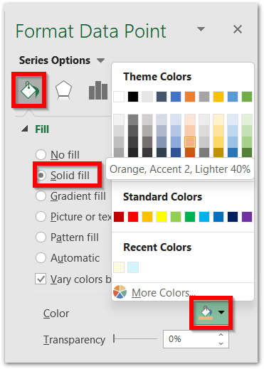
We can format each of the slices one by one by simply clicking on them, keeping the pane open.
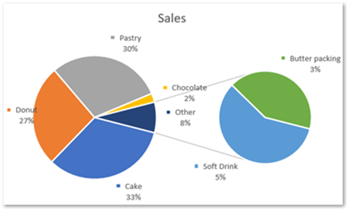
Similarly, we can apply formatting to the chart background. This is how the chart looks now.
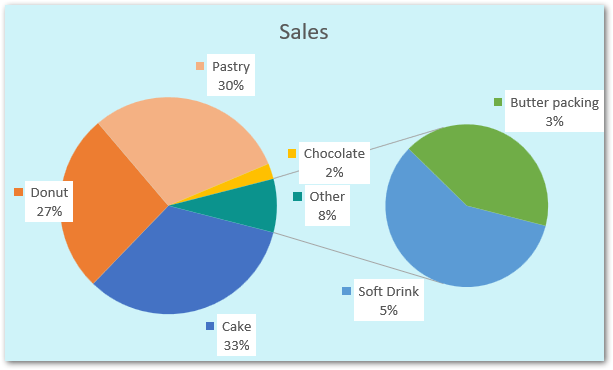
Chart styles are used to apply predefined chart formatting. We are not applying any chart styles in this chart. However, you can learn about applying Chart Styles in a Chart.
Customizing the Pie of Pie Chart in Excel
Splitting the Parent Chart
We can select what slices are going to be represented by the parent chart and subset chart. To begin:-
- Select the Chart.
- Go to Format Tab.
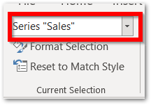
- Choose Series “Sales” in the Current Selection Group.
- Click on Format Selection Button. This would again open Format Series pane.
In the Format Data Seris Pane, the four options in the splitting section are:-
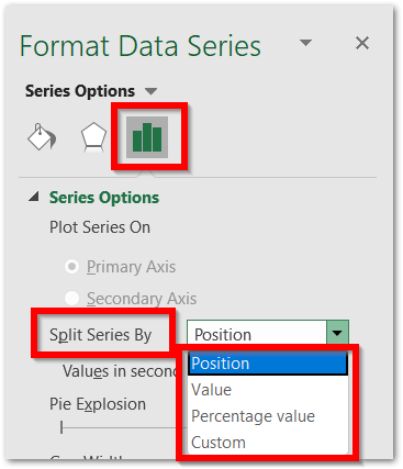
- Position – The Data Points to be represented in the subset pie are chosen from the bottom of the source data. The Subset Pie picks the data from the bottom to plot on it. However, We can select how many of them from the bottom we want to be represented by the subset pie. Selecting three would move three bottom categories from the source data into second plot (subset pie)

- Value – This criteria would apply to the value of each of slice of pie. We can choose the criteria as “Value Less than”. A Value less than 20000 would plot the sales of Chocolate, Soft drink, Butter Packing in the Second Plot.

- Percentage Value – This would split the categories on the basis of their percentage value. A percentage value of less than 6% would plot the series Chocolate, Soft Drink and Butter Packing in the second plot.

- Custom – The above three options splitt on the basis of some criteria. In custom, we will select a particular slice of pie and then choose the plot ( pie ) for it.
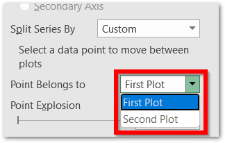
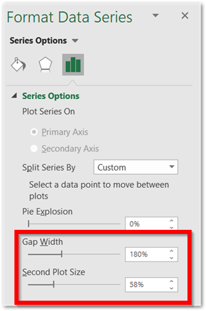
Additionally, we can change the relative size of the Subset pie and its distance (Gap width) from the Parent Pie from these two options.
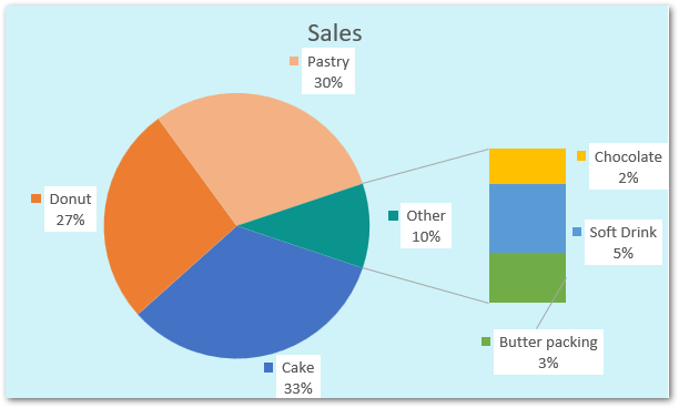
Bar of Pie Chart in Excel
This is similar to the Pie of Pie chart except that a bar (constant height) replaces the subset pie. To change the chart type of the above chart:-
- Select the chart.
- Go to Chart Design Tab.
- Click on Change Chart Type Button.
- Select Bar of Pie chart from there.
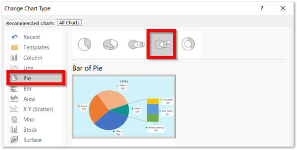
Consequently, the chart updates to the Bar of Pie chart.
Thank you for reading. 😎
RELATED POSTS
- 100% Stacked Column Chart in Excel – Inserting, Usage, Reading
- Pictograph Chart in Excel – Usage, Making, Formatting
- Sunburst Chart in Excel – Usage, Insertion, Formatting
- Stacked Column Chart in Excel – Usage, Examples, Format, Special Gridlines
- Bullet Chart in Excel – Usage, Making, Formatting
- XY Scatter Chart in Excel – Usage, Types, Inserting Scatter Chart
