In the recent blog, we learned how Pie Charts in Excel work. The limitation of the Pie charts is that we can represent only one data series with them. Doughnut Chart in Excel covers this limitation. So let’s get started 8D
What is a Doughnut Chart
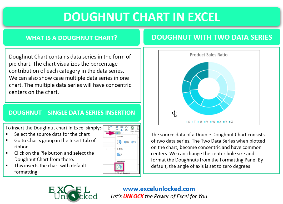
Doughnut Chart contains data series in the form of pie which has a hole in it at the center. The chart visualizes the percentage contribution of each category in the data series. It also has the ability to showcase multiple data series on one chart. The multiple data series would be represented by concentric (with common centers) pies with a common hole at the center of the data series.
- What is a Doughnut Chart
- Example 1 – Representing Single Data Series on Doughnut Chart
- Example 2 – Creating a Double Doughnut Chart
- Adding the Names of Data Series in Double Doughnut Chart
- Changing the Hole Size
- Changing the Angle of Slices
- Formatting the Data Series
- Doughnut Chart with Multiple Data Series
Example 1 – Representing Single Data Series on Doughnut Chart
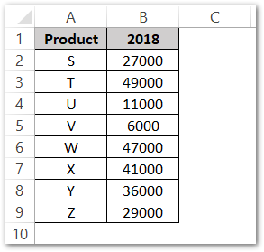
A Doughnut Chart with single data series is the same as the Pie Chart. Let us say we have the yearly sale of different products of a company as follows:-
To insert the chart, follow the steps mentioned below:-
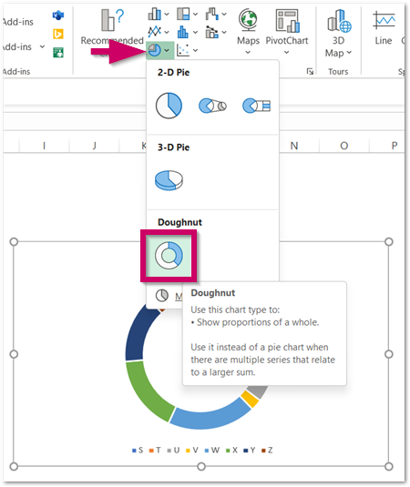
- Select the range of cells A2:B9
- On the ribbon, move to the Insert tab.
- Click on the Pie Button under the Charts Group.
- Select the Doughnut Chart from there.
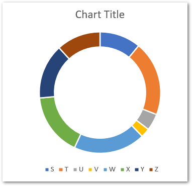
This will insert a Doughnut Chart with default formatting in the current worksheet like this.
Example 2 – Creating a Double Doughnut Chart
Double Doughnut Chart has the power to represent two data series. In the first example, we had taken the sales of 2018. In this example, the source data is as follows:-
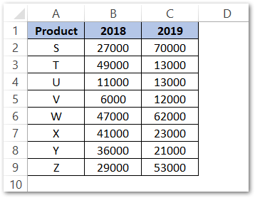
Here we have sales for two years which will result in two data series. Select the range of cells A2:C9 and insert the chart from the Charts Group in the Insert tab as follows.
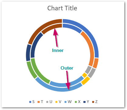
Here the outer Doughnut represents series 2 while the inner Doughnut represents series 1.

Adding the Names of Data Series in Double Doughnut Chart
We have not added the series name to the above chart i.e 2018, 2019. In order to add the series name, right-click on the chart. Choose the Select Data option from the shortcut menu.
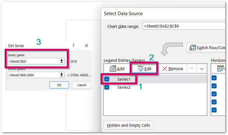
Select Series1 and then click on the Edit button. In the Edit Series Dialog box, select cell B1 (2018). Repeat the steps to add C2 (2019) as the name of series 2.
Changing the Hole Size
We can change the size of the center blank hole in a Doughnut Chart. Moreover, the chart readability increases. To do so, select the doughnut on the chart and press ctrl+1
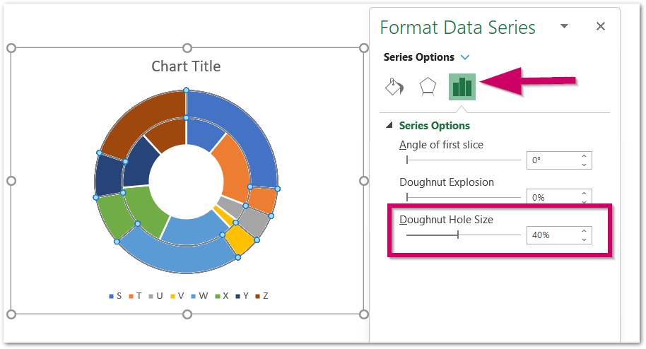
Navigate to Series Options in the Format Data Series pane and set the hole size. Decreasing the hole size will increase the radii of Doughnuts.
Changing the Angle of Slices
The default angle of the first data point/slice is set to zero degrees. We can change the angle of the doughnut slices by simply selecting the data series and changing the angle of the first slice.
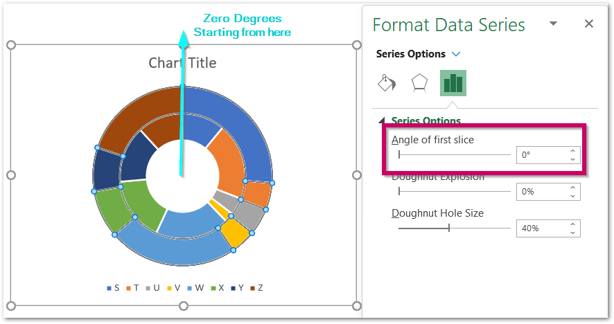
For now, we are not changing the angle of slices.
Formatting the Data Series
We can format each of the Doughnut Slices. To do so, double click on any doughnut slice to select it and press ctrl+1.
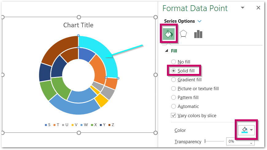
Navigate to the Fill tab in the Format Data Point pane. Choose the Solid Fill Color.
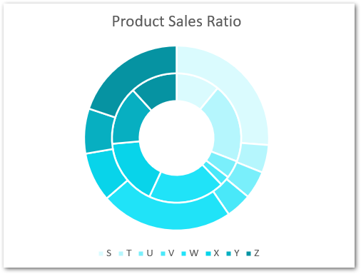
However you should keep the pane open and click on other slices on the chart to change their fill color, This is our final chart.
Doughnut Chart with Multiple Data Series
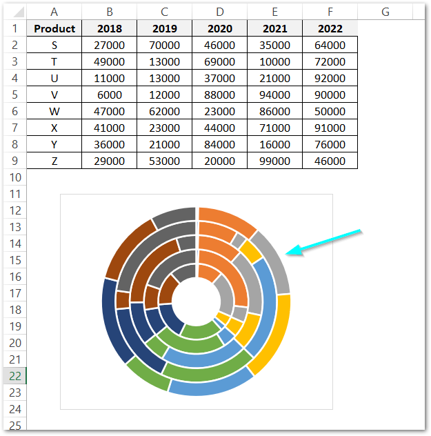
Let us update the source data we used earlier by adding a few more years. This would result in multiple data series plots.
This is how a Multiple Doughnut Chart looks.
Consequently. here comes the end of the blog. Thank you for reading 8D
RELATED POSTS
- Sunburst Chart in Excel – Usage, Insertion, Formatting
- Stacked Column Chart in Excel – Usage, Examples, Format, Special Gridlines
- Gauge Chart in Excel – Creating in Excel
- 100% Stacked Column Chart in Excel – Inserting, Usage, Reading
- Pictograph Chart in Excel – Usage, Making, Formatting
- Stacked Area Chart Excel – Usage, Insertion, Area vs Line, Negative Values

