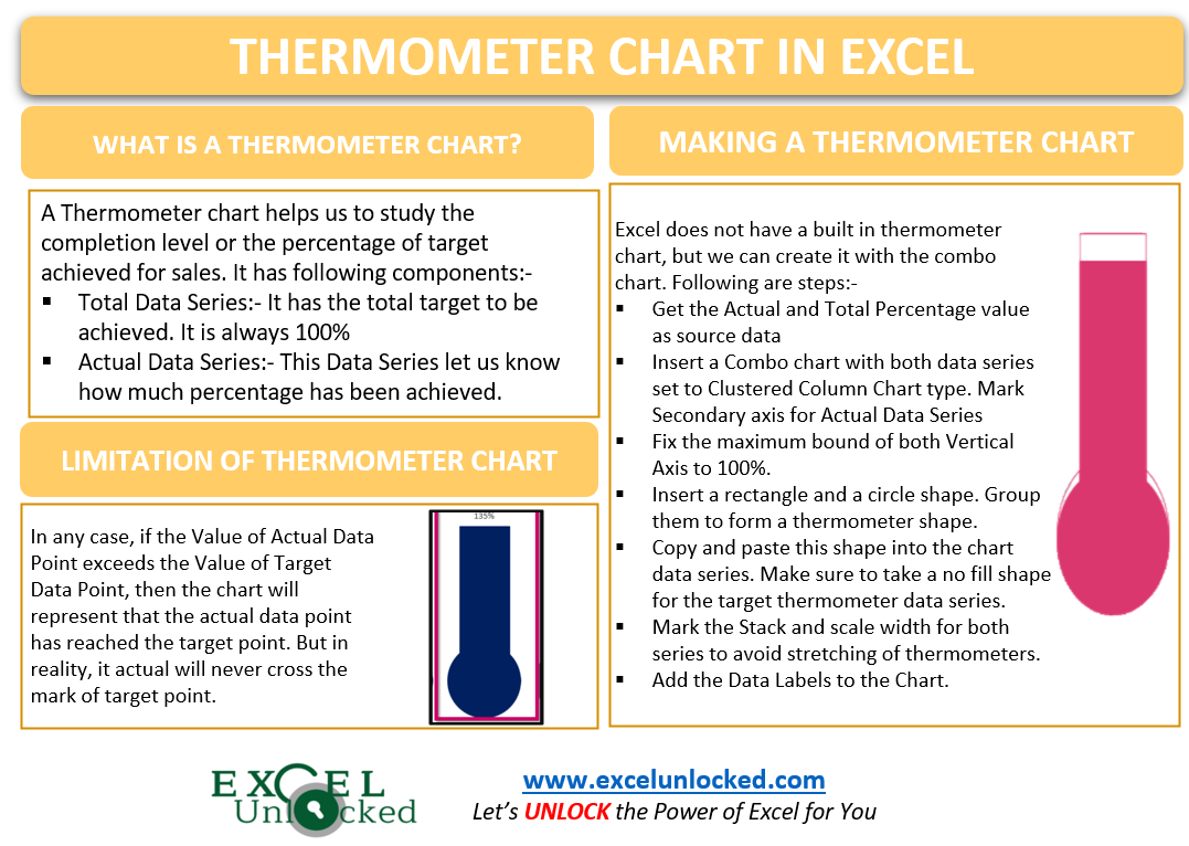
The Thermometer Chart in Excel is not unbuilt. But we can plot this chart type by using the 3D Clustered Column Chart in Excel. Let us see the usage 😎
What is Thermometer Chart in Excel?
A Thermometer Chart helps us to study the completion level or the percentage of target achieved for sales. This chart type lets us visualize the completeness of any project. It has the following components:-
- Horizontal Axis – This axis represents the Labels or Categories.
- Total Data Series – This data series would represent the total of the target that has to be achieved. It will always be 100%.
- Actual Data Series – This data series will let us know how much percentage of the total data series has been achieved.
- Primary Vertical Axis – It has the scale for either Total Data Series.
- Secondary Vertical Axis – It has the scale for Actual Data Series
Limitation of Thermometer Chart in Excel
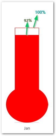
There is an important exception to understand about the Thermometer Charts. In any case, if the value of the Actual Data Point (102%) exceeds the Total Data Point (100%) then the chart will show that the Actual data point has reached the Total Data Point. On the Chart, the Actual will not exceed the total (100%). The reading of the thermometer cannot go beyond 100% (Total ). The Actual Data Point will represent 100% on the chart.
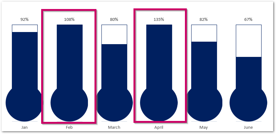
As you can see in the chart, the target (100%) has been achieved for Feb (108%) and April (135%) but the maximum representation would be up to 100%.
Making a Thermometer Chart in Excel
Let us say we want to make a monthly expenditure warning chart, that lets us know whether the limit for monthly expenses has been crossed. For that, we need to assume a Monthly Expense Limit. Let us assume it as ₹7500. Below is the data.
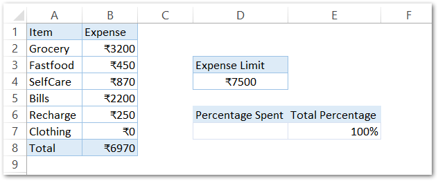
We can calculate the Percentage of Money spent (Actual Data Series ) by using the formula in cell D7.
=B8/D4
This will return the percentage of money spent as follows. Make sure to set the Number Format of Cells D7 and E7 as Percentages.

We will insert a 2D Clustered Column Chart for the range of cells D6:E7.
Correcting the Chart Data Series
The chart inserted in the above section is as follows.
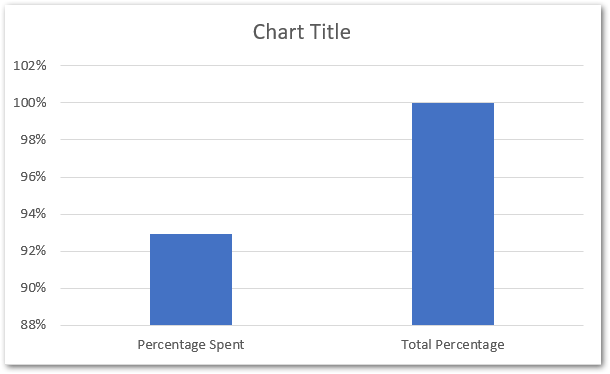
As you can see that both vertical columns are plotted as one data series. We need two separate data series for each of Actual and Total Percentage. To do so:-
- Right click on chart and choose the option Select Data.
- The Select Data Source Dialog box opens. Select the Series1 and Click on edit button.

- Enter “Expense” in the Series Name and Select the cell D7 as Series Value.

- Hit OK button in the Edit Series Dialog box.
- Before the Edit Series button, there is an Add button. Click on it and add a new series for Total Percentage.
- Enter the Series Name as Total and select the cell E7 as the series value.
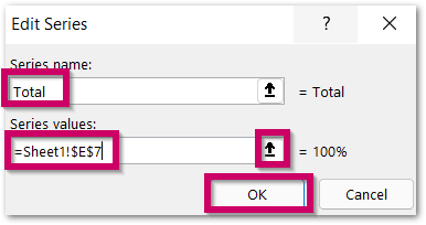
This updates the data series in the chart.


Changing the Chart Type
The second step is to change the chart type to a Combo chart. To do so:-
- Right Click on the chart and click on Change Chart Type option.
- Select the Combo Chart and Choose Clustered Column for both Data Series.
- Mark the Secondary Axis for “Expense”
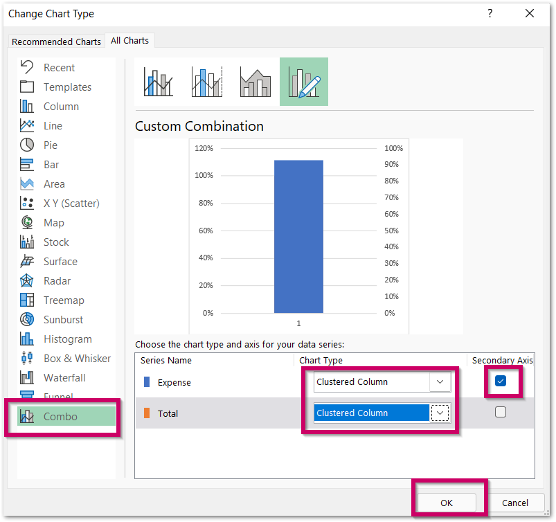
Fixing the Maximum and Minimum Bounds of Vertical Axes
By now the Maximum and Minimum Value of Axis Labels is based on the Source Data of the Chart. It is automatic and updates with changes in source data. We need to fix the Axis to lie in between 0% to 100%. In order to do that:-
- Select the Primary Vertical Axis on the Chart.
- Press Ctrl+1
- This opens the Format Axis Pane. Navigate to Axis Options
- Set the Minimum and Maximum bound to 0 and 1.
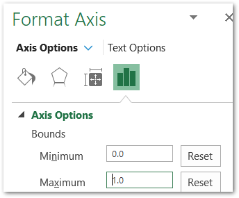
Similarly, fix the bounds for the Secondary Vertical Axis as well. This is how the chart looks.
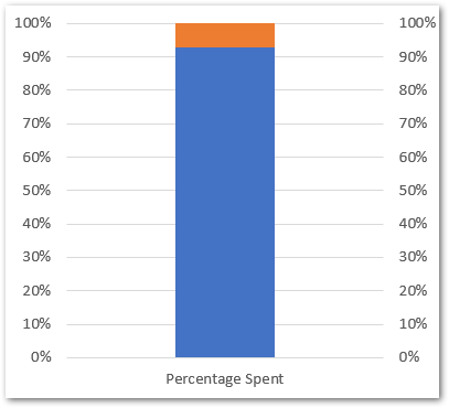
Adding Thermometer to the Chart
We need to insert a Rectangle Shape and a Circle from the Shapes button in the Insert tab on Ribbon. To make a thermometer, adjust the position of both shapes like this:-

Select both the oval and rectangle ( hold the shift key while selecting ). Go to the Shape Format tab. In the Align group, click on Group. This will group both the shapes as one.
You can change the fill color from the Shape Format tab and even remove the outline in the Shape Styles Group. Once the shape is formatted, select as a whole like this:-
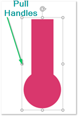
You will not be able to format the shape once it is inserted into the chart.
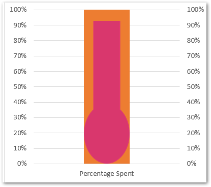
Press ctrl+c to copy this shape. Now Click on the Blue Column on the Chart and press ctrl+v. This will replace the bar with the thermometer on the chart like this:-
Make another thermometer shape with no fill color. Apply the outline of the same color as that of the thermometer we inserted above. The shape should look like this once grouped as one.
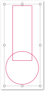
Copy and paste this shape to the orange bar as we did for the blue bar. Consequently, the chart looks like this now:-
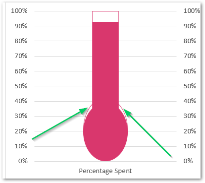
Correcting the Stretched Thermometers
You can see that both the thermometers have stretched them as per the magnitude of percentage they are representing. To avoid this to happen, Double click on the thermometer on the chart and mark this checkbox from the Format Data Series pane.

Moreover, you can remove the Gridlines and Vertical Axes from the Chart by simply selecting and pressing the delete key.
Adding Data Labels to the Chart
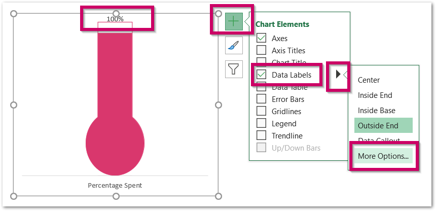
Select the chart. From the + button at the top right corner of the chart, mark the data labels and then go to more options as shown below.
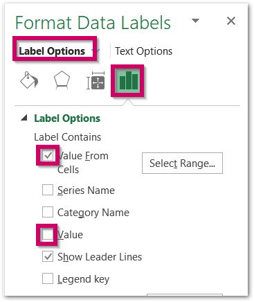
In the Format Data Labels pane, navigate to label options and mark the checkbox for Value From Cells. Select cell D7 and then unmark the check box for Value.
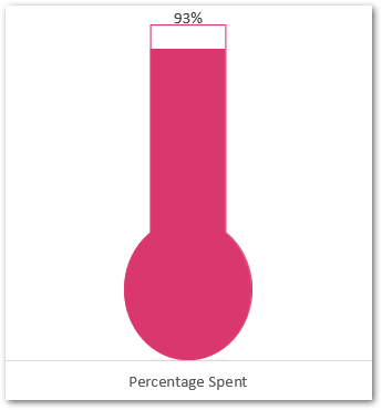
As a result, we have got the final chart.
This brings us to end. Thank you for reading.

