ln the earlier sections, we learned the usage of many types of charts in excel. Sparklines in Excel are also a type of visual representation of data. Sparklines play an important role in making interactive dashboards.
What are Sparklines in Excel
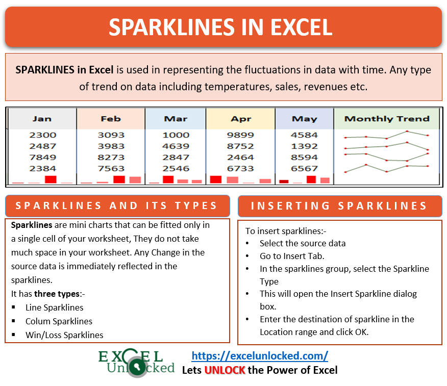
Sparklines are used to visually represent the data but not really like a chart. The sparklines do not have any horizontal or vertical axis. They only represent the trends in data. Sparklines are supposed to fit in a single cell of your sheet and they do not take much space in your worksheet.
Sparklines helps us to study the fluctuations in temperature, prices, budget, sales over time. They are inserted right parallel to the cells containing the numerical values.

Types of Sparklines in Excel
There are three types of Sparklines in Excel:-
- Line Sparklines
- Column Sparklines
- Win/Loss Sparklines
Using Line Sparklines
Let us say we have the regional revenue of a company for five months. Below is the data.

To add line sparklines:-
- Select the range B2:F5
- Go to Insert Tab in the ribbon
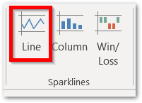
- In the sparklines group, click on Line Sparklines button
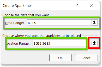
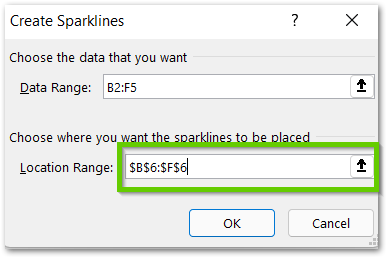
- This would open a dialog box named “Create Sparklines” . The dialog box has two parts named “Data Range” and “Location Range”.
- The Data Range is a reference to the source data for the sparklines
- The Location Range contains the reference to the destination where the sparklines would be plotted.
As we had selected the source data B2:F5, so now we only need to enter the location range for sparklines. Click on the button at the right side of the Location Range Textbox and then select the range G2:G5.
Also Read: A Complete Guide on Sparklines in Excel
Click ok. As a result, you will see the line sparklines successfully plotted in the worksheet parallel to the data. You can put “Monthly Trend” in cell G1. This is so because the range G2:G5 would contain the trend for different regions over months.

Using Column Sparklines
Column Sparklines represent the trend in data by using vertical bars instead of lines. They also fit in one cell for each data trend. For example, let us say I want to get the Regional Trend for the above data. To do so, simply:-
- Select the range B2:F5.
- Go to Insert Tab on the ribbon
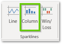
- In the Sparklines group, click on the Column Sparklines button.
This would again open the Insert Sparklines Dialog box. Choose the Location Range from there as B6:F6.
Click OK. Consequently, you would see the column sparklines in your data. Name cell A6 as “Regional Trend”. This is so because each of the columns in every sparkline represents the regional sales.

As you can see there is a total of four columns in each sparkline. The four columns represent the trend in sales of North, South, East, West. So if you see the sparkline in cell C6, you’ll see that for Feb, the sales in East were maximum and Sales in West were very close to it.
Also Read: Sparkline in Excel – Insert, Edit and Delete
Win/Loss Sparklines
As the name suggests to you, “Win/Loss” would probably mean two opposite data sets to be plotted. Well, these are the positives and negatives. This type of sparkline mainly indicates whether the data value for that was the point was either negative or positive. It would not show the magnitude of the data.
Let us say we have the quarterly revenue for different products of a company.
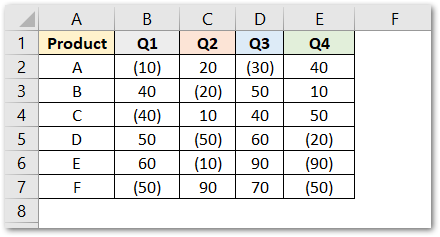
The negative values are formatted to be within brackets. The values within brackets are negative values.
To insert Win/Loss sparklines:-
- Select the range of cells B2:E7
- Go to Insert tab on the ribbon
- In the Sparklines group, click on Win/Loss sparklines button
- In the Insert Sparklines dialog box, set the location range as F2:F7 and click OK
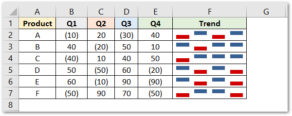
As a result, each of the sparklines in range F2:F7 contains four bars for the four quarters. the lower bars indicate the negative value while the upper bar indicates a positive value.
From cell F2, we can infer that the revenue for Q1 and Q3 is negative while it is positive for Q2 and Q4.
You can also learn about formatting the sparklines in our next blog.
Thank you for reading 😎
RELATED POSTS
- Trendlines in Excel – Types and Usage
- Column Chart in Excel – Types, Insert, Format, Clickable Chart
- Scatter Charts in Excel – Straight and Smooth Lines with Markers
- Line Chart in Excel – Inserting, Formatting, #REF! resolving
- High Low Close – Stock Chart in Excel
- Stacked Line Chart in Excel – Inserting, Reading, Formatting
