In this blog, we would learn how to use the Sparkline feature in Excel. A sparkline is just like a chart that we create in Excel.
What is Sparkline in Excel ?
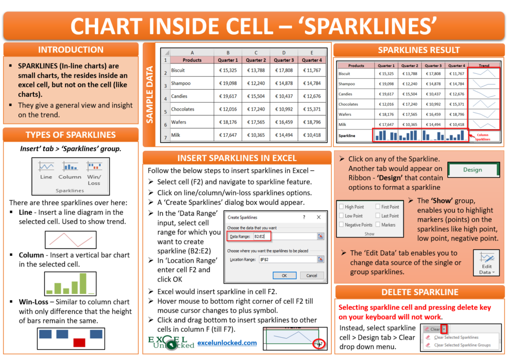
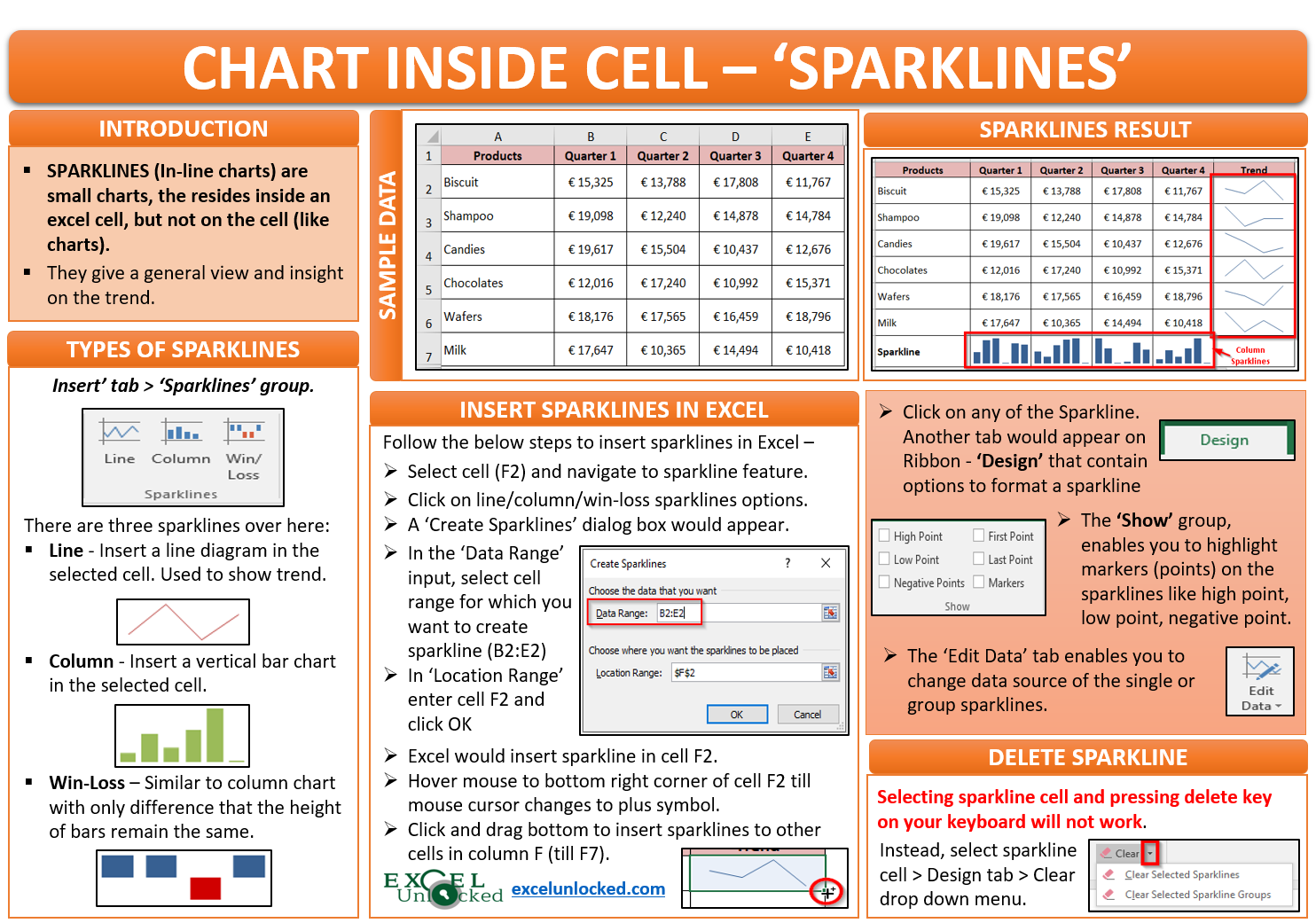
Sparklines (also known as in-line charts) are small charts, not on the excel worksheet, but inside an excel cell. It does not provide a detailed trend like any other excel chart but gives a general view and insight on the trend by using a small space.
Sample Data
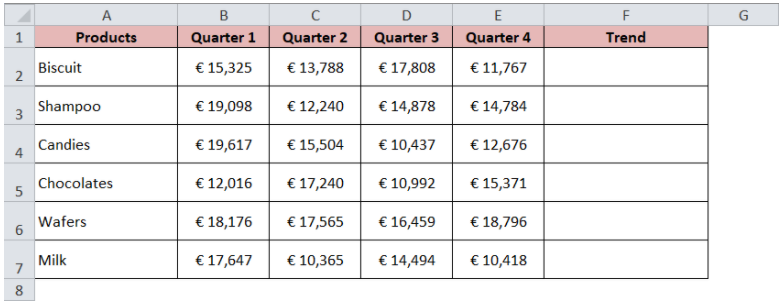
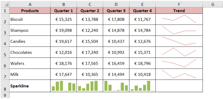
Below is the dataset that consist of product-wise sales figures across the four quarters in a year.
Where is the Sparkline Feature in Excel
Follow the below path to navigate to the Sparkline feature in Excel – ‘Insert’ Tab > ‘Sparklines’ group.

There are three types of Sparklines that you can create using this feature – Line, Column, and Win/Loss.
The Line sparkline would insert the line diagram in the selected cell. Mainly, it is used to show the trend (increasing or decreasing).
Similarly, you can use the Column sparkline to insert the vertical bar chart in the selected cell. The height of the bars differs for different values in data.
The Win-Loss sparkline option is similar to the column sparkline chart, with the only difference that the size of the bars is the same where bars above axis represents wins (positives) and below it represents loss (negatives).
Now let us learn how to insert sparklines in Excel
Insert Sparklines in Excel
Follow the below steps to add or insert the sparklines in excel:
Select the cell in which you want to add the sparkline (blank cell). In the present case, we want to insert the sparkline in cell F2.
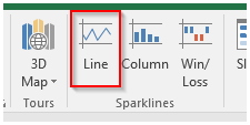
Then, navigate to the Sparklines feature under the Insert tab and click on the appropriate sparkline.
In the present case, as we want to show the trend, select the “Line” sparkline button as highlighted in the screenshot below:
The ‘Create Sparkline’ dialog box would appear on your screen as shown in the image below:.
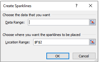
In the “Data Range” section, you need to insert the cell range for which you want do trend analysis In the present case, as we want to create the sparkline across products, select the range from B2:E2.
Also Read: Trendlines in Excel – Types and Usage
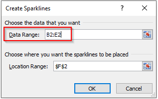
The “Location Range” would be the cell within which you want to insert the sparkline which in our case is cell F2 (the selected cell). And click on ‘OK’ button to exit.
You would notice that the excel inserts the Line Sparkline in cell F2.
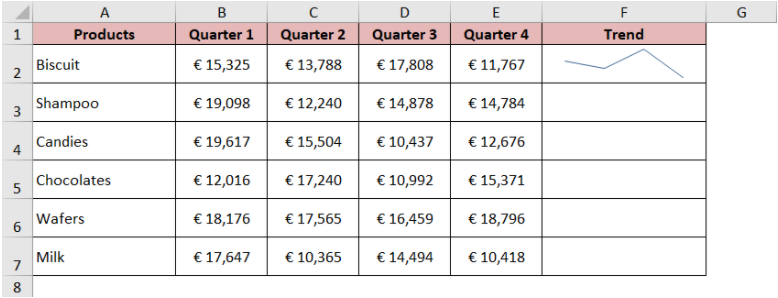
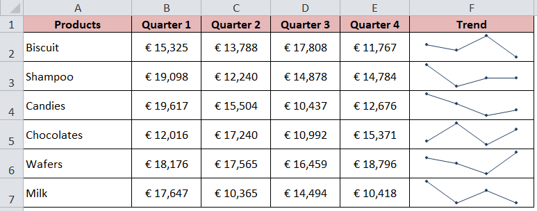
You can now easily get a rough idea about the trend of Biscuit sales. The sales fall in Quarter 2 and then again increase in Quarter 3 and then reduces drastically.
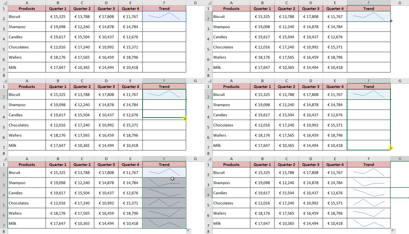
To insert the same line charts in all the cells in column F, hover your mouse cursor to the bottom right corner of the cell F2 till the mouse cursor changes to a plus like a symbol. Left-click and hold and then drag it downwards to insert sparkline to all the other cells in column F.
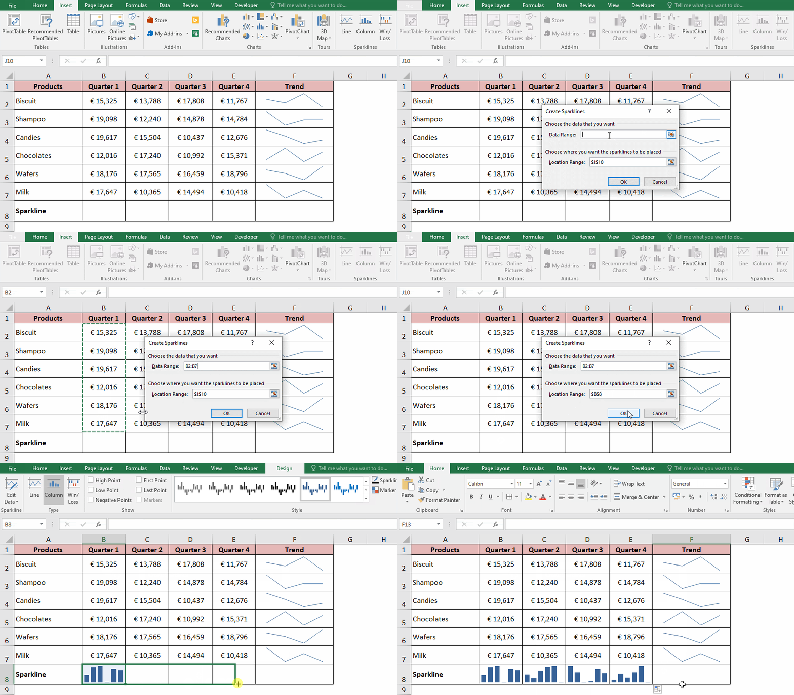
Just Like we used the line sparkline to get the quarter wise trend of the product, in a similar way, we can use the column sparklines to insert the sparklines for each quarter. See the below demonstration.
Change Sparkline Color
By default, excel inserts the sparkline in Blue color. However, you can change the color of the sparkline based on your color preference using the below steps:
Select the cell(s) containing the sparkline.
As soon as you click on the cell F6, you would notice that excel selects the entire group of the sparklines and inserts a new tab in the ribbon named ‘Design’.
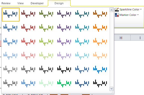
Click on this new tab ‘Design’. The options available for formatting the sparkline would appear as shown in the screenshot below:

Under the “Style” group, you would notice that there are several standard color styles that you can choose from.

Click on the style of your choice, and you would notice that the color of sparklines for the whole of the group would change accordingly.
To get more color combinations, click on the ‘More’ colors option (down arrow symbol) as highlighted in the image below:

You now have more lists of colors to select from.
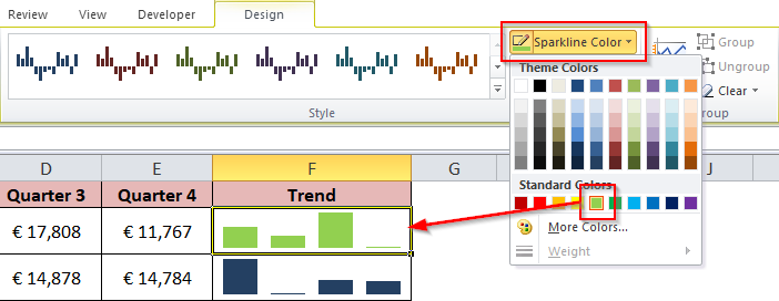
Additionally, you can select more colors from the “Sparkline color” option as shown in the screenshot below:
Showing Points in Sparkline
There are various types of points known as ‘Markers’ that you can show in Line Sparkline. These markers make the tiny little charts more noticeable.
To show the points in sparkline, select the cell which contains line sparkline. As a result, the ‘Design’ tab would appear on the ribbon bar.
In the group ‘Show’, you would notice that there are different checkboxes available.
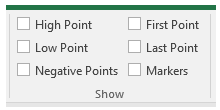
Let us understand each of these checkboxes with examples.
High Point: This option would highlight the highest point in the data in the selected line sparkline.
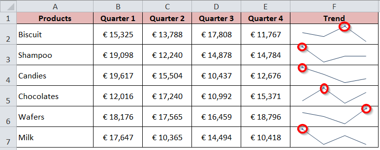
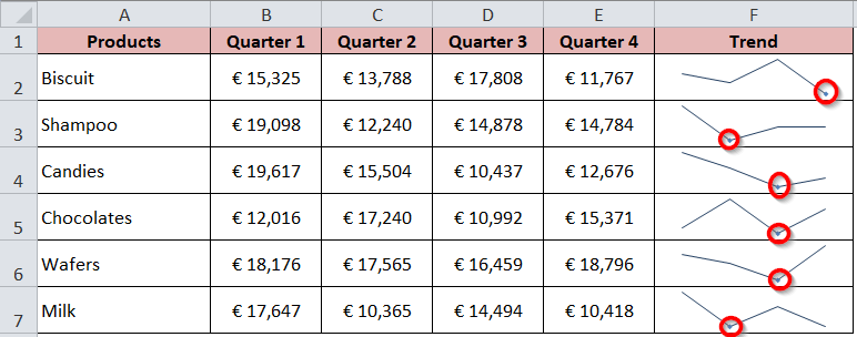
Low Point: This option if ticked, would highlight the lowest value in the sparkline data as you can see in the image below.
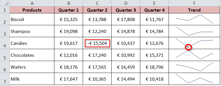
Negative Points: If your data contains any negative value, then that point alone would be highlighted in the line sparkline.
For explanation purposes, I have changed one of the figures to negative.
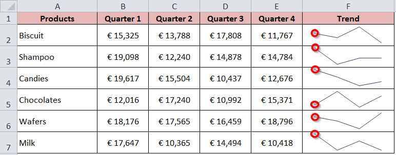
First Point: This checkbox would highlight the first points in the selected line sparkline.
Last Point: Similar to the first point, this checkbox would highlight the last points in the selected sparkline.
Markers: This option if ticked, would insert dots for each of the points in the line sparklines, as can be seen from the image below.
Delete Sparklines in Cells in Excel
In this section of this blog, we would learn how to remove the sparklines in Excel.
Let us first do one small exercise. Select the cell(s) that contain the sparklines and press the Delete button on your keyboard. Did excel remove the sparkline? The answer is NO. Pressing the delete key on your keyboard would not delete the sparklines.
In order to delete or remove the sparkline, follow the below procedure :
Select the cells that contain the sparklines and go to the ‘Design’ tab.
Under the group ‘Group’, click on the option “Clear” drop-down arrow and select the option – ‘Clear selected sparkline’ to delete the sparkline in the selected cell.
To delete all the grouped sparklines, select the option – ‘Clear selected sparkline group’.

How to Change Size of Sparkline in Excel
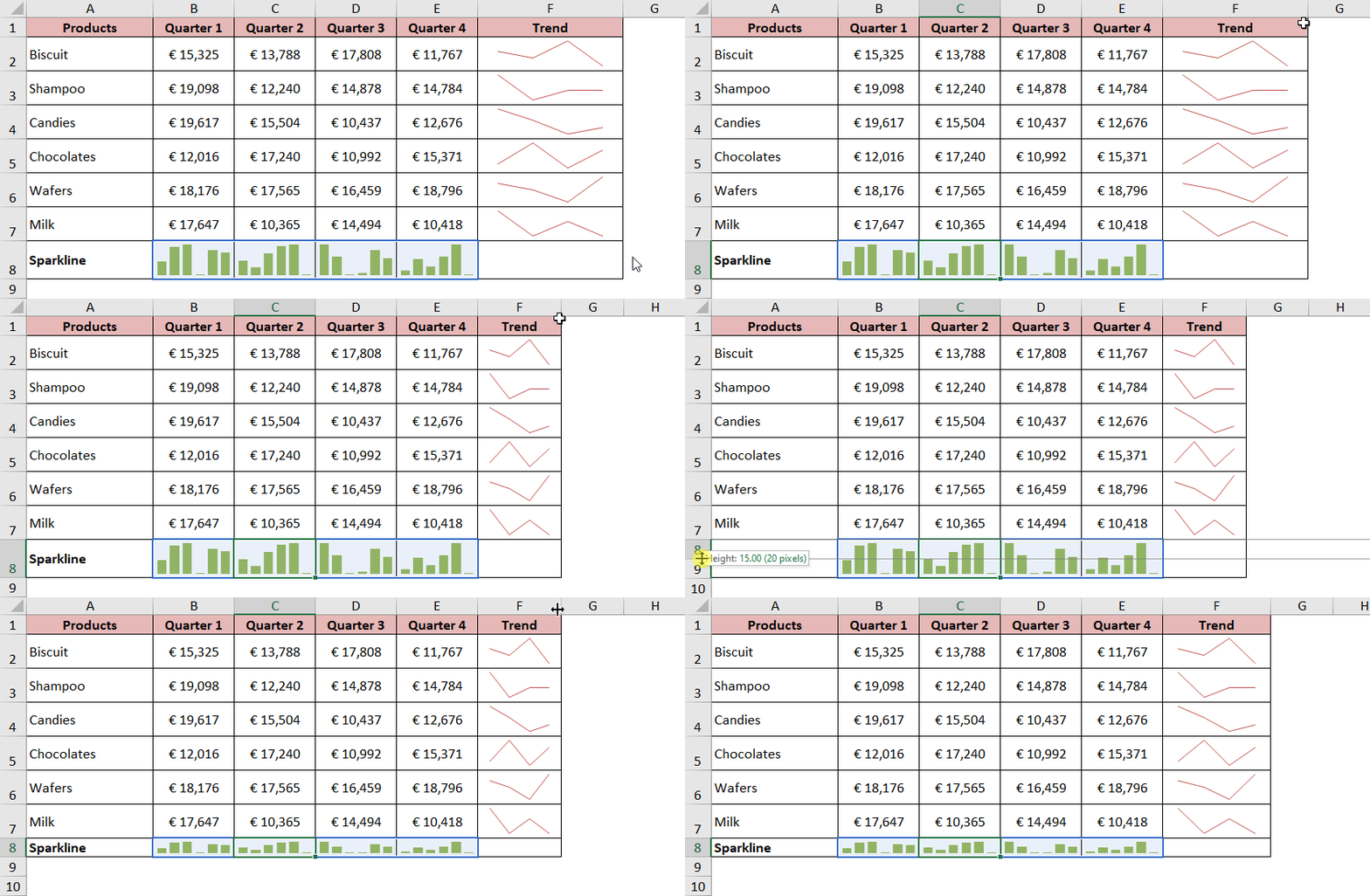
There is no rocket science to resize the sparkline in excel. As mentioned in the introduction of this blog, the sparklines are placed within the cell and not on the cell. Therefore, to resize the sparklines, simply you need to change the row height or column width.
The below demonstration is self-explanatory.
Edit Data in Sparklines
The “Edit Data” is the first option in the “Design” tab under the group “Sparkline”.

This option helps in changing the data source and range of the individual sparkline or group of sparklines.
To edit the data source of the sparkline, follow the below steps:
Step 1: Select the sparkline for which you want to change the data source. Suppose I want to change the data source of Biscuit, then select the cell F2 (containing the sparkline).
Step 2: In the group “Sparkline”, click on the option “Edit Data” drop-down button.
A drop-down menu would open as shown in the image below:
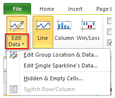
Step 3: From the drop-down list, select the option “Edit Single Sparkline’s Data”.
The “Edit Sparkline Data” dialog box would open from where you can change the source of the data. Enter the new source data range and click on the “OK” button.
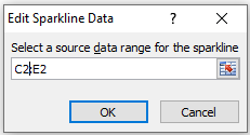
You would notice that the sparkline accordingly changed itself based on the new source data range.
This brings us to the end of this blog. Your views and critics are of paramount importance to improve the quality of my blogs.
RELATED POSTS
- A Complete Guide on Sparklines in Excel
- Stream Chart in Excel – Making, Usage, Formatting
- High Low Close – Stock Chart in Excel
- Column Chart in Excel – Types, Insert, Format, Clickable Chart
- Step Chart in Excel – Step vs Line, Insert, Working
- Stacked Column Chart in Excel – Usage, Examples, Format, Special Gridlines

Outstanding