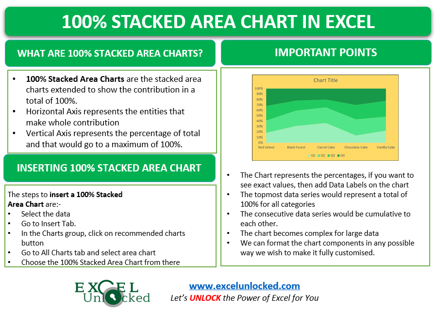
In the earlier blog, we learned the usage of 100 % Stacked Line Charts in Excel. It is recommended to first check the usage of 100% Stacked Line Charts before using the 100% Stacked Area Charts. 100% Stacked area charts work on percentages instead of values. The chart shows contribution more than the data values. Let us see how 😎
Here we go.
What are 100% Stacked Area Charts
100% Stacked Area Chart represents the contribution of each data series in each of the categories, where the total is always 100 %. The data series on the chart makes some part in the total of 100%.
In a 100% stacked Area Chart, the Vertical Axis represents the percentages that go to a maximum of 100% while the horizontal axis represents the categories to be plotted on the chart.
Inserting a 100% Stacked Area Chart
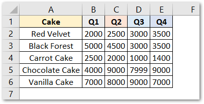
Let us say we have the quarterly sales of the different cakes of a bakery. Below is the source data.
To insert a 100% Stacked Area Chart, follow the steps:-
- Select the range A1:E6
- Go to Insert tab
- In the charts group, click on Recommended Charts button
- The insert chart dialog box opens.
- Go to All Charts tab and Click on Area Charts from the menu
- Select the 100% Stacked Area chart from there.
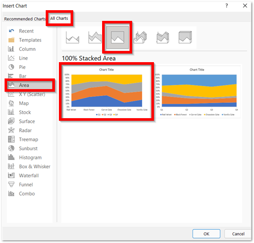
This would insert a default 100% Stacked Area Chart in Excel.
Efficient Reading of Stacked Area Charts
The chart inserted in the above section is:-
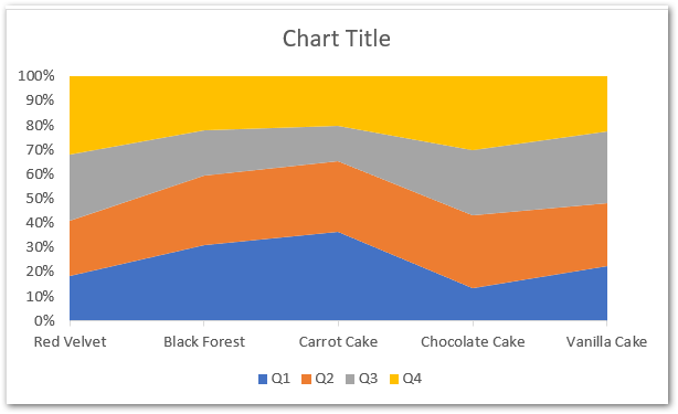
- This chart has one horizontal and one vertical axis
- The horizontal axis contains the categories i.e name of cakes
- The vertical axis has the percentage scale.
- There are total 4 data series named Q1, Q2, Q3 and Q4
- The Horizontal axis has 5 categories named Red Velvet, Black Forest, Carrot Cake, chocolate Cake, Vanilla Cake.
- The total sales of first category named Red Velvet can be calculated as:-
- Sales of Q1 ( ₹2000) + Q2 (₹2500) + Q3( ₹3000) +Q4 (₹3500) = ₹11000
- Thus, the total sale of Red Velvet cake is ₹11000. Therefore the 100 % is $11000 for fruit cake.
- The sale in Q1 is ₹2000. So the percentage contribution would be given 2000/11000*100= 18.18% on the chart
- Similarly, the percentage contribution of three quarters for Red Velvet is
- quarter 2 sales percentage = 22.72%
- quarter 3 sales percentage = 27.27%
- similarly, quarter 4 sales percentage = 31.81%
- As we know this is a stacked chart, so the data series would be stacked and the values would be cumulative to each other. For instance, see the stacking of percentages for Red Velvet:-
- Q1= quarter 1 sales percentage= 18.18%
- Q2=quarter 1 sales percentage+quarter 2 sales percentage=18.18+22.72=40.90%
- Q3=Q2+quarter 3 sales percentage=40.90+27.27=68.18%
- Q4=Q3+quarter 4 sales percentage=68.18%+31.81%=100%
- We will always get the percentage of last or topmost data series as 100% as it contains the sum of all data series below it.
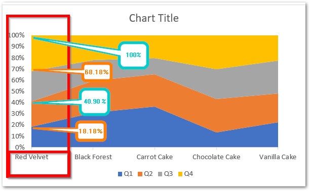
Similarly, you can read the percentage contributions for any other cake category on the chart.
Adding Data Labels on the Chart
We can even see the direct values from our source data on the chart itself. To do that, you need to add the data labels on the chart:-
- Select the chart.
- Click on the + button on the top right corner of the chart
- Mark the data labels from there
Now after adding the Data Labels, you can see both the percentage contributions and their values.
You can learn more about adding and deleting chart elements from here.
Formatting 100% Stacked Area Chart in Excel
Formatting allows us to change the way of how our chart looks, the color theme and helps us to match it with the spreadsheet. The different chart components included chart area, plot area, data series, chart axis, chart titles, data elements and almost everything on the chart can be formatted. Let us understand step by step.
To format any chart component, these are some common steps to select which component you wish to format:-
- Click on the chart
- Go to Format Tab in the ribbon
- Move the cursor to Current Selection Group and choose the required component from the list as per the situation :-
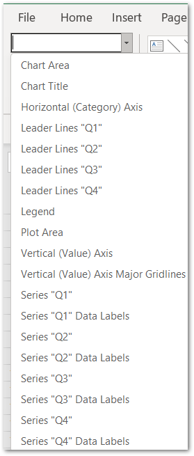
Formatting the Chart Area of a Chart
Select Chart Area from the list and click on the Format Selection button, As a result, this will open the Format Chart Area pane at the left of the excel window.
There you can choose the fill color and border for the chart.
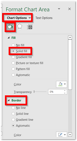
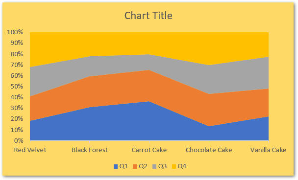
You can set the solid fill color for the chart and this is how the chart looks now:-
Formatting Data Series
There are four data series as Q1, Q2, Q3, Q4 and you will find any of them in the Current Selection group. Now click the button below it named Format Selection.
This will open the Format Data Series pane on the left.
Alternatively, if you have the Format Plot Area pane opened in the first part, you can simply click any data series to open the Format pane specific to that series.
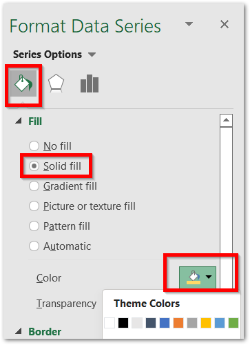
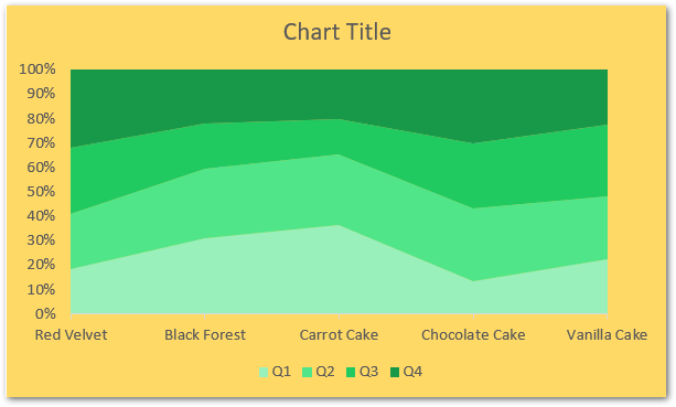
Choose a Solid fill color for your chart. Repeat this procedure by selecting the data series on the chart, keeping the formatting pane open. You do not need to use the Current Selection list as all it does for you is to select the specific chart component.
This is how representable the chart has become:-
Formatting Chart Axis
Formatting a Chart Axis is very important to know as it lets you adjust a lot of things including axis effects, fill, position, label formatting, major and minor bounds.
You can learn all of them right here.
This brings us to the end of the blog,
Thank you for reading
RELATED POSTS
- Stacked Area Chart Excel – Usage, Insertion, Area vs Line, Negative Values
- Stacked Line Chart in Excel – Inserting, Reading, Formatting
- Stacked Bar Chart in Excel – Usage, Insert, Format
- Column Chart in Excel – Types, Insert, Format, Clickable Chart
- Area Chart in Excel – Types, Inserting, Line vs Area, Correcting Chart
- Stacked Column Chart in Excel – Usage, Examples, Format, Special Gridlines

