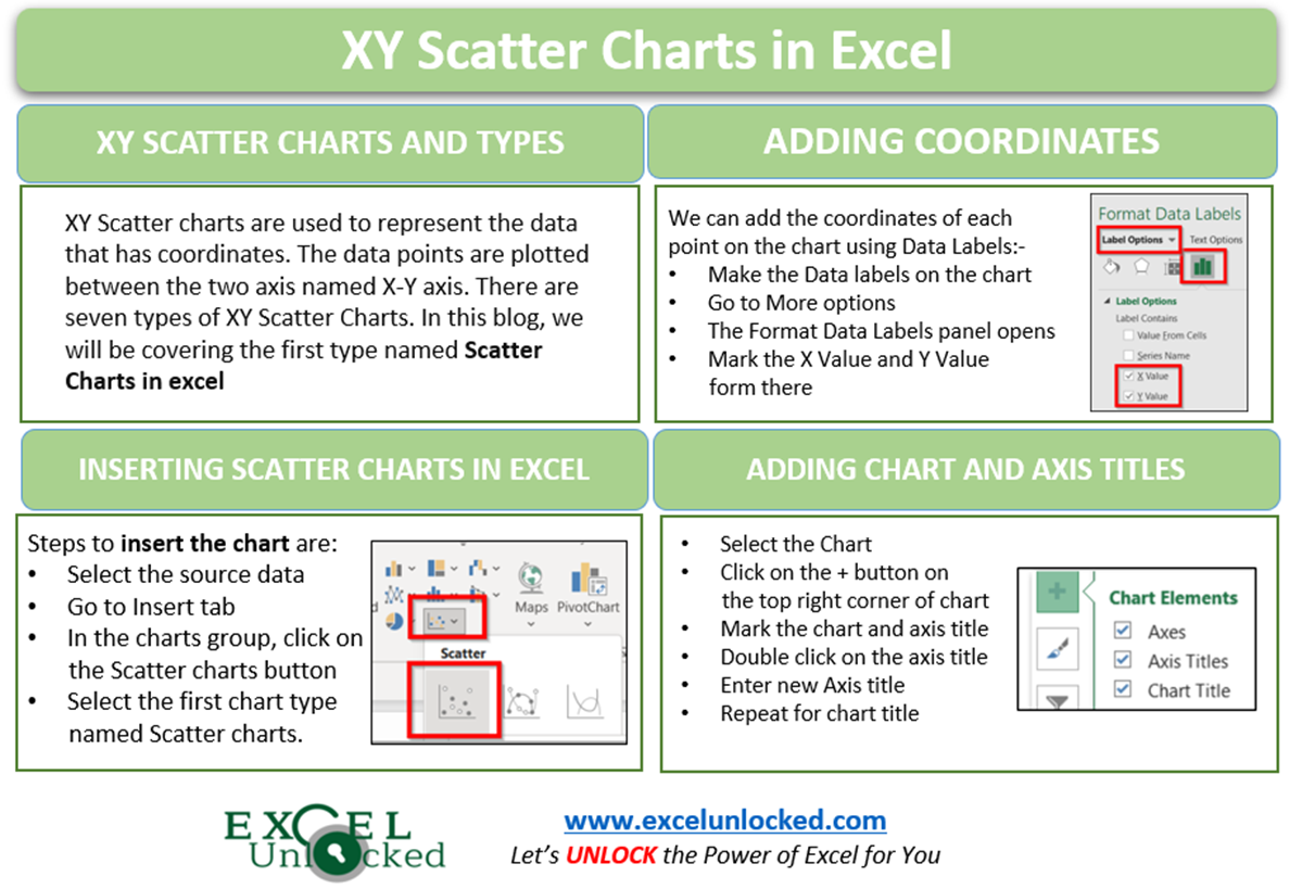
XY Scatter chart is a unique chart type that is used in special cases. Its usage is quite easy to understand. In this blog, we are going to understand the base of XY Scatter charts.
What are XY Scatter Charts in Excel
As the name “XY Scatter” suggests to you, there are two axes i.e X-Y Axis. The coordinates are scattered between these two axes. In this chart, there is no category axis. Instead, both the horizontal and vertical axis represents the (x,y) coordinates for each of the data points that plot on the chart.
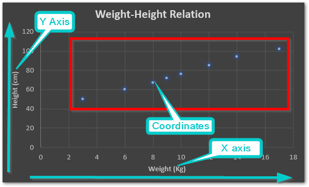
Consequently, this chart helps us visualize the relationship between two attributes of an entity. For example height-weight relationship for a person, distance-time relationship for a traveling car.
Types of XY Scatter Charts
There are seven types of XY Scatter charts. The functionality of all of them is similar except for their appearance.
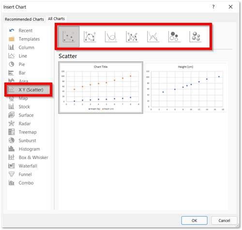
For instance, seven chart types are as follows:-
- 1st – Scatter Chart in Excel
- 2nd – Scatter with Smooth Lines and Markers
- 3rd – Scatter with Smooth Lines
- 4th – Scatter with Straight Lines and Markers
- 5th – Scatter with Straight Lines
- 6th – Bubble
- 7th – 3D Bubble
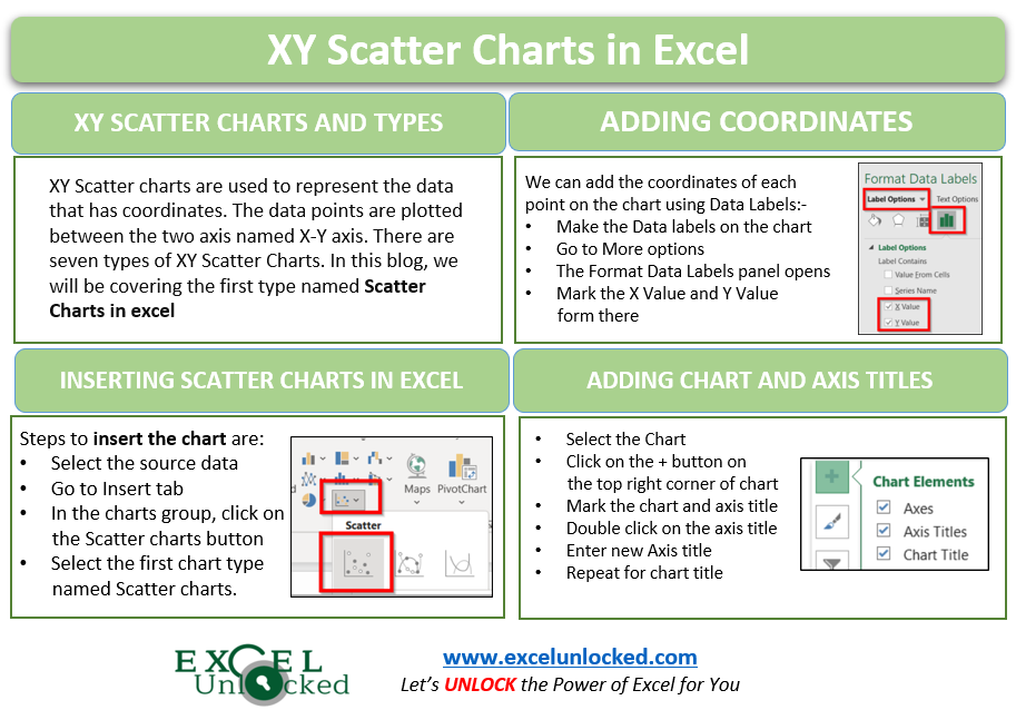
Inserting Scatter Chart
Starting from the first chart type of XY Scatter Charts i.e Scatter charts. Let us say we have the following information about the travel journey of a bus on a trip.
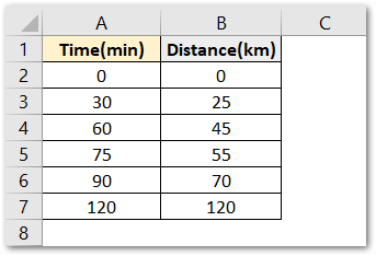
Following are the steps to insert a Scatter chart:-
- Select the range of source data A2:B7
- Click on Insert Tab on the ribbon.
- Hit on the Button for XY Scatter charts
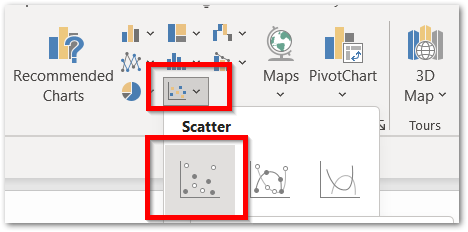
Click on this button. As a result, excel would insert a Scatter Chart in the current worksheet containing source data.
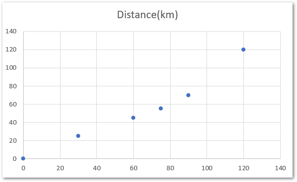
Plotting Coordinates of Scatter Charts
As we know the source data contains the distance covered with time. So there are two coordinated which would plot the points on the chart.
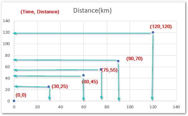
In the above chart:-
- The X axis or Horizontal Axis has the Time.
- The Y axis / Vertical Axis has the distance.
- The Six Coordinates are plotted between the two axes.
- We can easily visualize the coordinates for each data point through the axis,
Adding and Formatting Data Labels
Consequently, we can add the data labels on the chart to see the coordinates for each point.
To add the Data Labels on the chart:-
- Click on the chart
- On the top right corner of chart, a + icon would appear. Click on it.
- Mark the Data Labels from the menu and click on More Options
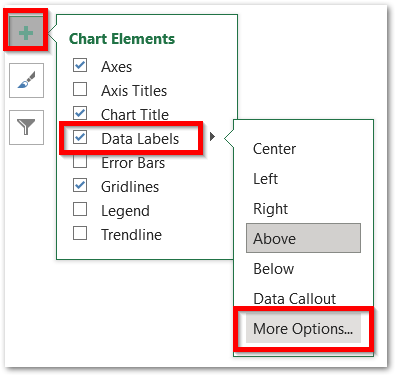
This opens the Format Data Labels Pane on the right of the excel window.
From there mark the X and Y coordinates to be displayed via the Data Labels.
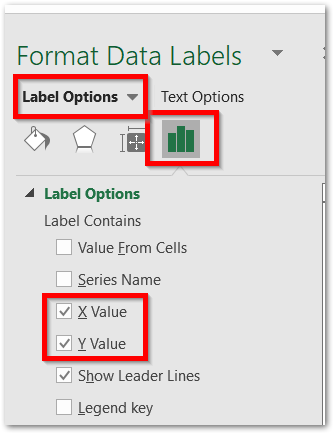
Mark the X Value and Y Value coordinate. This is how the chart looks now.
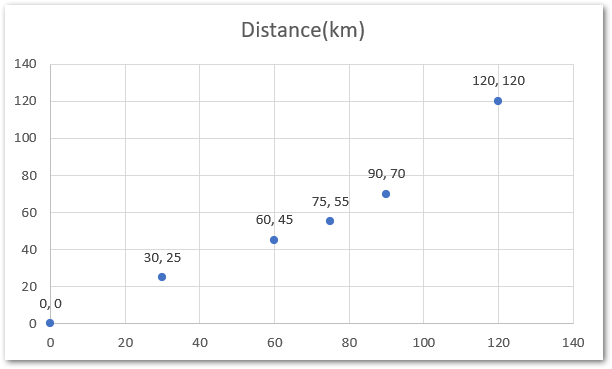
Remember that the coordinates would be in the format (x,y) i.e (Distance, Time)
Adding Chart and Axis Titles
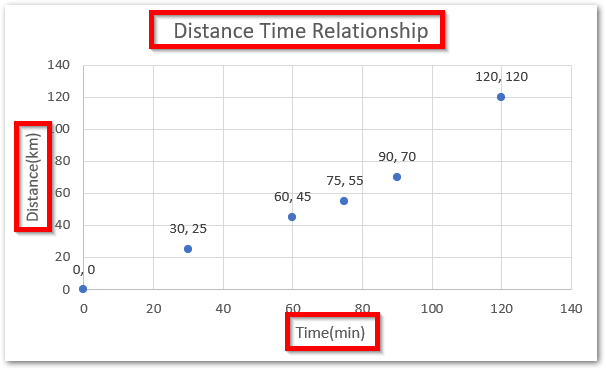
We haven’t added the proper chart and axis title yet. to add them simply:-
- Select the chart
- Click on the + icon.
- Mark the Chart title and Axis title from there
As a result, default chart and axis titles add to the charr. To change them:-
- Double click on the default chart title
- Type the new chart title
- You will see that while typing, the new title is typed in the formula bar
- Hit enter and the title in the formula bar will update the actual chart title
- Similarly, you can change the axis titles.
To further extend your knowledge about Adding/Deleting Chart elements, click here.
However, you can Formar Your Chart to make it look even better.
This brings us to the end of the blog.
Thank you for reading 😎
RELATED POSTS
- Column Chart in Excel – Types, Insert, Format, Clickable Chart
- Format Chart Axis in Excel Charts – Axis Options – Fill and Line
- All About Chart Elements of a Chart in Microsoft Excel
- Line Chart in Excel – Inserting, Formatting, #REF! resolving
- Pie of Pie Chart in Excel – Inserting, Customizing, Formatting
- Area Chart in Excel – Types, Inserting, Line vs Area, Correcting Chart

