In the earlier blog, we learned the usage of Scatter Charts in Excel. Scatter charts were used to represent two values in a data series through the x and y-axis. Each Datapoint has two coordinates by which it is plotted between the two axes.
Bubble Chart is the last chart type of XY Scatter charts and is very interesting to learn about. Let us start now.
What is a Bubble Chart in Excel
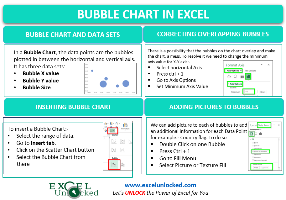
As the name suggests, the data points in this chart are the bubbles. There is one horizontal and one vertical axis in which the coordinates of each bubble are plotted. We need exactly three data sets in order to insert a bubble chart. Each data point ( bubble ) would have the following visualizations on the chart:-
- Bubble X axis value – This is the coordinate of each bubble on the horizontal axis
- Y axis value – Consequently, this is the Vertical Axis coordinates for each of the bubbles.
- Bubble Size – This would represent the size of bubble based on its numerical value in the data set.
Inserting a Bubble Chart in Excel
Let us say we have the Birth Rate, Death Rate, Population of different countries of the world. Below is the data.

To insert a bubble chart:-
- Select the range of cells containing numerical values B2:D6
- Go to the Insert tab on the ribbon.
- Click on the Scatter charts button. Select the bubble chart from there.
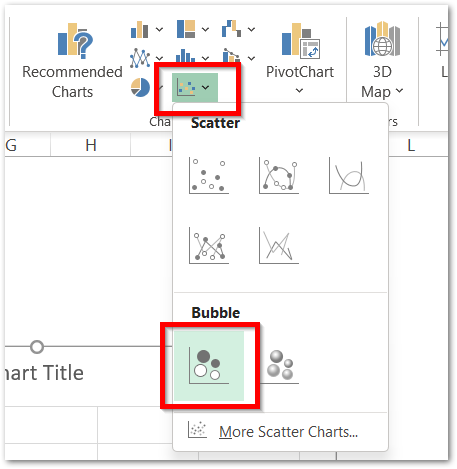
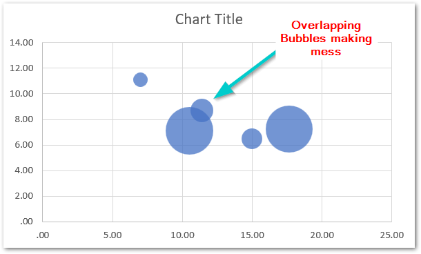
This would insert a bubble chart containing the X and Y-axis along with the bubbles in between. There can be a problem in your case when you got the chart inserted. The bubbles might overlap because of any of their coordinates having less gap between them as follows:-
Solving the Bubble Overlapping Problem
The Bubble Chart in Excel has this one issue. The overlapping of bubbles makes a mess on the chart. This happens particularly when the chart does not have enough scale to show the minimum gaps between bubbles without overlapping. Changing the Minimum Axis Value is going to help in this case. By now, the minimum vertical and horizontal axis values are zero as you can see:-
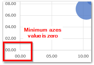
We can change this minimum value. But for that, we must know what is the actual minimum value for the axis to be taken so that all the points could be successfully plotted. To check the plotting of source data on the chart:-
- Right click on the chart
- From the menu, Click on Select Data option. This opens Select Data Source Dialog Box.
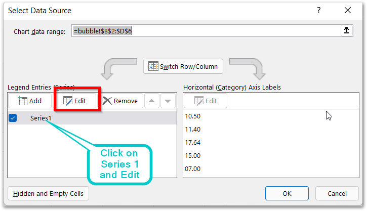
This series1 here is the series of bubbles, already plotted on the chart. Click on the edit button to see how the bubbles have been plotted on the chart,

Setup of a Bubble Chart in Excel
This will open up the Edit Series dialog box. It has four fields. “Bubble” here is the worksheet name. For instance, the four Series are as follows:-
- Name – You can add the name for each series if you have multiple series on the same chart.
- X Value – this is the range of cells that has bubble’s X coordinates of horizontal axis. i.e B2:B6 containing the Birth Rate. the $ sign is to lock these references ( absolute referencing)
- Y Value – this is the range of cells that has the bubble’s Y coordinates of vertical axis. i.e C2:C6 containing the Death Rate.
- Bubble Size – this would represent the numbers corresponding to the size of each bubble. i.e Population range D2:D6.
Here you need to find the minimum X and Y axis values in the source range. i.e 7.00 on X-axis and 6.51 on the Y-axis. So to represent the bubbles more precisely, we would take the minimum axis values as:-
- X Axis – 6
- Y Axis – 5
As of now, we have decided the minimum axes value for each axis of Bubble Chart, we can now change the default axis settings.
- Select the chart
- Go to Format Tab on the ribbon
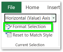
- In the Current Selection group, choose the Horizontal Axis to format.
- Click on Format Selection button
- In the Format Axis Pane, Set the minimum axis value as 6
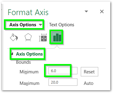
Now, click on the Vertical Chart Axis, and simply enter the Minimum axis value as 5. You can also remove the chart Gridlines to make it even cleaner.
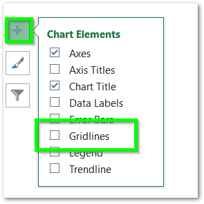
Follow the article to know more about Adding or Deleting Chart Elements.
This is how the chart looks now.
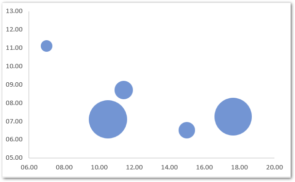
As you can see the minimum starting value of each axis has changed. As a result, the bubbles are not overlapping each other.
Adding Data Labels to Bubble Chart
Data Labels are the text boxes in our series that represent some kind of information regarding that series for each data point. To add Data Labels simply:-
- Click on the chart
- When the Chart’s pull handle appears, click on the + button on the top right corner of the chart.
- Mark the checkbox for Data Labels from there.
- Click on More Options in the Data Labels sub menu.
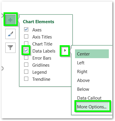
This opens the Format Data Labels Pane at the right of the excel window.
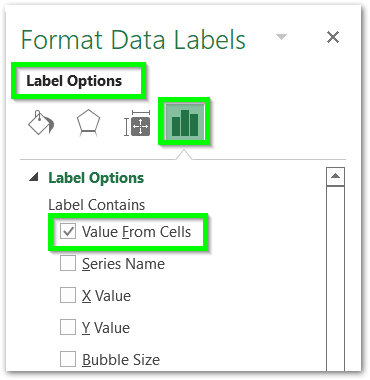
Open the Label Options and make the checkbox for Value from Cells. Make sure that the rest of the checkboxes in the label options are unmarked.
Select the range A2:A6 and click Ok to add it to data labels.
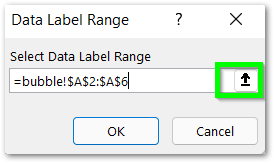
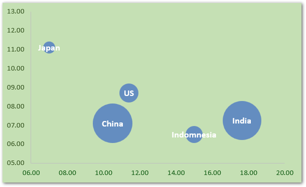
As a result, each bubble will now represent its county name with it. You can also set the Lable Position to the center of the bubble and change its formatting like any other textbox.
Formatting the Bubble Chart
The formatting done in the above chart is as follows:-
- The Font Color of Data Labels in set to white
- The Chart Background is Green
- The Vertical and Horizontal Axis Labels Font Color is Dark Green
You can format each of these components by clicking on it and then pressing ctrl+1. This will open the Format Pane for each of them. Note that this is a shortcut to going to the Current Selection Group in the Format Tab on the ribbon.
Adding Pictures to Bubbles in Chart
We can add pictures to represent the country flag for each bubble. Double Click on the first bubble. A single click will select all bubbles, while a second click without a pause will select the particular bubble you clicked on.
After selecting the bubble, press ctrl + 1 to open the Format pane for that bubble.
Make sure that you have selected the bubble and not the data label over it.
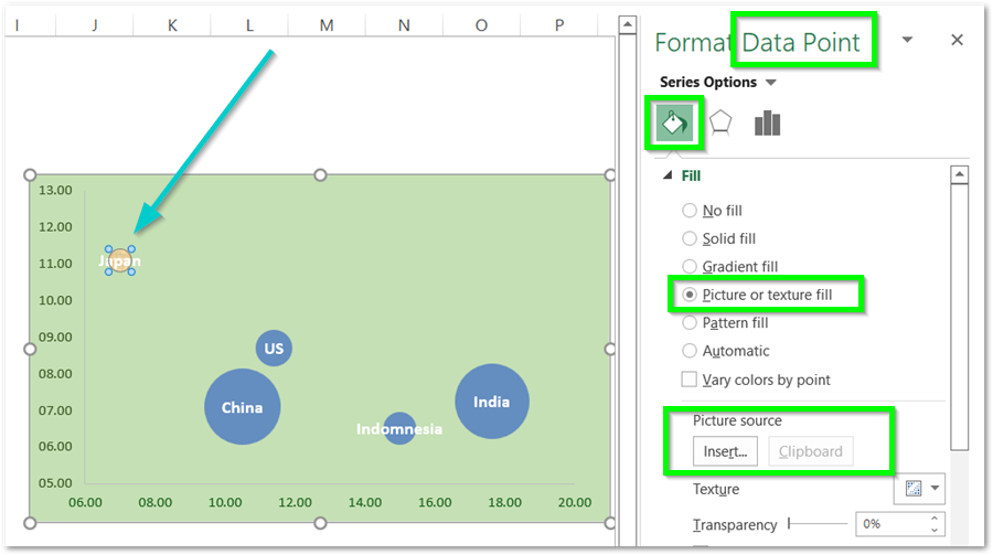
Click on the Picture or texture fill in the Fill menu. Click on the insert button. Browse the picture online for the Japan Flag and insert it into the bubble-like this.
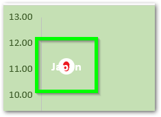
Repeat the procedure for all the country flags and this is the final resultant chart:-
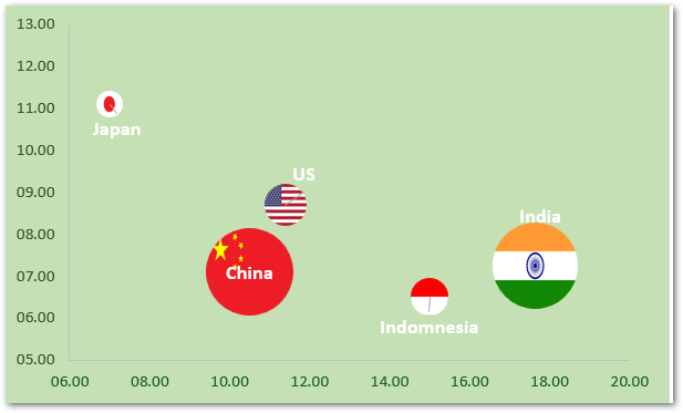
As you can see, we have shifted the position of some data labels ( by dragging ) as white font made it hard to read.
This brings us to the end of the blog.
Thank you for reading 😎
RELATED POSTS
- All About Chart Elements of a Chart in Microsoft Excel
- Column Chart in Excel – Types, Insert, Format, Clickable Chart
- Format Chart Axis in Excel Charts – Axis Options – Fill and Line
- Population Pyramid in Excel – Usage, Making, Formatting
- Line Chart in Excel – Inserting, Formatting, #REF! resolving
- Pie of Pie Chart in Excel – Inserting, Customizing, Formatting
