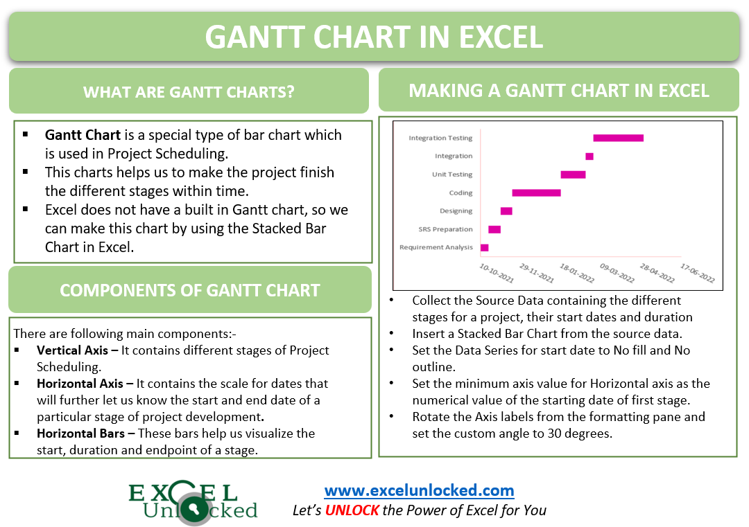
Gantt Chart is a special type of Bar Chart which is used in Project Scheduling. The chart helps to make the project finish within that time period. Let us see how this chart works 8D
What is Gantt Chart in Excel?
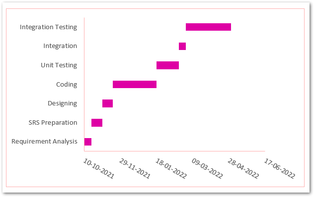
Gantt Chart represents the following components:-
- Vertical Axis – It contains the different stages in the process of project completion.
- Horizontal Axis – It contains the scale for dates that will further let us know the particular start date and duration of any stage of Project Development.
- Horizontal Bars – These bars will visualize the start, duration and endpoint of the different stages of Scheduled Project.
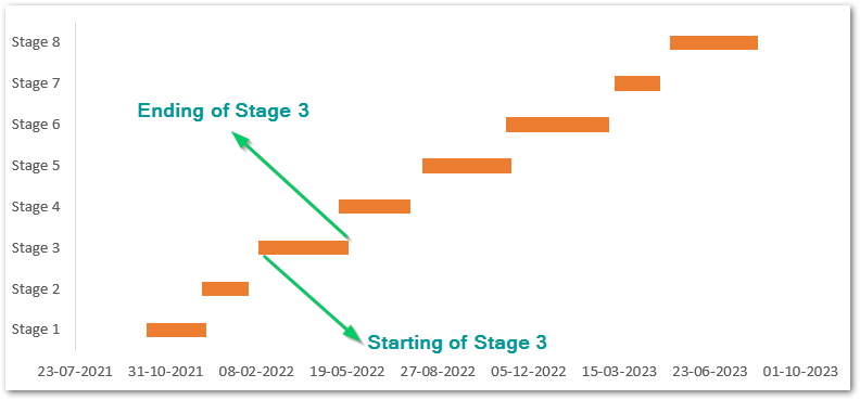
Inserting a Gantt Chart in Excel
Excel does not have any built-in Gantt Chart as one of its chart types. But we can probably use the Stacked Bar Chart in order to prepare the same. Let us assume there is a software development company and the manager wants to schedule all of the stages in the Software Development Life Cycle by preparing a Gantt Chart.
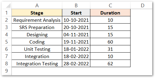
We have used the Date Function in Excel so as to get the starting in a proper Date format when representing them on the Chart

Inserting the Stacked Bar Chart
Follow these steps mentioned below to get the resultant chart.
- Select the range of cells A1:B7 ( we will add Duration later )
- Go to the Insert tab on the ribbon. Click on Recommended Charts button in the Charts Group.
- Go to All Charts tab and choose the Bar Chart from the list.
- Click on Stacked Bar Chart.
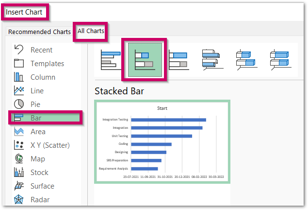
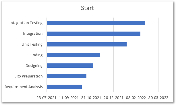
Consequently, this inserts the chart as follows:-
Adding Duration of Each Event to the Stacked Bar Chart
The chart inserted in the above section has:-
- Stages on the Vertical Axis
- Scale for dates on the Horizontal Axis
- Starting Dates in the Horizontal Blue Bars for events.
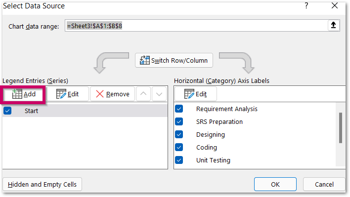
We have not added the duration ( in days ) for each of the events to the chart. To do so simply:-
- Right Click on the Chart.
- Click on Select Data option from the shortcut menu there.
- In the Select Data Source Dialog box, click on Add button under series section
- Click on the arrow button that corresponds to Series Name and select tcell C1.
- Again Click on the arrow button adjacent to Series Values and select the range of cells C2:C8.
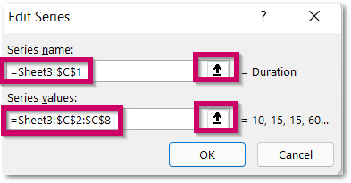
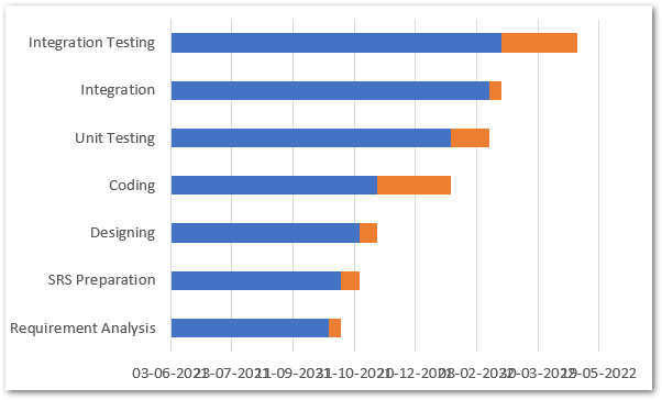
- Click OK and now observe the change in the chart.
Formatting the Chart to make it Gantt Chart in Excel
We need to format the above chart to make it look exactly like a Gantt Chart.
Formatting the Data Series
The ending point of blue bars is joined with the starting point of orange bars both giving the starting date for the event. We need to hide the blue data bars so as get the value of starting date of the event from the starting point of the orange bars. To do so:-
- Select the Chart and go to the Format tab on the ribbon
- Choose the Series “Start” in the Current Selection Group and click on Format Selection button.
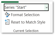
- This opens the Format Axis pane, Set the Fill for data series as No Fill, This will hide the blue bars on the chart.
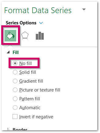
Similarly, you can change the solid fill color for the Orange Bars as well to set it to the matching color scheme that you used in the rest of your workbook. Just select Series “Duration” in the Current Selection Group and set the Solid Fill color instead of No Fill.
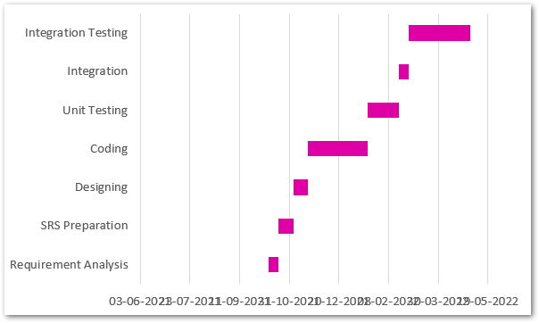
Consequently, the chart now looks something like this now.
Setting the Bar for first event
Since these bars are starting with some gap to the left of the plot area, we need to fix this. This can be done by changing the minimum axis value as the starting date for the first event. The steps to do this are:-
- Type in this formula in any of the cells of your spreadsheet.
=TEXT(B2,"#")
- This formula will return the Numerical Value assigned by excel to the starting date for first event as 44479. So now we can set the minimum axis value as 44479 which is suitable in this chart.
- Now select the Chart and go to the Format tab on the ribbon. Choose Horizontal ( Value ) axis and press ctrl+1.
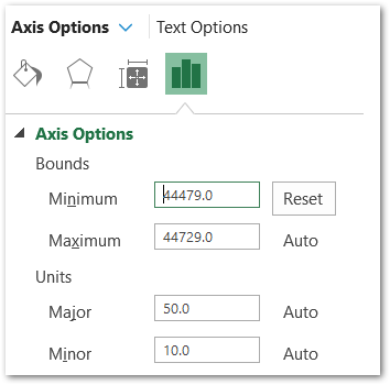
- Set the minimum axis value from the Axis Options as 44479.
Rotating the Axis Labels (Dates)
Since we have the Format Axis Pane Open for the Horizontal Axis, we can change the angle for dates because they are taking up much space when are in the horizontal direction. To do so:-
- Go to Size and Properties section
- Set the Custom Angle to 30 degree
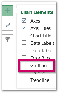
We have removed the gridlines from the chart from the + icon at the top right corner of the chart.
The results are satisfying.
Thank you for reading.
RELATED POSTS
- Bar Chart in Excel – Types, Insertion, Formatting
- Waterfall Chart in Excel – Usage, Making, Formatting
- Interactive Pictograph Chart in Excel – Usage, Making
- Open High Low Close Stock Chart – Insert, Format, Up/Down bars
- Change the Order of Data Series – Stacked Line, Stacked Area, Column Chart
- Stacked Bar Chart in Excel – Usage, Insert, Format

