The Pareto Chart in Excel is basically a combination of Line Chart and Column Chart in Excel. The Pareto Chart is used in Pareto Analysis. This is a very important chart which is used in big companies to take business decisions. Let us see how it works 8D.
What is a Pareto Chart in Excel?
Pareto Chart in Excel is used to get a pattern that forms the most percentage of the results. This chart helps us to study the Pareto Principle based on the 80/20 rule. According to it, 80% of the results or problems are due to 20% of the potential resources or causes.

This chart helps us to get the terms that are most impactful to a business or company. However, we can even use Pareto Chart to analyze the most frequently faced problems in an organization.

What does a Pareto Chart contain?
A Pareto Chart contains the following main components:-
- Vertical Columns – It is the data series representing the frequency of a particular event.
- Line – It is the data series representing the cumulative percentage for the event. This data series will let us verify the Pareto principle.
- X axis – This represents the Categories or Patterns that we want to look for.
- Primary Vertical Axis – It has the scale for representing vertical columns.
- Secondary Vertical Axis – It has the scale for representing cumulative percentages that go up to a maximum of 100%.
Preparing to Insert a Pareto Chart in Excel
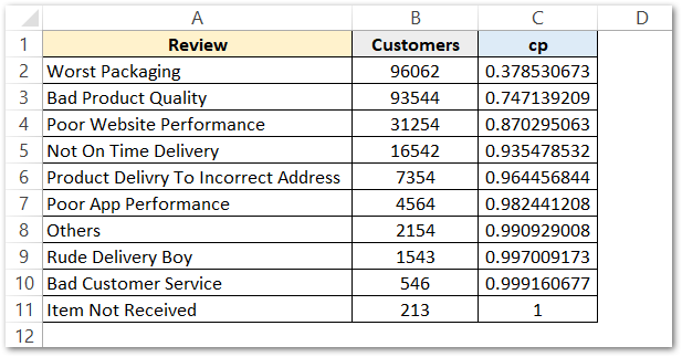
Let us say we have the reviews for Flipkart of its service to the customers. The customers have rated their service and the problematic records are as follows:-
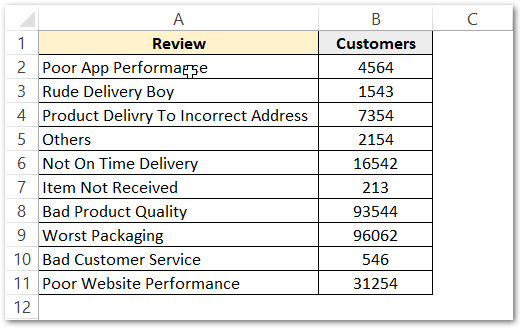
You can see above, that in column A we have the problem and in Column B we have the frequency of that problem or we can say the number of people that are facing that problem.
Preparing the Source Data for Pareto Chart
We need to arrange the cells in descending order and also prepare a column for Cumulative Percentage. Follow the below-mentioned steps.
- Select the range of cells A1:B7 and go to the Home tab on the ribbon.
- Go to the Sort and Filter button in the Editing Group.
- Click on Custom Sort. This opens the Sort Dialog box.
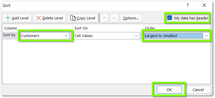
- Select the Customers in Sory by Field, Largest to Smallest (descending) as the Order field. Make sure that the check box at the top right corner is marked since we had the headings selected in the range A1:B7. Click OK.
- This sorts the data in descending order, The frequently faced problems are now on the top as follows:-
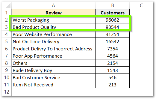
The first two problems are 20% of the customer reviews ( out of 10 ) and are the most occurring ones.
- After this, we will make two more columns named Cumulative Frequency (cf) and Cumulative Percentage (cp)
- Use this formula in cell C2 and copy the formula down using the Fill Handle Tool. For instance, the C11 will contain a total of all customer reviews.
=SUM($B$2:B2)
- Use the below mentioned formula in cell D2 and copy it down. As a result, this formula returns Cumulative Percentages.
=C2/$C$11
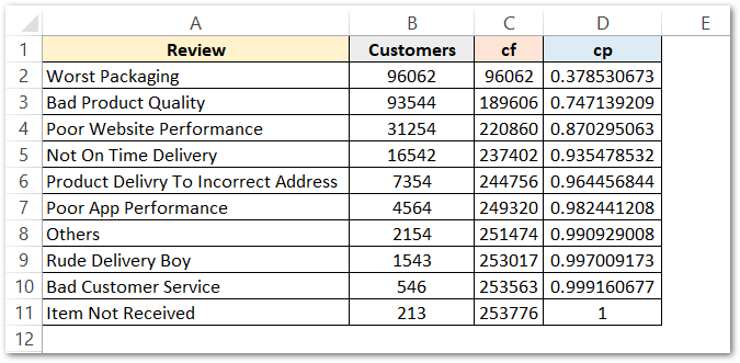
- The next thing is we want all the range C2:D11 pasted as value as we only need to formula results. To paste as value select the range C2:D11 and press ctrl+c
- Press ctrl+alt+v+v to paste the selected range as values. In other words, we can call this method as paste special.
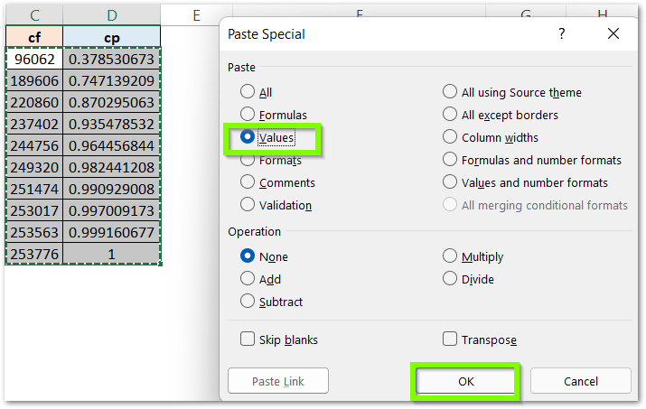
- Check the formula bar which does not show the formulas used. (keep the active cell as one of the cells from the range C2:D11)
- Delete the Column C for Cumulative Frequency. Now we get our source data for Pareto chart.
Inserting the Actual Chart
To insert the final chart, perform the following steps:-
- Select the range of cells A1:B11
- Go to Insert tab on the ribbon
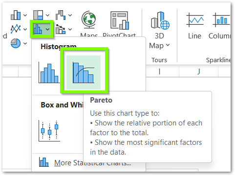
- Click on the Histogram Chart button in the Charts Group and select the Pareto Chart from there
As a result, this inserts the Pareto Chart as follows:-
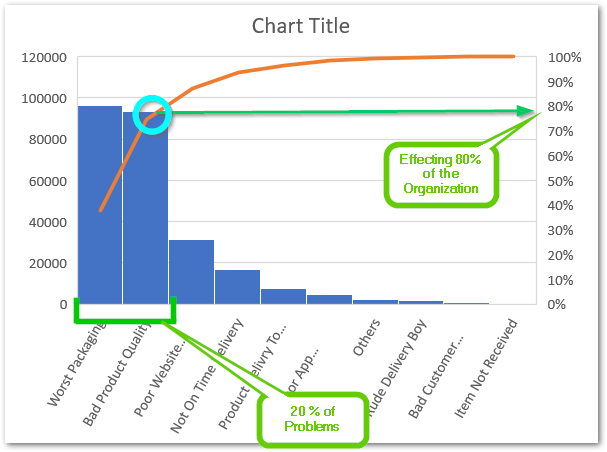
For instance, you can see that 20% of the Problems are causing 80% of the effect. This verifies the Pareto Principle in this chart.
Thank you for reading 😉
RELATED POSTS
- 100% Stacked Column Chart in Excel – Inserting, Usage, Reading
- 100% Stacked Line Chart in Excel – Inserting, Analyzing
- Bullet Chart in Excel – Usage, Making, Formatting
- 100% Stacked Area Chart in Excel – Insertion, Reading, Formatting
- Population Pyramid in Excel – Usage, Making, Formatting
- Pie of Pie Chart in Excel – Inserting, Customizing, Formatting

