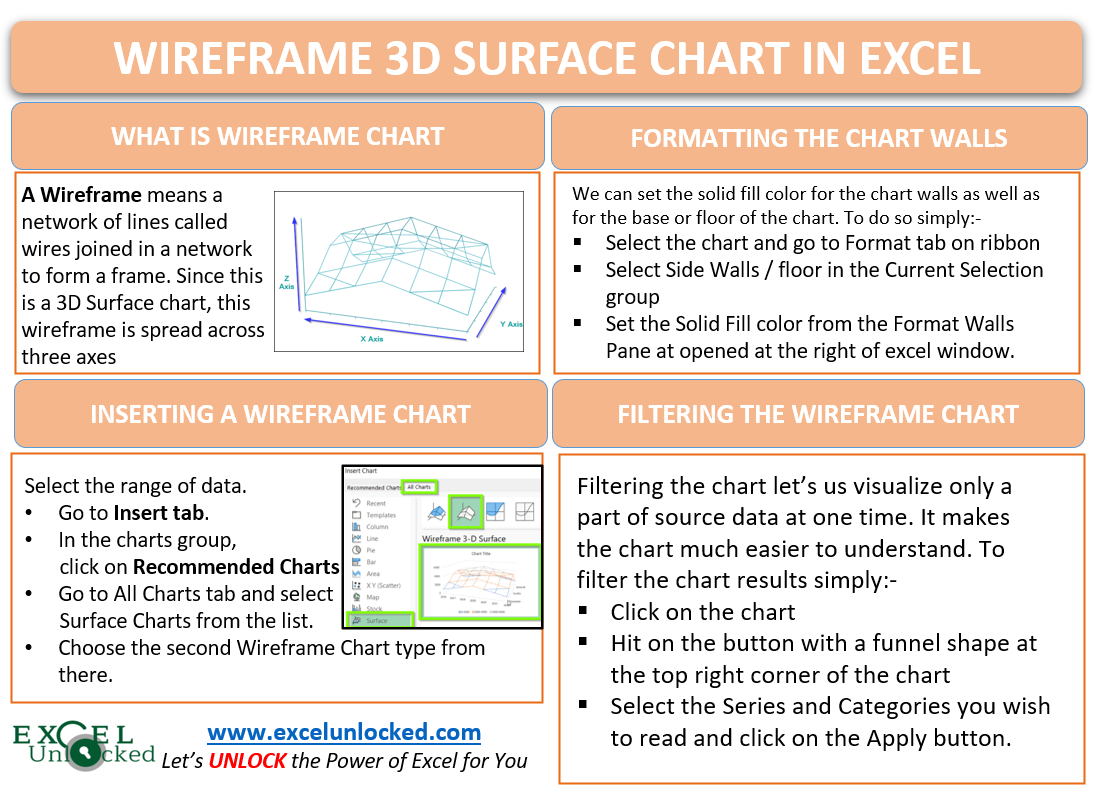
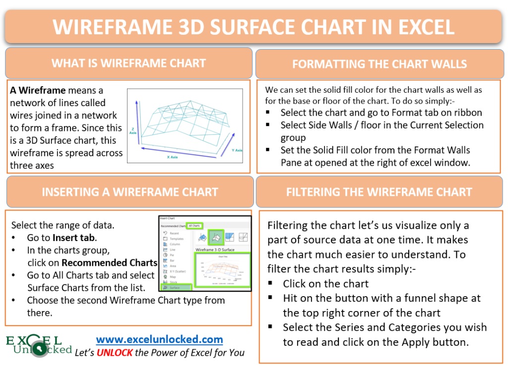
In the earlier blog, we learned the usage of the 3D Surface Chart in Excel. Wireframe 3D Surface Chart in Excel is an extension of 3D Surface Chart and the working of both of these charts is almost similar. Let us see how 😀
What is Wireframe 3D Surface Chart ?
A Wireframe means a network of lines called wires are joined to form a frame. Since this is a 3D Surface Chart, the wireframe is spread across the three axes i.e X-axis, Y-axis, and Z-axis. Each of these axes represents:-
- X Axis – It represents the categories on the chart.
- Y Axis – It represents the sub categories on the chart.
- Z Axis – It represents the scale for visualizing the data points.
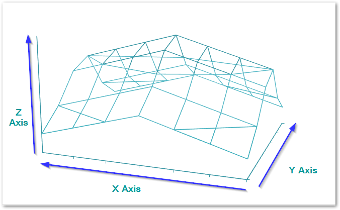
We need at least two data series ( each on the X and Y axis ) to be represented on this chart type. This is so because a line ( wire ) needs at least two points to be plotted to join.
Inserting a Wireframe 3D Surface Chart in Excel
Let us say we have had sales of a bakery of its cakes for a few years. The bakery owner wants to analyze these sales by using some relatable chart type. Let us make him a Wireframe 3D Surface Chart. Below is the data for sales.

As you can see there are seven columns representing years and six rows representing cakes. To insert the chart simply:-
- Select the range of cells A1:H7
- Go to the Insert tab on the ribbon. Click on the Recommended Charts button.
- Open the All Charts tab in the Insert Chart Dialog Box.
- Select the Surface Chart and choose the Wireframe 3D Surface Chart
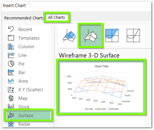
Consequently, this will insert the chart with default formatting.
Adding the Hidden Values of the Axis
The chart inserted in the above section is as follows:-
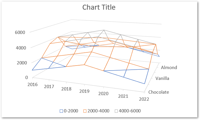
As you can see, all six cakes are not there on the axis, although they have been plotted successfully on the chart. This happens because of the compact space on the chart. To undo this:-
- Select the Chart and Go to the Format tab on the ribbon
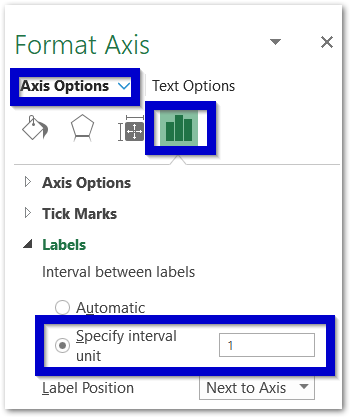
- Choose the Depth Axis (Y axis) in the Current Selection Group and press ctrl+1.
- This opens the Format Axis Pane.
- Go to Labels and Specify the Interval unit as 1.
Formatting Wireframe 3D Surface Chart
Refer to the previous article to format the Wires of the above chart. All you need to change is the border color of these wires and not the fill color since it is automatic. We would now learn to format the walls of this chart. To do so:-
- Select the Chart and go to Format Tab on the ribbon.
- Choose Walls in the Current Selection group.
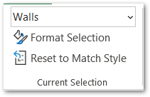
- This opens the Format Walls pane at the right of spreadsheet.
- Choose the Solid Fill Color for both of the side walls.
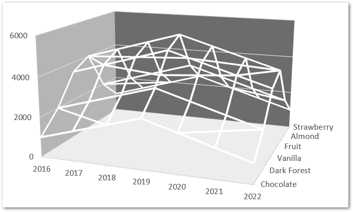
Similarly, you can format the base of this chart by selecting Floor in the Current Selection Group. This is how the chart looks after formatting the wireframe, walls, and floor.
Filtering a Chart in Excel
As you can see that this chart type might be intimidating to read at first especially when you are new to it. Applying filters to the chart lets us visualize a part of the source data. To filter a chart simply:-
- Click on the chart
- Select the third funnel shaped button at the top right corner of the chart.
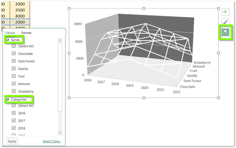
Consequently, you can now mark the series and categories you want in the chart and hit on apply button. Here we will take the sales data of 2021 and 2022 only and unmark the rest of the categories. The results are as follows:-
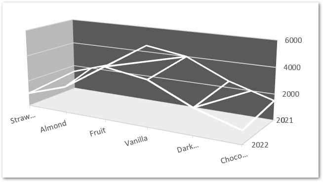
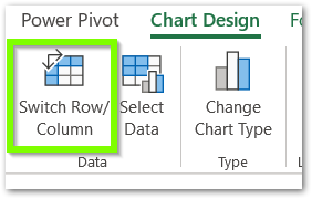
We have switched the rows and columns as you can see above. To switch the rows and columns simply select the chart and go to the Chart Design tab and hit on Switch Rows and Columns Button.
This brings us to the end of the blog.
RELATED POSTS
- 3D Column Chart in Excel – Usage, Insertion, Format
- Area Chart in Excel – Types, Inserting, Line vs Area, Correcting Chart
- Column Chart in Excel – Types, Insert, Format, Clickable Chart
- Radar Chart in Excel – Components, Insertion, Formatting
- Scatter Charts in Excel – Straight and Smooth Lines with Markers
- Format Chart Axis in Excel Charts – Axis Options – Fill and Line

